The Atari logo represents the gathering of users around the console for an exciting game, an invitation to go on an adventure together. The emblem’s symbols indicate game consoles’ high technology, novelty, and popularity.
Atari: Brand overview
In the 1970s, there was a revolution in the video game sector, thanks to which a new niche industry was born. At that time, console makers were emerging; among them was Atari. It entered the market in 1972, but until 1984, it was manufacturing slot machines. The firm launched its first set-top box in 1977, setting fertile ground for the next generation of interactive entertainment. Its most famous arcade was PONG, a table tennis simulator that became its first commercially successful video game.
For 50 years, the brand has managed to change many names and owners. It was first known as Atari Inc. and was owned by Ted Dabney and Nolan Bushnell. Warner Communications bought it in 1977. In 1984, when the computer games industry began to decline sharply, the main part of the division became the property of the Polish-American businessman Jack Tramiel and received the name Atari Corporation. The remaining assets were renamed Atari Games, Inc., but Warner Communications could no longer use the trademark logo as it originally existed.
In 1998, Hasbro Interactive bought out the consoles and video game business and renamed it Atari Interactive. Then, the interactive entertainment brand and Hasbro became part of Infogrames Entertainment. The new parent firm acquired all of the remaining shares of Atari Inc. and, in 2009, changed its name to Atari, SA. Thus, many Atari divisions eventually merged.
Meaning and History
The name and logo are the only things that connect a modern company with its predecessor (before the separation). The brand name has been used since 1972 and changed several times over 50 years, but all modifications were similar. The owners retained the traditional brand image because the iconic emblem was familiar to different gamers: it adorned all slot machines and consoles without exception. The developers made small changes to it so that each model had its symbol.
What is Atari?
Atari is a legendary brand for developing and releasing computer games that have hugely impacted the entire gaming industry. It was founded in 1972 and until 1984 was the leader in the video games market, and then due to the crisis, it was divided into several companies.
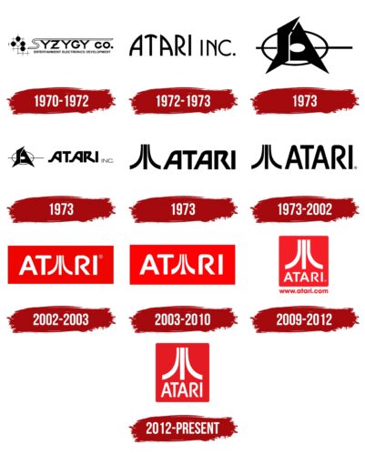
1970 – 1972
The Atari logo consisted of stylized lettering. She had the top fragment of the white “S” stretched out, which formed a long superscript line. Below is the rest of the text. He, unlike the first part, had a black color. At the bottom was another line – the third- clarifying information about the company. In front was an image of five balls – one white and four black. The space lined in a cage served as a background for them. The letter “S” was made with a double stripe – contour.
1972 – 1973
Following the company’s rebranding, the logo was redesigned. It introduced the word “Atari” with the letters “A” and “T” balanced. They were arranged in an impromptu “slide,” for which the designers rounded off the head of the central glyph. At the same time, the syllable “RI” stood alone. The font was capital, bold, and black.
April – June 1973
The designers used graphic elements to achieve maximum similarity to a serious logo. They originally beat the letters “S” and “A,” making them sharp – in the form of wide blades. An oval in the form of a target with lines extending to the sides was used as a background.
June – July 1973
The graphic icon has been combined with the word symbol. The inscription was in capital letters. Thanks to the rounding, the “R” and both “A” were smooth and smooth. The notches were missing. All elements had a one-line horizontal arrangement.
July – August 1973
A three-line structure in the form of a stele first appeared. The middle stripe was flat, and the side stripes were curved inwards. Nearby was an inscription with the company’s name. The letters had sloping tops, except “T” and “I,” which were made with 90-degree angles. The upper half of the “R” was open; the line did not fully converge with the opposite side, indicating Atari’s openness.
1973 – 2002
The iconic Atari logo is credited to in-house graphic designer George Opperman, who once founded Opperman-Harrington Inc. The first trademark owners, Ted Dabney and Nolan Bushnell, hired him to design the arcade machines.
Bushnell was also involved with creative director George Faraco in creating the logo. The firm’s co-founder gave George Opperman a clear but challenging task. He wanted to create a recognizable symbol consisting of several bold lines that could reproduce the drawing on any media and be recognized even from a great distance.
The designer provided several conceptual versions that matched the wishes. Nolan Bushnell chose one of them: a black abstract figure from three fragments. There was a wide vertical line in the center of the image. To the left was an arc similar to a graph of an increasing function, and to the right was a mirrored strip in the form of a decreasing function. The space next to the symbol was occupied by the black inscription “ATARI.” Opperman designed the font himself by rounding the top corners of both “A” and “R.” At the same time, the letter “R” stood out very much because its upper part was open.
This logo debuted in advertising and on the Space Race slot machine in 1973. As far as we know, it underwent minor changes after the sale but reached 2002 almost in its original form.
Warner Communications, which took over the Atari brand in 1977, was planning a global redesign and even polled gamers to see if they liked the new or old version of the logo. As it turns out, video game fans supported the classic icon, which became more recognizable than the famous Mickey Mouse. So the division retained its $ 3,000 native symbol, and Warner Communications executives spent $ 100,000 completely pointless.
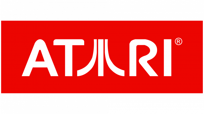
2002 – 2003
2002, the developers changed the logo’s appearance by placing it in a red rectangle. The pattern of three multidirectional lines was reduced and integrated into the word “ATARI”: it replaced the middle letter “A.” The lettering is now white to stand out better against a bright background. The typeface’s proportions have been slightly tweaked, with the designers rounded off the top corners “T” for symmetry.
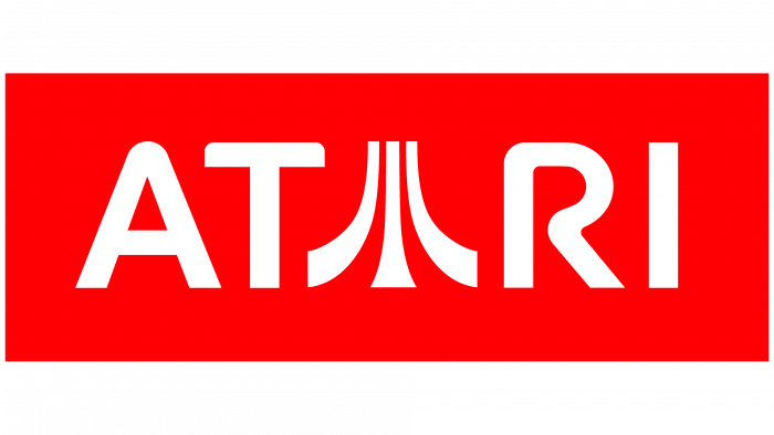
2003 – 2010
The previously used dark red has been lightened and given a rich hue. The shape of the Atari graphic has changed slightly: the developers have widened the lower edges of the lines so that the side arcs look like two horns, and the central vertical strip looks like the top of a trombone. This version of the logo first appeared on the cover of the 2003 video game Putt-Putt: Pep’s Birthday Surprise.
2009 – 2012
The bands’ similarity to trombone and horns was removed, as was the integration of the “stele” with the “A.” The three-line graphic icon and company name were separated and placed on different levels. The background was a red square with rounded corners. Beneath it was the company’s domain address.
2012 – today
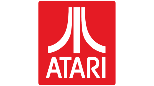
In 2010, the company returned to the classic design. The font and three-line pattern now look the same as in the early 1970s. The caption is scaled down and positioned below the figure, with both elements placed in a red rectangle with rounded corners. The alternate version contains a small red badge (left) and the brand name (right) on a white background.
The Atari branding symbolizes retro video games and remains relevant almost half a century since its inception. In terms of legend, it can only be compared with a Nike swoosh, but it makes much more sense than a simple tick.
George Opperman himself considered the video game PONG when creating the logo. The arcade’s dynamics inspired the designer, who imagined a moving ball hitting the centerline from two sides could bend it. As reported in a 1983 interview, Opperman embodied this idea in a geometric pattern.
The author admitted that he pondered for a long time how to best style the letter “A,” which is iconic for the Atari brand. And then he wanted to watch PONG play, and everything fell into place. Many see a ping-pong net (vertical stripe) and two rivals (arcs on the sides) in the logo. Slightly less often, an abstract drawing is associated with Mount Fuji, a Japanese character or religious symbol. But in fact, he has nothing to do with them.
Nolan Bushnell, in turn, called all theories “bullshit.” Commenting on an interview with George Opperman, the founder of Atari dispelled doubts about the design and said that the logo has no hidden meaning. In his opinion, it is just a pattern of three bold lines without concept. In any case, the iconic symbol has been preserved and has become a “guiding star” in the history of video games.
Atari: Interesting Facts
Atari, founded in 1972 by Nolan Bushnell and Ted Dabney, is a trailblazer in the video game industry known for its innovation and impact on gaming and pop culture.
- Start and Name: “Atari” is from the Japanese game Go, meaning a warning to an opponent. Bushnell, a Go enthusiast, liked its competitive edge.
- Pong: Released in 1972, Pong was among the first widely popular arcade video games, setting the stage for the gaming industry with its simple, tennis-like gameplay.
- Atari 2600: In 1977, Atari introduced the Atari 2600, a groundbreaking console that used interchangeable cartridges, allowing a variety of games to be played on one system.
- 1983 Crash: In the early ’80s, Atari struggled, especially with the video game crash of 1983, which was partly due to the poorly received E.T. game.
- Foundations for Modern Gaming: Despite these challenges, Atari’s innovations, like joystick controls and multiplayer games, laid the groundwork for today’s gaming industry.
- Ownership Changes: After difficulties in the mid-1980s, Atari changed hands several times, with different owners using the brand for various tech and gaming projects.
- Early PCs: In 1979, Atari also contributed to personal computing with the Atari 400 and 800 computers, which featured advanced graphics and sound.
- Atari Jaguar: In 1993, Atari launched the Jaguar console, advertised as the first 64-bit system. It couldn’t keep up with competitors like the Sony PlayStation and didn’t catch on.
- Cultural Impact: Atari has left its mark on pop culture beyond gaming. Its iconic logo and classic game imagery represent nostalgia for early video gaming.
- Atari Now: Atari remains active, focusing on game development and licensing, exploring new ventures like cryptocurrency (Atari Token), and planning Atari-themed hotels.
Atari’s role as a video gaming pioneer is undeniable, shaping the industry and maintaining a legacy celebrated by gamers and developers globally.
Font and Colors
The original lettering was designed by the same designer who created the Atari symbol. He made the corners of the letters partially rounded and depicted the capital “R” with a single curved line. In the late 1990s, the SF Atarian System font was created based on the wordmark. Its publisher is ShyFoundry. The traditional logo color is red, usually combined with white. The modern version uses the bright and rich shade # E5141E.
FAQ
Is the Atari logo copyrighted?
The Atari logo is protected by copyright law to prevent unauthorized use or copying. It is subject to trademark laws, which protect symbols, names, and slogans that help identify and differentiate products or services in the market. A logo helps customers recognize its products and services easily. If someone wants to use it, they must get permission from the brand. Unauthorized use may result in legal problems, including claims of copyright infringement.
What was Atari famous for?
The brand is known for creating arcade games, game consoles, and personal computers. The company made arcade games popular with the release of Pong, a simple game similar to tennis. It played a key role in developing the home gaming console market. It introduced the Atari 2600, one of the first consoles to use removable cartridges, and the Atari 400 and 800 personal computer models. This allowed players to purchase different games for the same system, offering a variety of gaming experiences. These computers were known for their good graphics and sound capabilities and were used for gaming and general computing tasks.
What does the Atari logo mean?
The logo, known for its three-pointed design, has a special meaning. George Opperman created this design when the brand was just starting. The logo features three vertical stripes, resembling the letter “A,” the first letter of the brand name.
These stripes symbolize the players and midline in the game Pong, the company’s first big hit. The upward and outward stripes represent progress and movement, reflecting the brand’s contribution to the development of the video game industry. Evelyn Seto, who helped Opperman refine the logo, contributed to its final design, which has become iconic in video games.
Is Atari Japanese?
No, it is an American company founded in California by Nolan Bushnell and Ted Dabney. Although the name comes from Go, a popular board game in Japan, which denotes a critical stage of gameplay, it does not reflect the company’s origins. Bushnell chose the name because he liked the aspect of the game, which he felt suited his company’s innovative approach. Despite the Japanese-sounding name, Atari’s roots and development are entirely based in the United States.
What was Atari called?
Originally called Syzygy Co., founders Nolan Bushnell and Ted Dabney soon discovered that another company in California had already taken the name. To avoid confusion, they chose the new name “Atari.” The name comes from a Japanese word meaning “to hit a target” and reflects a move in the game of Go, which Bushnell liked for its deep strategy. This new name marked the beginning of the brand’s journey in the gaming industry, where it became a significant player.
What is the company logo for Atari?
The logo is well-known and recognizable. It is a red rectangle with three white stripes: one straight in the middle and two curved on the sides. This pattern creates a sense of movement and action that aligns with the brand’s playful nature. The brand name appears in white capital letters below the stripes. This design is simple yet effective, making it an icon of video games and recognizable in entertainment technology.
