


![]() Aveeno Logo PNG
Aveeno Logo PNG
The refined elements of the emblem speak of the smoothness and gradual action of the brand’s cosmetics. The Aveeno logo emphasizes regular use for effect and highlights the relationship between the formulation’s ingredients.
The history of Aveeno began in 1945, when brothers Albert Musher and Sidney Musher set out to test whether traditional plant remedies could be validated through science. Working with dermatologists at the Mayo Clinic, they focused on oats, a long-used ingredient for soothing irritated skin.
Their research identified colloidal oatmeal, a finely milled form that remains suspended in water and creates a protective layer on the skin. The first product, Soothing Bath Treatment, used 100% colloidal oatmeal and was adopted in clinical practice. The name Aveeno came from Avena sativa, the Latin term for oat.
During the 1950s and 1960s, the brand expanded through pharmacies and dermatologists rather than mass retail. In 1961, Aveeno became the official name, with production managed by Rydelle Laboratories under S. C. Johnson & Son. In 1975, therapeutic moisturizers expanded beyond bath products, and by 1989, the Aveeno brand had established its own market presence.
By the late 1990s, Aveeno operated alongside brands like Neutrogena and Eucerin in the dermatological segment. In 1999, Johnson & Johnson acquired Aveeno, adding global distribution and research capacity.
In the 2000s, the portfolio broadened. In 2001, Aveeno Baby and Skin Relief Body Wash addressed the needs of sensitive skin. In 2004, Positively Radiant introduced soy-based skincare, followed by Clear Complexion in 2005 and Ultra Calming in 2006, expanding into facial care.
In 2023, Johnson & Johnson spun off its consumer division as Kenvue, placing Aveeno alongside Listerine and Johnson’s in the new structure.
Meaning and History
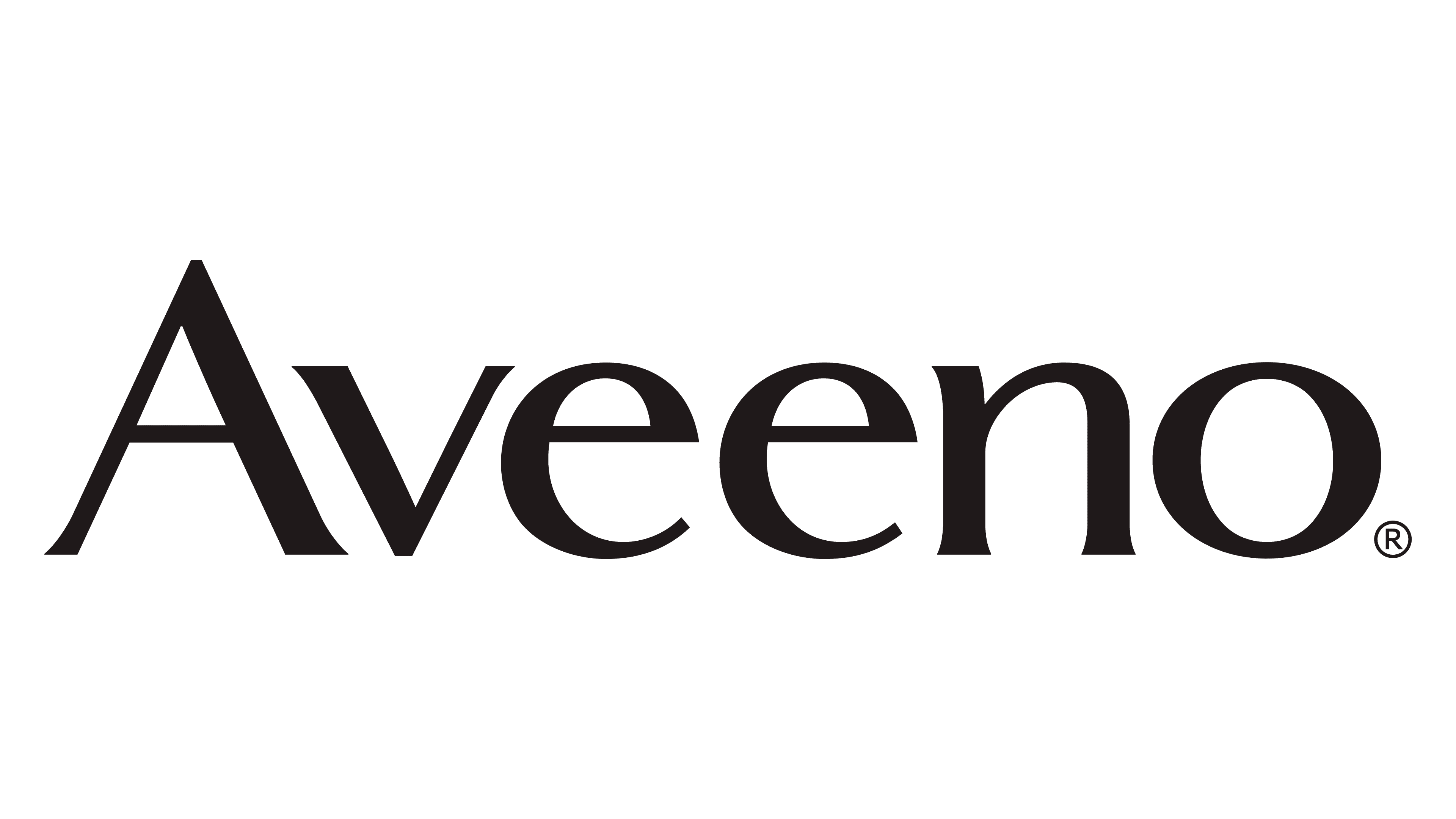
The Aveeno logo is incredibly simple, with no intricate monograms, no characters, no graphic elements. The key emphasis is on the company’s name so that customers will quickly remember it, and it will fit easily on even the smallest packages. At the same time, the logo cannot be dismissed as unoriginal because it has its own flavor. To emphasize the uniqueness, the designers stylized the first letter of the word “Aveeno.”
“A” has a non-standard layout: it is much larger than the other characters. Moreover, this is done not only because it is capitalized but also because of the graphic accent. The bottom of the character extends beyond the word and has an interesting serif that geometrically matches the edge of the lowercase “v.” Also, the thicknesses of lines “A” and “v” are the same, giving the impression that they are mirror images.
What is Aveeno?
Aveeno is a cosmeceutical brand that produces products not only for skincare but also for treatment. Its preparations based on avenanthramides help eliminate psoriasis, dermatitis, hives, burns, and other skin lesions. The company was founded in 1945 by brothers Albert and Sidney Musher. It now belongs to Johnson & Johnson.
Font and Colors
The brand logo has only one basic element: the name. Among other components, the slogan “Active naturals,” located below, is worth noting. It underlines the brand’s connection to nature and testifies to the use of natural ingredients.
The cosmetics manufacturer’s only logo consists of lettering in a typeface with miniature serifs. Most of the letters are in lowercase, except for “A” and “V.” The logo’s color palette is simple, monochrome, consisting of black and white.