


![]() Bad Dragon Logo PNG
Bad Dragon Logo PNG
The Bad Dragon logo has a neutral design, making it impossible to guess what the company does. On the other hand, it reflects its name and conveys a playful mood. That is, the emblem characterizes not so much the brand’s products as the general atmosphere it creates.
Bad Dragon began in 2007 in a student dormitory, not in a conventional office or factory. Ian Muldurs, known online as Varka, was studying computing science at the University of Glasgow in Scotland. As a fan of fantasy culture and the furry community, he saw a gap in the adult goods market for fantasy-based products, so he began experimenting with silicone in his dorm room.
On December 7, 2007, he announced the project on his Herpy Reference Archive website. The founding group included Varka, Brian “Aethus Nadorian” Dyer, and two community members, Narse and Raith. On June 6, 2008, Bad Dragon Enterprises officially opened sales. They presented their products at Anthrocon, a major furry convention, later that month.
The brand built its catalog around fictional creatures and character-based models, including dragons, seahorses, centaurs, werewolves, and vampires. Its audience overlapped with fans of World of Warcraft, Dungeons & Dragons, and similar fantasy worlds. The company used platinum-cure silicone instead of cheaper PVC or rubber materials commonly found on the market.
Bad Dragon grew through online sales, reaching customers in Europe, Australia, and Japan in its early years. Production later moved to larger facilities in Phoenix, Arizona, with sculptors and freelance artists creating new models. Varka also ran community platforms such as e621, e926, and F-List. On March 20, 2024, Bad Dragon filed a federal lawsuit in Arizona against SinSaint of Brooklyn, accusing it of copying product designs, characters, and forms.
Meaning and History
![]()
The company logo has moved away from realism and toward an ideal option for labeling manufactured goods.
What is Bad Dragon?
It is a brand that produces adult products with fantasy and animalistic designs. The product line includes intimate items inspired by mythological creatures, dragons, and other fantastical concepts. The brand focuses on unique aesthetics, a variety of shapes and materials, and offers customization options based on customer preferences.
2008 – 2018
![]()
The first visual sign appeared with the company’s opening. The option is hardly successful since it looks more like a cartoon banner.
On a rectangular background, covered with images of scales and reptiles, there was the name and the main character who personified it. The black background, intended to suggest games under the cover of night, made the image gloomy and heavy, reducing the visibility of details.
The left corner of the composition was occupied by the torso of a fantasy dragon lying on the ground. He looked more thoughtful than playful. The animal’s head rested on one of its clawed paws, and its gaze turned downwards. At the same time, the flames that overwhelmed the beast reddened the lower jaw, the front of the neck, and the chest. The dragon on the emblem is part of his fantasies, and he is considering ways to bring it to life.
The company’s name is in voluminous red letters at the level of the dragon’s mouth, reminiscent of a flame escaping from the chest. The name shows that the dragon’s thoughts go in a forbidden way.
There was a large space below the inscription, which made the logo incompatible. It was generally difficult to understand what the company does from the composition.
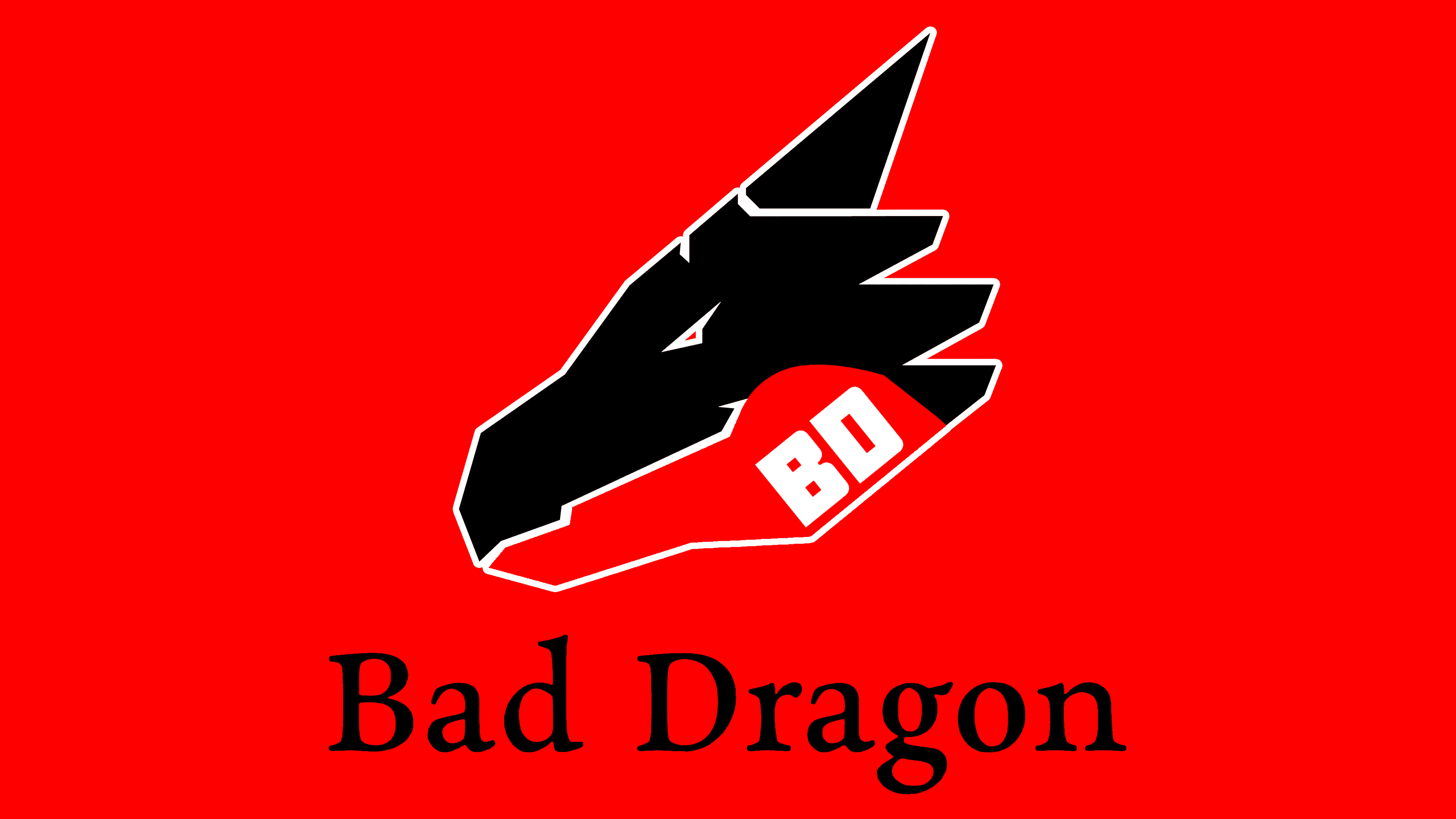
2018 – today
![]()
In 2018, the logo was updated to be more modern. The weighted background was removed, leaving a schematic representation of the animal’s head.
His eye is squinted, and his mouth is curved into a half-smile, which gives his muzzle a sly expression that hints at flirting and flights of fancy. The company provides ample opportunities for games.
- Products from Bad Dragon come in the most unusual shapes and colors. Each has a legend that immerses you in a fantasy world.
- Models belong to exotic animals; let you put them on and play a sexy role-play.
- The company offers the additional service of making a dream toy from a sketch to fulfill customers’ special desires.
The cone-shaped horn going up resembles the company’s main product.
The head is painted in two contrasting colors: black and red. These colors are the dance of passion, cold and flame, man and woman. Two tones indicate products for both genders. The black half is associated with the word “Bad.”
The halves are separated by a white line, suggesting a special lubricant is required for the toys’ normal functioning.
Instead of the name, the abbreviation BD is used and placed on the red half of the muzzle. The color “warms up” the fantasy, and the two letters continue easily, turning into BDSM. It becomes clear why the dragon is “bad.”
The modern logo design aligns more with the company’s direction and conveys the essence of its offer.
Font and Colors
Two colors are chosen for the emblem: red and black.
- Red – fire, passion, desire, love, burning touch.
- Black – night, secret, hidden from all desires, forbidden fantasies stored in the soul’s hidden corners. Placing the name abbreviation in red highlights what the company brings to light and helps realize these desires.
The letters of the inscription are rounded, with completely smoothed corners. The two rings, “B” and “D,” are shaped like the letter O and are associated with certain body openings. The inscription font is Manufaktur Heavy.