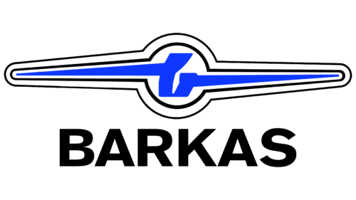
The Barkas logo leaves a feeling of wind and flight. It causes a desire to give way, moving forward force. The emblem is endowed with balance, reporting on the ideal design of machines that allows you to transport a large load.
Barkas: Brand overview
| Founded: | 1958 – 1990 |
| Headquarters: | Karl-Marx-Stadt, East Germany |
Barkas is a German brand of the Barkas B1000 truck model, manufactured by VEB Barkas-Werke under government orders for the GDR and socialist countries. Production ceased after German reunification in 1990. The Barkas logo has adorned nearly 200,000 cars.
The company was founded in 1957 based on the nationalized Framo plant. The first model was the Framo V901 / 2 truck, which was simply renamed. Only in 1961 did the company switch to its development of the B 1000 when the renovated factory in Karl Marx-Stadt opened.
Meaning and History
The brand logo is confident and dynamic. Connects the company’s cars with airplanes, drawing an analogy between driving a Barkas and flying.
The visual element is made in the form of a propeller with a thin black outline and a stylized blue letter b in the center, from which sharp blue rays extend into each blade. Under the image in large black letters is the name of the brand.
What is Barkas?
Leading brand of small trucks with various body types produced in the GDR until 1990. The design made it possible to use a car as an ambulance, closed and flatbed vans for transporting things, transport for mobile teams, and vans for selling food.
The structure is reminiscent of the following:
- Lightning, a plane taking off up. Indicates a decent load capacity of products, a load that the machine can handle easily. A loaded bus rides as if it were flying along the road.
- Windshield wipers that improve visibility and make driving easier in bad weather. The company’s trucks were not afraid of snow, wind, and rain. We were free to drive along country roads.
- The cars had a good balance, correctly arranged parts, and competent weight distribution. Therefore, with a mass of 1200 kg, the minibus could transport 1000 kg of cargo.
The letter b is the initial in the name of the company. The name is taken from a small capacious boat carrying passengers and cargo.
Interestingly, a stylized letter adorned the cars. At the same time, a different logo was used for printed materials in the form of an arrow of three diamonds indicating the brand’s name.
Font and Colors
The main color of the logo is blue. It symbolizes knowledge of one’s business, stability, and well-established production. The first modernization of the model took place almost 30 years later. The shade is associated with flight and fantasy, hinting at a wide range of bodies.
The massive font Basic Commercial Black speaks of the power and reliability of the machines. Trucks continued to serve regularly in the countries of the former socialist camp for many years after the cessation of production. Uppercase letters indicate a high demand for cars. The waiting period for private clients could be more than ten years.
Barkas color codes
| Han Purple | Hex color: | #0f38ff |
|---|---|---|
| RGB: | 15 56 255 | |
| CMYK: | 94 78 0 0 | |
| Pantone: | PMS Blue 072 C |
| Black | Hex color: | #000000 |
|---|---|---|
| RGB: | 0 0 0 | |
| CMYK: | 0 0 0 100 | |
| Pantone: | PMS Process Black C |


