


![]() BASF Logo PNG
BASF Logo PNG
Serious companies mean business. This is reflected in the brutal BASF logo, which appeals to a potential customer segment. Its robust design reflects the reliability and responsibility of a chemical manufacturing company.
Friedrich Engelhorn was born on July 17, 1821, in Mannheim, the son of a brewer. He first worked as a jeweler, but after 1848 moved into the gas business. In 1851, he managed the construction of Mannheim’s gasworks. He noticed that coal tar, a byproduct of gas production, could be used as a raw material for dyes.
On April 6, 1865, Engelhorn and several partners founded Badische Anilin- & Soda-Fabrik, later known as BASF. Mannheim rejected the factory due to concerns about smoke and odor, so production moved across the Rhine to Ludwigshafen. In 1868, Heinrich Caro became the first head of the laboratory. In 1869, BASF worked with Carl Graebe and Carl Liebermann to synthesize alizarin. This synthetic dye replaced the natural madder dye.
BASF expanded early. It opened a New York office in 1873, a site near Moscow in 1876, and bought a French plant in 1878. In 1897, it became the first company to produce synthetic indigo on an industrial scale. By 1910, more than 8,000 people worked at the Ludwigshafen site. In 1913, BASF opened the world’s first synthetic ammonia plant in Oppau, based on the Haber-Bosch process developed by Fritz Haber and industrialized by Carl Bosch.
In 1925, BASF joined IG Farben with Bayer and Hoechst. During Nazi rule, IG Farben used forced labor and produced Zyklon B. After 1945, the group was broken up, and the Ludwigshafen plant was nearly half destroyed. BASF developed Styropor in 1951 and was restored in 1952 under its historic name. In the 1960s, it built plants across Europe, Asia, the Americas, and Australia, later buying Wyandotte Chemicals in 1969 and Badische Corporation in 1973.
Meaning and History
![]()
BASF is a historical abbreviation that appeared at the beginning of the brand’s creation. It points to its roots and technical background, as it stands for “Baden Aniline and Soda Factory” (English: Badische Anilin- und Soda Fabrik). The company was founded by the industrialist Friedrich Engelhorn and launched in 1865. The private company was located in the city of Mannheim in the lands of Baden.
The founder worked at a gas plant that produced flammable gas, the by-product of which was tar. He used it to make dyes and various chemicals, particularly acids and soda. To avoid polluting Mannheim’s air, the entrepreneur built his plant in Ludwigshafen, on the opposite bank of the Rhine. In 1866, all production was moved to a new site (BASF). A large list of products was produced there, including, in addition to acids and soda, rubber, fuel, explosives, ammonia, and gypsum.
This plant has also suffered many mergers and refurbishments. The concern experienced major expansion in the 1960s, opening numerous branches abroad. Its branches have appeared in the USA, Great Britain, Spain, Japan, India, Mexico, Italy, France, Argentina, Brazil, Belgium, and Australia. As a result, in 1965-1968, management radically changed the strategy, assortment, and corporate identity. In total, there are eight logos in its history.
What is BASF?
BASF is a German chemical production company that produces soda, acids, ammonia, fuel, rubber, gypsum, and other chemicals. It was formed in 1865 and is located in the German city of Ludwigshafen. Under his leadership, there are many subsidiaries and joint ventures located in 80 countries worldwide.
1865 – 1922
![]()
An emblem with historical roots dates back to that period, in which two heraldic images were presented: a horse and a lion. They looked like the classic elements of coats of arms on shields. To the left was a horse standing on its hind legs. On the right was a lion with an anchor image in its paws. The animal figures looked like silhouettes with fine detailing. A common line connected the shields.
1922 – 1952
![]()
Then the logo was radically changed: instead of two heraldic shields, a vertical oval appeared. It was painted a solid beige and outlined in bold black. A similar strip was located inside and divided the geometric figure into two parts: at the top, there was the inscription “BA,” and at the bottom, “SF.” They were made in a smooth font of the same thickness as the frame. All letters were capital, black, without serifs.
1952 – 1953
![]()
The designers chose the debut version of the new logo and modernized it. They made the horse and lion figures completely dark so they would stand out against the white background. In addition, the developers added a linear structure resembling a crown. The teeth on it were straight with even angles, and in their gaps was the abbreviation of the name of the chemical manufacturing company, Baden Aniline and Soda Factory, “BASF.” The letters were capital, large, bold, and vertically elongated. The logo’s authors placed this composition at the top and, at the bottom, indicated the year the plant appeared: 1865. They circled all the elements with a thin black ring.
1953 – 1955
![]()
The new emblem looked completely different than the previous one. It consisted only of an inscription of the abbreviated name of the concern. Each letter was outlined with a light coffee stripe around the perimeter, reminiscent of a contoured frame. The interior of the symbols was painted beige. From the outside, they were complemented by gray shadows below and to the right.
1955 – 1968
![]()
In 1955, the return to the 1922-1952 logo occurred, but the letter grouping was different, with each letter having its own space. The designers divided the oval not into two parts but four, according to the number of characters. “B” and “F” were in black triangles, “A” and “S” in white ones. They were painted in contrasting colors to stand out against such a background.
1968 – 1986
![]()
The next logo looked like a rectangle. It was horizontal and black, serving as a background for white letters. The company’s name consisted only of capital letters, smooth, bold, sans-serif. Contrasting colors ensured good text readability.
1986 – 2004
![]()
The logo, presented in the mid-80s of the last century, contained, in addition to the text, a graphic element. The title was in bold black and placed on a white background. These were letters with wide legs that occupied almost the entire inter-character space. In front of them was a small square badge in red and white. It consisted of a spiral with a dot at its center: vertical coils diverged from it. At the top left, a miniature inscription with a short form of the company name was superimposed.
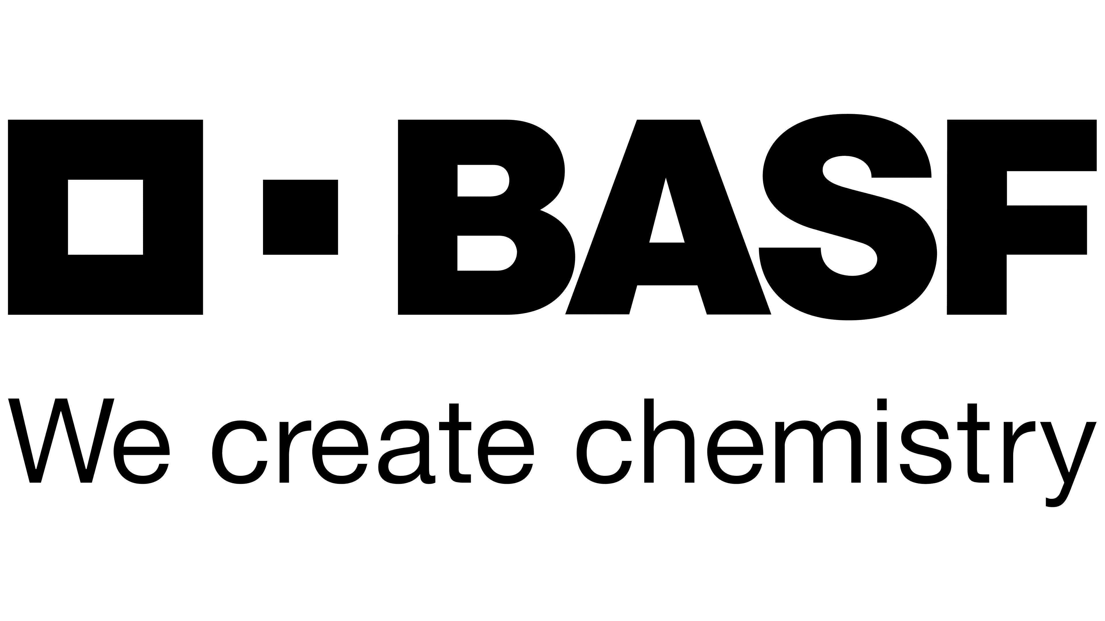
2004 – today
![]()
As we move into the new millennium, BASF has adopted a conceptual identity mark. It includes two main components: the title and the squares. The first reflects the continuity, strengths, and traditions that have come from the company’s past. The second signifies its close partnerships and suitable solutions, as the small square is an integral part of the big one, and they are perfectly compatible. Both figures look like a solid puzzle.
Moreover, the left square is larger. It consists of a wide outline. The right figure, on the contrary, is miniature. It has a solid fill and performs a dual role. First, it is a segment of a large square. Secondly, it is a separating element between the word “BASF” and the frame. The letters in the text are massive, almost 1.5 times as wide as in the previous logo. Some variants feature the corporate slogan “The Chemical Company.” As the management notes, it is an integral part of the identity and is used only in English. The motto is not translated into other languages.
Font and Colors
The international chemical concern has repeatedly changed its identity as it has continually developed: it has expanded its range and opened branches. All this required a relevant and recognizable logo. As a result, it took one of two forms, succinctly conveying the company’s name. Graphics have evolved, while the text part has retained its original appearance, with wide sans-serif letters.
The logo uses a typeface that resembles two types of fonts: Supria Sans Black and Sequel Sans Head Black by OGJ Type Design. This is a grotesque, consisting of broad letters. As for the corporate palette, the BASF logo does not have one. It says so in the branding guide. The developers note that it receives a shade of the background it is located on. The only condition is that it must be one color. This approach reflects the concern’s flexibility and innovativeness, evident across all areas of activity. The inscription can be painted in black or white.