


![]() Bavaria Logo PNG
Bavaria Logo PNG
Warm sun, clear water, and ripe wheat are visible in the emblem. The Bavaria logo represents an award-winning drink for its perfect combination of ingredients and balanced palate. The symbols allude to the white foam in the glass and invite you to taste the beer.
The brewery in Lieshout, North Brabant, documents activity dating to 1719, while local archives link brewing on Kerkdijk to Dirk Vereijken as early as 1680. In 1764, Brigitte Moores married Ambrosius Swinkels, and by 1773, the brewery had fully passed into the Swinkels family.
For decades, it remained a local business. Growth began in 1890, when Jan Swinkels started selling beer in nearby Helmond. Output rose from 988 hectolitres in 1890 to 1900 by 1900. During World War I, the family survived raw material shortages by securing malt stocks and briefly drying vegetables.
In 1924, Johannes Swinkels built a new brewery. In 1925, his sons Frans, Piet, and Jan registered Gebroeders Swinkels, switched to bottom-fermented brewing, and began brewing lager by the Bavarian method. The Bavaria name came from this brewing influence. Sales expanded to Amsterdam, Rotterdam, The Hague, and Utrecht. A bottling line opened in 1933, and a malt house followed in 1940, the same year the Bavaria trademark was registered.
In 1978, Bavaria launched non-alcoholic beer and exported it to the Middle East. The brand competed with Heineken and Interbrew while remaining family-owned. In 1999, it partnered with Koningshoeven monastery to produce La Trappe. After a dispute with the Bavarian Brewers Association, the European Court confirmed the European Court’s right to the name Bavaria. In 2016, the company acquired control of Palm and gained brands including Rodenbach. In 2018, it became Swinkels Family Brewers, and in 2019, it received royal status.
Meaning and History
![]()
The firm has developed a recognizable design for beer bottles. But the name depicted on its emblem became the reason for a lengthy trial. The German Brewers Federation wanted to ban the Dutch manufacturer from using the existing label. The European court ruled in favor of the alcoholic giant, which is why the word “Bavaria” still appears on the labels. On the old version of the emblem, instead of a compass, Bavaria’s coat of arms was depicted: heraldic lions holding a shield with the symbols of Swabia, Lower Bavaria, Franconia, and the Palatinate.
What is Bavaria?
This well-known Dutch brewing company is significant in the global beer industry, offering a range of beverages produced at a family-owned brewery in Lieshout, Netherlands. Using pure mineral water from its natural sources, the company produces a selection of classic premium beers, non-alcoholic varieties, and malt-based beverages. The brand is distinguished by its commitment to traditional brewing techniques, blending them with modern styles to cater to various tastes and occasions, from popular malt drinks with fruity notes to robust beers with rich flavors.
Until 2009
![]()
The logo’s shape resembles a keg, which structurally emphasizes its connection to the beer theme. There is a double golden-and-white border at the outer edge, surrounding a wide blue stripe with two linear highlights on the right and left. On the white inner background, a green shield is edged with a thin black stripe. At the bottom, numerous small strokes are visible around the narrow part, as if a shine. They take up the entire bottom space and end in the middle, under a short horizontal ribbon with the brand name.
Beneath it, another canvas is visible, painted in gold and bearing the word “PILSENER”. Both pieces of lettering have the same style and are in a serif typeface. There is a miniature oval-shaped icon above the wide horizontal ribbon. On a blue background, a curly letter “S” symbolizes the Swinkels brothers. On the sides of it, two ears diverge to the sides, and an elegant crown is flaunted at the top.
2009 – today
![]()
In October 2009, the company improved the old logo. She presented it in a modern look, choosing blue as the main color. The second new element is the compass on the triangular shield. This is a tribute to the Swinkels brothers, who started the brewery. The arrow points south, symbolizing the business’s direction.
Font and Colors
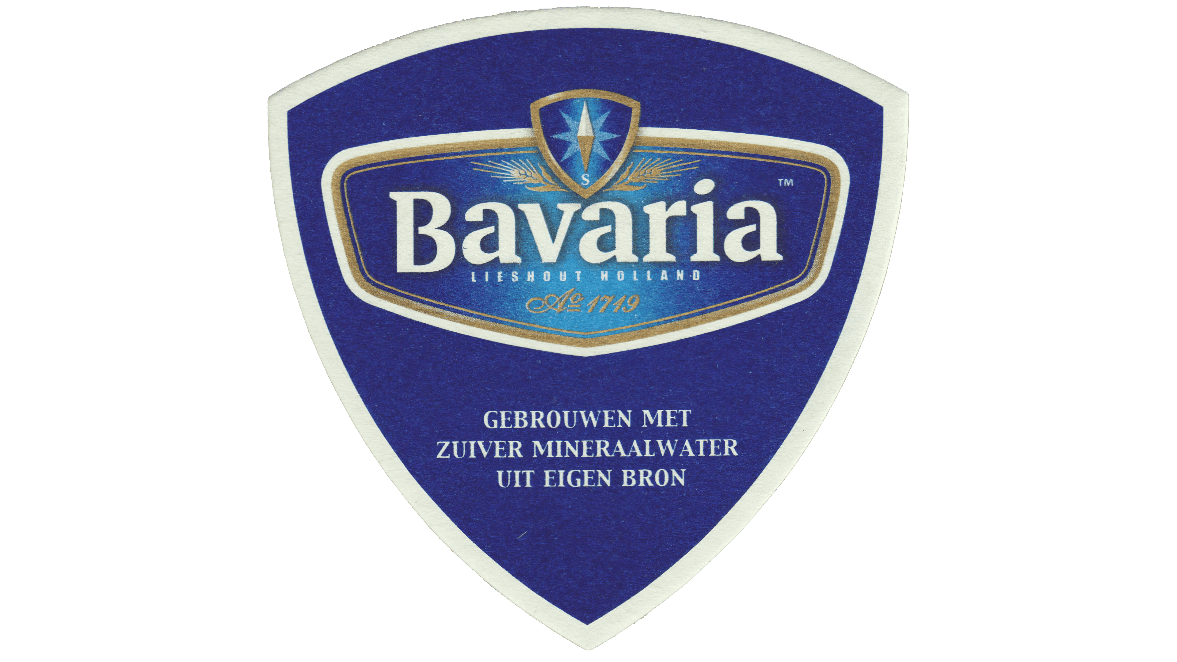
The font has also changed significantly. The designers redrew the letters to give them a clearer look. In the center is the word “Bavaria”. Below are the inscriptions “Lieshout Holland” and “1719”. The background is an elongated pentagonal shape with rounded edges and a blue gradient. It is embellished with several golden outlines.
FAQ
Is Bavaria a beer?
Yes, it is a beer. Known as Bayerisches Bier, it represents Germany’s rich brewing heritage and is celebrated worldwide for its exceptional taste and quality.
Bavarian beer is brewed in Bavaria, Germany, a region with a long history of beer production. The region follows the Reinheitsgebot, or German Beer Purity Law, which states that beer can be made only from water, barley, and hops. This law ensures the high quality and purity of Bavarian beers.
The brand offers a variety of beer styles, including lagers, pilsners, and wheat beers, each with a unique flavor. The beers are known for their rich, full-bodied taste and smooth finish, making them popular among beer lovers.
Is Bavaria an energy drink?
Yes, Bavaria is an energy drink. It contains taurine, high levels of caffeine, and added vitamins. The drink is golden and clear, with a sweet, overripe-fruit aroma.
The flavor is mostly sweet, with fruity notes like cherries and pineapple candies, and hints of vanilla. This makes it appealing to those who enjoy sweet and fruity energy drinks.
The energy drink gives you a boost of energy due to its caffeine and taurine. The added vitamins provide extra nutritional benefits. This combination of taste and energy-boosting ingredients makes beer a unique choice in the energy drink market.
What does the Bavaria logo mean?
The logo features a compass, symbolizing the brewery’s growth and expansion. This compass represents production development and the widening of its sales market, reflecting the brand’s journey and its efforts to navigate various challenges to achieve success.
The lettering serves as an identifier, providing basic product information and making the brand easily recognizable to customers.
The vertically elongated base matches the label’s shape, ensuring the logo looks balanced and appealing on the product packaging.
What is the symbol of Bavaria?
The main symbol of Bavarian beer is a compass with an arrow pointing south, paying tribute to the brewery’s founders and their journey. Another key element is the spikelets, representing the cereal seeds used to make malt, a crucial ingredient in beer production.
These elements in the Bavaria logo highlight the brand’s heritage. The compass honors the founders’ vision, while the spikelets emphasize the importance of natural ingredients in brewing.
What is the font of the Bavaria logo?
The logo uses a custom font for the word “Bavaria.” The letters are bold and geometric with serifs. The inner lines of the “B” and “a” have gaps, and the dot above the “i” is a sideways oval.
“LIESHOUT HOLLAND” is written in uppercase, sans-serif, with wide spacing. The number “1719” is in thin italics.
These font choices create a distinct look, blending tradition and modernity. The bold serif letters of “Bavaria” convey strength and heritage. The sans-serif “LIESHOUT HOLLAND” and italic “1719” add elegance and precision.