The style of the Bed Bath and Beyond logo immediately reminds of home furniture. The brand emblem is massive, expressive, attractive, and unconventional. An unusual combination of fonts shows that its owners want to show the product’s face, so the buyer subconsciously tunes in to the right choice.
Bed Bath and Beyond: Brand overview
Bed Bath and Beyond is a large US retail chain operating since 1971. It offers a wide range of home furnishings for kitchens, dining rooms, bathrooms, outdoor seating areas, gifts, home decor, etc. Its structure includes many stores covering 1460 locations in 50 states. In addition, the company has offices in Mexico, Canada, and Puerto Rico. The head office is located in Union, New Jersey. The founders of the brand are Warren Eisenberg and Leonard Feinstein.
Back in 1971, in Springfield, New Jersey, Warren Eisenberg and Leonard Feinstein started something big. They opened a small store and called it Bed Bath & Beyond, laying the foundation for what would become a key name in American households.
During the 1980s, the store began to expand quickly, spreading across the Northeast. By 1985, there were 17 Bed Bath & Beyond stores, showing how much people liked their expanding range of home goods.
1992 was a big year for the company as it went public on NASDAQ, which helped it grow even more. Over the next decade, Bed Bath & Beyond became a go-to place for home items, opening many stores yearly and adding to its product selection to meet various home needs.
In the early 2000s, the company bought Christmas Tree Shops and Buy Buy Baby, making its selection even bigger. However, the 2010s came with challenges, mainly from online stores like Amazon. Bed Bath & Beyond had to step up its online game and create loyalty programs to keep customers returning.
2019 brought major changes, with investors calling for changes in the company’s operations. This led to CEO Steven Temares stepping down, kicking off a new phase for the company focused on improving shoppers’ experiences and updating its stores.
Now, with over 1,000 stores and a strong online presence, Bed Bath & Beyond is still a big name in home goods. It’s working hard to stay on top in a changing retail world, aiming to keep its spot in American homes and hearts by improving the shopping experience and staying up to date with what customers want.
Meaning and History
Financial difficulties caused the beginning of this trading network. But not her own, but the ones from the discount stores called Arlan. Two senior employees noticed that the commercial market was shifting toward the complex point of sale, so they decided to quit and start their own company. As a result, they have their own structure. It was a Bed’n Bath store in Springfield, New Jersey.
The network expanded rapidly; in 1985, it had 17 outlets in New York and California. At the same time, the first Bed Bath and Beyond supermarket opened, which competed with older brands: Luxury Linens, Pacific Linen, and Linens’ n Things. Two years later, the company changed its old name to a new one (in 1987). In 1991, she opened seven more complex stores. It went public in 1992 and switched to computer control in 1993 to outperform others in the market.
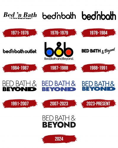
During the development of Bed Bath & Beyond, he founded several brands, grouping them by direction. They offer a variety of products—from household items to luxury interior decorations. All centers are presented under a single sign adorning supermarkets in the US and beyond. They are recognizable by a modest but stylish inscription, which serves as a name, an advertising object, and a personal label. In total, there are six logos in the history of this company.
What is Bed Bath and Beyond?
Bed Bath and Beyond is a large commercial retail chain offering a huge range of products for the home. She works in the United States, Mexico, Canada, and Puerto Rico, where she represents several brands in different directions. The head office is located in Union, New Jersey. The founders of the company are Warren Eisenberg and Leonard Feinstein. It has been in existence since 1971.
1971 – 1976
The earliest emblem is notable for its unpretentious design. It features the words “bed’n bath” in italics. The first letters in them are uppercase; the rest are lowercase. The minimalist design allows you to immediately focus on the main thing – the store’s name since, at that time, the logo was used as a sign above the main entrance. All symbols are black and bold and combine wide stripes with thin transitions between segments. Below is the motto of the trading network: “A new kind of store.” The text is on a white background.
1976 – 1979
This version is even more minimalistic: it contains nothing but the title in bold grotesque. The letters are streamlined, smooth, and even elongated vertically. Moreover, the designers made “b” and “d” as identical as possible, as if they were the same sign in a mirror image. They, like “a,” have round outlines resembling rings. “n” and “h” are similar to each other: they lack side elements, so they look like inverted brackets. Both words are pushed close to each other, separated only by the apostrophe located at the top. The color scheme is still monochrome.
1978 – 1984
This American retail chain has used a slightly updated emblem for four years. The changes affected only the thickness of the characters (they became bold) and their height (now the characters are stretched vertically). Letter spacing has been reduced.
1984 – 1987
The developers added a third word to the inscription – “outlet.” Like the first two, it was lowercase, black, and rounded.
1987 – 1988
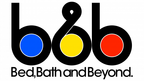
The style of this logo aligns with the design trends of the 1980s, which favored bold colors and simple, geometric shapes. This was when Bed Bath & Beyond established itself as a major player in the retail space, diversifying its product offerings and signaling through its branding that it was more than just a bed and bath store. The minimalist design suggests an easy, hassle-free shopping experience that customers could expect, paralleling the company’s efforts to simplify and enhance the customer journey during its period of rapid growth.
This logo prominently features the initials “BBB” for Bed Bath & Beyond, with each “B” having a bold, black outline and each containing a colored circle—blue, yellow, and red, respectively. The middle “B” intersects with a loop, visually referencing both the “&” symbol for “and” and perhaps an abstract representation of “Bed,” making the viewer ponder its dual nature. This middle “B” cleverly aligns with the brand’s name, suggesting an inclusive range of products for various aspects of home life—not just beds and baths, but beyond.
The colors are simple yet striking—primary colors that signify reliability (blue), energy (red), and optimism (yellow). These colors are often used to grab attention and are easy to remember, which could symbolize the brand’s extensive and diverse product offerings.
The font used for the initials is sans-serif, which is sleek and modern, reflecting the brand’s approach to home furnishings—contemporary and unfussy. Below the bold “BBB,” the full name of the brand is written in smaller, finer print, possibly to ensure that the message of the brand’s scope (“Beyond”) is communicated without interfering with the immediacy of the visual impact.
The style is minimalist and highly legible, suggesting the brand’s focus on simplicity and customer convenience. Its design stands for efficiency and straightforwardness, aligning with a period in the company’s history when it expanded and solidified its identity as a one-stop shop for home essentials.
The logo could reflect the era’s business climate, where distinct branding and expansion into comprehensive home goods were key to retail success. It resonated with a time of economic growth and consumer confidence when households sought brands that could offer quality, variety, and value—all suggested by this logo’s straightforward, bold design.
1988 – 1991
In 1988, the retail store chain adopted an updated logo based on the modernized name. The word “Beyond” appeared, replacing “outlet.” From then on, the brand name began to be written in bold letters in uppercase. The only exception was the addition: it was made in italics and was not located directly but diagonally. The monochrome is preserved.
1991 – 2007
The 1991 Bed Bath & Beyond logo focuses on the company’s mission to offer a wide range of products beyond the usual bedding and bath items. The logo is split into two lines with “BED BATH &” in a thin font on the top, giving it an elegant and classic feel that nods to the core home goods categories.
The word “Beyond” below is in a bold font, much larger than the top line, showing off a sense of growth and expansion. The letters get progressively wider, especially the last “D” that stretches out, making a grand, wide gesture. The boldness and exaggerated size of “Beyond” symbolize the endless choices the company offers.
The logo’s design is simple, black, and colorless, focusing on unique typography rather than colors. This choice suggests that the meaning behind the logo is more important than its visual appeal.
This logo marks a time when Bed Bath & Beyond aimed to highlight its evolution and expansion beyond traditional offerings. It reflects the company’s ambition to fill a niche as a home goods store and as a place where customers can find everything they need. Using two different font styles emphasizes a strategic product range division: maintaining traditional categories with “BED BATH &” and stressing innovation and broadening choices with “Beyond.”
Overall, the logo captures the spirit of an era and the company’s desire to exceed retail norms, offering customers more than the standard home store. It reflects Bed Bath & Beyond’s commitment to meet changing consumer needs, providing an ever-growing array of options for enhancing their living spaces.
2007 – 2023
In this logo, the key emphasis is on the last word in the brand name – “Beyond.” It is large – with a gradual increase from “B” to “D,” so the first letter is half as large as the last. At the same time, “Bed Bath” and the ampersand are made in the same thin lines. The name of the commercial network is ungrouped into two lines and aligned on both sides. In this case, the color scheme has become “more cheerful”: lilac.
2023 – today
In 2023, facing tough economic times and on the brink of bankruptcy, Bed Bath & Beyond introduced a new twist on its classic logo. This move symbolized the company’s desire to refresh and adapt to the current market despite its challenges.
The logo’s style, consistent since 2007, kept its design but changed in one significant way: its color. Previously, the logo was a shade close to purple or lilac, which gave it a soft and cozy feel, reflecting the warmth and comfort of home. It has shifted to a deeper blue, signifying freshness, stability, and reliability—traits the company wants to emphasize to customers and investors.
The choice of blue brings to mind purity and calmness, perhaps signaling the company’s intention to get back to business basics and start anew. This change represents a desire to turn over a new leaf, literally and figuratively, with a fresh vision and direction.
The logo’s typography remains the same, suggesting that while the company aims to innovate with a new color, it also wants to maintain its brand recognition and connection to its past. This approach shows Bed Bath & Beyond’s respect for its history and traditions while pushing forward and evolving.
2024
In 2024, Bed Bath & Beyond unveiled a new logo that shows the brand continuing to evolve and adapt to the latest market conditions and consumer tastes. This logo keeps the structure of previous versions with two main parts: “BED BATH &” on top and “Beyond” below, both in uppercase.
The top part of the logo brings back the thin and elegant font used from 1991 to 2007, highlighting the company’s rich history and stability. It’s a nod to the brand’s traditional values, its roots, and the vision that founded it.
The “Beyond” part is in a brand-new font, distinct from its predecessors, with a more angular look that balances thickness, height, and width. This reflects a modern design approach favoring line cleanliness and contemporary style. Moving away from the wider “D” of previous designs emphasizes a shift towards modern simplicity and functionality.
The logo remains classic black, reinforcing stability and solidness. Black is associated with elegance, strength, and restraint, which is crucial for a company aiming to maintain customer and partner trust in challenging times.
Using two different font styles symbolizes a balance between respecting tradition and moving forward. This blend of past and present in the logo design suggests Bed Bath & Beyond values its heritage but is also ready for change and innovation.
The 2024 logo redesign, likely a response to overcoming past difficulties, signifies a new phase in the company’s development. These changes express a desire to present a new strategic market position and offer customers an updated shopping experience that meets current trends and expectations. It’s a visual update and a signal that Bed Bath & Beyond is prepared for new challenges and opportunities while retaining its time-tested values and quality.
Font and Colors
What distinguishes the Bed Bath and Beyond logo from those used by competitors is its restraint and informativeness. The brand identity does not include distracting elements or bright design—everything is as practical, dry, and precise as possible. This characteristic is inherent in all six variants of the logo. Of course, the modern emblem is more original than the others but minimalistic. She got to color in 1991.
There are so many logos and so many fonts. This is how you can indicate the trend of the visual identity of this brand. In general, four types of typefaces were used. The early emblem features an antique reminiscent of Linotype’s Bodoni Std Bold. Then, there was a transition to the grotesque, close to Harry Heavy (developed by the Red Rooster Collection) or Horatio Medium (represented by the ITC studio). The inscription in another logo was typed in a font identical to Zealand Regular (by Hanoded). The modern version uses two typefaces: the top inscription – Futura Pro Medium, and the bottom – Boldstrom Regular from Sharkshock.
On the contrary, the corporate palette is not diverse and consists of monochrome. In the early versions of the emblem, black on a white background predominates; in the latest, it is lilac in dark and light shades.
FAQ
What is the symbol for Bed Bath and Beyond?
The Bed Bath & Beyond logo highlights the word “Beyond,” showing the brand’s growth since its 1985 redesign. The logo uses a bold font that gets bigger from the first “B” to the last “D,” symbolizing a journey beyond bed and bath products to a broader selection of home goods. The ampersand is designed with thinner lines, giving the logo a balanced look. This design choice showcases the company’s commitment to offering a wide range of items for the entire home, not just bedrooms and bathrooms.
Since starting in 1971, Bed Bath & Beyond has preferred simple and direct logo designs, reflecting its straightforward business. It aims to provide everything from basic home necessities to fancy decor. Over the years, the brand’s logo has changed a few times, each new design marking a step in Bed Bath & Beyond’s growth and how it’s seen in the market.
What font is the Bed Bath and Beyond logo?
Over the years, the typography of the Bed Bath & Beyond logo has taken quite a journey, mirroring the brand’s growth and evolution. In its early days, the branding leaned towards classic fonts akin to Bodoni Std Bold, setting a strong, foundational tone. As the brand matured, it embraced a more contemporary vibe with fonts that echoed Zealand Regular, signaling a shift towards modernity and freshness in its approach.
Today, the Bed Bath & Beyond logo elegantly combines two distinct typefaces: Futura Pro Medium for the upper part of the logo, bringing a sleek, clean linearity, and Boldstrom Regular for the lower part, adding a touch of solidity and grounding. This typographic duo balances modernity with a sense of reliability and trustworthiness.
What happened with Bed Bath and Beyond?
Bed Bath & Beyond recently faced tough financial challenges and prepared to file for bankruptcy in late January 2023. The company, known for its home goods, tried to avoid this by selling assets and finding new financing. Despite efforts to secure about $225 million through equity offerings and aiming for another $800 million, the outlook remained bleak as the economy weakened. Finally, the retailer filed for Chapter 11 bankruptcy, having struggled with declining sales for years. Even though stores, including Bed Bath & Beyond and Buy Buy Baby, stayed open and started closing some locations, they secured $240 million to keep running for a while.
Since January, Bed Bath & Beyond has been looking for ways to save the business, but sales have kept falling. The company’s stock also lost much value. Efforts to refresh the brand and attract more customers didn’t work out, especially as more people shopped online during the pandemic.
Interestingly, the company’s stock saw brief spikes in price due to the meme stock phenomenon, driven by activist investors and a surge in retail trading. However, these spikes didn’t reflect the real financial situation at Bed Bath & Beyond.
What does the Beyond mean in Bed Bath and Beyond?
The “Beyond” in Bed Bath & Beyond signifies the store’s wide array of products for all home areas, including bedroom and bathroom essentials. It represents their extensive selection that goes beyond the basics, covering everything from kitchen and dining accessories to home decor and outdoor items, aiming to cater to a comprehensive range of home needs.
