Beeline: Brand overview
Established in Russia in 1993 as an extension of VimpelCom PJSC, now called Veon, Beeline has become a prominent telecommunications player. VimpelCom itself was born a year earlier, in 1992, thanks to the joint efforts of Dmitry Zimin and Ogi K. Fabela II, and became one of the first Russian mobile operators. The brand name “Beeline” was chosen to capture the essence of the “direct route,” mirroring the English term for the shortest route between two settlements.
Throughout the 1990s and 2000s, Beeline’s influence expanded significantly, and it became the third-largest mobile operator in Russia. In a highly competitive environment, Beeline was up against giants such as Mobile TeleSystems, MegaFon, and Tele2. In 2009, a watershed change occurred when VimpelCom merged with Norwegian telecommunications company Telenor. The merged company, now headquartered in Amsterdam, was named VimpelCom Ltd.
In 2010, the company expanded beyond its Russian roots by acquiring telecom assets from companies such as Orascom and Wind, expanding its international reach. In 2017, in an effort to expand beyond telecoms, VimpelCom transformed and rebranded itself as VEON, positioning itself as a global technology company. However, Beeline remained the flagship brand, representing the company’s Russian division.
In 2022, VEON unexpectedly announced its intention to transfer ownership of its Russian businesses, including the Beeline brand, to the local administration. Currently, the move is still under regulatory scrutiny and awaiting official authorization.
Meaning and History
1993 – 1996
1996 – 1997
1997 – 2003
2003 – 2005
2005 – 2012
2012 – 2021
2021 – today
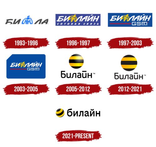
The Beeline logo has a bright color palette, as it is positioned as a youth mobile brand. It depicts a circle with alternating yellow and black stripes, which create an attractive contrast. These colors were chosen based on the brand’s name, which plays off the word “bee,” naturally colored in this way. The straight lines are also related to the name, as the term “beeline” means the shortest straight path between two points. Next to the two-colored balloon is an inscription in the Cyrillic alphabet in lowercase letters.
The logo resembles a sunbeam and the night sky. The circle with yellow and black stripes resembles a cool bee flying through the air. And the Cyrillic letters look more calm, which makes it easier for young people to perceive. It is simple, but it attracts attention, as if there is a buzzing coming from the screen, informing that something interesting is happening.
Beeline color codes
| Golden Poppy | Hex color: | #ffc500 |
|---|---|---|
| RGB: | 255 197 0 | |
| CMYK: | 0 23 100 0 | |
| Pantone: | PMS 7549 C |
| Black | Hex color: | #000000 |
|---|---|---|
| RGB: | 0 0 0 | |
| CMYK: | 0 0 0 100 | |
| Pantone: | PMS Process Black C |

