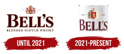
Bell’s logo emphasized the exclusivity of the product and the importance of the personal relationship between the buyer and the manufacturer. The emblem conveys the individuality of the drink, is an expression of the “soul” of whiskey and guarantees its quality.
Bell’s: Brand overview
| Founded: | 1851 |
| Founder: | Diageo |
| Headquarters: | Scotland |
| Website: | bells.co.uk |
Meaning and History
Bell became the official brand only in 1904, after Arthur Bell’s death, as he always resisted the idea of putting his name on the packaging. The Bell brothers died in 1942, and the company’s accountant, William Govan Farquharson, became chairman of the company. He focused on brand advertising more actively. Bell’s went public in 1949. In 1954 he was, exported to 130 different countries.
The Bell logo is an example of a minimalist design. The classic bold lettering in maroon with added gold gives the impression of a high-quality product. The lack of additional details forces you to focus on the flavor and class of Bell whiskey.
Arthur Bell’s signature appeared in 1896, and it still adorns every bottle, along with the slogan “Before You Go,” which was registered in 1921 and was first used four years later.
Despite the minimalistic logo, Bell’s continues to experiment with the bottle’s shape due to the brand’s consonance and the ringing of bells.
What is Bell’s?
Bell’s is a Scottish whiskey with a long history. It was introduced in 1851 by Arthur Bell, who sought to develop a new blended whiskey from single malts. At first, the brand belonged to the distillery Arthur Bell & Sons Ltd but eventually passed into the possession of the multinational company Diageo.
Until 2021
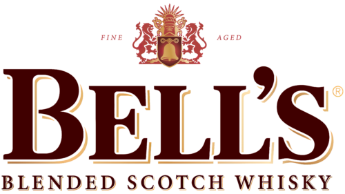
Until 2021, the trademark used a logo with the large brown word “BELL’S,” under which “BLENDED SCOTCH WHISKY” was written in small print. Each letter was outlined in thin beige lines, concentrated on the right and bottom. Due to the uneven contour, a 3D effect arose. The designers made all glyphs bold and capitalized but made the first “B” bigger to draw attention to the brand name.
On top was a red and gold emblem depicting a bell. That, in turn, was located against the background of a shield held on both sides by heraldic lions. The space above the shield was decorated with figured patterns and a rising sun with nine rays. To the left of the picture was written in italics the word “FINE,” and to the right – “AGED.” All the letters in the logo had serifs of different thicknesses.
2021 – today
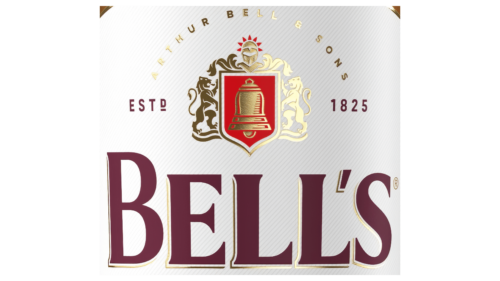
In 2021, an updated logo appeared on the labels of Bell’s whiskey. The designers changed the typeface of the brand name, shortening the serifs and removing the dot in the upper half of the apostrophe. They also removed the bottom phrase, which denoted the type of product. The emblem with the Bell has also been modernized. The golden color has become more vibrant and extended to almost all elements except the red shield and sunburst. In addition, the developers enlarged the central part of the image to match the size of the lions and changed the shape of the decorative patterns. On the left is now the abbreviation “ESTD,” and on the opposite side is the year Arthur Bell was born (1825).
Bell’s: Interesting Facts
Bell’s, officially called Arthur Bell & Sons, is a big name in the Scotch whisky world, known for its long history of tradition, quality, and innovation. Founded in 1851, Bell’s has become one of the most famous and widely enjoyed blended Scotch whiskies.
- Starting Out: Arthur Bell started blending whiskies in the 1850s, officially establishing his brand in 1851. He was a pioneer in seeing the value of blended Scotch whisky at a time when single malts were more common. His skills and vision helped shape the blended whisky industry.
- Quality First: Arthur Bell insisted on high quality, refusing to put his name on the bottle until the blend was consistently excellent. This focus on quality helped build Bell’s reputation for top-notch whisky.
- Advertising Pioneers: In the 1900s, Bell’s was among the first whisky brands to use motor vehicles for ads, making their brand more visible as they delivered whisky nationwide.
- Iconic Mascot: In the 1980s, Bell introduced its man mascot and his catchphrase, “Afore ye go,” which became well-known through advertisements.
- Royal Approval: Bell’s has earned the Royal Warrant, showing that it’s a trusted supplier to the Royal Family. This is a sign of the brand’s quality and prestige.
- Eco-Friendly Efforts: Bell’s parent company, Diageo, works on reducing carbon emissions and water use, showing a commitment to environmental sustainability.
- Worldwide Fans: while steeped in Scottish tradition, Bell’s is popular worldwide and appreciated for its accessible taste.
- Growing Range: Bell’s has introduced various whisky expressions over time, catering to different tastes but always maintaining Arthur Bell’s original commitment to quality.
- Famous Distilleries: The whisky in Bell’s blends comes from some of Scotland’s top distilleries, like Blair Athol, adding to its rich and complex flavor.
- Cultural Significance: Bell’s has significantly impacted Scottish culture and the worldwide whisky market, marking the evolution of Scotch whisky from a local treat to a global favorite.
Bell’s Scotch whisky represents the industry’s rich history and ongoing innovation, blending tradition with modernity to win over whisky enthusiasts worldwide.
Font and Colors
In terms of style and shape of some characters, the Bell’s logo typeface is close to such fonts as Geller Text Bold, Casad Serial Heavy, and MPI Antique. All characters are massive and uppercase, although “B” is much larger than the others – it acts as a capital letter. Serifs are classic, well defined.
The logo uses primarily burgundy, which is balanced by a creamy background. In addition to them, in other versions, there are dark blue, white, and black.
Bell’s color codes
| Black Rose | Hex color: | #592433 |
|---|---|---|
| RGB: | 89 36 51 | |
| CMYK: | 0 60 43 66 | |
| Pantone: | PMS 7421 C |
| Fire Engine Red | Hex color: | #c41920 |
|---|---|---|
| RGB: | 196 25 32 | |
| CMYK: | 0 87 84 23 | |
| Pantone: | PMS 485 C |
| Bronze Olive | Hex color: | #594b25 |
|---|---|---|
| RGB: | 89 75 37 | |
| CMYK: | 0 16 58 65 | |
| Pantone: | PMS 4485 C |
| Cream | Hex color: | #fcfbc9 |
|---|---|---|
| RGB: | 252 251 201 | |
| CMYK: | 0 0 20 1 | |
| Pantone: | PMS 7499 C |

