


“Benifex” unveiled a new logo and brand identity following the merger of Benefex and Benify. British studio For Different created the new identity, which debuted on May 12, 2026. The green “B” now takes the form of a looping handwritten flourish, paired with a wordmark featuring rounded serifs. The softer shapes are intended to give the technology platform a more caring, human presence.
Benifex develops digital services for managing employee benefits, rewards, and recognition. Benefex was founded in the United Kingdom in 2003, and Benify launched in Sweden in 2004. The companies merged on February 11, 2025, combining parts of their former names to create Benifex. At the time of the merger, the business served over 3,000 organizations and approximately 5 million employees across more than 100 countries.
The merged company needed a unified identity that connected its platform’s services to the lives of the people using them. Work began with conversations involving employees, clients, partners, and Zellis Group executives. Those discussions led the creative team to focus on supporting people through major life changes. For Different developed this theme as “For Life’s Moments,” encompassing the birth of a child, career changes, health concerns, financial difficulties, and loss. Employee benefits can help people manage everyday demands during these periods. The handwritten symbol was intended to convey care and support.
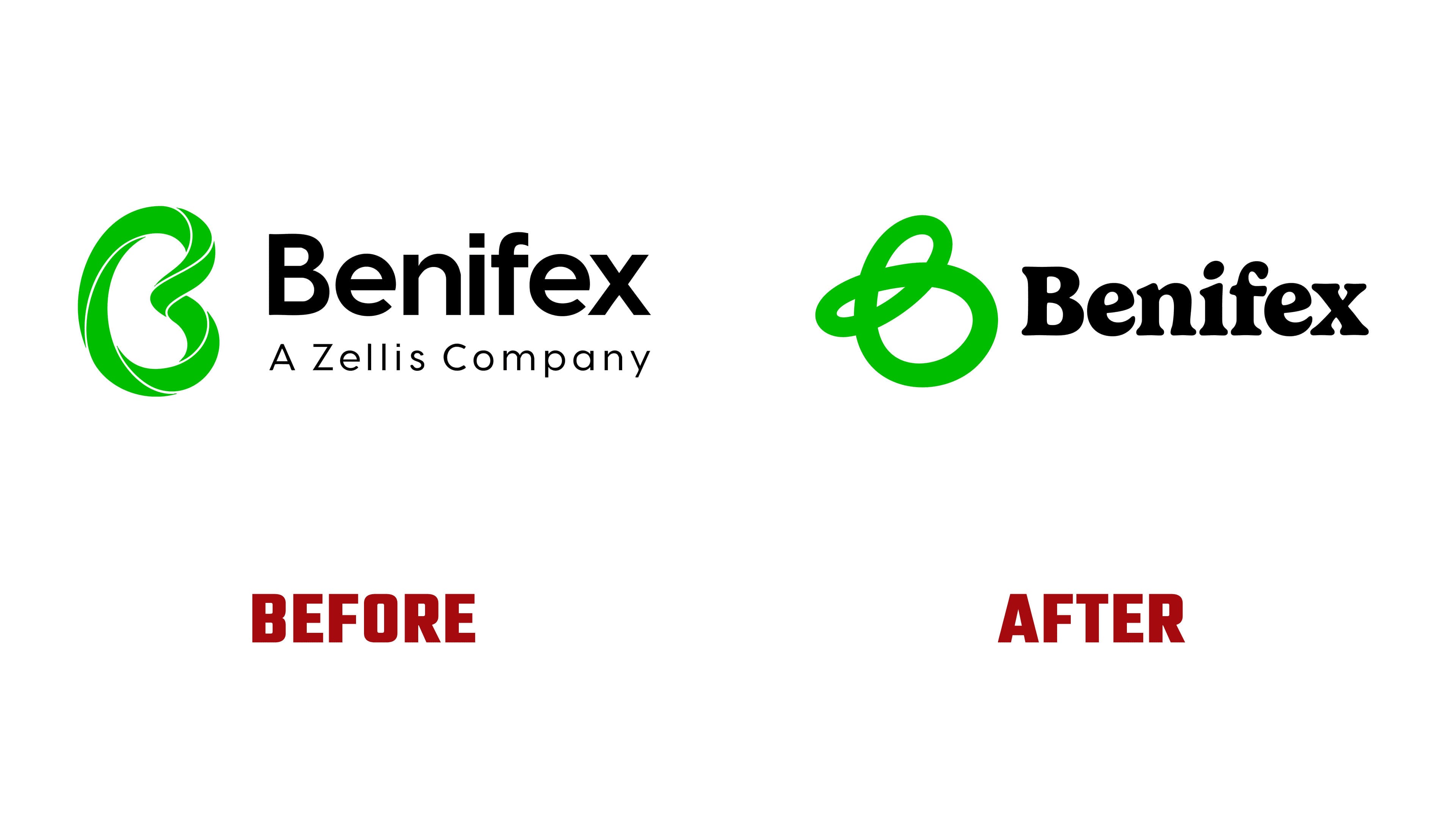
The previous logo paired a three-dimensional green “B” with a black sans-serif wordmark. Curved ribbons in several shades of green formed the letter, separated by thin white gaps. Its elongated outer contour was nearly oval, surrounding a large open space with a right-side indentation. The lettering combined flat stroke endings with rounded bowls. Beneath the name, the line “A Zellis Company” appeared in widely spaced letters.

In the new symbol, a single green line replaces the ribbons, curving and crossing over itself. The upper loop is narrow and elongated, while the lower loop is rounded, with a small projection on the left. A rightward slant gives the letter the appearance of a handwritten “B.” The symbol uses a single shade of green, with varying stroke widths that give the curves a sense of volume. It began as a hand-drawn sketch, which the designers digitized and refined while preserving the flourish’s loose contours.
The wordmark uses Gelica Bold, a bold serif typeface by Dave Rowland. It combines rounded forms, concave serifs, and contrasting thin and thick strokes. Rowland drew inspiration from Goudy Heavyface and Ludlow Black. Gelica gives the name a vintage print feel, while its curved letterforms echo the symbol’s loops. In the updated logo, the symbol and wordmark sit side by side on a single line. The former “A Zellis Company” tagline has been removed.
Green provides continuity with the previous identity. A bright green is paired with a dark forest green, and the standalone “B” appears at various scales, from large signs to app icons.
Benifex employees contributed to the identity by creating drawings about emotions and life events. Their work provided the basis for a collection of strokes and loops. For Different prepared materials for marketing, product teams, and employee communications. The company planned to roll out the identity over several weeks following the May announcement, with existing materials remaining in use as replacements were introduced.