


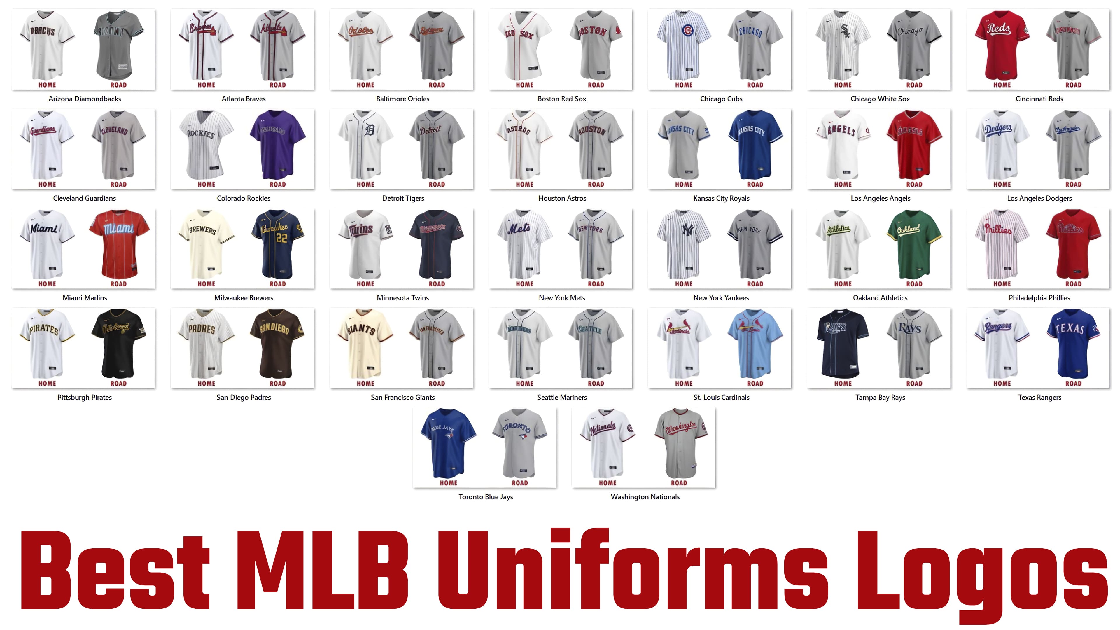
Sports uniforms today have not only practical and functional value but also carry an aesthetic load, strengthen team spirit, and serve as a convenient platform to display the team’s visual identity, shaping its brand perception and ensuring the team’s commercial success. The success of the most impactful identity is directly related to the quality of the uniform itself, as evidenced by the ranking of the best MLB uniform logos, which provide the necessary distinction between teams and reflect each club’s character and core values.
In baseball, the New York Knickerbockers Club was the first to adopt a team uniform in the early 1800s. It featured a commonality of style, color, and material. In addition to convenience and practicality, modern uniforms are characterized by brightness, contrast, and brilliance, which can “boast” protective headgear of any team. Today, almost every element of such sports equipment bears the main symbol of the team – its logo and emblem, which provides individual visualization and recognizability of each club.
30 Arizona Diamondbacks
![]()
The Arizona Diamondbacks have long been developing their visual style. The latest version is featured on the club’s updated white home and away uniforms, which are gray with a fine herringbone texture and diagonal lines. The home jersey features a thin black line around the sleeves and neckline. The text logo, D.BACKS, is printed in the same color with a thin red border. The letters are attractive in their execution, with the presence of pointed protrusions at the top of the letters, slits at the letter C, and a lower protrusion at the letter K. The away shirt also has stitching at the neck and along the edges of the sleeves. The lines are in two colors: a wide black center line, highlighted on both sides by thin electric-blue lines. The text logo – Arizona, like the home logo, is positioned horizontally on the chest and in the same black font, highlighted with a thin red stroke but further emphasized with a blue electric stroke.
29 Houston Astros
![]()
The unified poppy style of the Houston Astros baseball club’s road and home uniforms ensures that the team is easily recognizable at performances of various orientations. The white jersey features the home version, with subtle red trim around the collar, on both sides of the placket, and along the sleeves’ edges. On the road version, these lines are dark blue, and the jersey is gray. The logos on the Astros and Houston chests are in the same geometric font, in dark blue with a thin red outline and a curved shape. All letters have cut-off, sharp corners and consist of short, straight segments. This design provides ease of reading but does not form any particular uniqueness.
28 Tampa Bay Rays
![]()
In forming its identity, the Tampa Bay Rays baseball club departed somewhat from tradition, showing individuality in its color choices. The home jersey is made in a monochromatic navy blue, and the away jersey is in the already traditional gray; on the chest of both jerseys, a horizontally located text logo, Rays, in dark blue with white contrast edging and a light blue shade, giving volume to the letters. The letter R, at the junction of the stem and the top element of the letter, features a sparkling star with bright yellow rays and a white center. The trim on the collar, jacket, and sleeve edges on all jerseys is light blue on the home version and dark blue on the road version.
27 New York Mets
![]()
Like all other teams, the New York Mets have home and away baseball uniforms. Each has distinct differences that set the team apart on the field of play. Thin horizontal blue stripes highlight the home white uniforms throughout the jersey. On its chest in neat, round, italicized, dark blue is the club name – Mets; each letter is highlighted with a thin red border, making it easy to read the name from any stand. The name is set in the traditional style, with a slight rise at the top and to the left. The light gray home jersey has a thin dark blue border along the collar and button placket, and some distance from the sleeve edges. The team’s city name is set in a wishbone style, which many clubs use for their names. All letters have sharp protrusions that attract attention. The letters are highlighted in dark blue with a thin red outline.
26 Detroit Tigers
![]()
The Detroit American Tigers stand out with their home uniforms in an elegant, fresh white, accented with delicate blue details. It is the simplest among the clubs in the sport, designed in a minimalist style. In the home version, the collar and buttons are trimmed in this color. On the left side of the chest, the first letter of the club name is embossed in Gothic font. Some sharpness and brightness of the kick characterize its execution. This is provided by the elongation of the lines and the sharpness of the ends, which stand out in contrast to the background of thin rim lines. The road version of the uniform is light gray and features only an inscription at the center of the chest, the club’s full name. It is made in beautiful, dark-blue calligraphic italics. It is emphasized by a thin, bright red border, which in turn is framed by a white line. At the same time, the negative space between the letters, starting with the letter “t,” is also filled with white.
25 Texas Rangers
![]()
The Texas Rangers’ away jersey is especially eye-catching with its rich, bright blue color. On its background, the white text logo looks very effective: Texas in the original wishbone style, subtly and stylishly outlined in red, slightly capturing the main blue field. The edges of the sleeves are finished with a contrasting combination of two equal-width stripes: white and red. The left sleeve bears the club emblem, which resembles a white rectangular flag flying in the wind, with red, blue, and white stripes and club symbols. The first is represented by an inscribed dark blue rectangle, in the center of which is a white five-pointed star. The second is rectangular, divided horizontally into two halves, with white and red. The home kit is less attractive and looks traditional. The white jersey with a slight blue tint on the chest has the Rangers logo printed in round italics, with a slight leftward and upward tilt. All letters are in dark blue, with a subtle red-and-white border. The logo has a lower stroke at the wide, shapely-cut end, into which the first letters of the logo rest. The stroke originates from the eye-catching swirl of the final “s” and flows seamlessly into the logo’s beginning. Three signature lines run along the edge of the sleeve – blue, white, and red.
24 Cleveland Guardians
![]()
Among baseball team uniforms, the Cleveland Guardians outfit stands out for its modernity and high-end design. It uses a signature color scheme of traditional white, red, and blue shades. The team name is printed on the chest in large, bold red letters with a dark blue border on the white home version. The letters are geometric in shape. They consist of many short, straight lines connected at different angles. The usual graphic pattern with variable-size underlining is used; the right edge extends into a monogram at the lower end of the last letter “s.” It has an acute left corner, with its apex pointing toward the tail of the first letter “G.” The text is set with a slight rightward slant and a slight rightward diagonal relative to the horizontal. The away kit is gray, with the city name of the club’s location rendered in dark blue Gothic with a red contrasting border. The text is curved down the center of the chest. Both uniforms have dark blue, subtle edging some distance from the sleeve edge.
23 Cincinnati Reds
![]()
The Cincinnati Reds, based in the city of the same name, are characterized by a solid red home uniform for players and a light gray away uniform. Both jerseys feature contrasting sleeve trim in light gray and red stripes. The red jersey has part of the club’s name, “Reds,” in white sans-serif uppercase font along the chest, with a lower underline that tapers to a point, transitioning into a monogram at the end of the letter “s.” On the right forearm is a face image of a mustachioed character wearing a white hat with a red stripe. The away uniform has the city’s name inscribed on the chest in lowercase red letters of equal size with a white border, providing a contrasting logo against the uniform’s overall background color.
22 Washington Nationals
![]()
The Washington Nationals club’s visualization, depicted in home and away uniforms, is traditional. On the chest of the white home jersey with a slight blue tint and the gray away jersey, the text logos are in a uniform style with a traditional arrangement, slightly rising to the right, symbolizing the constant pursuit of victory. The home jersey features a logo with the word Nationals in an italicized, round, sans-serif font, with slashes on the upper, protruding portions of the letters “t,” “l,” and “h” on the away side. The letters N on the home logo and W on the guest logo share a similar initial element, with the W using the original attractive loop. Both logos have an underline that starts at the last letter and extends to the beginning of the word, where a shaped cut is made to create abrupt endings. On the home set, the letters are dark blue with a contrasting thin red border. On the away kit, the letters are bright red, highlighted with a white border. Both jerseys’ sleeves and collar area are marked with colored stripes of the corresponding combination of colors – red and dark blue on the home jersey and wider dark blue on the away jersey, highlighted on both sides with thin red lines. On the left sleeve is a circular club crest consisting of an inner white circle with a red capital letter W. This circle is outlined in blue and red, followed by a dark blue circle with a field filled with the full club name in white. Small red five-pointed stars separate the words. A thin red circle bounds the entire symbol.
21 Los Angeles Angels
![]()
The Angels baseball team in Los Angeles stands out with its bright, powerful uniforms. Like all clubs, it has two types: snow-white jerseys, the home version with a thin red border and the Angels’ inscription in red letters with a blue-and-white border, creating volume with a gray shadow. The away one is done in bright red with white and blue trim, and the logo is in the reverse of the home uniforms’ colors. In both cases, the curved chest logo stands out and is eye-catching. The lettering is in a clear, flowing wishbone font with thick main strokes and a few thin, pointed elements. The emblem’s central figure represents the name’s first letter, is slightly larger than the rest, and has a gray halo around the top.
20 Miami Marlins
![]()
The Miami Marlins baseball team’s uniforms for both home and away games are original in execution but different in style. Red body with thin, light blue vertical stripes and light blue lettering of the club name embossed on the chest in a font specially designed for the team logo. The letters are highlighted in darker blue, creating a three-dimensional effect for better visual perception. At the same time, the first lowercase letter “m” is larger than the rest, and the letter “i” has a small regular triangle as an upper element. The basic T-shirt is white with a slight blue tinge. On its chest is the name of the city the team represents, with an elegantly executed first letter, “M,” and a stylized marlin. It is distinguished by an original outline of two thin red-and-white lines that contrast favorably with the jersey’s overall background.
19 Kansas City Royals
![]()
Many baseball clubs met the new season with an updated style. The Kansas City Royals have done just that, significantly improving their visuals. The emphasis on classic design and the brevity of the logo and emblem have ensured that it is simple, easy to remember, and, therefore, easier to recognize. The gray home kit with a deep blue Kansas City emblem and the blue away kit with similar white text look stylish and attractive. The lettering curves across the chest in a geometric font, whose angularity only adds to the visual appeal. On the gray jersey, the text is in the away uniform color, while on the away jersey, it is in a bright contrasting white. Both jerseys have stripes slightly off the edge of the sleeves, wide blue on the home side and white on the away side. The home jersey is distinguished by club symbols on the left sleeve. It is a heraldic shield with a light yellow upper part, resembling a crown, and a dark blue lower sector, in which the letters K and C are printed diagonally in white. A thin white outline highlights the coat of arms.
18 Baltimore Orioles
![]()
Like all baseball teams, the Baltimore Orioles have two types of uniforms: white for home games and basic gray away uniforms. Both are distinguished by a thin red trim just above the sleeve edge, highlighted at the top and bottom by an even thinner black stripe. Both jerseys have the words that make up the club’s name on the chest: “Orioles” on the home jersey and “Baltimore” on the away jersey. Both jerseys have the same style across the top of the chest. A graceful, rounded, cursive font reminiscent of hand lettering is used. In-home matches are larger. All letters are bright red with a thin black border, making the text stand out and providing clear boundaries. Both names are underlined with a cut-top corner instead of the commonly used sharp one.
17 San Diego Padres
![]()
The San Diego Padres’ team uniform is quite attractive. Especially away, thanks to the color composition, the original combination of dark brown and light yellow, which was a successful return to the club’s historical past. The shirt has a thin yellow trim around the neckline and the edges of the sleeves. The San Diego lettering on the chest features a traditional curve at the center, and the letter outlines are highlighted with a thin white line. On the left forearm is the club’s symbol: a monk in a playful black cassock, a baseball bat on a yellow field, and a round badge with a yellow-and-black outline. Home shirt – white with dark blue vertical stripes, with a thin yellow-dark-brown stripe around the neck collar and on the edge of the sleeves, matching the main color of the letters of the logo and their contrasting outline. The logo is characterized by the font’s execution, with letters featuring attractive, sharp elements in the upper part. All the letters are uppercase and of the same size. They are known for their confidence and precision.
16 Chicago White Sox
![]()
The Chicago White Sox, a baseball club from the city of the same name, has the most recognizable logo and uniform design. The home version is a white jersey with thin black vertical stripes, which are covered on the left side of the chest by a large emblem, the word Sox, a cascade of black letters from top to bottom. The first letter, “S,” is enlarged, with the lower tail curled up, the top repeated, offset to the left, and down. The others are smaller in size. Each letter is surrounded by a thin gray outline, contrasting with the text on the general background. The font is Gothic. On the gray uniform along the chest is a black inscription – Chicago, made in the same black but round italic font with a light gray border. The letters are arranged diagonally from left to right. A wide black stripe along the edge of the sleeves distinguishes the jersey itself.
15 Colorado Rockies
![]()
While lacking the luster of the stylish, modern uniforms, the Colorado Rockies’ team uniforms still have appeal. Its home and away uniforms are designed in a traditional style. But they also have individualized moments. The home jersey is white with horizontal purple stripes, and the away jersey features the Rockies logo and the word “Colorado” on the chest. The logos are in the same font, style, and color scheme: black outlines with white outlines and gray inner fills, with a traditional curve toward the center. The stunning combination of purple, black, and gray has a particular visual impact.
14 Milwaukee Brewers
![]()
The Milwaukee Brewers club uniform is distinguished by the color scheme adopted by the team and the presence on the left sleeve of the away kit jersey of an emblem in the form of a part of a yellow brick wall, on which there is a large letter M in dark blue – the color of the road kit, fully repeating the style and execution of the first letter of the name – Milwaukee, applied horizontally across the chest. The home kit is off-white with thin blue-yellow stripes along the edge of the sleeves. A curved inscription on the chest – Brewers in navy blue capital letters, finished with a thin yellow outline to increase contrast and aid visual perception. A large geometric serif font is used here. The curvature softens the straight strokes and sharpness of the serif corners. The away jersey is characterized by bright contrast. Thin yellow lines decorate the button placket, collar trim, and sleeve edges on a dark blue background. This color is used in the emblem and the writing of the club name on the chest. The italicized Roman script has slashes that make it more square, forming sharp corners that especially emphasize the last two letters, “her,” which immediately catch the eye.
13 Toronto Blue Jays
![]()
In addition to the text logo, Toronto Blue Jays baseball players display a jarhead graphic on their jerseys, featuring bright blue, red, and white. It is located on the left side of each jersey’s chest, directly below the last letters of the text. On the blue home kit, the emblem is highlighted with a white border for better visibility against the blue background. The home uniforms have an overall blue background on which the Blue Jays’ name is printed, with a double-open outline in white that, due to the background’s negative space, creates the perception of the letters’ shapes. The away jersey is light gray. The word Toronto on it is in the same font and style as the logo on the home page; only the letters are circled in blue, and the word itself is curved in the middle.
12 Seattle Mariners
![]()
Another baseball club, the Seattle Mariners, has done a good job on its visual design. An unforgettable impression is made by the spectacular color combination of dark blue and “sea wave,” with the logo applied to home and away jerseys. The gray color of the latter enhances this effect. The stylized wind adds additional appeal to the rose symbol in a circle, which, with its lower ray, forms the upper cutout of the letter M on the white logo of the home kit in the word Mariners or focuses on itself with a white contrasting inner field, located in the middle of the letter S on the away jersey in the word Seattle. Both jerseys have subtle dark blue trim around the collar and button placket.
11 Pittsburgh Pirates
![]()
The Pittsburgh Pirates baseball team’s uniforms have also changed their identity. While keeping the name spelling “Pirates” in the style, the team changed the uniform color. The home one is white, with black geometric letters in sharp, right angles, contrasting with orange trim. The away team has the opposite color of solid black. The letters of the word Pittsburgh are outlined in thin orange on a black background, making the uniforms elegant and memorable, and setting them apart from the classic identities of other clubs. Both uniforms are trimmed with a black stripe on each side, with subtle orange accents around the neck and the edges of the sleeves. The left sleeve of the away uniform features the club’s emblem: a one-eyed pirate’s head in orange and black with light gray inserts.
10 Boston Red Sox
![]()
The Boston Red Sox home and away uniforms feature a traditional, modern cut with color, material, texture, and printed logo text. It is one of the most recognizable teams today, despite its lack of graphics, thanks to the overall sophistication of its look. Both uniforms feature the iconic red lettering, effectively accented with a thin blue outline: the Red Sox on the white home jersey and Boston on the light gray away jersey, textured with a small, attractive horizontal stripe. The logos are in red over a black outline in a wishbone-style font; the letters feature small but sharp protrusions with strict overall symmetry. The home shirt is highlighted with thin red stitching along the button placket and around the collar. Away is a club emblem on the left forearm in the form of a pair of red knit socks.
9 Philadelphia Phillies
![]()
The Philadelphia Phillies, a baseball club, recently unveiled new, stylish, and progressive uniforms in a classic street-casual style. Its blue-burgundy-and-white color palette conveys confidence and calm, elevating the image. The white home jersey features thin vertical maroon stripes to help players stand out on the pitch. The Phillies’ name (as on the away kit) is printed horizontally across the chest in burgundy. The font is a calligraphic italic with dots over the “i” in the form of blue five-pointed stars, which dilutes the composition, making it catchier and more memorable. The away kit is completely burgundy. Therefore, the burgundy logo text is highlighted with a thin white border, clearly defining each letter.
8 Minnesota Twins
![]()
Using a non-standard font for the logo in the Minnesota Twins sports uniform design makes it stand out against the background. The club has white home jerseys with the word “Twins” in bold sans-serif, which emphasizes the slight curve of the top horizontal bar of the letter “T” and the softness of the angles in the execution of all the letters, in deep navy blue with a red border for emphasis. The underlining in the logos of both t-shirts is much shorter than the traditional designs and has no connection to the logo letters. This design forms a sleek, confident, modern style. The away version of the jerseys is dark blue, and the word Minnesota is written on the chest in a bright red font with a white border. The left shoulder of each jersey features the club’s emblem, with the Twins name in red and blue, on a circular element with a white field.
7 Atlanta Braves
![]()
The Atlanta Braves, a team from Atlanta, have an original visual style in their uniforms. It is represented by a bright red text logo in a stylish, bold, italic red font, highlighted by a thin black outline and an original emblem. It depicts a red hammer with a triangular handle and an elongated grip. These two elements are connected by a decoratively intertwined yellow rope, which creates an additional visual accent. The richness of the composition, with the effective highlighting of the red letters in the text blocks on both T-shirts and the contrasting thin black outlines, makes it even more attractive. Each graphic element on the home and away jerseys adds stability and confidence to the entire rendition while drawing attention to the traditional elements. The home jersey is white, while the away jersey is gray. Both uniforms have subtle red trim with black inserts around the collar and jacket, and some distance from the sleeve edges.
6 Chicago Cubs
![]()
The Chicago Cubs’ baseball uniforms are considered among the most eye-catching because of the bright logo on the home jerseys. The white jersey with vertical thin blue stripes stands out immediately. The visual impact is enhanced by the round-shaped mark on the left side of the chest, placed atop the stripes. The composition and color scheme, featuring red, blue, and white flowers, add to the appeal. In the inner white space of the blue circle, repeating its shape, a large letter “C” is drawn in red, from the center of which a combination of smaller letters “ubs” is emitted, the same color but in a heavy, stable font. The thickness of the letter “C” and the blue outer circle are the same. The design of the gray-away kit is less varied. On the chest, the word Chicago is printed in equally sized blue lowercase letters in an arc shape. All letters are outlined in a thin white outline to enhance readability and visual appeal.
5 San Francisco Giants
![]()
The San Francisco Giants’ baseball uniforms differ significantly in design between the home and away uniforms. Both jerseys are distinguished by their primary color – the home jersey is cream, and the away jersey is gray. Each has a text logo on the chest in the same dark blue font with a red border, with the characteristic sharp elements inherent in Gothic fonts. This gave the logo a certain heavy-handedness. On the home uniforms, the jersey has red and blue stripes around the collar and on the edges of the sleeves. On the home side are thin stripes on the collar and jacket. Just above the sleeves’ edges is a thin blue stripe framed by two thinner red ones, as on the home version.
4 Los Angeles Dodgers
![]()
Another Los Angeles baseball team, the Dodgers Club, tops the list of the best logos on MLB members’ uniforms. On the chest of the white home jersey and the gray away kit jersey, elements of the club’s name are printed in a rich, even blue font. At home, it is the Dodgers; away, it is Los Angeles. The texts are placed with some rise to the left. Each is underlined with a stroke running from right to left from the tip of the last letter to the first capital letter. The line thickness increases towards the end, where a shaped cutout creates a sharp tip. The font is bold, with every detail perfectly balanced. The thoughtfulness of the roundings and sharpness of the letter elements ensure the balance. The rounded tail of the letter “S” and the design of the large letters A and L are particularly attractive. The blue color emphasizes the elegance of the execution.
3 New York Yankees
![]()
Fans believe the New York Yankees brand is more than just their great play. Its iconic abbreviation, an intertwined N and Y, attracts special attention and is recognized worldwide for its “oriental” design. The white home kit with thin light-blue vertical stripes, the emblem on the left chest, and the gray away kit with the logo as a text element and the name “New York” are immediately eye-catching on the field of play. All logos use the club’s primary colors: white (for the text border) and blue (for the sign and logo font). The sans-serif uppercase font is particularly well-suited to the logo’s minimalist style. The away uniform features a distinctive element: three stripes: two wide dark blue stripes and a white, slightly thinner one separating them along the edge of the sleeves. The club uniform has a modern look and feel.
2 St.Louis Cardinals
![]()
The St. Louis Cardinals, an MLB baseball team, stand out for their dressy uniforms featuring eye-catching bright red and yellow elements. The chest of both uniforms, the home white and light blue, features an image of two bright red birds perched on the edge of a light yellow baseball bat. This combination of colors creates a pleasant and cheerful mood, making the emblem attractive and memorable. The emblem is placed above the text logo on the home uniforms above the word Cardinals, where the top curl of the first capital letter C surrounds the top of the bat. The away uniform also uses the letter S. Both names are written horizontally across the chest in a bright red, round font, set in a soft, elegant italic, drawing attention to the slight curvature and elongation of the letters. All letters are highlighted with a thin blue border that smoothly transitions into a shadow in the output version, creating a sense of letter volume. The letters C and L have elongated lower tails that emphasize the 1-2 following letters from below. The away jersey has trim around the edge of the sleeves, a button placket, and a collar joint with a thin red line.
1 Oakland Athletics
![]()
Oakland Athletics uniforms feature the traditional MLB logo, with the club’s name and city spelled out in the team’s fonts. The home and away jerseys are differentiated by color. The home uniforms are white, and the away ones are rich green. On both jerseys, the text is written across the chest in a stylish uppercase font with a slight upward slope, with an underlined width that increases from the end of the last letters to the beginning of the words. Its abrupt ending is formed with a shaped cutout. The Athletics home kit is dark green with a subtle bright orange border that makes it stand out. The large letter A is particularly eye-catching, made in short strokes with a curl at the top, and the letter “t” with a beveled top. The away uniform is decorated along the bottom of the sleeves with a thin white stripe flanked at the top and bottom by two wider orange stripes. The emblem, consisting of the word Oakland, is in the style of the home uniform. But its primary color is white.