 Bimbo Logo PNG
Bread and baked goods play a central role in the daily diet, accompanying meals throughout the day. Producing these products involves baking, packaging, and distributing them to retail chains. The Bimbo logo is associated with a company that manufactures baked goods and supplies them to markets in Latin America and other regions.
Grupo Bimbo was founded on December 2, 1945, in Mexico City by Lorenzo Servitje and his partners. The company began operations with thirty-four employees and produced packaged bread. The brand’s symbol, the white bear, was created the same year. By 1949, the company had opened a branch in Puebla and began developing a nationwide distribution system.
In 1958, the company introduced the famous snack Gansito. In the 1960s, the company expanded at scale, opening new factories across Mexico. In 1971, the company launched the Barcel brand, which later became a major player in the snack segment. In 1972, the company built one of the world’s largest bakeries.
In 1980, Bimbo shares were listed on the Mexican Stock Exchange. In the 1990s, the company entered the international market and acquired baking enterprises in the United States and Brazil. In 1998, the Bimbo Bakeries USA division was created, which became a key part of the group’s structure.
In the 2000s, the company continued to expand internationally. It acquired the brands Oroweat, Thomas’, Entenmann’s, Joyco, and Nutrella, and launched production in China. In 2011, Bimbo acquired the Sara Lee divisions in the United States, Spain, and Portugal. This made it the largest baking company in the Western Hemisphere.
In 2014, the company acquired Canada Bread for 1.83 billion Canadian dollars. By the 2020s, the company operated more than 150 factories in 30 countries.
In 2023, Bimbo acquired the company Natural Bakery.
The company announced plans to invest two billion dollars in infrastructure development across seven Mexican states. At the same time, it is expanding its presence in China. The total investment exceeds $70 million. The company is building production facilities in ten cities, strengthening Bimbo’s position in the global bakery and snack food market.
Meaning and History
What is Bimbo?
A Mexican multinational corporation from Mexico City that ranks first in the world in baked goods production. Its portfolio includes more than 100 brands and over 13,000 products, including Marinela, Barcel, Oroweat, Sara Lee, Thomas ‘ and Entenmann’s. The distribution network covers 3 million points of sale and 57,000 routes, and 196 bakeries handle production.
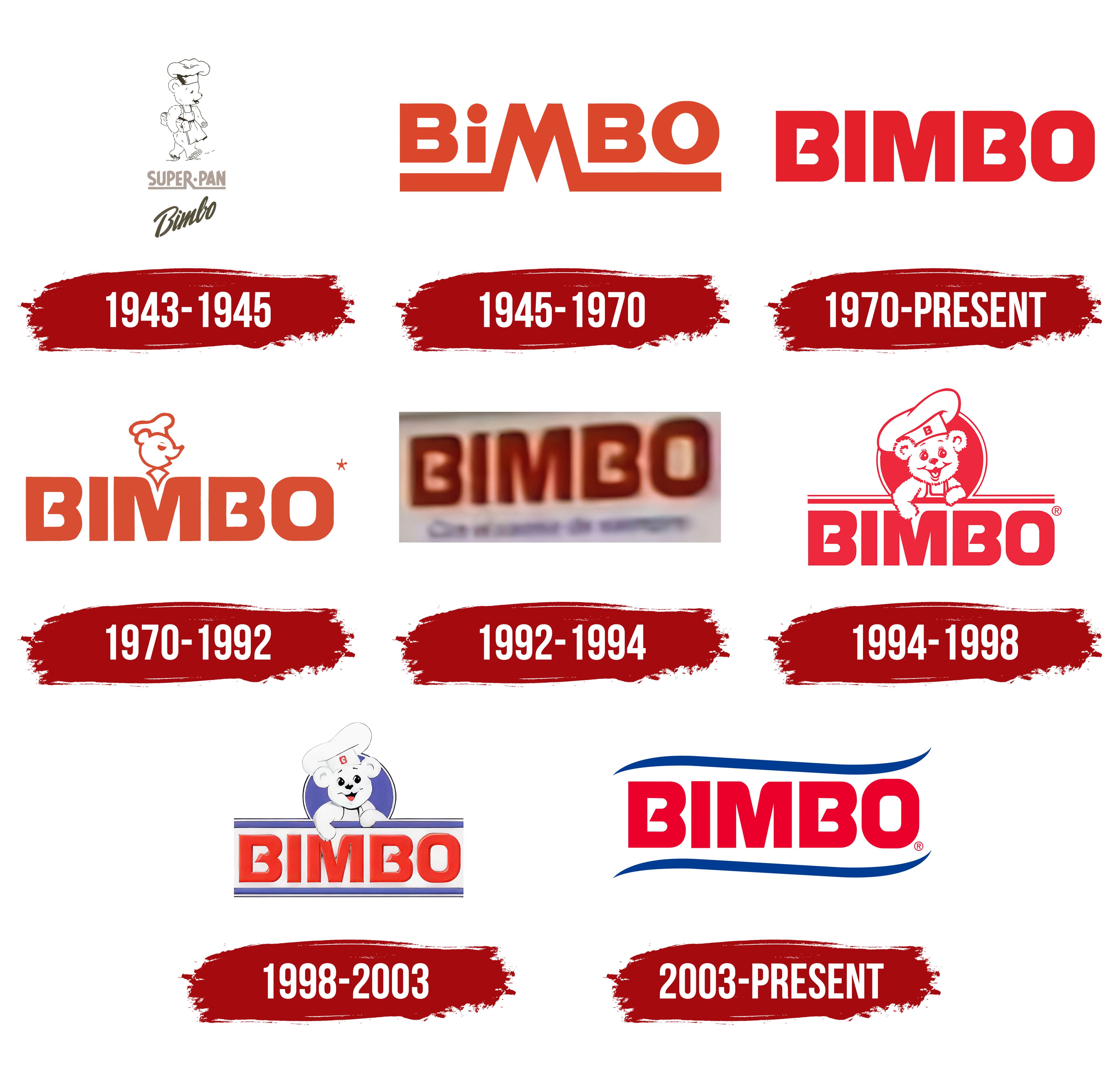
1943 – 1945
The name Bimbo appeared two years before the bakery business opened in Mexico City. In 1943, while preparing the venture, the founders added it to a list of potential names and circled it. Other candidates included Pan Rex, Pan Lirio, Pan Nieve, and Pan Azteca. Another option, Pan NSE, combined the initials of the Spanish words nutritivo, sabroso y económico, meaning “nutritious, tasty, and affordable.” The founders later learned that bimbo is an Italian colloquial term for a little boy. The Italian connection added another association after the name had already been proposed for the future brand. Unrelated alcoholic beverage brands in Spain also used Bimbo, including Anís Bimbo and BIMGIN.
In 1945, Lorenzo Servitje and his partners established Panificación Bimbo. The Spanish word panificación means breadmaking and describes the company’s business. Production began on December 2. The initial assortment included white sandwich bread in two sizes, dark bread, and toast. The products were sold in packaging, and the early wording, Super-Pan Bimbo, connected the brand name to bread through the Spanish word pan.
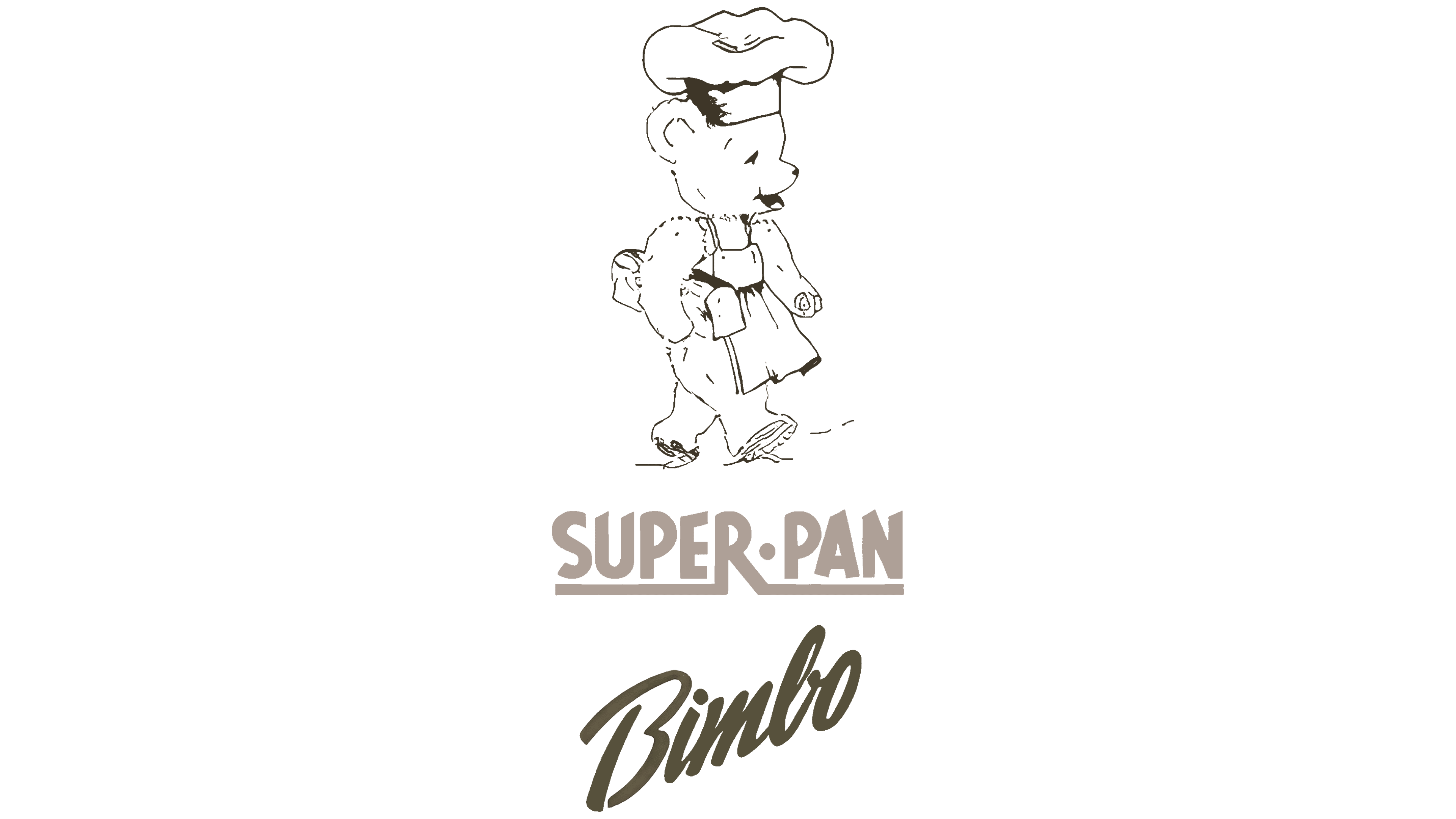
The logo had three tiers. A bear cub in a baker’s outfit sat above the lettering, SUPER·PAN filled the middle, and a handwritten Bimbo finished the bottom. The illustration and two lettering styles brought together a baker, the product description, and the brand name. The upper line used narrow uppercase letters, while the lower line resembled a signature with a large initial “B.”
The bear cub was shown in profile, walking left with its head slightly lowered and a friendly expression. The black drawing relied on outlines and limited hatching. Varying line thickness conveyed facial features and details of the clothing. The tall chef’s hat had soft folds, and the apron included a waistband and ties. The bear wore slippers. Its baker’s outfit connected the character to breadmaking, as did the company name and the wording beneath the illustration.
SUPER·PAN was centered in narrow uppercase sans-serif letters with a brownish-beige color. A dot separated the words, and an underline connected to the “R.” The tightly spaced upper line contrasted with the slanted, handwritten Bimbo below. The lower line rose diagonally to the right, with flowing strokes resembling a calligraphic signature. After a separate, oversized “B,” the remaining letters joined together. An olive-brown color made the name slightly darker than SUPER·PAN. This early version with the bear cub and handwritten name preceded Bimbo’s red logo with heavy lettering.
1945 – 1970
In 1945, Bimbo introduced Osito Bimbo, a white bear cub dressed as a baker with a loaf of bread under its arm. The character began as a Christmas card Jaime Jorba received. The animal pictured on the card became the basis for the brand’s mascot. Anita Mata, Jaime Sendra’s wife, added a chef’s hat, an apron, and a loaf of bread. Alfonso Velasco also adjusted the nose’s shape.
The baker’s clothing and loaf connected the bear to the company’s products. White fur and a gentle appearance conveyed cleanliness, tenderness, and softness. Early versions showed the character from head to toe, with an elongated muzzle, a relatively slender body, and a tall hat. Later revisions gradually changed its proportions. The body and head became rounder, the nose grew shorter, and additional fur details created a fluffy texture.
On the 1945 packaging, the brand name appeared in terracotta-red, thick-stroke sans-serif lettering. BiMBO used mostly uppercase letters, though the “i” retained a round dot. The “M” dominated the design. It rose above the neighboring letters, and its legs extended below the line before turning into two thick horizontal bands. The bands spread left and right beneath the name’s full length.
The underline connected to the El Molino pastry shop. Bimbo’s early history included work there, and the shop’s visual identity informed the new logo’s lower bands. By joining the “M,” the underline became an extension of the letter, bringing the name together in a single shape.
1970 – today
For its 25th anniversary in 1970, Bimbo paired an updated wordmark with a smaller bear image. The redesign changed the letters’ proportions and the character’s placement. A compact BIMBO replaced the protruding “M” and its lower extensions. All five letters became the same height, with the bear’s head positioned above the name’s center.
The name appeared in bright red sans-serif lettering. Thick strokes combined with straight contours and slightly rounded outer corners. The white spaces inside both “B” letters were angular. Horizontal cuts created sharp inner corners, while diagonal sections in the middle gave the openings unusual shapes. The interiors looked more rigid than the softly rounded outer forms.
The bear appeared as a profile outline of its head, retaining the chef’s hat and neckerchief. Placed above the “M,” the illustration was small compared with the name. Its red lines matched the lettering. The heavy wordmark dominated the logo, with the small baker’s portrait above it.
1970 – 1992
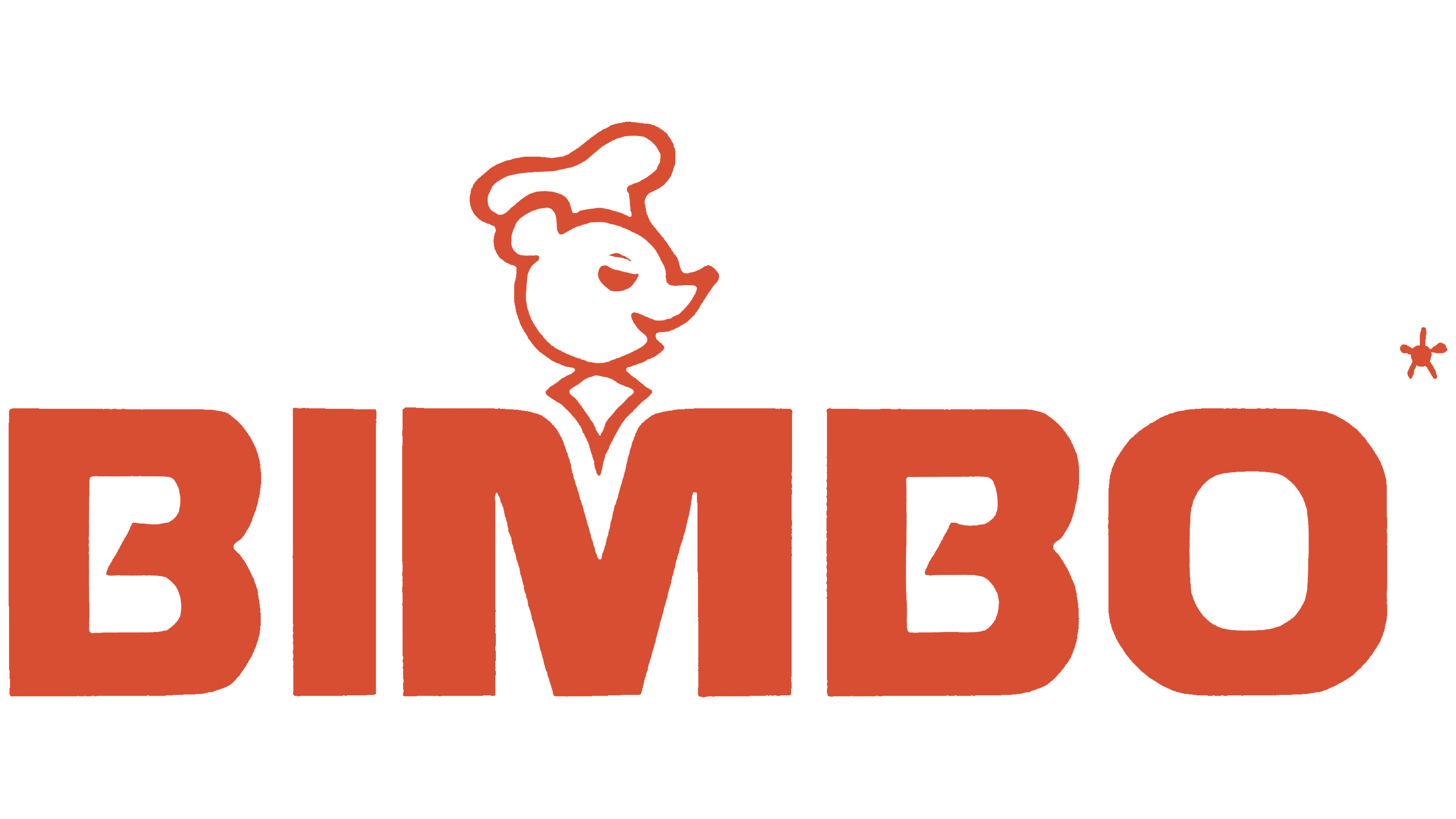
In another Bimbo version, the bear cub in its chef’s hat appeared above the brand name. The illustration and lettering shared a terracotta-orange color close to brick red. The entire emblem used one color, with no distinction between the character and the letters.
The bear’s head faced three-quarters. The simplified illustration showed a nose, an ear, and a closed eye, while a slight smile gave the face a calm expression. The large hat had flowing curves and folds. Beneath the muzzle, two curved lines met at the bottom to form a tie.
BIMBO occupied the lower portion in uppercase letters with thick strokes and rounded outer corners. The same construction continued throughout the word. A small five-pointed star appeared on the right near the upper edge of the “O.” It used the same brick-red color and added a small decorative accent.
1992 – 1994
Bimbo also used a version without the bear, making the brand name the logo’s basis. The standalone wordmark later became established in corporate use. It identified other brands as belonging to the company, allowing the BIMBO name to appear independently of the character.
The dark red name appeared on a light, beige-like rectangular background. Its five uppercase letters had heavy, upright sans-serif forms. Uniform stroke thickness and solid fills created a dense line of lettering, while rounded outer forms softened its contours.
One version added the phrase “Con el cariño de siempre,” meaning “With the same love as always,” beneath the name. The thin lower line accompanied the heavy BIMBO lettering and added a message for customers. The weight difference kept the name dominant, with the tagline serving as a verbal addition.
1994 – 1998
The 1990s update changed the bear’s role in the Bimbo logo. A small profile outline gave way to a detailed portrait facing the viewer. The character occupied the upper portion of the emblem, with horizontal lines and the brand name beneath its paws. Red united the illustration, circular frame, and lettering.
The face featured large round eyes with eyelashes, a small nose, neatly defined ears, and an open, smiling mouth. Fine strokes conveyed the texture of the fur. The bear wore an apron and a large, folded chef’s hat. A “B” appeared on the hat’s front band, linking the character’s clothing to the name Bimbo.
A red circle with a white inner outline surrounded the portrait. The hat extended beyond the top of the frame, and the front paws rested on two horizontal lines. The thin upper line extended the circle to the left and right. Beneath it, a thicker band spanned the logo’s full width, with a section descending toward the “M.”
The lower portion contained BIMBO in bold uppercase sans-serif letters. Broad strokes gave the name a dense form. The horizontal lines above connected the heavy lettering to the bear’s portrait.
1998 – 2003
The introduction of blue separated the Bimbo logo into a colored frame, a white bear, and a red name. The circle behind the character and the upper and lower bands became violet-blue. Highlights and shadows gave the lettering depth while preserving its heavy sans-serif forms and rounded outer corners.
BIMBO appeared inside a rectangular block between horizontal bands. Broad violet-blue lines and thin black ones defined its upper and lower edges. The upper black line extended the bear’s circular frame, connecting the portrait to the lettering. A colored circle with a black-and-white outline sat behind the white character.
The bear faces forward, its head tilted slightly to the left. A rounded muzzle, fluffy ears, and a slightly open mouth kept its expression gentle. Small highlights appeared in the black eyes, nose, and mouth, and a red tongue was visible inside. Dark outlines defined the white baker’s outfit. The character leaned over the horizontal bar, resting both paws on it.
A large hat with flowing curves and turned edges completed the portrait. A rectangle containing a red “B” appeared on its front. In 2003, the name’s frame changed. Curved lines with thin, pointed ends replaced the straight bands.
2003 – today
For small formats, Bimbo used a simplified logo with the red name framed by two blue bands. It belonged to the same system as the complete bear emblem and was used when the character appeared separately. This arrangement kept the brand name present without repeating the bear.
BIMBO sat centered on a white field. Its bright red uppercase sans-serif letters had heavy forms, uniform stroke thickness, and rounded outer corners. Blue lines, matching in shape and width, ran above and below the name. Their gentle curves extended along the full line of lettering, leaving white space around the letters and tapering at the ends.
Imaginity worked on a later update to the visual identity. Its team focused on the relationship between the bear and the name. The character was enlarged relative to the lettering, its proportions were revised, and its outlines were refined. Its facial expression became gentler. The update refreshed the familiar image while preserving the features generations of customers recognize.