


Bob’s Red Mill is updating its visual identity while keeping its foundation in natural foods, its founder’s recognizable portrait, and its image as a family brand. Bob’s name, the mill, and trust in simple foods remain at the center. The company was founded in 1978 and makes whole-grain oats, flour, baking mixes, and other products. Today, the business is employee-owned and continues to mill grain in Milwaukie, Oregon. The new look was created by Turner Duckworth together with the brand team.
The redesign had a practical task. Bob’s Red Mill has more than 200 products, multiple categories, dietary labels, and strong shelf competition. The old look helped shoppers find the brand, but it appeared overloaded. Bob’s portrait, with its dense lettering, shadows, complex frames, and warm yellow background, required extra time from the shopper.
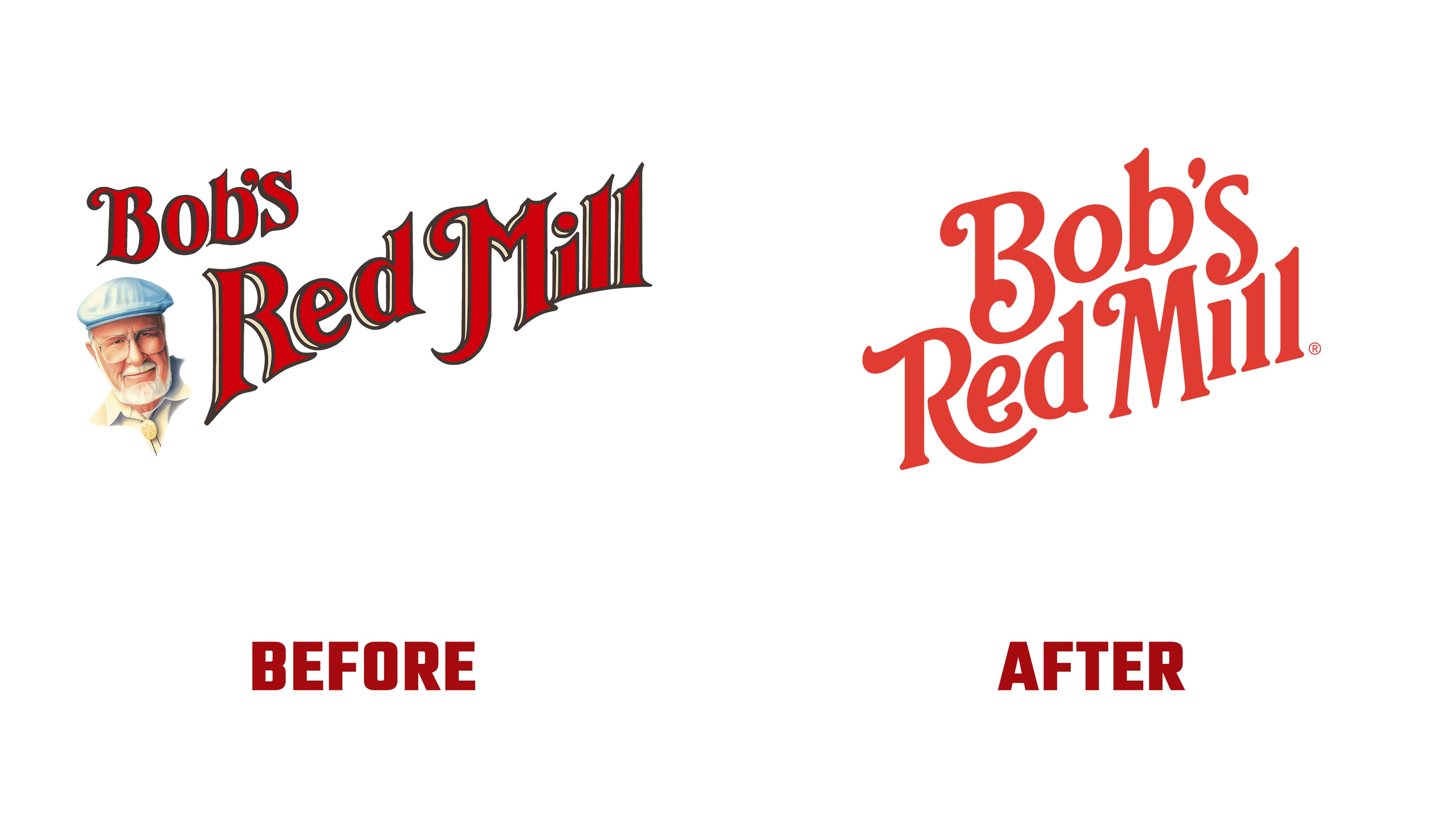
The new logo keeps the craft feel, while becoming larger and clearer. The mark retains the atmosphere of an old painted sign. Rounded serifs, soft flourishes, rounded terminals, and a relaxed line arrangement reinforce the brand’s recognizable image.
The lines in the logo are set more tightly. Bob’s, Red, and Mill look like one living structure. The letters support one another and create a complete mark. For longtime customers, the brand remains familiar, while in stores, the packaging now works better from a distance.
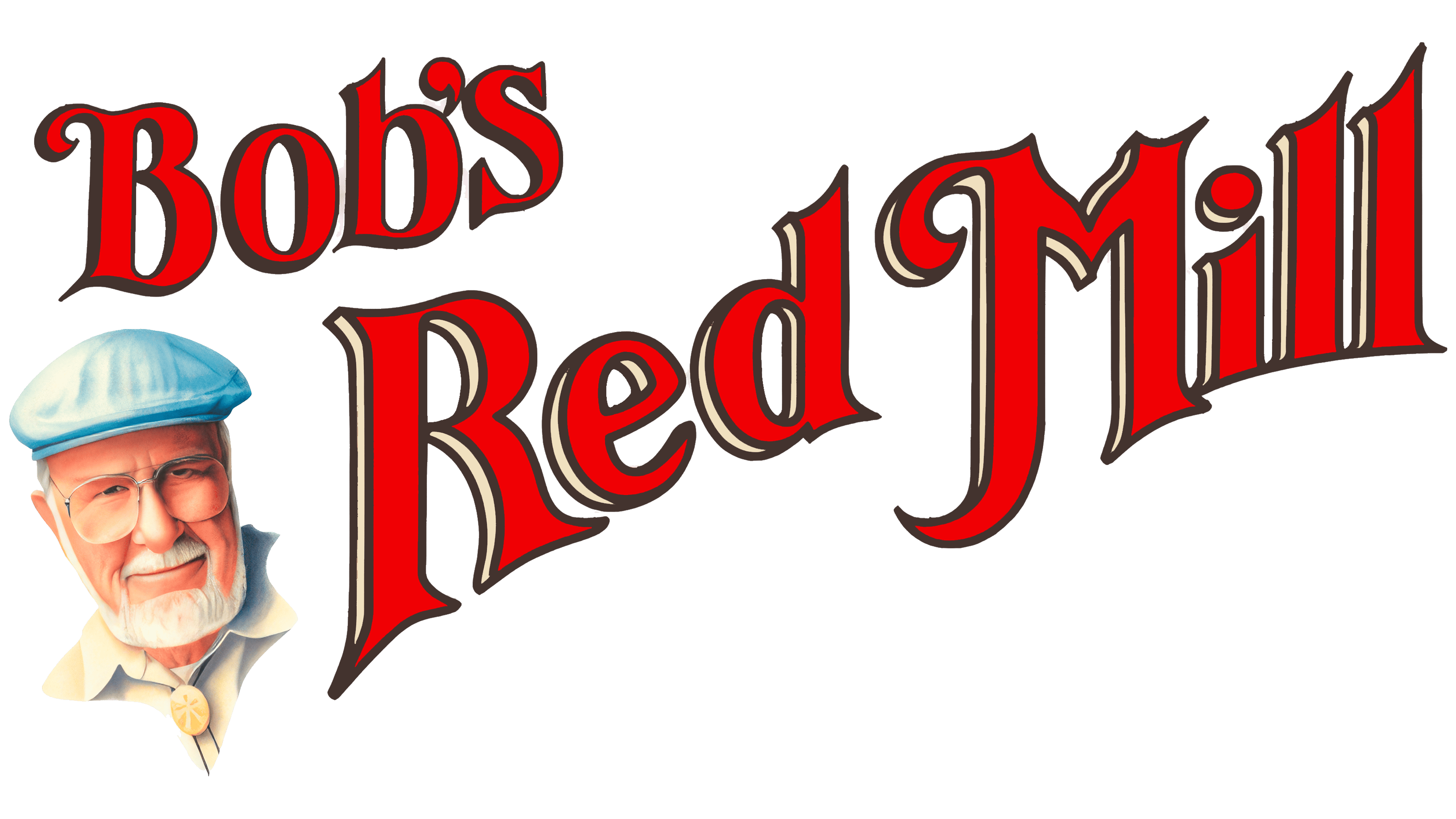
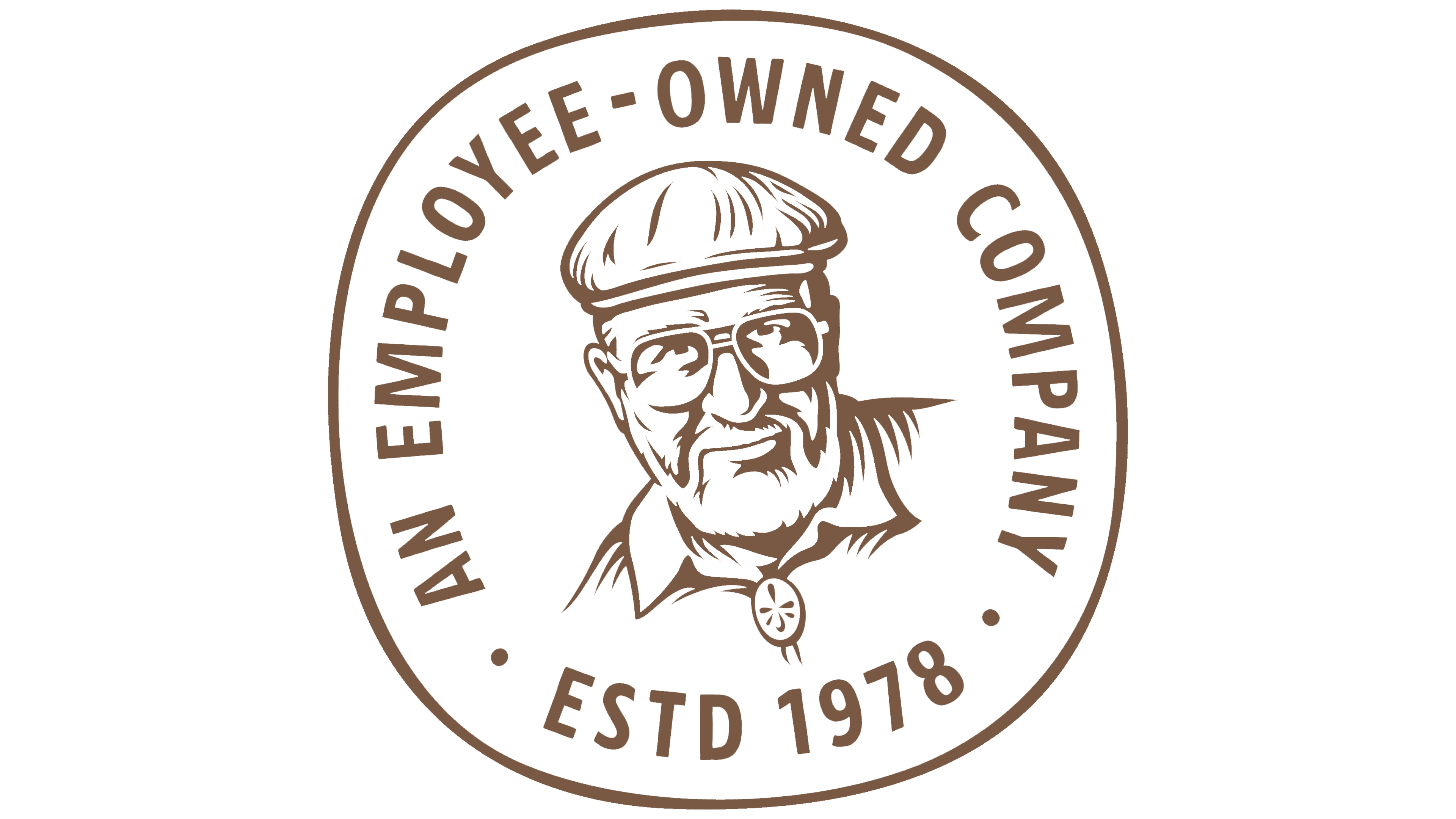
The portrait of Bob Moore remains in the system, but it has received a new illustration and the role of a quality seal. It does not overload the logo; instead, it supports the founder’s story, personal responsibility, and trust in the product. For a brand built on the idea of simple ingredients and home-style food, the connection to the person behind the name remains necessary.
The abstract mill became the second key motif. It refers to the original Red Mill, where the company’s story began. The mill helps the packaging tell the story of the brand’s origins. Together with the large logo, it guides the eye toward the product name, category, and dietary labels.
A typeface called Red Mill was developed for the identity. Painted signs on farms and old storefronts inspired it. Jason Carne took part in the logo work, while Dalton Maag handled the typefaces. The new typography supports the brand’s warm, handmade tone and helps unify the large product range into a single system.
Bob’s Red Mill has kept its coziness, slight eccentricity, and old-fashioned charm.