German quality, fidelity to history, endless user trust, and adherence to traditions are reflected in the Bosch logo. The Bosch logo can be found on automotive parts, home, garden, and construction equipment, security systems, and energy-saving systems.
Bosch: Brand overview
Bosch is one of the global leaders in the production of professional and household electrical goods. It is part of the structure of the eponymous company Robert Bosch GmbH, formed in 1886, and is one of its four divisions. The company’s headquarters are located in Gerlingen, Germany.
Meaning and History
The brand is known for its unsurpassed product quality, earning an excellent reputation. Today, its emblem is easily recognizable worldwide: the branded products are in high demand, as many customers trust products with the Bosch logo.
Over the years, the company has changed its visual style several times but always stayed within its concept: quality, clarity, and simplicity. The first versions reflected the company’s initial area of activity: it specialized in manufacturing devices with ignition magnetic coils.
What is Bosch?
It is a trademark of the German conglomerate Robert Bosch GmbH, which produces components for automobiles, garden equipment, household appliances, construction equipment, security systems, energy-saving technologies, and industry. The company was named after its founder, German inventor Robert Bosch, who opened a workshop in 1886.
1900 – 1907
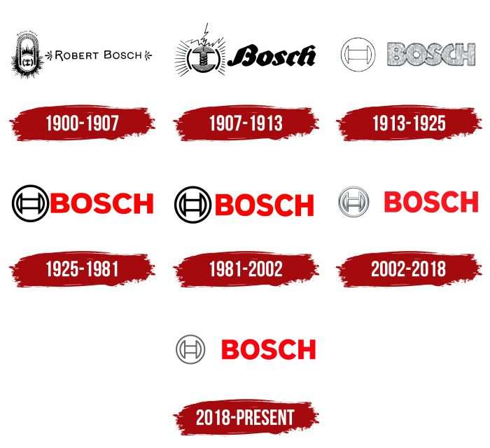
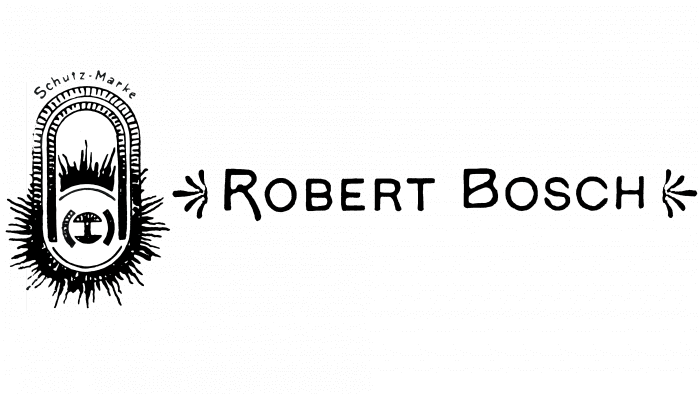
The debut emblem of the technology giant appeared in 1900, as the trademark was officially registered only in 1899. The emblem consisted of the company founder’s name, Robert Bosch, with two patterns on the sides. The font was thin, elegant, and accentuated: “R” (with an elongated leg) and “B” (with an internal stroke diagonally). The second half featured an image of a magnetic spool and bolts with electrical discharges sparkling in different directions.
1907 – 1913
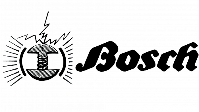
This was an important period in the evolution of the logo, as it received a new design, which served as the basis for all other versions. Designers made the symbol visually lighter. They shortened the name, leaving only “Bosch.” The word was written in a wide italic font with geometric sharp-pointed letters, and the element on the left was halved. The electromagnetic coil, on the contrary, was enlarged, emphasizing it. The discharges of outgoing current were now directed to the right and left, with an imitated cable depicted at the top.
1913 – 1925
In 1914, a redesign was conducted, changing the brand name. It acquired a modern and minimalist look. Now, the emblem consists of five merged letters, made in a classic sans-serif uppercase font. The symbols are thick, dotted, grey, and outlined with a thin contour. The graphic part was simplified: it contains only the electromagnetic element surrounded by a ring.
1925 – 1981
In 1925, developers spiced up the monochrome with bright red, making the logo look much brighter and more contemporary. This palette continued in subsequent modifications. Scarlet capital letters of medium thickness and a black contour sign on the left stand out against a white background, attracting consumer attention.
1981 – 2002
The design update during these years did not bring significant changes. The only differences from the previous version were the thickening of the font in the company name and the lines of electromagnetic coils. In addition, red color was added for intensity. The emblem remained in this form for 20 years.
2002 – 2018
The transition into the new millennium required a contemporary variant. Therefore, designers proposed a three-dimensional logo using a “metallic” design. They made the graphics silver-grey, added brightness to the inscription, and increased its size.
2018 – today
After 17 years, Bosch decided to simplify the visual identification again and returned to the old two-dimensional logo. However, it retained the grey palette to emphasize the connection with technology. Thus, a dark-ash-colored magnetic coil appeared in a circle. The inscription remained the same: simple capital letters with smooth beveled edges.
Bosch: Interesting Facts
Bosch is a big company from Germany that makes a lot of different things, from car parts to stuff we use at home. It started a long time ago, in 1886, and has done some important things since then.
- How It Started: A guy named Robert Bosch started the company in Stuttgart, Germany, to work on electrical engineering and making things precise.
- Big Invention: In 1902, Bosch made a spark plug that helped cars run better, which was a big deal for cars back then.
- Growing Worldwide: Bosch didn’t just stay in Germany; it started selling things in other countries like the UK in 1898 and now works in over 60 countries.
- Car Innovations: Bosch has come up with a bunch of cool stuff for cars, like systems that help cars run smoother, stop better, and use less fuel.
- Not Just Cars: Bosch also makes things for homes, like appliances and tools, and works on projects to make buildings and energy use better.
- Focus on New Ideas: Bosch spends a lot of money on research to come up with new technologies, holding thousands of patents, especially in areas like the Internet of Things and artificial intelligence.
- Bosch Rexroth: This part of Bosch works on making machinery and systems for different kinds of industries, including energy.
- Helping Out: Bosch also has a foundation that gives money to help with health, education, and other big issues around the world.
- Bosch and Racing: Bosch has been involved in racing, giving teams high-tech parts for their cars.
- World War II: Bosch used forced labor during World War II, which is a dark part of its history. They’ve recognized this and have helped pay compensation.
Bosch has grown from a small shop to a huge company that affects a lot of different parts of our lives, from the cars we drive to the tools we use at home, all while trying to make the world a bit better.
Font and Colors
The current logo of the leader in the production of electrotechnical products reflects the strength and heritage of the brand and demonstrates the progress and growth of the parent company. Smooth, simple lines convey its directness and accessibility. The bright color embodies the energy provided by the products, and grey symbolizes professionalism, practicality, and reliability.
The company has its own brand book, for which the corporate font Bosch Family was specially made. Bosch uses a font pair of two grotesques: thick, weighty letters for the logo and light, thin letters for the slogan.
Bosch color codes
| Pigment Red | Hex color: | #ec1b24 |
|---|---|---|
| RGB: | 236 27 36 | |
| CMYK: | 0 89 85 7 | |
| Pantone: | PMS Bright Red C |
| Medium Gray | Hex color: | #bbbec0 |
|---|---|---|
| RGB: | 187 190 192 | |
| CMYK: | 3 1 0 25 | |
| Pantone: | PMS 428 C |
FAQ
What does the Bosch symbol mean?
The mysterious symbol in the shape of the letter H, consisting of two semi-ovals and a rectangle, is a simplified image of one of the components of a magneto-electric machine, which became Bosch’s first product.
What is the origin of the Bosch logo?
The original logo of the German company was a graphic image of an anchor (a component of a magneto-electric machine) in a magnetic housing. Electrical discharges emanated from it. On the right was written the name of the person who founded the company: “ROBERT BOSCH.”
