


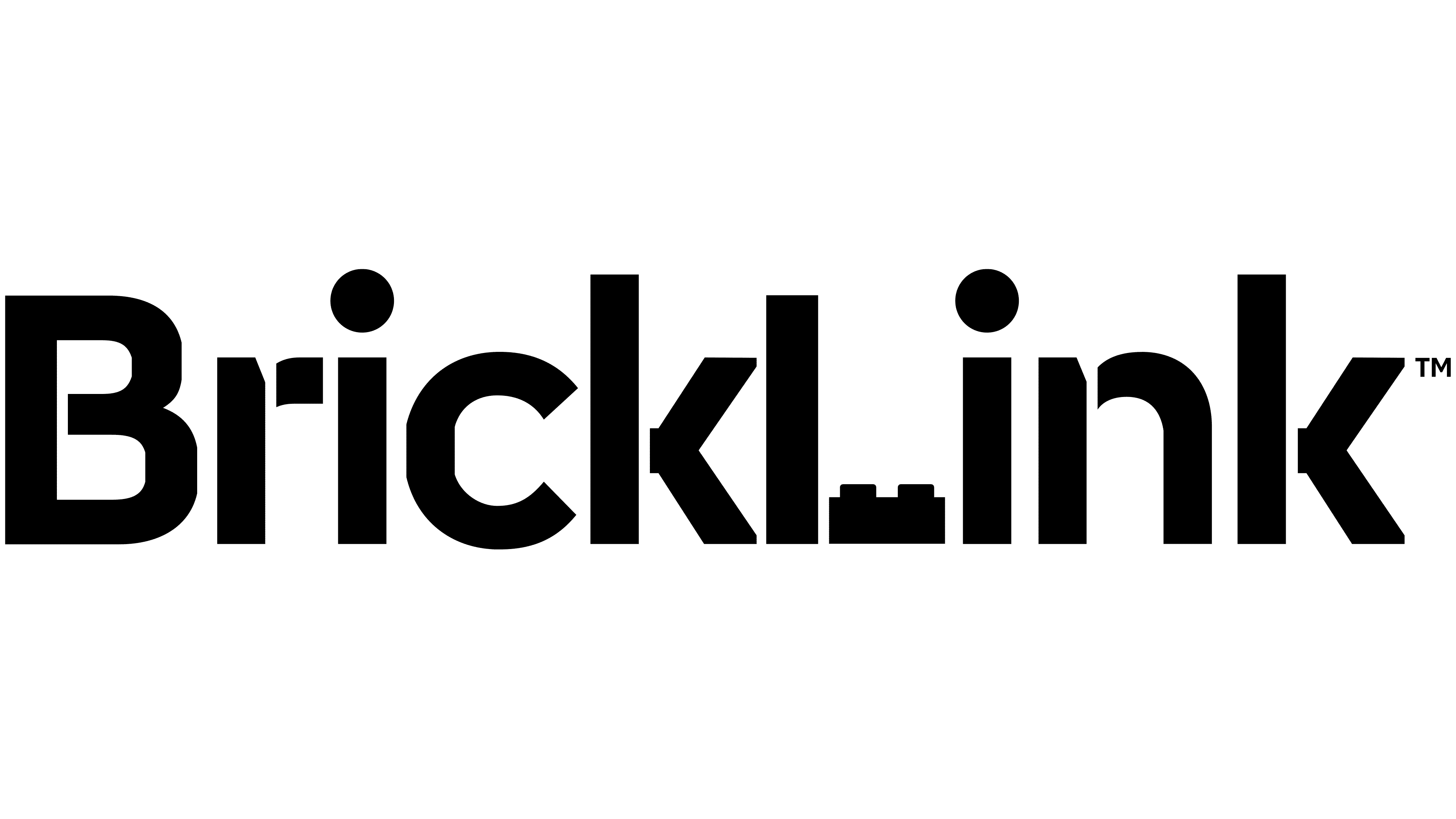
Early work by BrickLink founder Dan Jezek laid the groundwork for the marketplace’s June 2026 identity update. The platform for buying and selling LEGO parts, minifigures, and sets introduced a new logo and visual identities for its different sections. The team revisited Jezek’s ideas of connection, exchange, and collaborative creativity, building LEGO references into the wordmark.
In the new BrickLink lettering, uppercase “B” and “L” distinguish the two parts of the name. The letters have angular outlines and flat stroke endings, while the dots over the “i” letters remain round. The previous lowercase BrickLink wordmark had rounded terminals. To its left stood a yellow cube with a face, a thick black outline, and shaded sides that gave it dimension. The new logo centers on black lettering interrupted by narrow vertical gaps.
Two 1×2 LEGO plates form the base of the “L.” They carry forward the story of the white 1×12 brick in the original emblem, reinterpreting that long piece as part of a letter. The LEGO reference is now integrated into the name. It remains visible when the logo is printed in a single color.
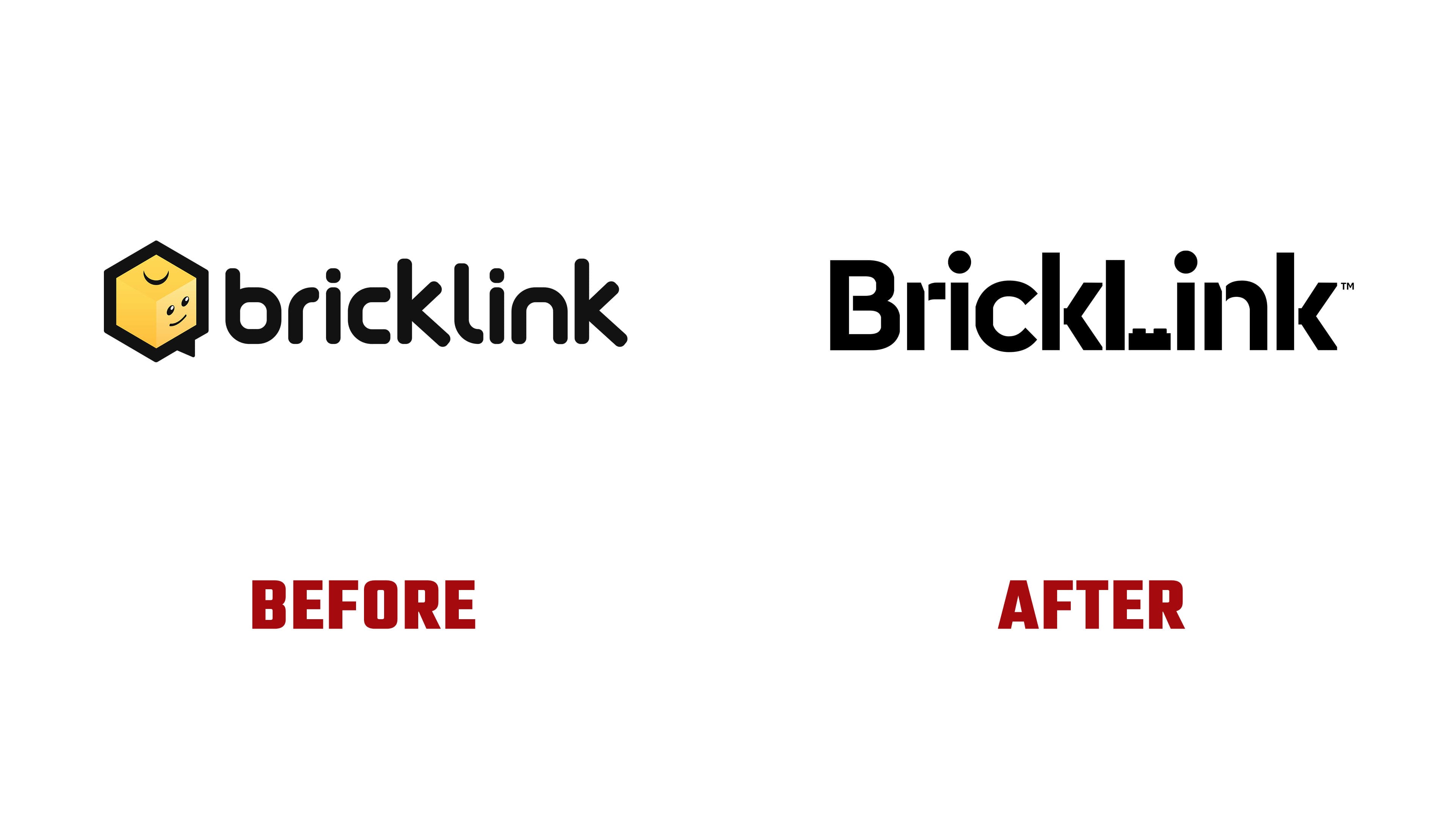
The BrickLink team associates the gaps between strokes with connections yet to be made among community members. The openings also recall the grid of an architect’s drafting paper and the precision required to build complex models. The segmented letters reflect the assembly process familiar to LEGO buyers, sellers, and designers.
The return to the early logo also revisits its symbolism. Jezek’s two parrots represented buyers and sellers, while the white brick between them stood for their shared love of building. Light blue referenced the sky and the platform’s potential to grow, while green conveyed the peaceful atmosphere of friendly gatherings. Over more than 25 years, BrickLink has built a community that still holds on to its founder’s ideas. After Jezek died in 2010, users rallied around the project he had created.
Light blue and green return in the new identity, along with one of the parrots. The bird now serves as a community mascot. It will appear across the site in different guises, continuing the buyer-seller interaction story introduced in the original emblem.
The update covers BrickLink’s four areas of activity: Marketplace, Studio, Designer Program, and Community. Platform head Steven Lee explained that BrickLink’s range of activities created the need for change. People visit to shop, design models, join the designer program, and connect with others. The identity is intended to help them find the sections they need, including on smaller screens. The team developed shared guidelines for all four areas while giving each its own colors and imagery.
The section emblems are constructed from LEGO 1×1 tile shapes. Marketplace’s green “M” combines buyers and sellers meeting with an open catalog. Community’s light blue “C” forms a heart and a smile when rotated. Designer Program’s yellow “D” becomes an open window, symbolizing creative possibilities. Studio’s multicolored “S” brings together the platform’s four areas. The Marketplace and Community emblems are new, while the Studio and Designer Program versions have been reworked.
The rollout began in June 2026 with the main navigation and social media channels. Subsequent phases will cover the remaining website pages. Event branding is being updated beginning with Brickworld Chicago, and new packaging is planned for 2028. The BrickLink Designer Program name is being shortened to Designer Program. Future releases will be identified by year and wave, such as “2028 Wave 1 Collection.”