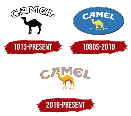
Camel logo visual identity is a combination of pastel colors, a camel figure, and matching lettering. The image of the animal was not chosen by chance. The picture is complemented by a basic color scheme in beige tones, which is in harmony with all emblem elements.
Camel: Brand overview
| Founded: | 1913 |
| Founder: | R. J. Reynolds |
| Headquarters: | United States |
| Website: | camel.com |
Camel is a popular tobacco manufacturer with a long history. The brand is under the control of 2 influential corporations at once. In Asian countries, it is represented by Japan Tobacco, and in the United States, it is managed by Reynold Tobacco. The main feature of the product is the composition. It consists of light (from Virginia) and dark tobacco varieties (from Turkey).
The international brand Camel has become a true legend in the tobacco industry. It has existed for more than 100 years, and during this period, the recipe has succumbed to some changes. The composition of the filler also changed. But, the types of tobacco remained unchanged. The manufacturer still uses a mixture consisting of Virginia and Turkish varieties.
Meaning and History
The visual component of the Camel identity is based on the use of a unique image of a camel and an inscription made in an unusual font. Each element of the concept complements each other favorably, resulting in a harmonious emblem. It is immediately recognizable in almost every corner of the world since the logo is completely different from the design of other tobacco brands.
What is Camel?
Camel is the name of one of the world’s most popular tobacco manufacturers. The company has two control centers (in Asia and America), and its products are sold worldwide. The main difference between tobacco products of this brand is the use of an American mixture. It consists of soft light tobacco and tart Oriental variety.
1913 – today
The company first introduced its products to the market in 1913. At that time, the brand was owned by a large American company (R.J. Reynolds Tobacco). The manufacturer of the first cigarettes then used a special mixture (American Blend). It consisted of two types of tobacco – light and tart Oriental. In 2008, the composition was slightly changed.
The packaging of tobacco products was made in the best traditions of strict laconic design. The packs depicted the main symbol of the brand – a one-humped camel, as well as an unusual brand name. The picture with the animal was not detailed. It was a black camel with pronounced contours. Above was the name Camel.
The inscription was in a thick, rounded typeface that was only relevant for a while. They were signs of thin black lines. Inside, there was a white background. The elements were perfectly combined with each other and created a harmonious emblem associated with a solid brand. The chosen color also emphasized the image of the tobacco manufacturer.
For the emblem’s design, only two colors were used: black and white. This is a classic color combination that demonstrates the elitism and special status of the company. The coloring also emphasizes stability and self-confidence, which the company has shown throughout the entire period of its existence.
1980s – 2019
The animal is in front of a large blue oval in this Camel logo. It evokes positive associations because it resembles an oasis – a welcome water source in the middle of a hot desert. The yellow silhouette of the camel is detailed with dark yellow outlines that outline the upper legs, ears, nose, eyes, and mouth. The light arc behind the animal symbolizes the sand hill.
The name of the cigarette brand forms a white arch above the animal. For the inscription, a set of glyphs with individual designs is used. The letters have an asymmetrical shape due to the uneven distribution of triangular serifs and due to the violation of standard proportions. The long projection at the top of the “A” resembles an upward arrow, a symbol of purpose. As for “C” and “E,” they look like a camel’s footprint in the sand.
2019 – today
The original logo was only changed in 2019. The company decided to carry out a complete rebranding. The changes affected all parts of the logo:
- font;
- images of a camel;
- colors.
The new Camel lettering was done in an unusual Coffin Nails typeface, inspired by handwriting. The image of a one-humped camel was still located under the brand name. The shape and contours of the animal have not changed much. However, the colors were drastically different. Instead of achromatic colors, calm and warm beige tones appeared on the emblem.
The chosen color symbolizes friendliness and comfort, which causes only pleasant associations. In combination with a stylized graphic element, it favorably emphasizes the company’s style. An advantageous addition is also a massive font with original curves. He demonstrates strength, confidence, and lightness.
The updated camel symbol also emphasizes the overall concept. Its contours have not changed much, but the picture has become more voluminous and “alive” due to the special coloring. Designers used several shades for decoration at once, making it possible to create a brighter and more vital figure. The new performance only emphasized that the company is developing and confidently moving towards success.
Font and Colors
The products are currently sold under a logo developed in 2019. This updated version is done in warm base colors combined with an expressive font. The letters look quite powerful and confident, which evokes associations with success. All of them are in capital format, but some of them have characteristic differences.
The letter A and L have elegant curves that make the emblem particularly stylish. The selected design emphasizes the company’s desire for development and constant updates. This applies to both visual identity and product quality. By updating its logo in 2019, the brand has again demonstrated how important it is to change everything periodically for the better.
A successful decision with the design was a clear confirmation of this. The classic black and white coloring have been replaced by several shades (beige, brown, light gray, and white). They are in perfect balance, thus symbolizing the balance in the tobacco blend. The updated color scheme also has an additional meaning.
It lies in pleasant associations with calmness, comfort, and friendliness. The goals were achieved because now the brand is recognized in almost every corner of the world. Many buyers first choose by appearance and then evaluate the quality. In the case of Camel, both criteria are in perfect harmony.
Camel color codes
| Xanthous | Hex color: | #efb530 |
|---|---|---|
| RGB: | 231 181 48 | |
| CMYK: | 0 24 80 6 | |
| Pantone: | PMS 1235 C |
| Ruddy Brown | Hex color: | #b3581b |
|---|---|---|
| RGB: | 179 88 27 | |
| CMYK: | 0 51 85 30 | |
| Pantone: | PMS 159 C |
| Dark Gray | Hex color: | #acadb0 |
|---|---|---|
| RGB: | 172 173 176 | |
| CMYK: | 2 2 0 31 | |
| Pantone: | PMS Cool Gray 5 C |
