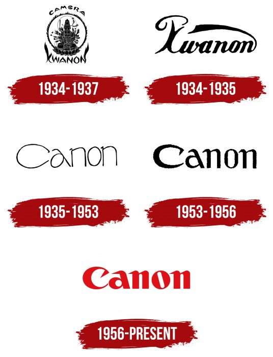
The Canon logo, a Japanese optics and electronics manufacturing company, is based on the concept of the goddess Kanon. A leading brand in its field, it uses a recognizable and succinct logo that requires no explanations or additional visual support.
Canon: Brand overview
| Founded: | 10 August 1937 |
| Founder: | Goro Yoshida, Saburo Uchida, Takeo Maeda |
| Headquarters: | Ōta, Tokyo, Japan |
| Website: | global.canon |
Meaning and History
The Canon logo has changed several times. Designers modified the font and color, retaining only the general concept.
What is Canon?
Canon is a Japanese multinational corporation headquartered in Tokyo, engaged in the production of lenses, cameras, scanners, semiconductors, medical equipment, printers, and manufacturing devices. It was founded in 1937 under the name Precision Optical Industry Co., which was changed ten years later.
1934 – 1937
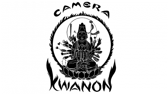
The company’s first logo contains many fine details. It depicts the multi-armed goddess Kwanon, believed to help people. She is sitting in a lotus position inside a burning black ring. Above is the word “CAMERA,” and below – is “KWANON.” The name of the mythological creature is written in fiery letters.
1934 – 1935
Artists retained the word “Kwanon,” removing all other elements. To make the logo attractive, a decorative handwritten font was used.
1935 – 1953
In 1935, the first Canon logo appeared. It was designed by a graphic designer who worked on brand advertising.
1953 – 1956
Typographers made the lines thicker and the font more confident. Now, the word stands out noticeably.
1956 – today
In 1956, the company introduced a red version of the emblem. It is based on the modified 1935 logo.
Canon: Interesting Facts
Canon is a big Japanese company that makes cameras, printers, and many other things. It started in 1937, and its name was inspired by a Buddhist figure, showing it wanted to be kind and recognized worldwide.
- How It Started: Canon began with a camera named “Kwanon,” the first of its kind in Japan, but it was just a starting point, not sold to people.
- Cool Cameras: In 1976, Canon made a big leap with the AE-1, which was so easy to use because it had a computer inside. This made it easier for anyone to take great photos.
- Printing Innovations: In 1985, they also made the first inkjet printer, which used a special way to put ink on paper, making printers better for everyone.
- Going Digital: Canon was one of the first to move from film cameras to digital ones, making taking and sharing photos easier.
- More Than Just Cameras: Besides cameras and printers, Canon also works on medical equipment, TV lenses, and even stuff for making computer chips.
- Supporting Photographers: Canon helps photojournalists and documentary photographers by sponsoring a major photography contest, showing that it cares about telling stories through pictures.
- All Over the World: Canon is a global company whose products can be found anywhere. It is known for being reliable and high-quality.
- Beyond Photography: They’re always coming up with new ideas, not just in photography but also in things like security cameras, medical imaging, and even artificial intelligence.
Since it started, Canon has grown a lot, always working on new ways to help us see and share our world.
Font and Colors
Canon is the foundation of the brand’s visual identity. This word was coined from the name of the goddess of mercy, Kwanon, who served as the basis for the modern brand concept. Designers opted for typographic design, avoiding hand-drawn elements.
Italian Gio Fuga developed the exclusive logo font. Small sharp serifs at the top of the letters, rounded shapes, and uneven line thickness characterize it. The skewed space between the letters creates the impression that the letter “O” is tilted to the left.
There are two color palette options: red-white-primary and black-white-secondary. They are used equally depending on the color of the contextual space. Red symbolizes determination and purpose, embodying Canon’s core values, so the designers chose it.
Canon color codes
| Safety Red | Hex color: | #bf1920 |
|---|---|---|
| RGB: | 191 25 32 | |
| CMYK: | 0 87 83 25 | |
| Pantone: | PMS 485 C |
