![]() Capri Sun Logo PNG
Capri Sun Logo PNG
The emblem exudes tenderness and dreaminess. The company focuses on a children’s audience through the Capri Sun logo. For the younger generation, the company produces only safe, purified drinks.
Meaning and History
![]()
Capri Sun’s story begins in Germany in 1969, when Rudolf Wild, founder of Zick-Zack Werk Rudolf Wild, a nutritional supplement company, introduced the Capri-Sonne orange drink. Wild saw the company’s main mission as promoting natural products and rejecting the use of chemicals. Therefore, the new drink had a useful composition, as reflected in the logo’s design.
What is Capri Sun?
This beverage brand is known for its unique packaging and variety of fruity flavors, and it is owned by different companies worldwide, including Kraft Heinz in North America. The distinctive blend of fruit juices and flavorings enables the brand to offer a wide range of products, including sports drinks, reduced-sugar beverages, and classic fruit drinks. A key feature is the variety of recipes tailored for global markets, from traditional fruit combinations to tropical mixes in convenient, portable packaging.
1978 – 1981
![]()
Capri-Sonne was successful, so production gradually spread to Switzerland and the United States. Rudolf’s son, Hans-Peter, joined the family business. Thanks to Hans, the company became the international corporation Rudolf Wild GmbH & Co., and the drink’s name in the foreign market was changed to Capri Sun. Under this name, he debuted in the US in 1978 and received his first logo.
The drink’s name on the emblem consists of two words, written with a hyphen: Capri and the sun. They create an association with relaxation, fun, and warmth. The sunny Italian resort of Capri has long been a holiday destination for celebrities and royalty. This is a real paradise for tourists. And the sturdy packaging keeps the drink safe to take with you on vacation.
The name Capri Sun in the emblem is written in soft, rounded letters, reminiscent of oranges and the sun. The white color of the inscription indicates the absence of synthetic compounds in the drink, and the orange shadow is another indication of the heavenly body and the sweet fruit.
Packaging and logo options for overseas audiences continued to be tested. And three years later, a new final version appeared, which lasted almost 20 years.
1981 – 2000
![]()
Since 1981, Capri Sun has been distributed throughout the United States, and it began shipping to Asia and Africa with a new word logo. On it, the brand name has an interesting style, in which the bottoms of the letters form an arc, as if it were set atop the sun. Below, on an airy, pale-yellow ribbon, an inscription about the drink’s naturalness reflects the company’s main idea and goal. The logo is set against a blue sky background. And the main inscription is white as a cloud. The overall concept of the emblem should convey a feeling of heaven, relaxation, cleanliness, and tranquility. In addition, blue and white in the logo indicate that pure spring water is used for production.
2000 – 2003
![]()
The logo becomes more minimalistic. The blue sky remains only in the stroke of the white letters of the name. The tape also disappears. Instead, an asymmetrically positioned inscription is added: “All NaturaL” in a delicate yellowish hue, a hint of sweetness, lemons, oranges, and the sun. The capital letters at the beginning and end of the word NaturaL further emphasize the naturalness of the first ingredient through the last.
2003 – 2014
![]()
The company launches multivitamin drinks and 100% apple juice. This is reflected in the logo. It loses its gentle tones. But there are more associations with the sky, the sun, and rich, bright tastes. The shadow of the letters turns sky blue, the stroke is blue, and the inscription about naturalness is set against a bright yellow ribbon. The logo evokes a holiday feeling, and the hot sun suggests ripe fruit and concentrated drinks.
2014 – 2018
![]()
In 2010, KKR became Hans-Peter’s partner, and in 2014, they sold part of the business, leaving Capri Sun production to themselves. In the same year, the drinks container was changed to have a transparent bottom. All this led to changes in the logo. It only has the brand name on it. It has slightly blurred blue-blue contours, giving the impression of a transparent floating cloud. The information about naturalness was removed, apparently due to consumer complaints about the high sugar content in drinks, the small amount of juice, and mold detected in the food.
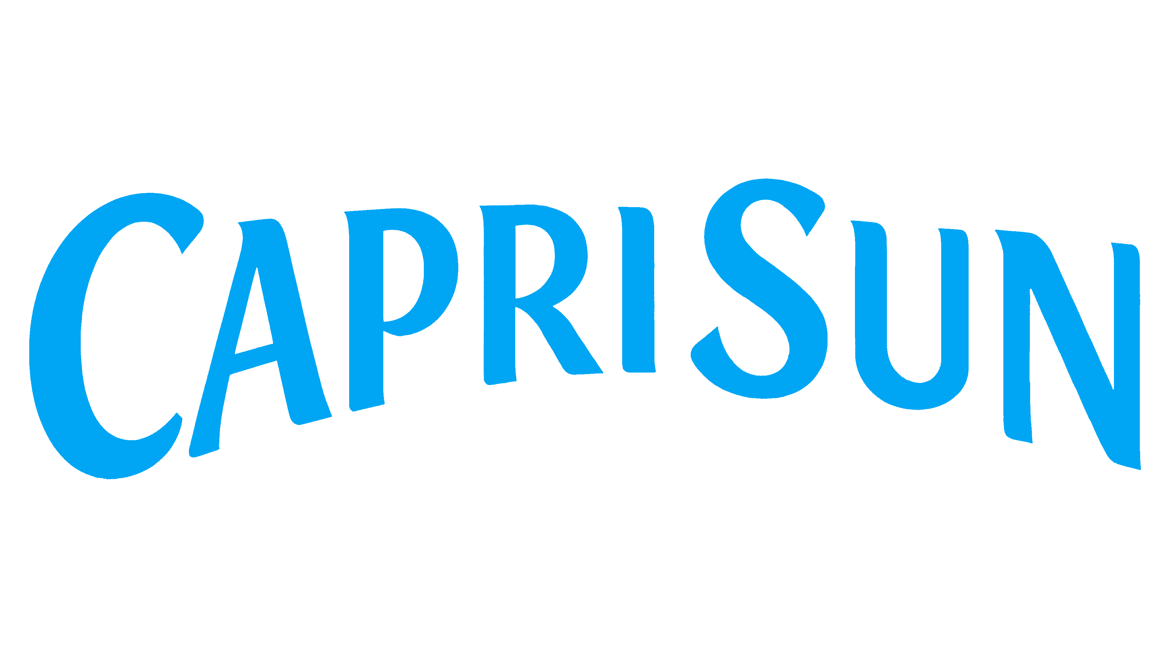
2018 – today
![]()
The brand sells 250 million packs annually, reaching heavenly heights. The new drinks logo features a soft blue background evoking the sky and seawater. The brand name is written on it in white, in flowing letters. In general, the logo creates a feeling of childhood. There is a slight association of flowers with the lakes of Switzerland.
Font and Colors
Despite the “sunny” name, the brand’s main colors are blue and white. This is the sky and clouds, but the sunlight, as planned, is inside the package. In addition, white conveys naturalness, and blue suggests a creative approach to drink-making, as evidenced by the wide range of flavors in Capri Sun. Cronos Pro Display Bold logo font.