


![]() Cartoon Network Logo PNG
Cartoon Network Logo PNG
The Cartoon Network logo is a prototype of a video cassette that holds various programs. Information about the children’s audience, a wide range of programs, and round-the-clock broadcasting is hidden in the shades of the emblem’s color palette.
Cartoon Network launched on October 1, 1992, after Ted Turner acquired Hanna-Barbera Productions and a large pre-1986 MGM cartoon library. The channel became part of Warner Bros. Entertainment. First, it relied on classic animation such as The Flintstones, Tom and Jerry, and Scooby-Doo. Its first broadcast was a Merrie Melodies short with Bugs Bunny, setting the channel’s early identity around archive cartoons.
In 1993, World Premiere Toons, later What a Cartoon!, began testing new ideas and helped launch Dexter’s Laboratory, Johnny Bravo, Cow and Chicken, and The Powerpuff Girls. In 1994, Space Ghost Coast to Coast became the channel’s first original series, mixing celebrity interviews with reused 1960s animation. Cartoon Network expanded internationally in 1996, reaching Australia, Europe, and Latin America.
In 1997, the Cartoon Cartoons block gave the channel a stronger identity in original programming. Toonami arrived in 2000 and helped introduce US viewers to anime such as Dragon Ball Z, Sailor Moon, and Mobile Suit Gundam Wing. In 2001, Adult Swim launched as a late-night block with shows such as Aqua Teen Hunger Force, The Venture Bros., and Robot Chicken.
Cartoon Network Studios was formed in 2004, giving the channel tighter control over original production. The 2010s brought experiments with live-action shows, the 2014 mini-series Over the Garden Wall, We Bare Bears in 2015, and the Cartoon Network app in 2016. Later originals included OK K.O.! Let’s Be Heroes, Infinity Train, and Mao Mao: Heroes of Pure Heart, while 2021 brought closer management ties between Warner Bros. Animation and Cartoon Network Studios.
Meaning and History
![]()
The project was launched in October 1992. At the same time, his first logo appeared, designed by a team of professionals: Hatmaker, Corey McPherson Nash, Tom Pomposello, Primal Screen, and DESIGNefx. For its black-and-white palette, it was named Checkerboard.
Initially, the programs only contained reruns of Warner Bros. animated films, MGM shows, and Hanna-Barbera cartoons. The core service had accumulated 8,500 hours of animated content by the time Cartoon Network opened.
The channel’s debut exclusive show was a cycle of cartoon anthologies called “The Moxy Show” (released in 1993). It was followed (after about 12 months) by Space Ghost Coast to Coast, Cartoon Network’s artistic reworking.
All this gave the TV project a successful start and made it recognizable. It was initially broadcast on only 233 cable networks but has benefited from package deals. As a result, by the end of 1994, the children’s television service was ranked fifth in popularity among American cable channels. He had three of his emblems.
What is Cartoon Network?
It is a brand of several dozen channels that broadcast in different languages. They are all owned by the same company and broadcast children’s programs produced by Cartoon Network Studios or purchased from other companies. The television network launched in the United States in 1992.
1991 – 1992
![]()
Although it lasted less than a year, the “Cartoon Network” logo remains an iconic element associated with the channel’s early days. It was designed in a black-and-white color scheme, which adds a sense of simplicity and allows viewers to focus on the design details. At that time, animation was primarily seen as entertainment for children, but the channel aimed to push the boundaries of this perception by offering a diverse range of content that could appeal to both kids and adults.
The main element of the emblem is a circle, within which the channel’s name, “Cartoon Network,” is placed. The circular shape of the logo symbolizes the television screen, hinting at the broadcasting format and the channel’s connection to traditional media. The circle in the design symbolizes completeness and infinity, making it an ideal representation of a channel that aims to create a continuous stream of animated content for its viewers.
The serif font used in the logo is characterized by its unique graphics, featuring rounded lines and smooth transitions. This font is reminiscent of classic cartoons, where letters often had a playful and unconventional style. The clear contours of the letters add visual strength and make the emblem recognizable even from a distance.
The black circle contrasts with the white letters, enhancing the logo’s visual impact. This contrast symbolizes the variety and opposites that the channel sought to offer its viewers, from classic cartoons to more modern and experimental programming.
1992 – 2004
![]()
The main designer of the first logo was Hatmaker Studio, which partnered with Corey McPherson Nash. Tom Pomposello, Primal Screen, and DESIGNefx contributed to the creative process. They have created a discreet and unique logo in which each letter of the channel name appears in a separate square, painted black or white. The characters are wide, uppercase, sans-serif, from the Eagle Bold font. Moreover, the colors alternate, so the logo was nicknamed Checkerboard. All 14 miniature blocks form a horizontal rectangle measuring 7 cm by 2 cm.
2004 – 2010
![]()
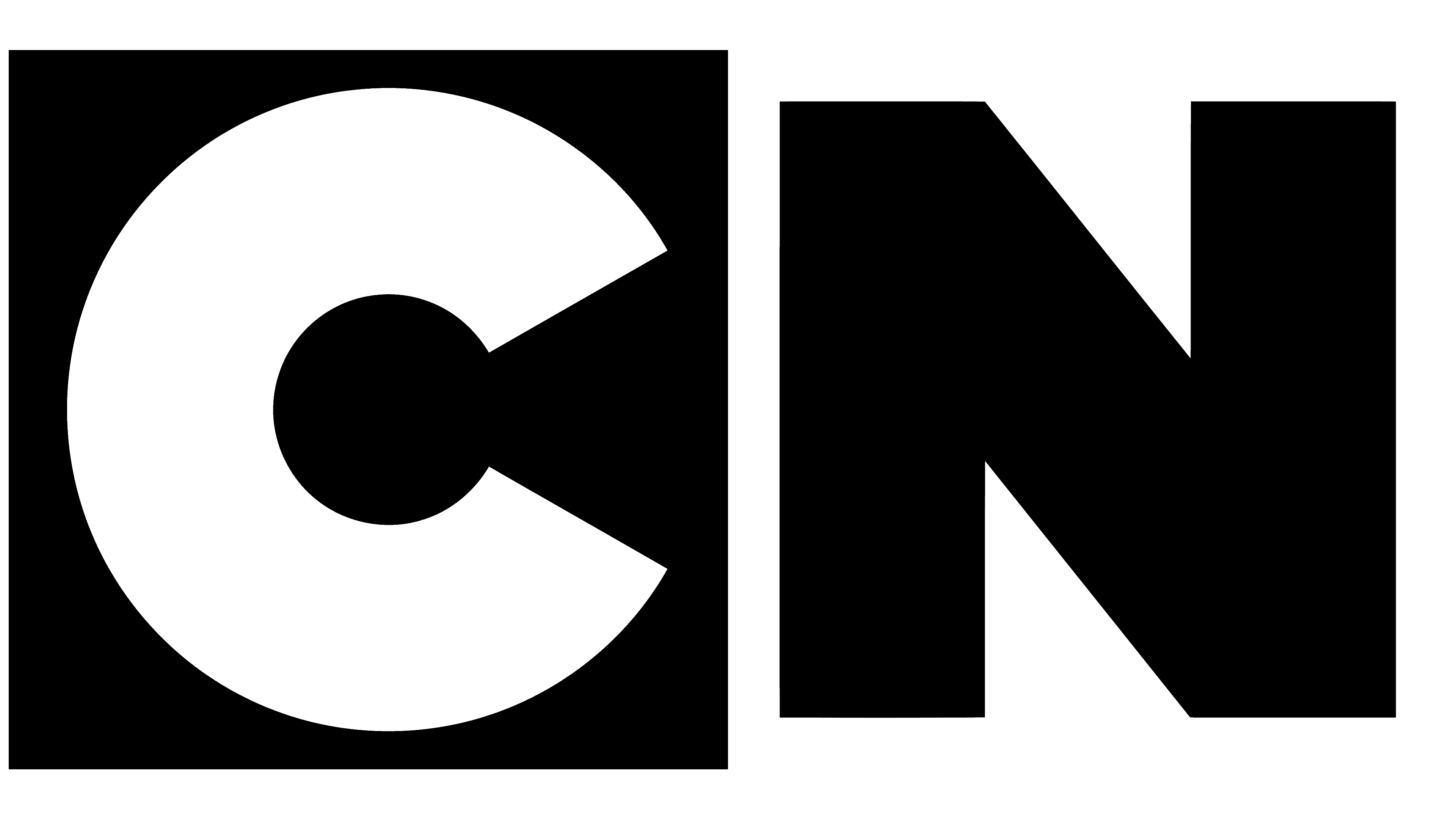
After the redesign, the number of squares and characters in the logo was reduced to two. They were the capital “C” and “N”, the first letters from Cartoon Network. However, in the animated version, they are not on squares but cubes. Sydney-based Australian agency Animal Logic and the network’s in-house team have taken over the creation of the new on-air face for the youth channel.
The Hanna-Barbera concept was used as a prototype. Geometric shapes are slightly layered on top of the other, so they stand at different heights: the second letter is lower than the first. With the help of gray side shadows, the cubes are turned sideways, making them look three-dimensional. “C” has a black background, and “N” has a white background. Below is the channel’s full name in small print.
2010 – today
![]()
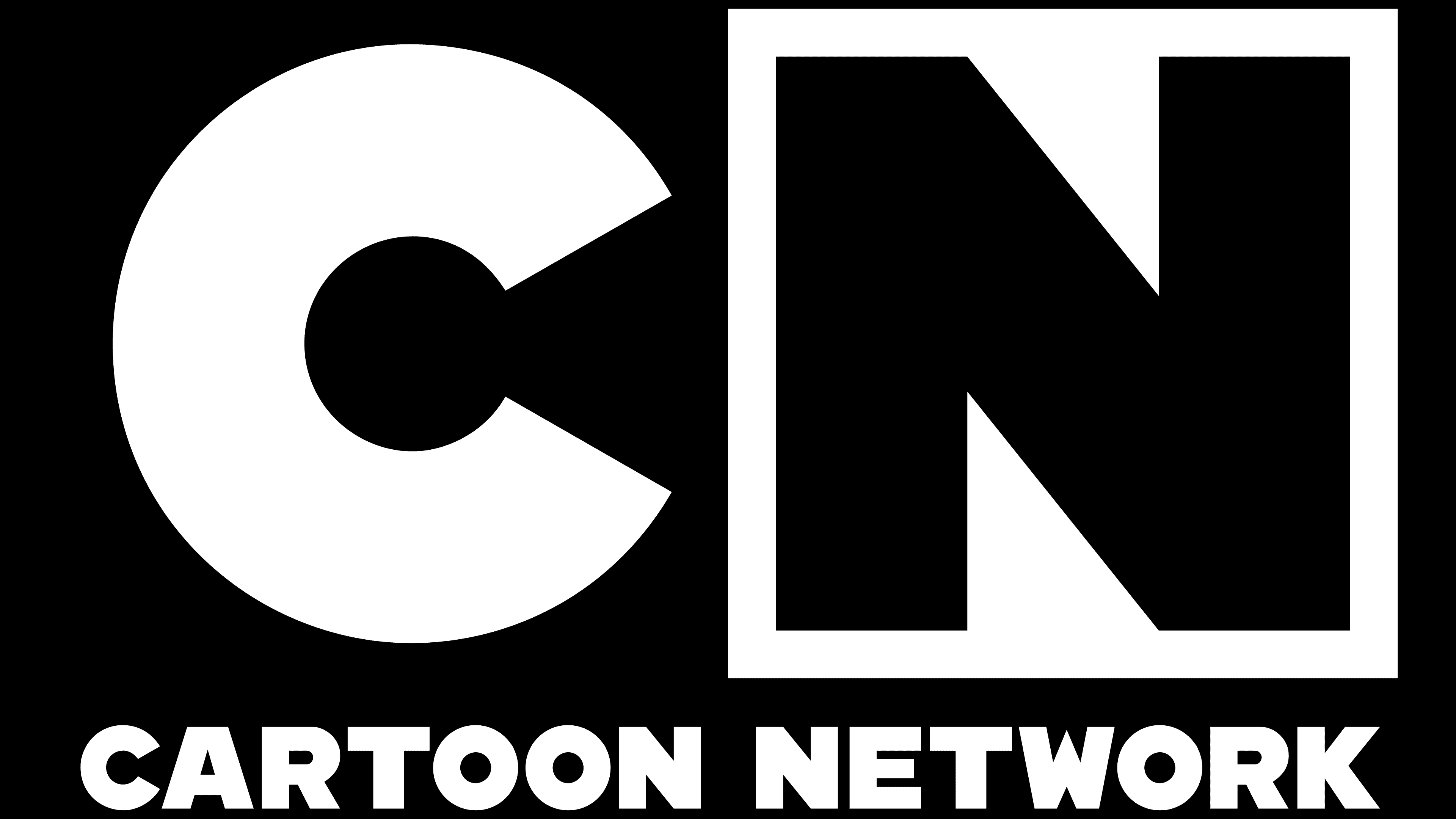
The new “Cartoon Network” logo is a modern, streamlined visual symbol that reflects the channel’s updated look following its 2010 rebranding. This logo evolved from the previous version, retaining key elements while adapting them to contemporary design standards.
The logo is rendered in a black-and-white color scheme, giving it a clean and versatile appearance. The black-and-white contrast evokes a sense of classicism and stability, which is important for a channel with a long history and significant influence in animation. These simple colors make the logo recognizable against any background and across various media formats. One of the most common backgrounds is blue.
The main elements of the logo are the letters “C” and “N,” set within square shapes. This design nods to the original “checkerboard” pattern used in the earliest Cartoon Network logos. However, these squares are flatter and more sharply defined in the new version, emphasizing a modern approach and the channel’s structured content.
The font for the letter “N” has been redesigned to be more geometric, with no sharp corners or extended lines, resulting in a stable, balanced look. This design choice symbolizes the reliability and consistency the company aims to convey to viewers through high-quality, diverse content.
Font and Colors
Earlier versions of the emblem used the Eagle Bold typeface, a smooth sans-serif with sharp edges on certain letters (“A,” “N,” “W”). In the current version, the font is different, modified by Gotham Black (officially named “CN Bold”).
The corporate palette is modest: it combines white and black, which earned it the nickname “Checkerboard”.
FAQ
What is the Cartoon Network font?
The font associated with the Cartoon Network brand is CN Bold. It is known as Lubalin Graph ITC Turner Bold in its metadata, which shows its typographic background.
CN Bold has a bold, blocky design that stands out and attracts attention, making it ideal for TV screens and print applications where clarity is key. The font has clean lines and geometric shapes, giving it a modern and playful look. It works well in logos and promotional materials, maintaining readability and consistency.
Why is the Cartoon Network logo black?
Black and white provide maximum contrast, making the logo clear and easy to read. This is important for a television network, where the logo must be recognizable even on small screens. These timeless colors stay in style, making the logo attractive for many years without requiring frequent design changes. The black-and-white scheme is versatile and works well on various backgrounds, be it an animation frame, a poster, or a product. The brand has maintained its black-and-white scheme throughout history, creating a strong and lasting connection with its audience. A simple black-and-white logo focuses on content rather than branding elements, allowing the animation and shows to take center stage.
What is the meaning of Cartoon Network?
This is an American cable channel owned by Warner Bros. Discovery. It is part of The Cartoon Network, Inc., which operates Boomerang, Cartoonito, Discovery Family, Adult Swim, and Toonami. The brand aims to entertain a wide audience, from young children to adults, with its varied programs.
The network is known for iconic children’s series such as The Powerpuff Girls, Dexter’s Laboratory, and Adventure Time. Adult Swim offers content for older audiences, including shows like Rick and Morty and Robot Chicken. Boomerang focuses on classic cartoons, while Cartoonito caters to preschoolers with educational and entertaining shows. The brand fosters creativity and provides a platform for new talent.
The channel extends beyond the United States; localized versions are available in many countries. This global reach ensures that its content resonates with diverse audiences worldwide. By tailoring its programming to local tastes and preferences, the network remains relevant and appealing across cultures, demonstrating its commitment to being a global entertainment brand.
When did the CN logo change?
The logo changed in 2010, marking a new era for the brand. The new logo was first shown during the network’s presentation on April 21, 2010, and was officially adopted on May 29, 2010. This launched a new corporate identity with a modern, simple design.
The logo change aimed to modernize the brand and appeal to a contemporary audience. The simple design and updated elements reflect a more current image. The new style, energetic theme, and creative intros energized the audience and attracted longtime fans and new viewers.
What does the Cartoon Network logo mean?
A logo is a distinctive symbol that reflects a brand’s personality and values. “CN” makes it easy for viewers to identify it.
The logo’s checkerboard pattern with black and white squares creates a high-contrast visual effect. The pattern creates a playful and dynamic environment suitable for channeling content for children and teenagers. The squares symbolize movement and energy, reflecting the lively nature of the brand’s programs. High contrast ensures the logo stands out across platforms, increasing brand recognition among viewers. The black-and-white color scheme enhances the logo’s attractiveness and effectiveness. The sharp contrast makes the logo easily readable and recognizable from a distance, which is important for a TV channel.
This thoughtful design ensures that the brand remains recognizable and resonates with children and teens.
What type of logo is Cartoon Network?
The logo combines an emblem and a wordmark, complemented by a checkerboard pattern and a bold black-and-white color scheme. Using the CN Bold font adds strength and clarity to the logo. This design conveys the brand’s personality, making it memorable and universal. Combining these elements results in a visually appealing logo that perfectly matches the brand’s focus on animated content for children and teenagers.