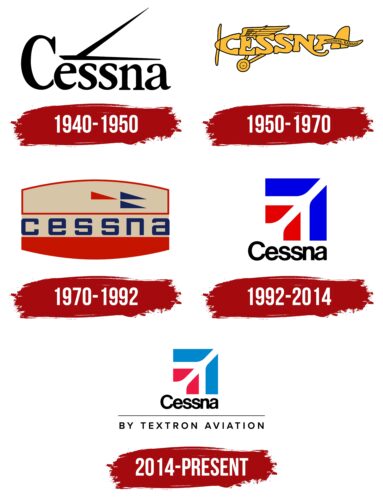
The Cessna logo fully conveys the company’s “heavenly” work. It is related to the theme of air transportation because, in the negative space of the striped square, the silhouette of an airplane taking off is visible. The palette consists of the colors of the American flag, which also refers to the country where the company is located.
Cessna: Brand overview
Cessna is an American airline founded in 1927 by Clyde Vernon Cessna, after whom it was named. It is a subsidiary of Textron Aviation. Cessna specializes in the production of jet aircraft and small aircraft. The number of employees exceeds 9.5 thousand people.
In 1911, Kansas farmer Clyde Vernon Cessna, inspired by the Wright brothers’ success, built his first airplane using wood and fabric. After several test flights and numerous crashes, he successfully flew his aircraft, marking the beginning of his aviation journey.
By 1916, Clyde had established his first aviation company, Cessna-Cooke Aeroplane Company, in Wichita, Kansas. The company focused on producing monoplanes, which was innovative at the time as biplanes were more common among other manufacturers.
Facing economic challenges in the aviation industry, Clyde was forced to shut down his company in 1924 and returned to farming. However, his passion for aviation never waned, and in 1926, he teamed up with Lloyd Stearman and Walter Beech to form the Travel Air Manufacturing Company.
In 1927, disagreements over Travel Air’s future direction led Clyde to leave and found his own aircraft company. He was determined to prove the superiority of monoplanes over biplanes, and his new enterprise began producing efficient and faster aircraft.
The Great Depression in the 1930s hit the aviation industry hard, and his company had to close its doors in 1932. However, in 1934, Clyde’s nephews, Dwane and Dwight Wallace, persuaded him to revive the business. They refocused on producing single-engine aircraft, which marked the company’s return to the aviation market.
During World War II, the company shifted its focus to military production, manufacturing the AT-17 Bobcat training aircraft for the U.S. Army Air Forces and components for Boeing B-29 Superfortress bombers. This period was crucial for financial stability and growth.
After the war, in 1946, the company transitioned back to civilian aircraft production by introducing the Model 120, a two-seat light aircraft that gained popularity among private pilots and flight schools.
The company expanded its product line significantly in the 1950s. 1956 the firm introduced the Model 172 Skyhawk, the best-selling aircraft in aviation history. Another notable model, the Model 180 Skywagon, launched in 1953, became popular among bush pilots.
In 1969, the company introduced the Citation, a business jet. This marked a new era, allowing it to compete in the burgeoning business aviation sector.
Throughout the 1970s, the company expanded its light aircraft and business jet range. The Citation 500, introduced in 1972, became a significant success, reinforcing the company’s reputation in the jet market.
In 1985, General Dynamics Corporation acquired the firm for $813 million, substantially changing management and operations—the acquisition aimed to strengthen General Dynamics Corporation’s position in the aviation industry.
However, in 1992, rising liability insurance costs forced the company to cease production of piston-engine aircraft. The focus shifted entirely to business jets and turboprop aircraft.
Following changes in liability legislation, the firm resumed production of piston-engine aircraft in 1996, starting with the Model 172 Skyhawk, once again catering to private pilots and flight schools.
In 2014, Textron acquired Beechcraft Corporation. This acquisition led to the formation of Textron Aviation, merging the original brands, Beechcraft and Hawker, under one umbrella, enhancing capabilities and market reach.
Meaning and History
What is Cessna?
This is one of the largest airlines in the United States, with almost a century of experience in creating jet aircraft. This company is known for producing small piston engine aircraft, business jets, and general-purpose aircraft. The company was founded by Clyde Vernon Cessna, who built his first airplane from wood and fabric. Over time, the company gained recognition for its innovative monoplane designs, which set it apart from the more common biplanes of its early years. Cessna’s product line includes popular models such as the Skyhawk, the best-selling aircraft in aviation history, and the Citation, a series of business jets.
1940 – 1950
The first version of the Cessna logo appeared in 1940. It was black and white, and the brand name used a classic bold serif typeface. All letters were black, and horizontal and diagonal lines above them should be associated with the aircraft’s target audience.
1950 – 1970
The first redesign introduced the most iconic Cessna logos to the public. Its basis was a helicopter made from the name of the company. For example, the first “C” is the nose of the helicopter, and the last “A” is the tail. The rest of the symbols were the main part. Propellers, landing gear, and wings, which were above the letters, were created additionally. The entire image was rendered in orange with black outlines. In addition to the main name on the helicopter’s tail, there is a ribbon with the inscription “Wichita, Kansas.”
1970 – 1992
The new logo was based on a swollen red rectangle inside which several elements were. The first is a wordmark with the brand name in classic bold sans-serif with lowercase blue letters. It was placed inside a light gray rectangle. On top, there was also another deflated rectangle of the same color. Inside, there were three triangles on the right side. One of them was red, and two were blue. They were supposed to be associated with aircraft.
1992 – 2014
The last current redesign was introduced in 1992. He allowed the Cessna logo to be updated to international standards. The changes were because Textron acquired the rights to this company. The basis of the logo was a square, divided by several lines into elements of blue and red. The lines themselves created the silhouette of the aircraft. Globally speaking, the logo looked extremely stylish. The blocks were blue toward the front of the aircraft, while the rear was red.
The company name was added at the bottom in black letters using a simple sans-serif typeface. Also, sometimes, an additional inscription, “Textron Aviation,” is added.
2014 – today
In 2014, Cessna ceased to be a company and became one of three separate brands manufactured by Textron Aviation. However, she decided not to abandon her usual identity, so the new logo is as similar to the old one as possible. Above is a square sign consisting of blue and red figures. The colored elements are separated by negative white space, which looks like a simplified and stylized airplane. It highlights Cessna’s status as one of the leaders in the aviation industry.
The brand name is written at the bottom and right-aligned concerning the square. It uses a bold sans-serif font with narrow letter spacing. Below the word is a long, thin horizontal line that separates the phrase “BY TEXTRON AVIATION.” The white color of the logo symbolizes high quality and perfection. Blue is associated with the sky, reflecting the connection between aviation and freedom of flight. Red represents energy and innovation, as Cessna was one of the first to use the latest technologies and materials in aircraft manufacturing.
Font and Colors
Verbal inscriptions, as a rule, were performed using the classic bold sans-serif type. It is easy to read and looks attractive and confident in the eyes of the target audience.
The company uses a red, blue, and white color palette. Thanks to the combination of these colors, a logo associated with the company’s activities was possible. In contrast, the name Cessna is presented in black, indicating the strength and ambition of the project.
