


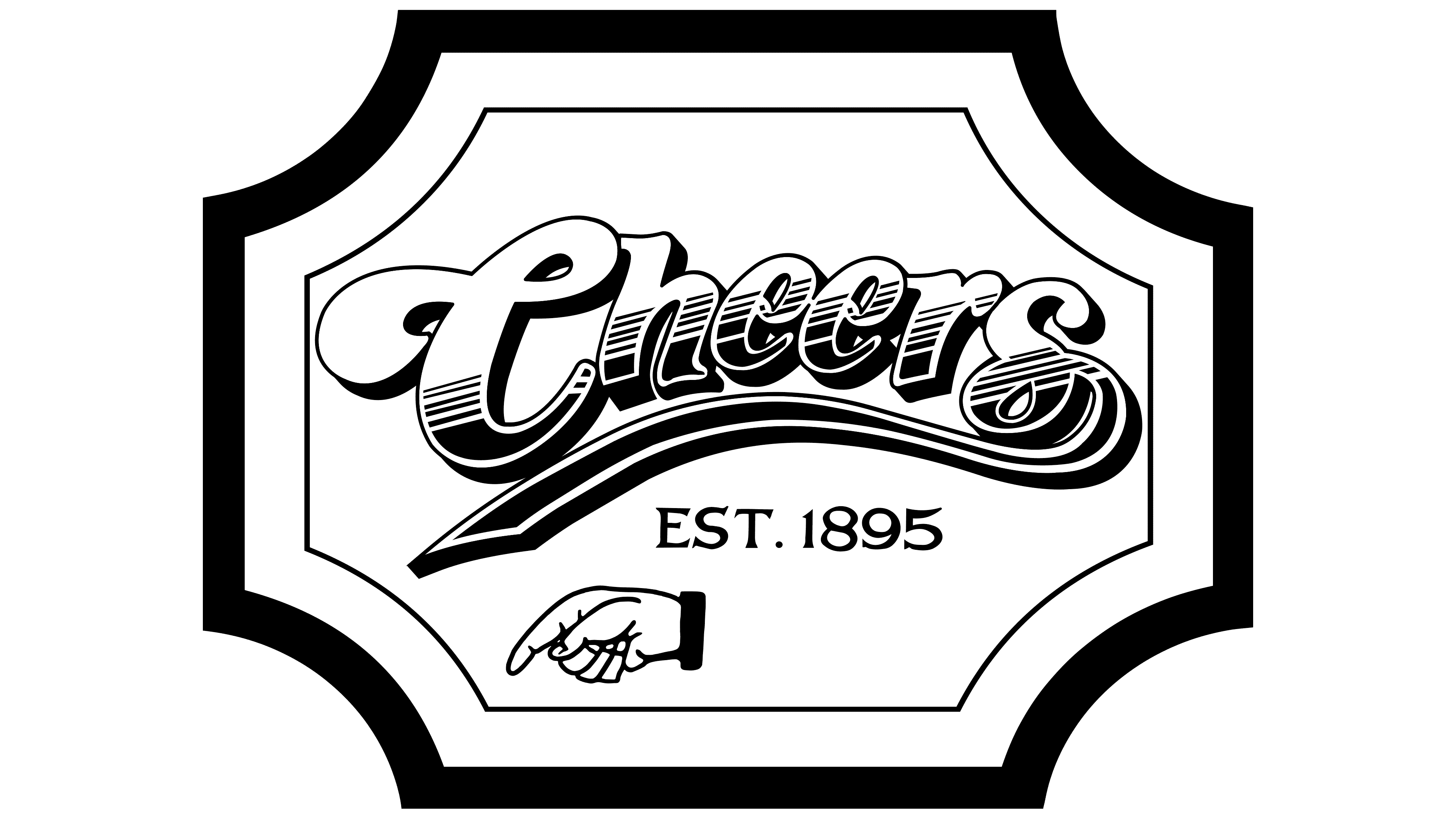
![]() Cheers Logo PNG
Cheers Logo PNG
Designers have chosen a Cheers logo with bold lettering for the American TV series, each letter of which is lined at the bottom with numerous small strokes, transitioning into a solid brown color. The font is unique, without analogs. The first and last characters have elongated tails with a double twist, indicating the complexity of life’s twists and turns.
Meaning and History
![]()
The original idea was to create an American version of the British sitcom Fawlty Towers, set in a hotel. That was the ambiance in which the action was supposed to take place. However, the creators came up with the idea of a tavern: they modernized it, turning it into a bar where people with various stories constantly gather. This seemed much more promising to them. As a result, the events in the series were moved to a Boston bar called Cheers. The simple slang word, spoken as a good wish before drinking, after a conversation, or as a farewell, fits perfectly into the visual identity of the staged show.
Instead of a woman, as originally planned, the authors used a male character named Sam. Various people with different life situations flock to his establishment. They gather to relax from problems, share experiences, drink, and chat. In this way, the series stretched for 11 seasons. Luckily, the theme is truly inexhaustible. The show’s idea is excellently reflected in the logo, which not only beautifully illustrates the content but also serves as an individual imprint. The overall style of the Cheers logo has always remained the same.
What is Cheers?
Cheers is an American comedy television series about the patrons of a bar who meet, drink, relax, joke, complain, and share their lives with one another. It aired from 1982 to 1993, spanning 11 seasons. A total of 275 half-hour episodes were produced. Charles/Burrows Productions and Paramount Network Television were responsible for filming, and the show aired on NBC. The working group was led by Glen, Les Charles, and James Burrows.
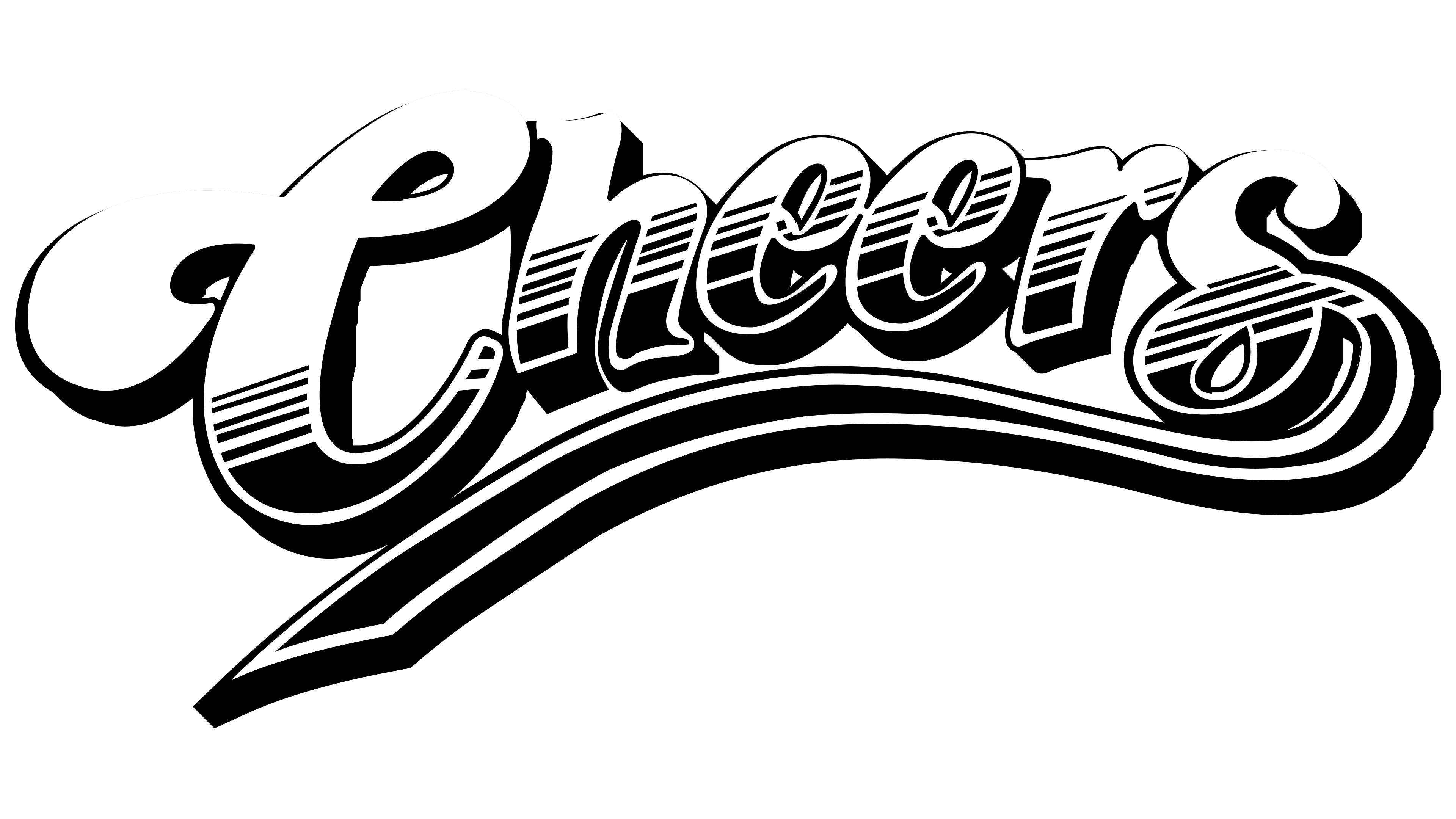
The sitcom has only one emblem, a text-based one. At the same time, it is also graphical, as the designers created a font specifically for it, drawing it to match the style of the comedy series. The initial letter “C” is reminiscent of humor and laughter, as it looks like an open mouth from the side. Overall, due to the elongated and twisted element, the letter barely resembles an alphabetical character; it is more akin to the infinity symbol’s curl.
The glyphs following it lean to the right, giving the impression that they rest on the “s,” which does not have this inclination. However, it has a long tail that tapers into a solid underline. A wide, sinuous ribbon stretches to the left under the entire inscription and sharply wraps around the “C.” Precise alignment is absent. Nonetheless, the letters do not yield to it; they are also large and massive. All of them are lowercase, except for the first one. Shadows in black are added below and to the right of the characters, giving them weight and volume.
The logo and name for the sitcom were developed by a Los Angeles studio consisting of three people: Carol Johnsen, Bruce Bryant, and Jim Castle. Their design served as the basis for the sitcom’s signature style and the fictional bar where the main events unfold. Later, a real bar in Boston adopted the same name, inspired by the creators of the comedy show. It has since become part of a commercial giant, branding an endless array of souvenir products. The emblem is available in two Letraset designs that reflect the 1970s society’s obsession with Art Nouveau and Victorian styles. Their distinguishing features include curls, wide and narrow ribbons, ornateness, and rich decorations.
Font and Colors
The calligraphic inscription features many smooth curls, soft lines, and rounded elements. It is essentially a symbiosis of two typefaces: Flamenco Inline and Candice. They accurately convey the fascination with richly decorated styles prevalent in the 1970s, such as Victorian and Art Nouveau.
The developers combined the extravagant capital “C” with lowercase bold letters, complementing the picturesque emblem with an arc-shaped stripe and a flowing “sporty” stroke. Such underlining was once characteristic of baseball team identities, which resonates well with the main character’s image, as Sam is a former player. Moreover, it was present in commercial logos from earlier eras.
Naturally, none of the characters belong to classical printed fonts, as they are hand-drawn. Such styling successfully imitates handwritten symbols that would have adorned an old-fashioned pub. The palette is not much more modest: as expected, it also reflects the Victorian style, evoking associations with gilding on moldings and curls.