The Chicco logo exudes joy. And it cannot be otherwise, because it represents the manufacturer of toys and clothes for children, so attractiveness is its strong point. But the emblem doesn’t just bring fun; it also attracts potential customers. Kindness, cordiality, warmth, happiness – that’s what gives this sign to people around.
Chicco: Brand overview
| Founded: | 1958 |
| Founder: | Artsana Group |
| Headquarters: | Como, Lombardy, Italy |
| Website: | chicco.com |
Meaning and History
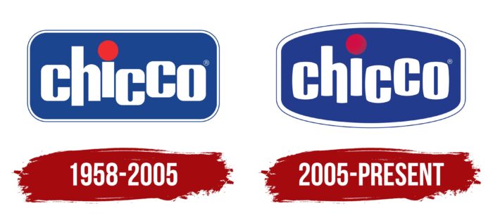
Despite the company’s more than 60-year history, only two versions of the logo were presented. What’s more, the only redesign made minimal styling changes. As a result, visual brand awareness is at the highest level among the target audience. It should include parents with children under the age of 12. The company continues active production, and therefore the popularity of Chicco goes far beyond Italy.
What is Chicco?
This is one of the most famous world brands engaged in producing children’s clothing.
1958 – 2005
The first version of the logo was introduced in 1958, immediately after the company was founded. It lasted a long 47 years, being one of the most recognizable emblems on the market. In the original version, almost all the elements that are the basis at the moment are presented.
The Chicco logo consists of a blue rectangle with rounded corners and blue and white outlines that give the image a three-dimensional feel. The central rectangle’s central part is the verbal inscription “Chicco.” This is a modern sans-serif typeface with floating letters. All characters were presented in lower case to evoke positive emotions in the target audience. The arrangement of letters also makes it possible to associate with children’s games and the age when the child does not yet strive to place things, doing this extremely chaotically. The standout element is the large red dot above the “i.” It can also be associated with an inverted exclamation mark. In addition, it is worth noting the peculiarity of writing two lines in the letter “h,” which differ in length.
The contrast of blue, white, and red colors only adds positive colors to the logo, making it stand out from the competition.
2005 – today
The only redesign to date has made minimal changes to the logo. Many buyers did not even immediately notice the difference. However, there are changes. For example, the shape of the emblem has become even more rounded. The white outline has become more visible and now contrasts against the background of the main color palette. The font of the brand name has remained unchanged. The only update involved the red dot, now a significant distance from the symbol’s vertical line.
Moreover, the gradient of red gave her elegance and strength. She looked more graceful against the blue background. The length of the lines in the “h” has also changed. Now the right line has become more noticeable.
The main focus of the update was on changing the color palette. The logo itself began to look more modern and interesting, although the tones are not as friendly as before.
Font and Colors
The company used a classic bold sans-serif font. Despite this, there are peculiarities in the writing of certain characters, for example, the letter “h” and playing with the length of the lines. Thanks to the minimum length, the verbal inscription itself is read easily and quickly remembered.
The white-blue-red color palette contrasts effectively and makes the Chicco logo elegant and friendly. The company tried to make the logo as casual as possible.
Chicco color codes
| Marian Blue | Hex color: | #223b8c |
|---|---|---|
| RGB: | 34 59 140 | |
| CMYK: | 76 58 0 45 | |
| Pantone: | PMS 287 C |
| Spanish Carmine | Hex color: | #ce1044 |
|---|---|---|
| RGB: | 206 16 68 | |
| CMYK: | 0 92 67 19 | |
| Pantone: | PMS 192 C |
