The logo of China Airlines, Taiwan’s largest airline, represents a blend of tradition and modernity, reflecting both the company’s style and the region it serves. It symbolizes the airline’s pursuit of excellence in global aviation while honoring Taiwan’s rich cultural heritage. The logo is a visual ambassador for Taiwanese culture internationally, reinforcing China Airlines’ identity as a bridge between East and West. The design resonates with the values of hospitality and progress, embodying the airline’s role in promoting Taiwan’s dynamic economy and beautiful scenery worldwide.
China Airlines: Brand overview
China Airlines, Taiwan’s national airline, is a state-owned entity headquartered in Taipei. It was established in 1959 and launched its operations in 1961, originally deploying a pair of PBY Amphibious aircraft. The airline provides comprehensive flight services across a broad network spanning Asia, North America, Europe, and Oceania, serving over 90 global destinations.
Taiwan’s Taoyuan International Airport and Kaohsiung International Airport are the two primary hubs from which China Airlines operates. As of 2022, its sizeable fleet exceeds 100 aircraft, comprising various models from both Airbus and Boeing. This includes A330s, A350s, and 747-400s.
The airline’s services extend beyond passenger flights, encompassing cargo and courier offerings. In 2021, China Airlines transported over 19 million passengers. The airline is investing significantly in modernizing its long-haul fleet, cabin interiors, and onboard amenities to stay competitive.
China Airlines is a member of the SkyTeam airline alliance, collaborating with notable partners like Delta, Air France, KLM, and Korean Air. The company’s workforce is substantial, with more than 13,000 employees distributed globally. Its reported revenues for the year 2021 were approximately US$5.2 billion.
Despite the name “China Airlines,” the airline is not affiliated with any airlines from mainland China and does not operate flights to mainland Chinese destinations.
Meaning and History
What is China Airlines?
It is Taiwan’s national airline based in Taipei. It operates an extensive network of domestic and international flights connecting Taiwan to destinations in Asia, Europe, North America, and Oceania. Known for its high service standards, it offers various service classes, including economy, premium, business, and first class. The airline ensures a comfortable and enjoyable travel experience by offering modern aircraft, in-flight entertainment, and meals, supporting the country’s tourism and economic growth.
1959 – 1977
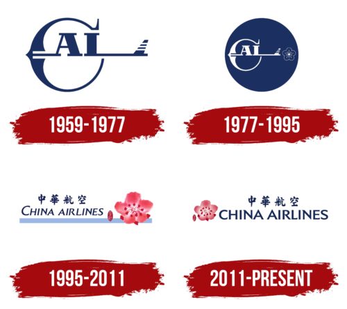
From 1959 to 1977, China Airlines introduced a logo that creatively reflected its mission to represent China in the airspace. The logo was designed to symbolically integrate elements of aviation with national identity.
The company name was transformed into a stylized image of an amphibious airplane, highlighting its adaptability and versatility. In this design, a large letter “C” was shaped to resemble a bird spreading its wings, giving the logo a sense of elevation and freedom. The elongated letter “L” elegantly transformed into the airplane’s tail, adding dynamism and recognition to the image.
The design included an element resembling a bow, a deliberate association conveying the speed and precision of the company’s flights and symbolizing good fortune and the achievement of goals. A stripe through the middle of the letters symbolized an arrow, and the curved lines of the letter “C” resembled a bowstring, visually enhancing the association with dynamism and determination.
The abbreviation “CAL,” which stands for China Airlines, was included in the logo to emphasize simplicity and elegance, as it is associated with the small airplanes operated by the company. This simplicity and elegance in the design highlighted the airline’s refinement and high level of service.
1977 – 1995
The company’s emblem was updated to give it a lighter and airier appearance. The emblem’s color was transformed to white, perfectly resonating with the image of clouds in the sky, emphasizing the lightness and soaring quality associated with aviation. This change in design is intended to reflect the purity and high standards the company strives to maintain.
The new emblem’s central element is an airplane, depicted as an inscription against a blue circle. This circle symbolizes the sun and the sky, adding significance and versatility to the logo. The blue color was chosen deliberately as it is associated with technical excellence and dominance in the air, emphasizing the company’s ambitions and drive to lead in the aviation industry.
A significant new feature in the design is the addition of a flower at the back of the airplane—a Taiwanese plum blossom or Japanese apricot, a pink symbol of Taiwan. This element lends the logo softness and beauty and serves an important symbolic function, highlighting the company’s Taiwanese identity. The flower is a frequent motif in Taiwanese painting and culture, representing a piece of national heritage and pride.
1995 – 2011
With the modernization of its fleet, as the carrier’s airplanes became more contemporary and spacious, the brand decided to rethink its logo to reflect its current stage of development better. In the new design, the logo moved away from the image of an amphibious airplane in favor of a softer and more aesthetically appealing symbol—the Prunus mume flower, the Japanese apricot, or Chinese plum. This flower, culturally connected to Asia, symbolizes the beauty of the region’s nature and adds sophistication and refinement to the logo.
The flower is depicted in red with a slight blur, evoking the image of petals floating on the wind. This visual element conveys a sense of lightness and airiness, perfectly aligning with the themes of spring and blooming. Such imagery enhances the company’s perception of being youthful and dynamic, ready to offer its passengers unforgettable journeys.
The central design element—a lilac stripe connecting the image with the company’s name—creates a sense of motion. This line symbolizes acceleration before takeoff, emphasizing the airline’s dynamism and commitment to continuous development and progress. It adds a modern touch to the design and highlights the company’s technological excellence.
The characters and inscription in dark blue font contrast with the lighter background, adding visual appeal. The dark blue color of the font was chosen deliberately—it is associated with experience, professionalism, and reliability, which are crucial for an airline aiming to emphasize its competence and earn the trust of its customers.
2011 – today
In the latest version of the logo, the plum blossom on the left side is rendered with exquisite detail, making its depiction strikingly lifelike. The detailed rendering of the petals creates an impression that one can almost smell its pleasant fragrance when leaning closer to the image. This design element evokes purity, freshness, and youth associations, contributing to a positive brand perception.
The theme of naturalness and freshness captured in the logo continues into the interior of the company’s aircraft. The new cabin, clean air, and soft color palette emphasize the carrier’s commitment to creating an ideal onboard environment. Passengers can expect comfort during the flight and an enjoyable atmosphere that encourages relaxation and enjoyment of the journey.
Visual changes have affected the company name inscription. A more confident and stable presentation has replaced the previously used slant. The text now lies horizontally, symbolizing reliability and stability. Glyphs extended at the ends further enhance this impression, creating a sense of a strong and dependable company presence in the market.


