The unique taste and unparalleled quality of vermouth are embodied in Cinzano’s bright and fresh logo. The original color composition, typographic graphics, and heraldic motifs reflect Italian pride and commitment to tradition in a modern interpretation.
Cinzano: Brand overview
| Founded: | 1757 |
| Founder: | Gruppo Campari |
| Headquarters: | Italy |
| Website: | camparigroup.com |
Meaning and History
The Cinzano logo is bright and fresh. Its silvery inscription beautifully contrasts the geometry of the red and blue background. The printed letters and “Z” stand out against the rest, making the Cinzano logo very recognizable. Silver is also used for the rounded rectangular frame of the logo.
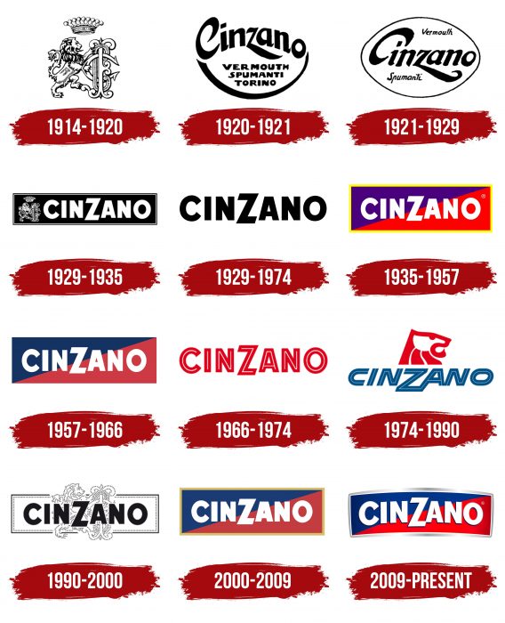
The color palette of the Cinzano logo has not undergone significant changes throughout the brand’s history, unlike its symbol. For a considerable period, Cinzano logos were distinguished by heraldic motifs. In 1929, its symbol became the head of a lion. First, the lion looked right, then left, and then it was redesigned and stylized several times.
The current Cinzano logo represents tradition with a modern twist and Italian pride, which characterizes the brand.
What is Cinzano?
Cinzano is a vermouth produced in Italy using a secret recipe with more than 30 ingredients. It’s known that its initial composition included beneficial and aromatic herbs such as yarrow, thyme, and marjoram. The brand’s history dates back to 1757, when the first version of the drink based on Alpine plants was introduced. Cinzano now offers various types of vermouth, including red, pink, and white. Gruppo Campari owns the brand.
1914 – 1920
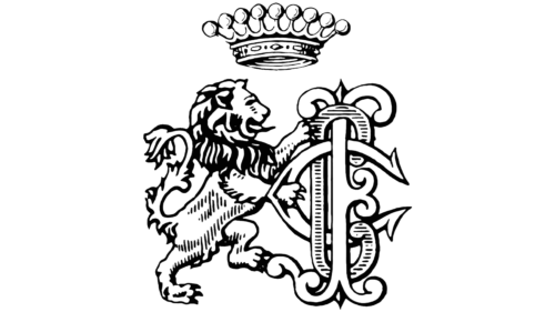
The history of Cinzano dates back to 1757, when two brothers created a new secret recipe for vermouth. However, the trademark associated with this invention was only registered in 1914. The logo contained a black-and-white image of a lion. The animal looked like a classic heraldic symbol: it stood on its hind legs with a curved tail and a protruding tongue. Its fur was shaggy, especially on the tail, and atop its head sat a massive crown adorned with nine balls. The lion held a stylized monogram of the letters “FCC,” which should be deciphered as “Francesco Cinzano e Co.” Francesco was a descendant of one of the brothers who created the unique vermouth recipe.
1920 – 1921
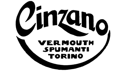
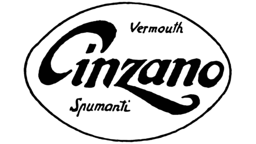
During the Art Nouveau bloom of the 1920s, the sparkling wine manufacturer introduced several new labels. However, they did not replace the traditional design but were used alongside it for special occasions. Among them was an elegant logo with the embossed inscription “Cinzano,” under which was a column of words “VERMOUTH,” “SPUMANTI,” and “TORINO.” The lower lines, centered, were outlined by a wide arc. The brand name consisted of disproportionate letters with sharp curls (e.g., “C”) and excessively long elements (e.g., “z”). Italian graphic designer Antonio Boggeri designed some of the 1920s labels.
1921 – 1929
In another case, the word “Cinzano” was placed in the middle. It was aligned horizontally, but a pronounced right tilt created dynamism. The letters had short, sharp serifs. The elongated lower “z” was preserved, and its end was bent in the form of a hook. The raised “C” reminded of a halo shifted to one side or an open mouth ready to swallow “i.” The top right corner of the logo featured the small italic word “Vermouth,” and “Spumanti” was located in the lower left corner. The base for the black inscriptions was a white oval with a black outline.
1929 – 1935
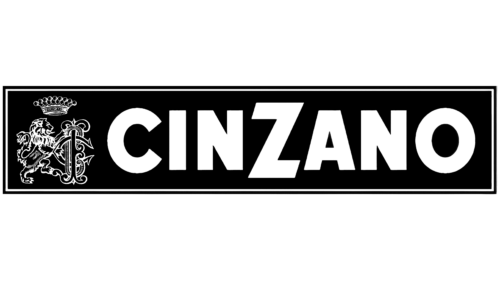
In 1929, a black rectangular logo was created. Almost the entire space inside was occupied by the white word “CINZANO,” written in uppercase and bold sans-serif letters. The font resembled a modified Bunya Black by Aring Typeface AB. The letter “Z” was most notable- for its size and original design. The designers trimmed its ends at an angle that did not match the slope of the central diagonal. To the left of the alcohol brand’s name was a black-and-white lion with the same monogram as on the emblem from 1914. This heraldic motif has always been present on Cinzano labels.
1935 – 1957
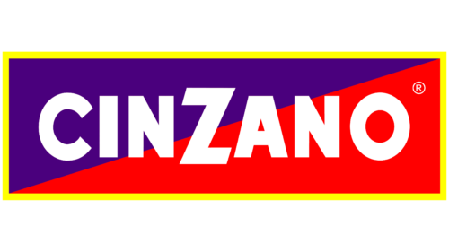
In 1935, the rectangle became taller and much more colorful, as it was formed from two triangles placed together: bright violet and red. The frame, which previously consisted of black stripes, was repainted in yellow. The black-and-white lion supporting the monogram disappeared altogether. This allowed for enlarging the inscription, centering it, and adding a registered trademark sign in the top right corner.
1957 – 1966
The designers removed the yellow outline and changed the color scheme. Bright violet turned into dark blue, red into burgundy, and their shades became pale and unsaturated. It is also known that the lion was used on the Cinzano label in the 1950s and faced left, but it is not represented in this version of the logo.
1966 – 1974
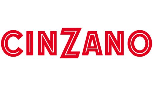
The multicolored rectangular base disappeared – only the inscription remained. After the update, it was predominantly bright red, with white used sparingly – in the form of narrow stripes drawn inside each letter. Thanks to this design, the logo resembled a neon sign.
1974 – 1990
The 1974 emblem was the work of Landor Associates. The company paid attention to the heraldic lion, making it large and stylized. But the designers moved away from the classic: they removed all elements except the head and changed its shape beyond recognition. The animal fragment was depicted with swirling red stripes, the lower part of which resembled sun rays – a symbol of dawn, optimism, and hope.
Below was the blue word “CINZANO” with thin white lines inside the letters. The font became flatter, and the glyphs slanted to the right. At the same time, the designers moved the letter “Z” down so it wouldn’t protrude from the top, and they lengthened the left diagonal of the letter “A.” After all the changes, “Z,” “A,” and “N” were combined into one design. Quite large gaps were left between the other letters.
1990 – 2000
The developers returned the rectangular base to the logo but made it white and outlined it with a black frame, which was interrupted at the top and bottom – in the places where parts of the lion protruded. The heraldic animal and the monogram next to it were depicted as a pattern of dots. Similar dots ran around the entire perimeter of the rectangle from the inside. The drawing was partially obscured by the black inscription “CINZANO.” The word in the foreground traditionally consisted of bold sans-serif letters. The font was the same as on the emblem from 1929.
2000 – 2009
For several years, a colorful logo consisting of dark blue and burgundy triangles was used. They formed a rectangular base surrounded by a golden edge. Inside, as always, was the name of the vermouth. In this version, the word was white, and the font was traditional Cinzano.
2009 – today
The branding agency Lumen changed the logo design, turning the perfect rectangle into a twisted figure with four corners. The designers bent the base and slightly changed the inscription to match the new round shape of the logo. It turned out that the side letters were positioned slightly below the central ones, except for “Z,” which always protruded above the line. The golden frame was replaced with white and silver with a gradient. The glyphs now have black shadows on the left and below. Bright shades of red and blue are used instead of dark shades of red and blue. The darkening remained only at the edges, as they create visual volume.
Cinzano: Interesting Facts
Cinzano is a famous Italian drink that’s been around for a long time, and it’s a big deal in the world of drinks.
- How It Started: In 1757, two brothers who knew much about herbs started making this special red drink in Turin, Italy. People liked it because it tasted good.
- Royal Thumbs Up: In 1786, the king and Queen liked it so much that they made it their official drink, which made even more people want it.
- Different Kinds: Cinzano comes in a few types, like Rosso (that’s red), Bianco (white), and Extra Dry. They mix different herbs and spices to make each one taste just right.
- Around the World: After starting in Italy, Cinzano began to be sold in other countries, making Italian-style drinks famous everywhere.
- In Lots of Drinks: Cinzano is found in classic recipes like the Negroni, Americano, and Martini. It’s a key part of what makes those drinks special.
- Cool Ads: They had some creative ads in the past, with famous artists making posters that many people wanted to collect.
- Bicicletta Drink: There’s a drink named after Italian cyclists who liked to have a Cinzano with soda after racing. It was like a boost to help them get home.
- Who Owns It: Cinzano has been owned by different companies over the years. It’s part of Gruppo Campari but retains its classic taste and style.
- Eco-friendly: Lately, Cinzano has been trying to be better for the planet by using lighter bottles to reduce shipping pollution.
- Famous Everywhere: Cinzano isn’t just known for being a drink; it’s shown in movies, books, and songs, making it a symbol of fancy Italian style.
Cinzano has a long history, making it more than just a drink. It’s a part of cocktail culture and has a cool story that shows how a simple drink can become famous worldwide.
Font and Colors
The bold sans-serif font used for Cinzano’s brand name roughly resembles Phosphate RR Solid or DOCK11 Heavy. The vermouth manufacturer has adhered to this style since the late 1920s and has always emphasized the central letter “Z.” The traditional red-white-blue palette has been adapted to modern conditions. The light gradient emphasizes progress and Italian luxury.
Cinzano color codes
| Quick Silver | Hex color: | #a0a1a4 |
|---|---|---|
| RGB: | 167 30 49 | |
| CMYK: | 5 100 71 22 | |
| Pantone: | PMS 422 C |
| Air Force Blue | Hex color: | #003586 |
|---|---|---|
| RGB: | 0 53 134 | |
| CMYK: | 100 60 0 47 | |
| Pantone: | PMS 287 C |
| Neon Red | Hex color: | #ff000f |
|---|---|---|
| RGB: | 63 194 204 | |
| CMYK: | 60 0 23 0 | |
| Pantone: | PMS 172 C |
