![]() Citrix Logo PNG
Citrix Logo PNG
The Citrix logo is businesslike yet unconventional. It reflects the individuality that the software company engaged in virtualization products aspires to. Being essentially a pioneer in this field, it wants to exhibit its personality in everything, focusing on originality.
Meaning and History
![]()
At its inception, the company was named Citrus, reflecting its mission to create a comprehensive multilingual programming environment that would serve as its foundation. However, it was later renamed due to the lack of originality in the name: it was too common and found in various fields. An existing company with the same name protested, claiming trademark rights. As a result, the software developer was forced to adopt a new name.
The word “Citrix” is formed from two bases. The first is “Citrus” (the owners still did not completely abandon it, using it in a less recognizable format), and the second is “UNIX” (an operating system). The original version was also preserved because it perfectly aligned with the company’s concept: citrus fruits consist of many independent segments, forming a whole product in a single shell.
What is Citrix?
Citrix (more precisely Citrix Systems) is an American software giant with offices in California, North Carolina, Paris, London, and Sydney, and development centers in the United Kingdom, Greece, Japan, India, and Australia, all managed from the head office in Fort Lauderdale, Florida. The company specializes in virtualizing workspaces, desktops, and cloud technologies, and in remote collaboration solutions, offering corresponding programs and applications. It was founded in 1989 by Ed Iacobucci, one of the pioneers of virtualization.
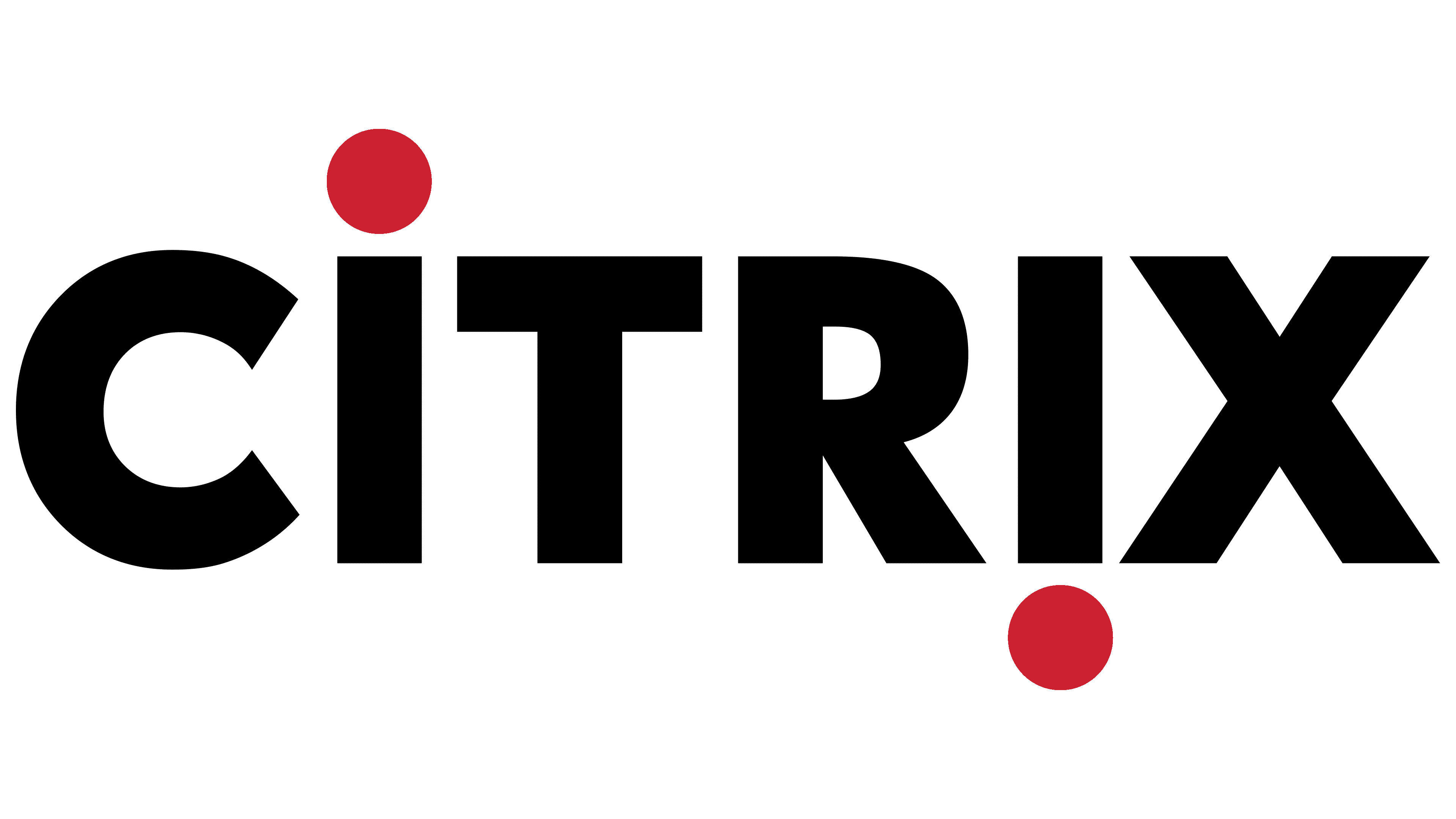
1989 – 2020
![]()
The logo included the name set in bold uppercase font. The exception was the lowercase “i”: to better express the software developer’s ideology, it was supplemented with classic dots. To illustrate the concept of a virtualization revolution, the letters were placed mirror-wise: the first glyph occupied its usual position, while the second was inverted. The upper dot moved down and extended beyond the word’s boundary. At the same time, all symbols were strict, even geometric, and chopped.
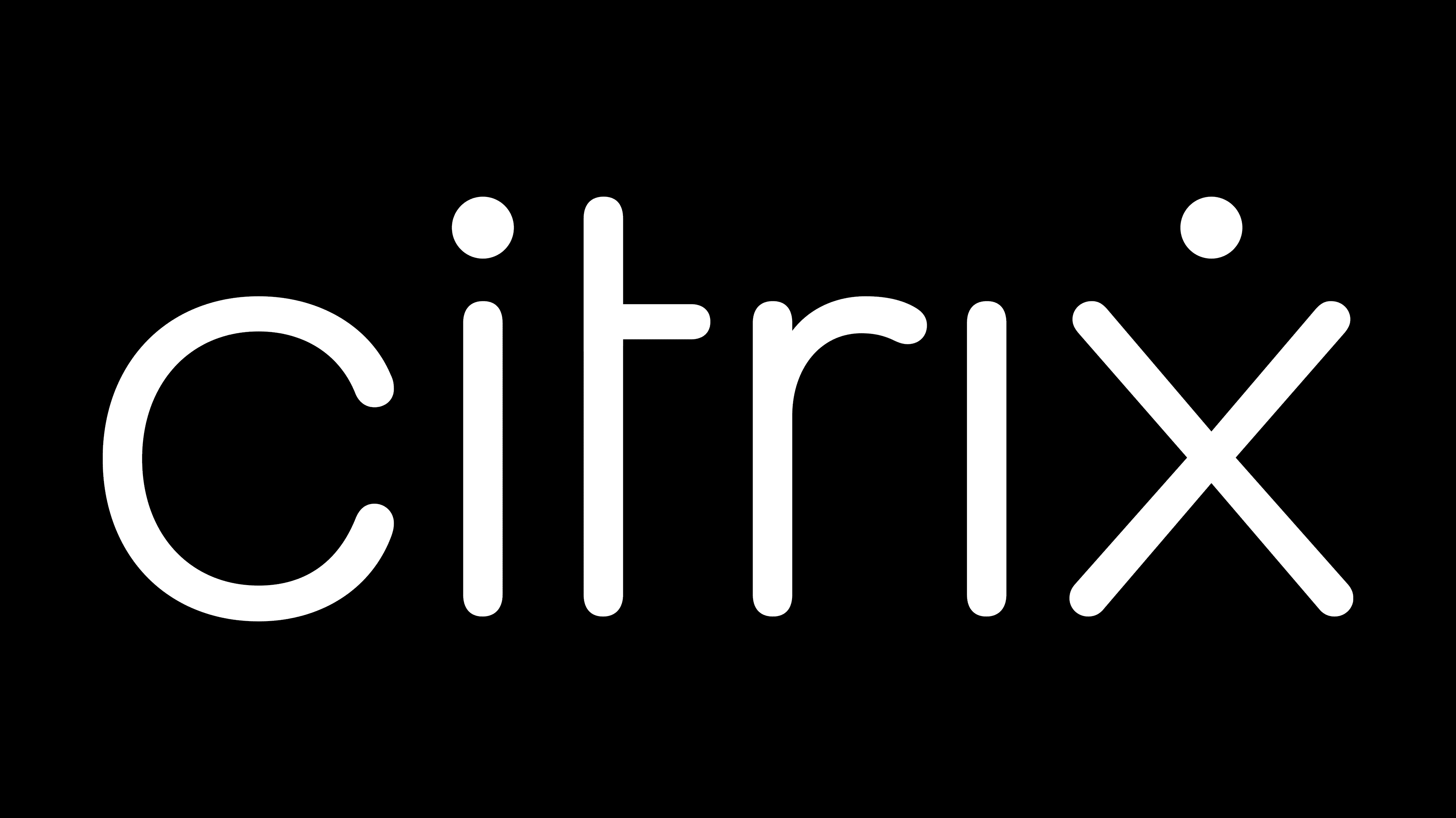
2020 – today
![]()
After modernization, the Citrix logo became softer and lighter. To achieve this, designers reduced the line thickness, converted the letters to lowercase, elongated them upward, and rounded the ends. The dots on the “i” convey the informal atmosphere: the first glyph’s dot is standard and in its proper place, while the second is moved to the neighboring “x.” As a result, the last symbol in the word looks like a simplified human figure with widely spread legs and raised arms. The dot, in this case, appears as a head. The other letters are even and thin, made in the form of vertically standing sticks, except for the semi-circular “c.” The left part of the crossbar is removed from the “t,” and the “r” is shaped like a cane.
Font and Colors
The inscription style in the Citrix emblem is a brand-specific hardware style. All letters are thin, smooth, vertical, and lowercase. The early name version was set in a bold font resembling Avenir Standard Black, while the later one used thin letters with rounded ends without serifs. The palette is predominantly dark on a light background, with the text usually set in black.