


 Claire’s Logo PNG
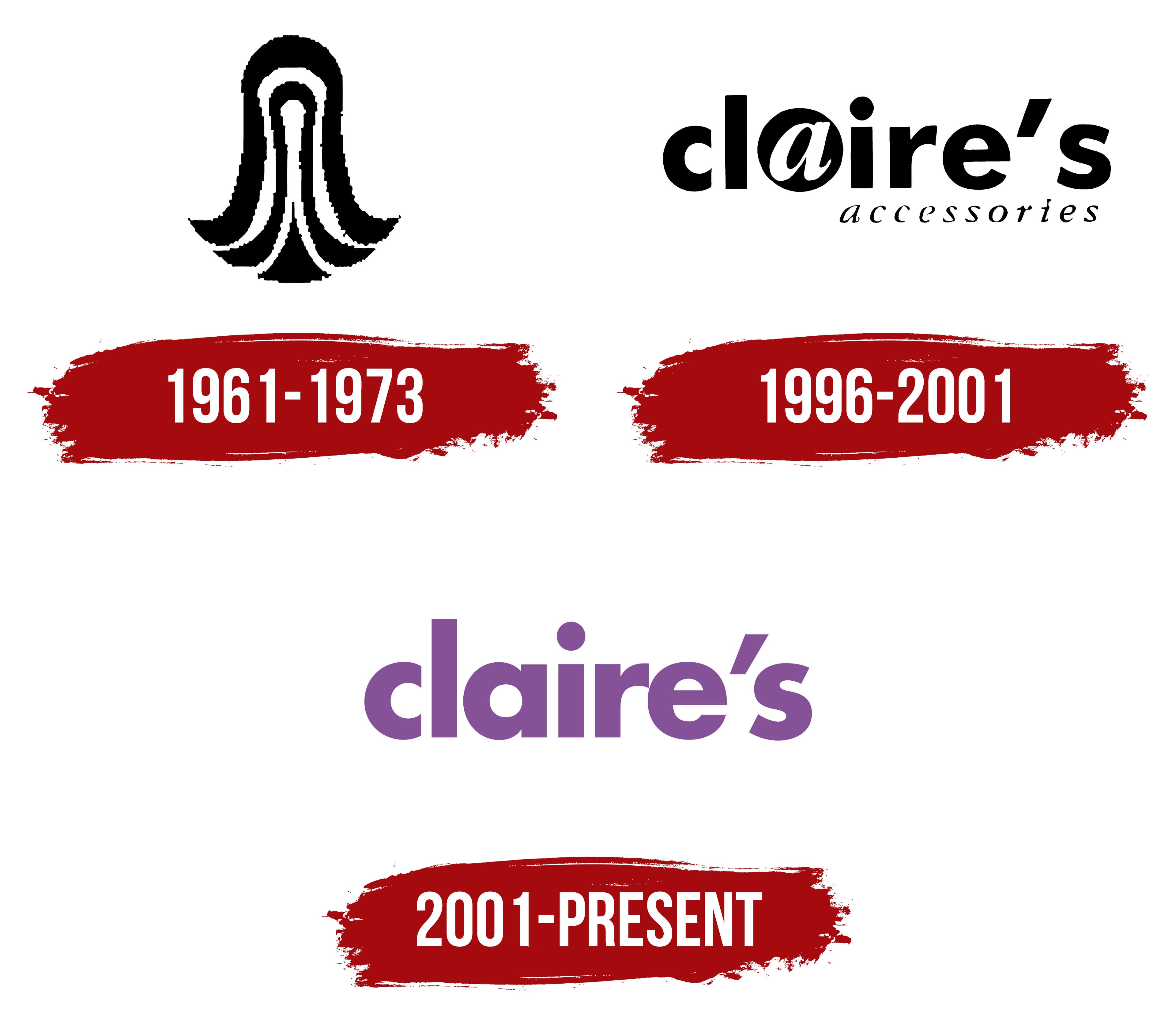
Claire’s logo is delicate and pleasing. The emblem highlights the youthful beauty of its customers. The brand is ready to bring bold fantasies to life and help create new, modern looks. The combination of the font and the emblem’s color scheme speaks of creative inspiration and dreaminess.
Claire’s began in 1961, when Rowland Schaefer founded Fashion Tress Industries in Chicago, Illinois. The company first made and sold wigs and artificial hair, a popular fashion category at the time. In 1973, Schaefer bought Claire’s Boutiques, a 25-store chain focused on jewelry and fashion accessories, and the business moved away from wigs.
In 1978, the company became Claire’s Stores, Inc. and started opening shops in malls across the United States. Its main customers were teenage girls and young women looking for affordable accessories. In the 1980s, the range expanded to include hair accessories, jewelry, and other fashion items, while ear piercing became an important service.
International expansion began in 1990 with stores in Japan. Claire’s strengthened its European presence by buying Bow Bangles in 1995 and Cleopatra’s Choice in 1998. In 1996, the company held an IPO on the New York Stock Exchange. In 2001, it introduced Icing by Claire’s for women aged 18 to 35, and in 2002 it opened its 2,500th store.
In 2005, Claire’s bought Afterthoughts from Federated Department Stores. Apollo Management acquired the company for $3.1 billion in 2007, taking it private. From 2008 to 2013, Claire’s expanded in Europe and Asia, launched e-commerce, and reached over 3,000 locations in 36 countries. Debt and retail changes led to restructuring in 2016 and Chapter 11 bankruptcy in 2018. From 2018 to 2022, Claire’s optimized stores, updated its products, strengthened online sales, and later added an AR mobile app for virtual try-on.
Meaning and History
What is Claire’s?
It is an international accessories and jewelry retailer primarily targeting young girls and teens, founded by Rowland Schaefer. The company operates an extensive network of stores throughout North America, Europe, and Asia and is headquartered in Hoffman Estates, Illinois. It is known for its wide range of affordable accessories, including earrings, necklaces, bracelets, hair accessories, and novelty items. The brand has become synonymous with ear piercing services, offering this popular service at many locations. The company’s assortment includes fashion items and licensed merchandise from popular entertainment franchises. It has become a premier destination for young consumers looking for fun, colorful, and inexpensive fashion accessories.
1961 – 1973

The company’s first emblem was designed as an intricate figure resembling long women’s hair. This choice was linked to the brand’s initial product line of wigs. The company operated under the name Fashion Tress Industries and was considered a leading manufacturer of fashionable hairpieces. The hair in the logo was styled into beautiful, smooth strands with curls at the ends. Light beading adorning the hairstyle indicated attention to detail and product quality.
1996 – 2001
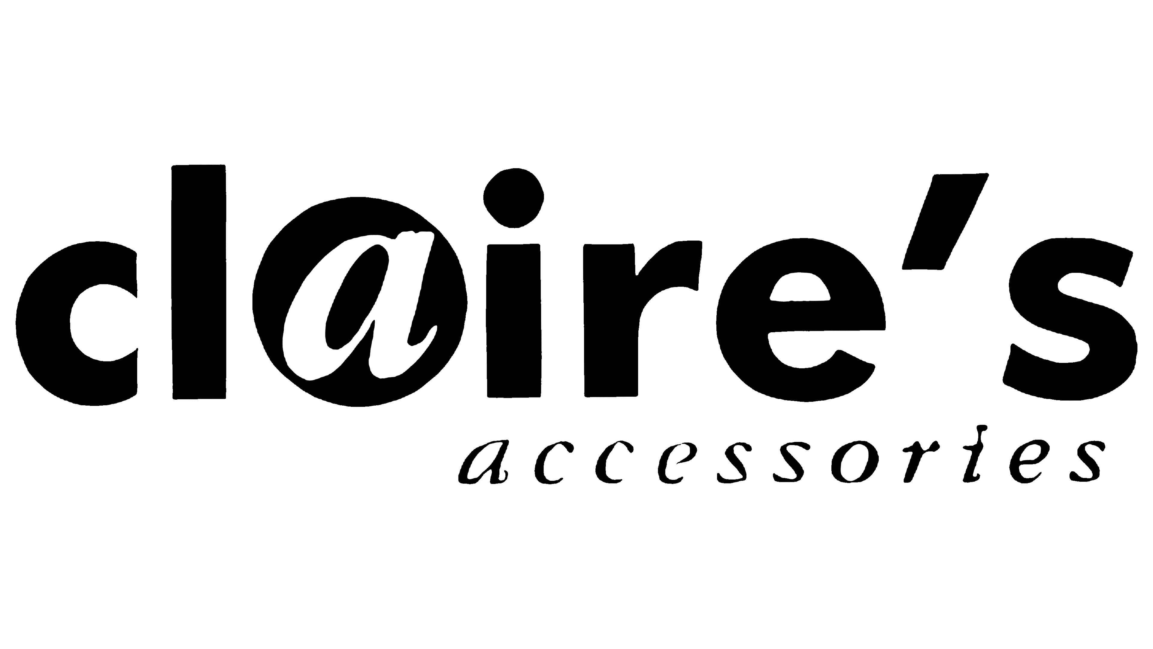
The focus shifted to jewelry production, leading to the brand’s name change to Claire’s Accessories. The feminine name emphasized the brand’s dedication to women. The founder chose it to evoke pleasant associations with a neighbor girl named Claire, whom everyone likes. This was intended to make customers perceive the stores as friends they want to chat with and share secrets.
The emblem is designed in two levels. The upper inscription highlights the letter “A,” enclosed in a clear black circle. This composition resembles a bead, an element from a necklace or bracelet. The shape also suggests an earlobe with a new, beautiful earring, as the company provided ear-piercing services.
The second line adds the business direction Accessories in thin cursive letters.
2001 – today
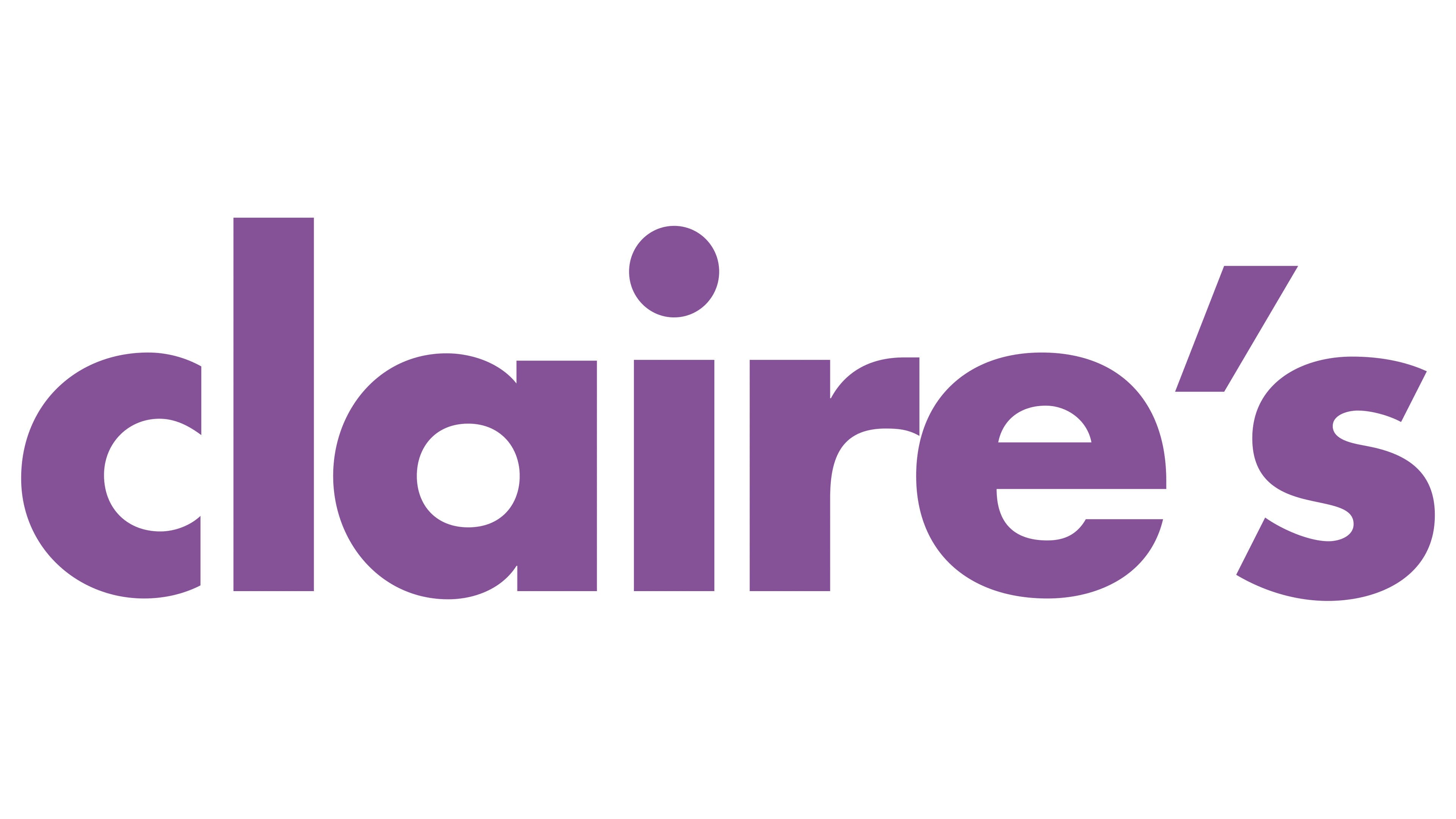
The modern Claire’s logo emerged when management passed to the founder’s daughters after his stroke. This event brought new ideas and a fresh perspective to the brand, reflected in the updated emblem. The brand continues to take pride in its history, maintaining authenticity and originality, as seen in the logo’s design.
Claire’s emblem features the brand name in lavender. The font has soft, rounded shapes, making it look friendly and appealing. The use of lowercase letters adds informality and accessibility.
The lavender color symbolizes youth, creativity, and energy, perfectly reflecting the brand’s target audience, teenagers and young girls. The softness and roundness of the letters emphasize friendliness and approachability, which are important for a company aiming to be close to its customers.
The Claire’s logo reflects the company’s mission to offer fashionable and affordable accessories for young people. It creates an atmosphere of fun and creativity, making the brand’s stores attractive to teenagers seeking stylish, modern accessories.
The chosen font is simple and contemporary, with shortened, slightly unfinished letters that add a sense of uniqueness. This style highlights the store chain’s informal, youthful image.