Claro: Brand overview
Established in 2003 as a subsidiary of renowned Mexican telecommunications giant América Móvil, Claro was originally based in Brazil. It emerged from the merger of various regional units under the América Móvil umbrella, such as ATL, BCP, Americel, Tess Celular, and Claro Digital. Within a short period of time, the company expanded its operations to other states in Brazil, aiming for nationwide availability.
In 2008, América Móvil took the important step of consolidating its disparate regional brands in other Latin American countries under the Claro banner. In the same year, Claro appeared in Argentina, Paraguay and Uruguay. In the late 2000s and early 2010s, the company continued its expansion strategy, marking its presence in various Latin American territories such as Colombia, Chile, Peru, and some Central American countries through acquisitions and subsequent rebranding.
Claro is now the telecommunications division of América Móvil, operating in 14 Latin American countries. The company relies on investments in technology, particularly 4G and 5G, to expand its mobile subscriber base in the region. Claro, which is headquartered in Mexico and will have around 150 million mobile subscribers by 2021, is a powerful player in Latin America’s telecommunications market.
Meaning and History
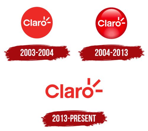
2003 – 2004
2004 – 2013
2013 – today
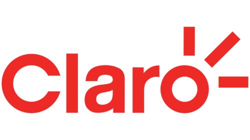
The wireless services offered by this telecommunications company are reflected in its logo. They are represented by three short lines running in different directions from the letter “o.” The longest line is a diagonal line located in the center. The rest of the name has no graphics – they are just letters. The first letter is lowercase, which emphasizes the global importance of the brand. The text mostly consists of lowercase letters and is colored red, symbolizing high business activity and peak emotions.
The red color in the logo feels like a living color as if life is always boiling in it. The three lines coming from the letter “o” are like signals reaching out, as if the company is always in touch with people wherever they are. The longest diagonal line is as if it indicates something important, arousing curiosity. The lower-case text is as if saying, “Hey, we’re accessible; we’re for everyone.”
Claro color codes
| Pigment Red | Hex color: | #ee2a27 |
|---|---|---|
| RGB: | 238 42 39 | |
| CMYK: | 0 82 84 7 | |
| Pantone: | PMS Bright Red C |
