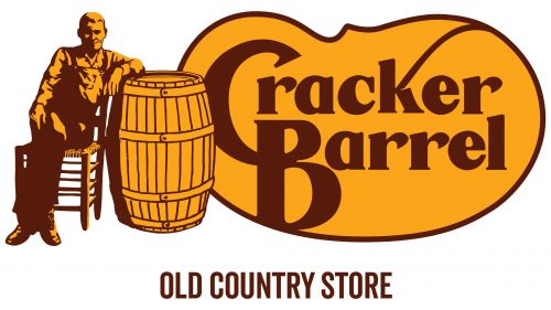
The Cracker Barrel logo welcomes all visitors, inviting them to step into a cozy restaurant and immerse themselves in the nostalgic atmosphere of rural life. The emblem conveys a sense of hospitality, tranquility, and simplicity associated with the culture of the American South.
Cracker Barrel: Brand overview
The origins of Cracker Barrel can be traced back to 1969 when oil industry veteran Dan Evins opened a restaurant and gift shop in Lebanon, Tennessee. Evins envisioned a location where visitors could unwind, eat well, and discover intriguing things.
On September 19, 1969, the first Cracker Barrel Old Country Store opened its doors in Lebanon on Highway 109. The restaurant was in a prime location next to an interstate exit to draw in passing motorists. Combining a restaurant with a gift and souvenir shop was novel.
“Cracker Barrel” refers to the old cracker barrels frequently seen in country establishments, acting as meeting places for guests. This concept mirrored Evins’s intention to give his facilities a warm, welcoming feel.
Early on, the menu featured many Southern classics like fried chicken, ham, and pancakes. Customers immediately took to this idea, and the company started to expand.
By 1977, the business, mostly found in the Southeast along interstate roads, had grown to 13 locations. That year, it started drawing interest from investors and went public by issuing its shares on the stock exchange.
Expansion continued rapidly during the 1980s. After moving beyond Tennessee, the company opened more eateries in surrounding states, growing to fifty locations by 1987.
Growth persisted in the 1990s, with an average of 50 new locations added yearly. The company increased its emphasis on retail and broadened the selection of goods offered in its outlets.
A range of branded food products was introduced in 1997, and they are now available in restaurants and supermarkets nationwide.
Innovation and growth continued in the 2000s. In 2002, the corporation launched the Cracker Barrel Cornerstones program to raise the caliber of customer service.
A major milestone was reached in 2004 with the opening of the 500th restaurant.
The 2010s offered fresh opportunities and challenges. The menu was modified in response to shifting consumer preferences, keeping traditional foods while introducing healthier options.
A new restaurant concept, Holler & Dash, was introduced to offer contemporary takes on classic Southern fare, targeting a younger clientele.
In 2017, Holler & Dash Biscuit House was introduced, serving Southern cuisine in a more contemporary environment, with a menu highlighting biscuits and other foods.
The menu expanded in 2018. Responding to the increasing demand for balanced meals, new dishes, including healthier options, were introduced. A greater emphasis on seasonal goods drew more customers year-round.
In 2019, the company purchased Maple Street Biscuit Company for $36 million to increase its market share in the fast-casual dining industry.
Aggressively expanding delivery services, the business partnered with apps like DoorDash and Uber Eats, allowing it to reach more customers and boost revenues outside its restaurants.
In 2020, numerous modifications were made. The business plan was adjusted to prioritize delivery and takeout options, with new technologies introduced to enhance ordering and customer service procedures.
In 2021, menu innovation continued, adding new foods and beverages, including alcoholic cocktails at certain locations, to raise the average check and attract more clients.
2022 saw further advancement in digital technologies. Enhancements to the mobile app streamlined the ordering process and introduced additional features for the reward program.
In 2023, the focus was on redesigning the interiors of the eateries, aiming to keep the atmosphere welcoming while updating the space to satisfy modern patrons.
Throughout its existence, the company has stuck to its initial idea of offering home-style food, a welcoming environment, and merchandise. It keeps developing and adapting to shifts in the retail and food service sectors while preserving its unique character.
While keeping up with contemporary restaurant industry trends, the business remains loyal to its heritage, serving classic Southern cuisine. It has successfully balanced maintaining its style and introducing the advancements required to stay competitive in the modern food service industry.
Meaning and History
What is Cracker Barrel?
This is a well-known restaurant franchise that combines Southern-style dining with rustic retail. The restaurants offer comforting, nostalgic dishes like country-fried steak, chicken and dumplings, and all-day breakfasts. The interior features retro elements and antiques, creating a warm atmosphere. In addition to food, visitors can find unique items in the retail store, including decor, vintage candies, and local culinary products. The brand has become a popular spot for travelers due to its convenient locations along major highways, offering a sense of warmth and comfort reminiscent of small-town America.
1969 – 1977
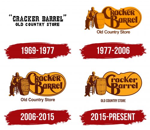
When the first Cracker Barrel location opened, it had no proper logo—only a large yellow inscription adorning the building’s brown facade. The welcome sign became the brand’s unofficial emblem for eight years. Its unique Western-like style conveys the rustic theme of the store and restaurant chain.
The retro vibe is most noticeable in the top line, where the phrase “CRACKER BARREL” is located. Its vintage font resembles the late 19th-century design when printers used wooden blocks for signs and newspaper headlines. This font category is known as Wood Type and is associated with the American Old West, old stores, and saloons.
The letters are rough, but the large, decorative serifs that extend above, below, and even in the middle give them elegance. The angularity and unevenness create an aged effect, as if time has slightly worn the inscription. The retro design adds a few extra decades to the company’s visual identity, creating a deceptive impression that it originated not in 1969 but in the 19th century.
The logo intentionally transports to an earlier era, immersing one in the nostalgic atmosphere of simple country life, as Cracker Barrel aims for its visitors to feel at home. The font seems heavy and “unpolished,” which has charm: the rough style emphasizes the idea of naturalness associated with the good old days. The brand’s name is placed in quotation marks, which can also be seen as a nod to tradition.
In the second line, where the phrase “OLD COUNTRY STORE” is located, a completely different font is used—a regular bold grotesque without decorative elements. Its neutral design contrasts with the brand name, creating a balance between creativity and practicality. This helps maintain visual harmony, preventing the logo from overloading with massive letters. Both parts of the inscription are colored black—a universal shade that suits both vintage and modern styles.
1977 – 2006
In the mid-1970s, it became clear that the chain, which had expanded to 13 locations, needed a new visual identity—nostalgic but not clichéd. At this stage, it was decided to create a full-fledged logo illustrating the name Cracker Barrel. This led to creating the brand’s signature character—an old man sitting on a chair next to a barrel.
The man is dressed simply, like an average Southern American farmer: in overalls, a shirt, and laced-up boots. His image was believed to be modeled after Danny Wood Evins’s uncle Herschel. This man put all his efforts into growing the business and helped advertise the restaurants owned by his nephew. However, there is no evidence that the emblem specifically depicts Herschel.
Stories about typical visitors of old country stores inspired the artist who created the logo. He sketched the idea on a napkin and later refined the drawing, using a random person with a similar appearance and build as a model. Certainly, it was not Herschel.
The elderly man is seated on a chair, one leg crossed over the other, resting his elbow on a large wooden barrel. This object is not merely decorative but a key feature of many rural stores in the late 19th and early 20th centuries. Salted crackers were once stored in such large barrels, and people often gathered around them to discuss the latest news.
Thus, both the logo and the name Cracker Barrel symbolize a cozy place to enjoy a good meal and find friendly company. This is a big plus for the brand’s visual identity, which seeks to be associated with the hospitable culture of the American South.
Nearby is a shape resembling an oval, like a giant orange bean. The brown inscription “Cracker Barrel ” occupies its interior space,” split into two levels. It is done in a custom font, where each glyph has its unique design. However, there are common features that unite almost all the letters:
- Small sharp serifs;
- Vertical form;
- A mix of thick and thin lines;
- Gentle curves;
- Slight asymmetry.
The letter case is uneven and does not affect their size: for example, all the “r” characters look uppercase, yet they match the size of lowercase symbols. The logo has only two large glyphs: the initial “C” and “B.” They enhance the informality of the logo, giving it an old-fashioned touch, as if it were a sign from the 19th century.
Below is another inscription: “Old Country Store.” The font used is Helvetica Bold, a classic grotesque that makes the text simple and clear. Its style is entirely different from the design of the brand’s trade name, so the two parts of the text create a pleasant visual contrast. Yet, something common ties all the elements of the logo together: its colors.
Brown is associated with rural life, stability, and reliability. Orange symbolizes hospitality, communication, and joy. These colors give Cracker Barrel restaurants the image of a cozy place where one can expect a warm welcome and homemade food.
2006 – 2015
2006, the restaurant chain modernized its emblem, making it more distinct. However, the concept remained the same: designers kept the old man on the chair, the large barrel, and the unique lettering. Only minor details were changed, enhancing the image’s clarity.
- Bold dark outlines were added to the light elements. This allowed the logo to be resized in digital environments without losing clarity.
- Shadows on the character’s face and clothing became deeper. This made him look darker, but it’s a positive change since his image is now harder to associate with any specific individual, which was the designer’s intention.
- The “Cracker Barrel” text appears much clearer and more expressive. To achieve this, the logo’s creators increased the spacing between the letters, smoothed the corners, slightly curved the “l,” and widened the apertures on all four “r” characters.
- The decorative base received a dark outline, adding a sense of completion to the emblem.
- The words “Old Country Store” in the bottom line became more readable due to increased spacing.
Yet, all these details are less noticeable than the color change. The brown in the new logo is not as bright as before, and the orange has taken on a pale yellow hue. This increased the contrast between dark and light elements, positively affecting the brand’s recognizability.
2015 – today
The updated logo differs from previous versions by the absence of a long elegant stripe that used to stretch from the “k” to the right, smoothly curve around the text, and drop down, following the border of the orange base. This swirl went right through the “B” and was connected to one of the “r” characters with an additional curved line. Now, the “k” and “B” are directly connected to the outer outline of the sign containing the name Cracker Barrel.
The company had to remove the meaningless stripe from its emblem because some African Americans believed it represented a slave whip. Opponents of the brand invented a myth that the man sitting in the chair was a slave owner and that the barrel next to him held tools for punishing slaves. This scandalous conspiracy theory emerged due to the ambiguous perception of the word “cracker,” which is used as slang for a whip.
Fortunately, these accusations are untrue, as whips were never stored in barrels—they would have just gotten tangled there. The man is a farmer—a typical visitor of old country stores. In the 2015 logo, designers changed the appearance of the seated figure, making him a bit taller and removing some shadows that obscured the work overalls and his kind smile.
The barrel’s outlines became smooth and clear, and the side shadow was reduced, making the drawing less dark than before. For this same purpose, the colors were given a pleasant, warm hue. The logo still uses orange and brown, which are associated with rural comfort and accurately reflect the restaurant chain concept. However, the style of both inscriptions has changed significantly.
The phrase “Cracker Barrel” has become more compact, as the letters are no longer stretched vertically. All “r” characters, which previously looked uppercase, have been changed to lowercase. The serifs lost their former sharpness and now take the form of short mini-rectangles. There is no clear boundary between the initial “C” and “B,” so they merge, forming a monogram. This new element creates a sense of antiquity, which was the designers’ intention: the deliberate aging of the emblem brings it closer to the brand’s rustic style.
The inscription “OLD COUNTRY STORE” is now composed entirely of capital letters and uses a narrow font stretched vertically. It is connected to the previous version by the lack of serifs and a rather strict style, which visually balances the playful feel of the upper part of the text.
The logo suggests the simple and welcoming nature of the restaurant chain, where one can enjoy good food, spend time in an old-fashioned, friendly atmosphere, and listen to country music.
