The Cracker Jack logo is a unique symbol that is popular in America and is now recognizable worldwide. The two words, written in a distinctive font and red color, evoke associations with sweet popcorn.
The creator of the small company likely could not have imagined that he would introduce a masterpiece to the world. In his imagination, it was just a dream. But a real sweet revolution occurred, turning an unknown treat into one of the most beloved.
Popcorn with the red, shining Cracker Jack logo is enjoyed in movie theaters and during leisure time. The product brings happiness to people of all ages and genders. It is considered fast food, but not just any kind—it’s the first.
Cracker Jack: Brand overview
In 1871, German immigrants Frederick and Louis Rueckheim established a modest enterprise selling popcorn on Chicago’s streets, marking the inception of Cracker Jack’s history. Their popcorn’s superior quality and delicious flavor made it famous among the locals.
The Rueckheim brothers debuted their innovative product 1893 at the Chicago World’s Fair. A concoction of popcorn, peanuts, and molasses immediately drew guests in. At first, though, the food was difficult because the ingredients did not adhere together.
Louis Rueckheim created a trade secret formula in 1896 to address the issue of components clumping together. This invention resulted in the product currently known as Cracker Jack. A taster reportedly cried out, “That is a crackerjack!” and that is how the term “Cracker Jack” came to be. (It is an old-fashioned phrase for “excellent!”).
An important development in the product’s history occurred in 1908 when the well-known song “Take Me Out to the Ball Game” was composed, referencing the brand. This song significantly raised brand awareness and connected it to the national sport of the United States of America, becoming an unofficial baseball anthem.
1912, the firm started putting “prizes” in each Cracker Jack container. These were the first trinkets, baseball cards, and tiny toys. This invention greatly expanded the brand’s appeal, particularly to young consumers, and became a defining feature of the product.
Sailor Jack and his dog Bingo were shown on the packaging in 1918. These characters stayed on the packaging for years and eventually became brand emblems.
The Rueckheim company changed its name to The Cracker Jack Company in 1922 to better represent the rising demand for its primary product.
The brand underwent substantial alteration during the 1960s. The Borden Company purchased the business in 1964, which resulted in more distribution and production capability.
The company started experimenting with different tastes and forms in the 1970s. Although fruit and cheese flavors were added, the original recipe continued to be the most well-liked.
Another significant development in the brand’s history happened in 1997, when Frito-Lay, a PepsiCo division, purchased the product. Thanks to this acquisition, the brand’s development and marketing now have more opportunities.
The firm spent a lot of money modernizing the brand in the early 2000s. The product line was increased, packaging was modified, and production procedures were enhanced.
2013 was a significant year for product innovation. Aimed at an adult market, the company launched the Cracker Jack’D product line, which has stronger flavors and some varieties with more caffeine.
In 2016, an important alteration to the brand tradition took place. Digital awards replaced real ones in packaging. Each gift contained a QR code that could be scanned to unlock smartphone games and other digital materials rather than toys.
The firm commemorated its 125th anniversary in 2017. To commemorate this milestone, a unique marketing effort was initiated to remind customers of the brand’s rich past and its affinity with American culture, particularly baseball.
In 2018, the company returned to its original practices. The firm started reintroducing tiny toys and trinkets in select shipments in response to customer comments that they were missing the tangible prizes, even if they were still delivering digital prizes.
In 2019, the firm added Cracker Jack Chocolate & Caramel to its product lineup. This was a major departure from the traditional recipe, but it also brought in new customers and satisfied the expanding need for chocolate snacks.
2020 was a year of innovative packaging. The firm unveiled new recyclable packaging that is friendlier to the environment. This was a component of PepsiCo’s larger plan to increase the sustainability of its goods.
In 2021, the company improved its internet visibility by introducing social media initiatives and interactive web campaigns. Additionally, the brand started working with other influencers to reach a younger audience.
2022 marked a return to baseball’s origins. To emphasize its ties to baseball history, the firm introduced a unique packaging line featuring iconic past and present players.
In 2023, the company kept experimenting with new flavors, releasing special seasonal products like Cracker Jack Peppermint for the winter holidays and Cracker Jack Pumpkin Spice for the fall.
Furthermore, in 2023, the firm introduced an educational program about the background of American snack manufacturing. This initiative features interactive teaching for students and virtual tours of the production process.
Over the years, the brand has remained true to its identity and ties to American culture while adjusting to shifting customer preferences. To appeal to new and older generations of consumers, the brand struck a balance between innovation and tradition.
Meaning and History
What is Cracker Jack?
It’s a brand of caramel-covered popcorn and peanuts known for putting a prize in every bag. Owned by Frito-Lay, a subsidiary of PepsiCo, the brand has been a popular snack for over a century. It is known for its iconic red, white and blue packaging depicting Sailor Jack and his dog Bingo, is often associated with baseball games and American nostalgia, and is famous for its sweet, crunchy flavor. This product is widely available in supermarkets, stores and online retailers, remaining a favorite treat for many.
1896 – 1937
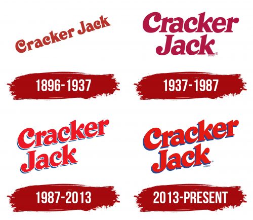
The first Cracker Jack brand identity used a dark red tone. The wide letters with unusual borders looked bright and dynamic, rising from the lower left corner to the right. The brand name was written in italics, and many modern customers see a resemblance to contemporary graphics and trendy fonts in these letters. The letters appeared very expressive on a white background and were perceived.
No one disputes that the sailor and the dog made the logo recognizable. This image immediately attracted attention and managed to captivate the viewer.
1937 – 1987
The 1937 logo’s tonality is close to a dark raspberry color. The authentic font with elegant flourishes is retained, but now the phrase Cracker Jack is written in two lines. This creates a sense of unity. Although the words are not enclosed in a frame, this arrangement is advantageous as the two words are read simultaneously.
The massive letters with thin lines and large spacing emphasize the company’s scale, which created this unique product. The characters remain on the logo, becoming more lively and realistic.
1987 – 2013
The trend of improvements and enhanced visualization continues. Many familiar red letters now have outlines, making them more expressive through the play of contrasts. A thin blue line turns the letters into real images, noticeable and recognizable.
The phrase Cracker Jack is read easily and quickly, standing out brilliantly against the white, snowy background. The tricolor adds a sense of patriotism that customers love. The rounded elements of the letters spark curiosity. Large dots filled with red on the letters “c,” “k,” and “r” draw attention.
The sailor remains part of the identity, but now he recommends and suggests buying a pack of popcorn, holding it in his hands.
2013 – today
The new tonality completely transformed the brand’s concept, becoming an element of renewal and drawing attention to the delicious and high-quality products.
The size of the letters and outlines has been expanded, creating the impression that the beautiful inscription is within arm’s reach. The simplicity and minimalism are evident. The new logo possesses the uniqueness that the creators aimed for.
The white background is the base for the stylish graphics, detailing the elements and making them dynamic. Each letter looks like a musical note playing on an instrument’s strings.
