Creativity is the main feature of the Crayola logo. It concentrates on creativity, imagination, and a positive world perspective. Kindness and cordiality – that’s what this logo conveys. It concentrates on the joy of being able to create and give others only positive things.
Crayola: Brand overview
| Founded: | July 25, 1885 |
| Founder: | Edwin Binney and C. Harold Smith |
| Headquarters: | Pennsylvania, U.S. |
| Website: | crayola.com |
Meaning and History
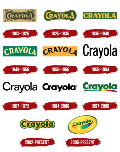
The presented brand has been operating for almost 150 years, and during this time, visual recognition has become more and more tangible. In total, about ten logo options were presented to the target audience of Crayola. Each redesign introduced new elements, making the logo more modern and unique. Thus, he stood out from the competition.
What is Crayola?
This is the best option for art lovers. The company became famous for the production of high-quality colored pencils. More than 50 million customers across the US purchase Crayola products every year.
1903 – 1925
The first version of the Crayola logo was introduced only in 1903. The main element was a white wordmark on a dark green background. The shape of the background was unusual and even mystical. If we talk directly about the brand name, it was made in a classic bold sans-serif font. Even though all the letters were capital, the first and last looked more voluminous. Moreover, the first “C” repeated the shape of the frame, and therefore sometimes, the buyers of products read the name as “Rayola.”
1925 – 1935
Crayola’s retro logo used two typefaces. One – large, bold, with triangular serifs – is located in the center for the brand’s name. The second one is small, thin, and sans-serif for the phrase “TRADE MARK.” In the word “CRAYOLA,” the first “C” and the last “A” were enlarged, indicating the creative nature of the company. The golden inscriptions were inside a heavily deformed green oval with a narrowing in the center. The shape of the base was unusual and attractive due to the curved lines that created a sense of movement. The bright colors of the emblem represented the diversity of Crayola’s products.
1935 – 1948
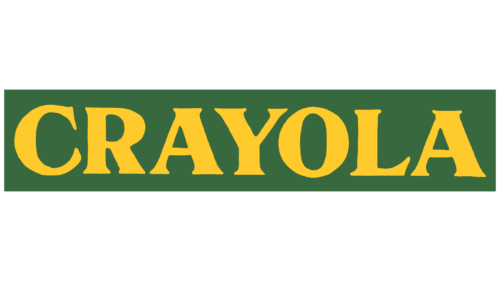
The brand name was inside a green rectangle. This time the letters were all the same size, and the font looked like a cross between SoftMaker’s Priamos Serial Xbold and DTP Types’ ArbescoDT Bold. The simple and concise design of the logo reflected the company’s core values, such as accessibility and safety.
1948 – 1956
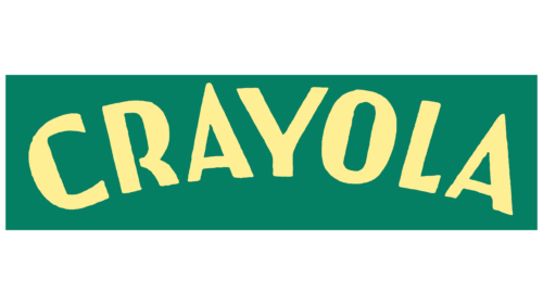
The inscription on the emblem has taken the form of an arch because it resembles a rainbow, which is associated with bright colors, childhood, and creativity. The font has also changed: the designers used not written letters, but drawn ones, to reflect the company’s main activity – the production of colored pencils. The pale yellow brand name looked crisp and contrasted against the dark turquoise rectangle.
1956 – 1966
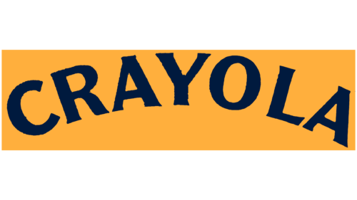
A dark blue arched “CRAYOLA” logo was used for a decade. The background was an orange rectangle, which created a bright and cheerful mood. Bold letters were decorated with short sharp serifs. The dynamic font emphasized the company’s creative approach to producing goods for children’s art.
1958 – 1984
The minimalist brand name appeared on a blank white background. His sans-serif was similar to Dunwich Type Founders’ modified Lorimer No 2 Condensed Medium. Strict black letters symbolized the seriousness and responsibility of the company.
1967 – 1972
The key change in the logo is related to updating the color palette. Now they were green letters on a yellow background. Bright colors attracted more attention, highlighting the brand in a fairly competitive market.
The writing style has also become more modern. The lines in the letters have become more elegant. All letters except the initial are in lower case.
1984 – 2006
Perhaps the most concise logo in the history of the company. Now it was black lettering on a white background. The strict and confident sans-serif typeface looked easy; it looked spectacular on different surfaces.
1997 – 2006
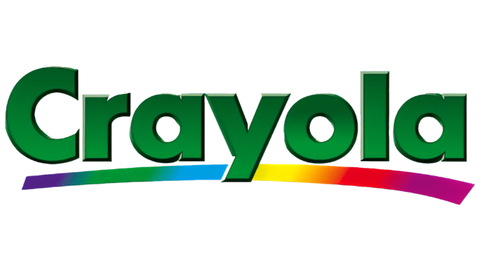
At this stage, several versions of the logo were used in parallel. The first was a lowercase wordmark with the brand name using a green gradient. There was a sense of three-dimensionality along with the black shadow in the image. Below, under the inscription, there was a slightly rounded horizontal line, divided into blocks painted in all the rainbow colors.
2002 – today
Since 2006, a serif green lettering with a pronounced orange shadow and green outline has also been used. This version of the logo looked bizarre but interesting.
2006 – today
The most recent version was introduced in 2006. This is perhaps the most user-friendly logo ever. The inscription “Crayola” is inside the yellow oval. The gradient causes the hue to be closer to orange on the right side. The title is again in green with a yellow outline.
Under the very inscription is a “smile,” divided into blocks in all colors of the rainbow. The oval itself, with a voluminous green outline, is slightly inclined, and therefore it seems that it is rolling.
Font and Colors
Several font variations have been used throughout the many redesigns of the “Crayola” logo. Globally speaking, as a rule, it was a classic bold sans-serif font with a unique style of writing individual characters.
The color palette changed all the time. When it comes to the latest versions of the logo, the emphasis has been placed on favor of bright colors. The yellow-green color palette is associated with positive emotions and life and arouses interest among potential buyers.
Crayola color codes
| Daffodil | Hex color: | #ffff29 |
|---|---|---|
| RGB: | 255 255 41 | |
| CMYK: | 0 0 84 0 | |
| Pantone: | PMS 396 C |
| June Bud | Hex color: | #bddc60 |
|---|---|---|
| RGB: | 189 220 96 | |
| CMYK: | 14 0 56 14 | |
| Pantone: | PMS 374 C |
| Spanish Green | Hex color: | #339445 |
|---|---|---|
| RGB: | 51 148 69 | |
| CMYK: | 66 0 53 42 | |
| Pantone: | PMS 355 C |
| Phthalo Green | Hex color: | #072b16 |
|---|---|---|
| RGB: | 7 43 22 | |
| CMYK: | 84 0 49 83 | |
| Pantone: | PMS 3435 C |
