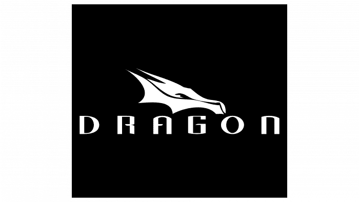
“No matter how high Elon Musk’s legendary cosmic dragon rushes, he always returns to Earth,” the Crew Dragon logo says. The emblem represents passion and flight. It shows the majesty of the moment of sending tourists into space.
Crew Dragon: Brand overview
| Founded: | 8 December 2010 |
| Founder: | SpaceX |
| Headquarters: | United States |
Meaning and History
The Crew Dragon has originally planned for logistics flights under the Commercial Resupply Services 2 project and the Commercial Crew Development program. He was supposed to fly to low-earth orbit and serve for tourist missions to the moon. In parallel with him, a Martian mission plan is currently being developed with the launch of his modification of the Red Dragon to the red planet.
Work on Crew Dragon started in 2010 as the DragonRider project when NASA was looking for performers to send crews to the ISS space station under the state CCDev program. The final selection took place in January 2016.
After an unsuccessful takeoff attempt in test mode, the study of the reasons continued for a long time. The investigation was completed in July 2019. A second verification test took place in January 2020, and in May of the same year – the main one, with two astronauts on board. The launch, lifting, and docking of the module with the International Space Station were completed successfully.
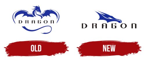
Due to the innovativeness and very high value of the SpaceX project for the United States, the Crew Dragon emblem is popular today. It serves as a print for T-shirts, baseball caps, gift pens, decorative flags, mugs, notebooks, and other souvenir items. In general, since the program’s launch, the rocket had two logos: the first is the original version, the second is its modern modification.
What is Crew Dragon?
Crew Dragon is a manned spacecraft developed by the American company SpaceX for transporting people and cargo to Earth’s orbit, particularly to the International Space Station. It was designed in 2010 and was initially called DragonRider.
Old logo
The debut version of the logo is depicted on the first spaceships of SpaceX. It is a large winged dragon with widespread wings. The mythical creature hovers in the air, looking down. Smooth lines and aerodynamic curves accentuate its flight capabilities – there is no geometrically rough stroke in the logo. The upper part is the dragon’s head, torso, and wings; the lower part is the tail. They are separated by the inscription “Dragon,” which runs along the entire horizontal border between the wings.
New logo
The second emblem was adopted in connection with the re-launch of the spacecraft. It has been used on a recent vehicle. It depicts only a fragment of a dragon – a head turned in profile. This version differs from the previous one in smooth, confident, and hard lines. The change in the style of the drawing indicates the increased seriousness of the project. Enlarged nostrils evidence the pressure, wide-open eyes, thorns laid back, which seem to be pressed by a powerful stream of wind at the moment of purposeful flight. The visual emphasis is on aerodynamics, so the head is narrow, streamlined, elongated, with a closed mouth, while on the first logo, it is open. The word “Dragon” is enlarged and positioned at the bottom.
The spacecraft, designed by innovator Elon Musk, has excited the public, especially the American one. This is due to the high hopes that the people place on him because NASA used Russian systems before that. In this case, US residents feel pride in their country, increasing global prestige, reflected in the last emblem.
The dragon symbolizes independence, innovative spirit, freedom, perseverance, and perseverance in achieving ambitious goals. The new logo is the embodiment of the American dream. Thanks to him, every American feels like another “dragon’s head,” of which, according to legend, he may have many. Consequently, the Crew Dragon trademark is the materialization of the people’s main idea “Together we will reach any heights!”
Crew Dragon: Interesting Facts
SpaceX’s Crew Dragon is a game-changer in space travel, leading the way in commercial spaceflight.
- Background: Initially called DragonRider, Crew Dragon builds on the success of Cargo Dragon. It’s designed to carry astronauts to and from orbit, showcasing SpaceX’s commitment to making space more reachable.
- Commercial Milestone: It’s the first spacecraft built by a private company, certified by NASA for crewed missions to the International Space Station (ISS), changing how space missions operate with private sector involvement.
- Innovation in Design: Crew Dragon is reusable and can dock with the ISS independently. It can transport up to seven astronauts multiple times, making space travel more cost-effective.
- Safety First: It has an advanced escape system to protect the crew during emergencies, a feature tested successfully in January 2020.
- Historic Missions: Crew Dragon’s first manned flight in May 2020 was a landmark event. It was the first astronaut to launch from American soil since 2011.
- Modern Controls: The spacecraft features touchscreen controls for a sleek design and simplified operations, moving away from traditional spacecraft interfaces.
- NASA Partnership: NASA’s funding through the Commercial Crew Program played a crucial role in developing Crew Dragon, which is part of a strategy to involve private companies in space exploration.
- Global Collaboration: Crew Dragon has carried American and international astronauts to the ISS, underlining its role in global space research and the ongoing presence of humans in space.
- Future Goals: Crew Dragon is part of SpaceX’s larger goals, which include missions to the Moon, Mars, and beyond, laying the groundwork for future exploration.
- Named by Astronauts: The spacecraft for the Demo-2 mission was named “Endeavour,” the craft for the first operational mission was named “Resilience,” a symbol of exploration spirit and perseverance.
Crew Dragon represents a new chapter in spaceflight, highlighting the significant impact of commercial ventures on space exploration and international collaboration.
Font and Colors
In both versions of the logo, a similar typeface is used because it has not been changed. The inscription is made in the upper case in an individual font. The symbols have a wide inter-letter space and original design. Connecting line “R,” horizontal stroke “A” and an inwardly curved leg “G” are unified: they have an identical design. The only difference is that the bar “A” is turned to the right, while the other two letters are turned to the left.
Another individual difference of the inscription is in the graphic parallel between some signs. So “A” looks like the top of “N,” “D” looks like a cut off half of “O,” and “R” looks like an inverted “G.” The palette of the emblem also did not change: it always consisted of dark blue and white.
Crew Dragon color codes
| Sedona Red | Hex color: | #172d9a |
|---|---|---|
| RGB: | 23 45 154 | |
| CMYK: | 85 71 0 40 | |
| Pantone: | PMS Dark Blue C |
| Black | Hex color: | #000000 |
|---|---|---|
| RGB: | 0 0 0 | |
| CMYK: | 0 0 0 100 | |
| Pantone: | PMS Process Black C |
