


![]() D.C. United Logo PNG
D.C. United Logo PNG
The D.C United logo expresses national pride. It symbolizes strength, courage, unity, and fury, qualities that lead players to victory. It embodies the spirit of competition, balanced with calm composure and a sense of superiority. This balance is the key to success.
D.C. United is an American professional soccer club competing in the Eastern Conference of Major League Soccer. The United States Soccer Federation contributed to its establishment, fulfilling its promise to FIFA by helping create a new professional league. On June 15, 1994, Major League Soccer selected Washington, among 22 contenders, as one of the first 7 teams, with 3 more added before the league’s launch.
The Washington Soccer LP group, led by billionaire George Soros, acquired the club’s rights in 1995. The company took responsibility for choosing a nickname. Ideas included “Spies,” “Americans,” and “Eagles.” However, the new team’s operators ultimately decided to simply name it “D.C. United.” The name “United” referenced well-known European clubs like “Leeds” and “Manchester United” and reflected the team’s location in the United States capital. “D.C.” is the traditional abbreviation for the District of Columbia.
The team’s colors and original logo were announced on October 17, 1995, along with those of the other ten teams, at a presentation in New York. D.C. United’s primary colors are black and white, and the team’s nickname is “the black-and-red.”
On February 15, 2001, Washington Soccer LP sold the club to Anschutz Entertainment Group. On January 8, 2002, AEG, led by billionaire Philip Anschutz, became its sole investor. On January 8, 2007, D.C United Holdings purchased D.C. United from Anschutz Entertainment Group for $33 million. This group included Japanese-American businessman William H.C. Chang and developer Victor MacFarlane, D.C. United president Kevin Payne and former basketball players Christian Laettner and Brian Davis.
On May 21, 2009, the previous owner, Victor MacFarlane, announced the sale of his share in D.C. United Holdings was sold to its principal owner, William Chang, who acquired 98% of the organization’s shares. On October 21, 2009, Chang bought out Davis and Laettner, who owned the remaining 2%, thereby gaining full control of the team’s shares. In 2012, Erik Thohir and Jason Levien, co-owners of the NBA’s Philadelphia 76ers, acquired the club and its holding company, with Chang remaining a minority investor.
Meaning and History
![]()
Since 1996, D.C. United has had three logos. They shared a concept (a bird with spread wings), a color palette (black, red, and white), and a style (military-themed). The club was often accused of its logo resembling the Nazi eagle. As a result, the club had to change its debut emblem just a year after it was approved.
What is D.C. United?
D.C. United is an American soccer team from Washington. It competes in Major League Soccer’s Eastern Conference. The team is the only sports club to have won the Copa Interamericana. Boasting numerous trophies, it is one of the country’s most successful soccer teams. The team was founded in 1994 and began playing in 1996, gradually winning four MLS Cups, four Supporters’ Shields, six conference championships, and three U.S. Open Cups.
1996 – 1997
![]()
The first logo of D.C. United featured a Norman shield. The heraldic element is triangular, with smoothly curved sides. The red surface has a black outline. At the top is a framed team nickname. Dark letters stand out against the white background. The words are written in uppercase, with no spaces; dots are the only thing separating “D.C.United.” The font is old-fashioned, looking elegant due to the tildes and the contrast between thin and thick lines.
The bald eagle, the national bird of the U.S., occupies most of the shield, representing strength and speed. The eagle faces right, with its wings widely spread. Six schematic feathers (three on each side) point downwards. Below them are three white stars outlined in black. In the center of each pentagonal figure is a soccer ball. They represent the three jurisdictions of the region.
1998 – 2015
![]()
DC United’s debut logo lasted only one season. In 1998, the team changed it under public pressure. They kept the bald eagle, previously compared to the Nazi eagle, and modified some details. The heraldic shield became less rounded and more angular. The letters lengthened. Designers added a small space between “D.C.” and “United.”
The logo’s color palette remained the same, but the designers ran a white line between the red surface and the black outline. This line also outlines the eagle. The eagle’s head is disproportionately small and turned to the left. The wings are spread, as in the previous logo, but the feathers point sideways. Three sharp triangles in the tail and red eyes indicate aggression.
In the center of the bird is a yellow pentagonal star outlined in white, and inside the star is a soccer ball. This ball is a reminder of the club’s triumph in the inaugural season of Major League Soccer in 1996.
2016 – today
![]()
In 2013, United conducted extensive market research into the brand’s current state. The study showed a need for modernization to reflect the growth of the sport and the league in the United States. The current brand does not adequately represent the United community. The DC United emblem acquired a new look, but the previous concept remained: it continued as part of D.C. United’s tradition.
After Element Advertising completed the initial logo design, Red Peak Group enlisted designer Peter Horridge to create the final version. Horridge is based in the UK and was involved in redesigning the royal crest for the English Queen’s royal household.
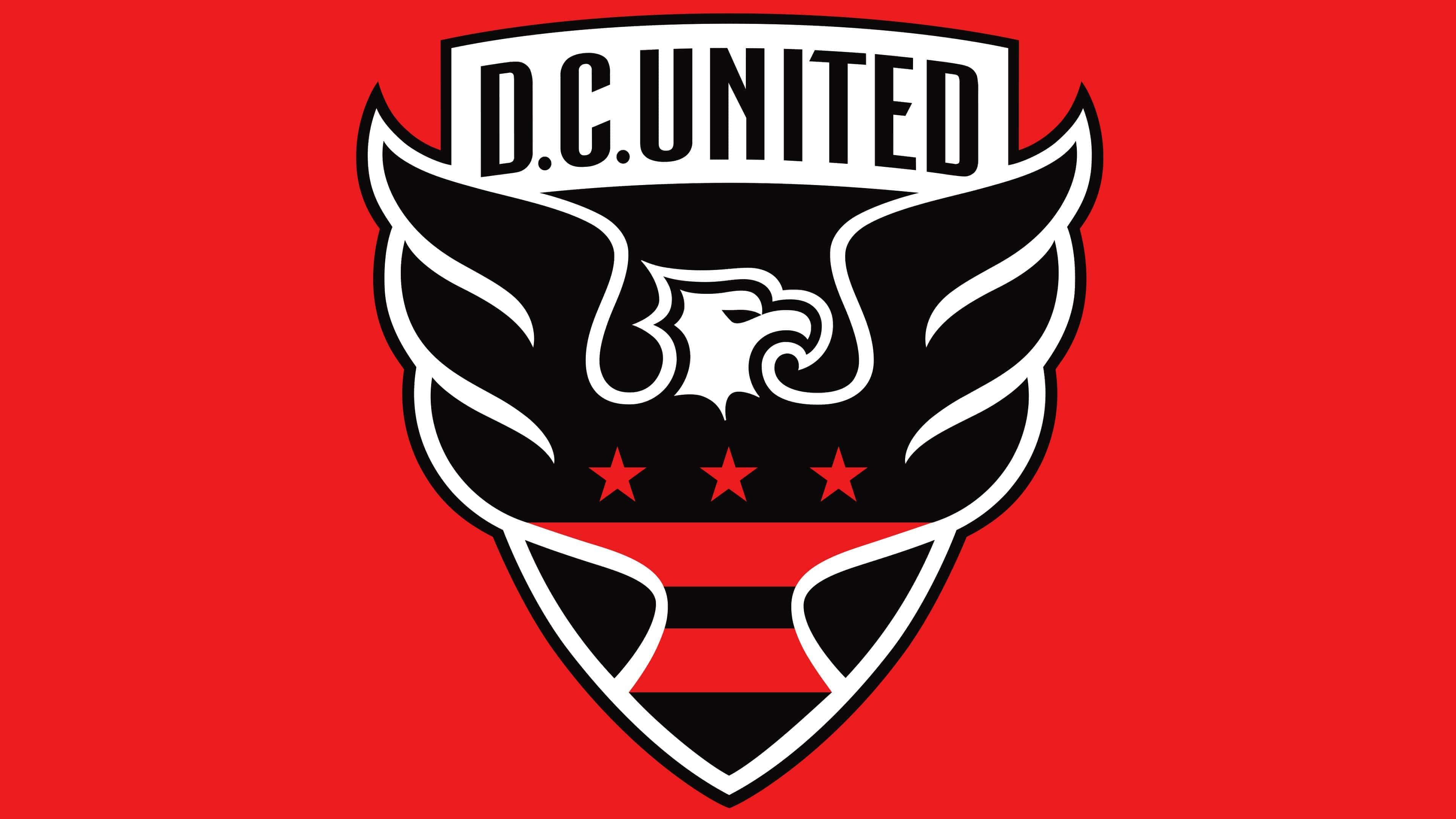
On December 10, 2015, D.C. United unveiled the updated logo at Union Market. It features an old French triangular shield with a sharp point. The nickname is in a black frame above the heraldic symbol. The font is sans-serif, without flourishes. All letters are uppercase.
The eagle is at the center of the DC United logo. Its wings break free from the shield, emphasizing the brand’s core value: freedom. The shape of the eagle’s head hasn’t changed, but it’s now turned to the right. Below the bird are two wide stripes, and above them are three pentagonal stars in a line. These elements are taken from the flag of the District of Columbia and the coat of arms of George Washington’s family, dating back to 1559.
The color palette hasn’t changed since 1996, but the shades have become darker and deeper. The outline, wordmark, shield, and body of the eagle are black, while the background behind “D.C. United” and the inner outline are white. The stripes and stars are red.
Font and Colors

The enduring symbol of D.C. United is an eagle with outstretched wings, proudly looking to the side. The logo’s design has changed several times due to ambiguous criticism. Many accused D.C. United resembles the Nazi emblem. However, the soccer club has never deviated from its chosen concept, steadfastly maintaining its original style since 1996.
Artists managed to make the bald eagle look menacing. Perhaps the U.S. national symbol seems so because the emblem’s primary colors are red and black. The sense of danger is intensified by a silhouette consisting of many angular elements. Even the three five-pointed stars against the bird’s backdrop seem ominous. However, they, like the two horizontal stripes, were taken from the Washington flag.
The font on the old logos resembles Copperplate Gothic Bold or Onyx. In the modern version, the words “D.C. UNITED” are written in the club’s proprietary font. The inscription has always been black because this color stands out well against the white rectangle. The shield and eagle are also black, except for the white bird’s head and the red pattern consisting of lines and stars.