D-Link: Brand overview
Founded in 1986 by Ken Kao in Taipei, Taiwan, the company that became D-Link was originally named Datex Systems Inc. A year later, in 1987, it was decided to rebrand the company as D-Link Corporation. The company announced itself in 1988 with the LANSmart network operating system, which was one of the first peer-to-peer networking solutions.
By 1991, the company had grown so large that it required the construction of a specialized facility in Taiwan’s science-oriented Hsinchu Industrial Park. Although documents indicate that the company changed its name from Datex Systems Inc. to D-Link Corporation in 1992, it should be noted that it had already been operating under that name since 1987. In 1994, D-Link made financial history by becoming the first Taiwanese networking company to be publicly listed, debuting on the Taiwan Stock Exchange.
The following year, 1995, D-Link expanded its operations to India, opening a branch office there and beginning manufacturing operations. Over time, the company expanded its international reach, establishing itself in Europe, North America, and other regions.
Today, D-Link is an established figure in the global networking sector, with more than 2,000 employees in 60 countries. From a local Taiwanese company, it has successfully transformed into a multinational corporation known for its networking solutions.
Meaning and History
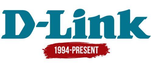
1994 – today
Ornate letters turn the D-Link logo into a unique emblem by which you can quickly identify the Taiwanese corporation that makes networking equipment. Large, massive letters create a sense of reliability and confidence. The dot above the “i” is egg-shaped, and in the center of the “D” is a directional arrow. This arrow is clearly visible in negative space and points to the right. Equally interesting is the hyphen between the first two glyphs, which looks like a perfect parallelogram. All the letters have large serifs with a diagonal slope.
The logo turns out to be pretty neat. The letters are not just there; they have slight variations that make you look at them twice. The arrow in the “D” is like a little secret, and the egg-shaped “i” is just fun. Even the hyphen isn’t just a line; it’s a shape that draws the eye. It’s not just a name; it’s a mini work of art.
D-Link color codes
| Duck Blue | Hex color: | #03758d |
|---|---|---|
| RGB: | 3 117 141 | |
| CMYK: | 98 17 0 45 | |
| Pantone: | PMS 7712 C |


