The Daimler logo is strict and stylish. It embodies the logical mind and graceful approach to solving problems inherent in the founders. The emblem is environmentally friendly, constantly updated, and developed.
Daimler: Brand overview
| Founded: | 1926 – 2022 |
| Headquarters: | Stuttgart, Germany |
Daimler is the world’s largest automaker, originating in 19th-century Germany. Groups of investors own them. The giant’s revenue is more than 134 billion euros per year. The headquarters is in Stuttgart. In 2022, the conglomerate was renamed the Mercedes-Benz Group.
The company is the result of an amalgamation of geniuses from the 19th and 20th centuries, most of whom we know today as car names. Benz, Maybach, and Chrysler – these engineers stood at the origins of the automotive industry. They gave the world the first cars, motorcycles, buses, trucks, and, most importantly, engines that mankind uses today.
Meaning and History
Behind the simplicity of the company’s logos, there is a two-hundred-year history of the creators of cars. The emblems immortalize the memory of the most significant names, outstanding engineers, and geniuses of thought. That is why in most variations, there is no image, and the viewer’s attention is focused on the names of the corporation, which change as new giants join and grow.
What is Daimler?
Automotive giant with assets of 259 billion euros, founded in Germany through the merger of Gottlieb Daimler and Karl Benz. It specializes in the creation of passenger cars on gasoline and electricity. More than 170 thousand people work at the conglomerate’s factories.
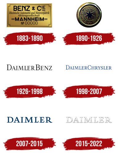
1883 – 1890
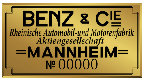
The logo is made in the form of a metal plate, which, apparently, the owners placed on the new horseless carriages produced by the company.
At the head of the emblem is the inscription: Benz & Cie. This association appeared in 1883 due to the union of the engineer-inventor Karl Benz and two bicycle repairmen, M. Rose and F. Eßlinger. The addition of Cie comes from the abbreviation companies since the full name of the collaboration was: Benz & Companie Rheinische Gasmotoren-Fabrik. For convenience, the name was abbreviated.
Benz had a fairly rich experience before this company, as a result of running its factory, where it invented and produced a two-stroke engine, and later a system patented by him, which became the basis of modern cars (a complex of ignition, spark plugs, carburetor, battery, clutch, radiator, and gearbox gears). Therefore, his name is central to the logo.
Below is a detailed transcript: Rheinische Automobile und Motorenfabrik Aktiengesellschaft. The inscription told which plant the company manages and what it does. At the factory, Benz continued to shape the future car, combining its developments and design features of bicycles. The result was Motorwagen – the first car in history.
The logo was completed with the inscription Mannheim No. 0000. Production took place in the third-largest German city, and four zeros hinted at many future modifications of the new invention.
1890 – 1926
The restless genius of Benz continued to give the world more and more new creations: several models of cars, the first trucks (1895), the first buses (1895) on internal combustion engines, and a flat engine (1986).
However, in the production of cars, he had another German competitor Daimler Motoren Gesellschaft (DMG), opened in 1890 by another German engineer Gottlieb Daimler. He, along with Wilhelm Maybach, invented the gasoline-powered internal combustion engine.
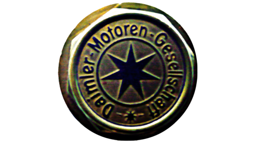
Daimler’s logo was an embossed metal circle resembling a wheel. Inside, the company’s name was spelled out in a circle, and in the center was a seven-pointed star. The beams looked like the inner spokes of the wheels of vehicles, especially the Petroleum Reitwagen, the world’s first motorcycle built by Gottlieb.
The combination of spokes in the center and a convex rim along the edges enhanced the resemblance to a wheel.
1926 – 1998
In 1926, the two giants finally met and merged into a single corporation called Daimler-Benz. The new logo reflected the unification. It consists of two names of the founders, written in elegant thin letters, each of which is indicated in capital letters.
Interestingly, by that time, none of the designers were no longer working in these companies. Gottlieb Daimler died in 1900, and Maybach left the firm a few years later. Benz also left Benz & Cie as a developer and started another company with his sons.
However, the designers’ names were chosen for the new corporation and logo as a tribute to their contributions and talent. Thin, graceful letters personify a flexible mind and education. They echo the light wheels of new cars. The lack of separation between the surnames indicates close cooperation and connection of developments.
1998 – 2007
In 1998, one of the major intercontinental mergers took place. Germany’s leading and US’s third largest corporation merged into DaimlerChrysler AG.
The association’s logo retained the style of the previous sign and also consisted of the company’s name. The font of the inscription has also remained the same. However, its letters are smaller. The solution helps keep it compact, as both parts of the title are quite long.
Firm names are listed in order of precedence. Therefore, Daimler precedes Chrysler, as it is ahead of Chrysler in age by 25 years. Plus, there were lengthy proceedings regarding the fact that Daimler-Benz practically absorbed a younger company and did not close the deal on an equal footing.
The color of the emblem has also changed from black to blue. The hue indicated the rise of the possibilities of a joint corporation to heaven, thanks to the combination of knowledge and experience.
2007 – 2015
The expected rise in the development of the joint corporation did not occur. Since 2002, each of the firms has continued producing its cars. In 2007, part of Chrysler was sold. Therefore, the company retained only the first part of the name, like the logo.
The emblem has a large blue inscription in capital letters, with serifs representing progress, development, and growth. The company occupies a leading position in the car market. There are several successful partnerships. Along with the Chinese BYD, Denza luxury cars appear, and MV Agusta motorcycles are bought from Italians.
2015 – 2022
The 2015 logo takes on volume and light gray and white gradient. The redesign indicates renewal, a new starting point for development.In partnership with other automotive companies, the company has acquired Here Technologies, which develops navigation systems and maps.This is one of the brand’s steps towards implementing a new strategy – to become a mobility supplier. For the same reason, Daimler is partnering with young start-ups. The next step was electric vehicles. And the light logo, in this vein, is a symbol of environmental friendliness.
In 2022, the company was renamed the Mercedes-Benz Group, which completed the history of Daimler logos.
Font and Colors
Over the years, the logo’s color has evolved from black to blue to white. The clarification process showed the company’s ability to revive, renew itself, and create new masterpieces. In white, a message of concern for the environment, new partnerships, and a rethinking of one’s place in the modern technological robotic world. The names of the founders continue to live, but with new inventions. The company strives to remain the flagship, as it was at the time of creation.
The font is close to Pliego Medium, with delicate serifs that show chic and technological excellence.
Daimler color codes
| Gainsboro | Hex color: | #dedfdf |
|---|---|---|
| RGB: | 222 223 223 | |
| CMYK: | 0 0 0 13 | |
| Pantone: | PMS Cool Gray 1 C |
| Black | Hex color: | #080808 |
|---|---|---|
| RGB: | 8 8 8 | |
| CMYK: | 0 0 0 97 | |
| Pantone: | PMS Black 6 C |
