


![]() Damco Logo PNG
Damco Logo PNG
Bright design and simple elements characterize the Damco logo, making the logistics company recognizable worldwide. The innovative design demonstrates an unconventional approach to work and a quick search for transport solutions. High responsibility is the logo’s key message.
Damco traces its history to 1905, when Dutch entrepreneur C.W.H. van Dam founded a freight forwarding company. The brand name came from his surname, following a common business practice of the early 20th century. The company operated in sea freight and logistics, a field that was growing rapidly as international trade expanded and steamship routes became central to global commerce.
During the first half of the 20th century, Damco built agency ties and commercial contacts in major European and Asian ports. Its work covered transport coordination, customs clearance, and warehouse storage. For trading houses working across borders, these services were essential because cargo had to move between ships, railways, warehouses, and local delivery networks.
Damco later became part of A.P. Møller-Mærsk, the Danish shipping and logistics group. By the late 20th century, Maersk Line controlled a large share of global container shipping, and Damco became the group’s freight forwarding arm. In the 2000s, the company expanded into supply chain management, opened offices in Asia, Africa, and Latin America, and worked with producers of clothing, electronics, and consumer goods, moving products from Asian factories to Europe and America.
In global logistics, Damco competed with Kuehne + Nagel and DB Schenker, both large operators in sea, air, and land transport. In 2019, A.P. Møller-Mærsk restructured its logistics business and moved Damco’s ocean and air freight operations under the Maersk name. Damco remained solely focused on supply chain management, then gradually lost its distinct role in customer communications as Maersk consolidated logistics under a single corporate brand.
Meaning and History

Visual brand awareness is high among Damco’s target audience. First, we are talking about organizations that need logistics services. Also, the unique logo, which has not changed throughout the company’s existence, has become familiar to Damco customers.
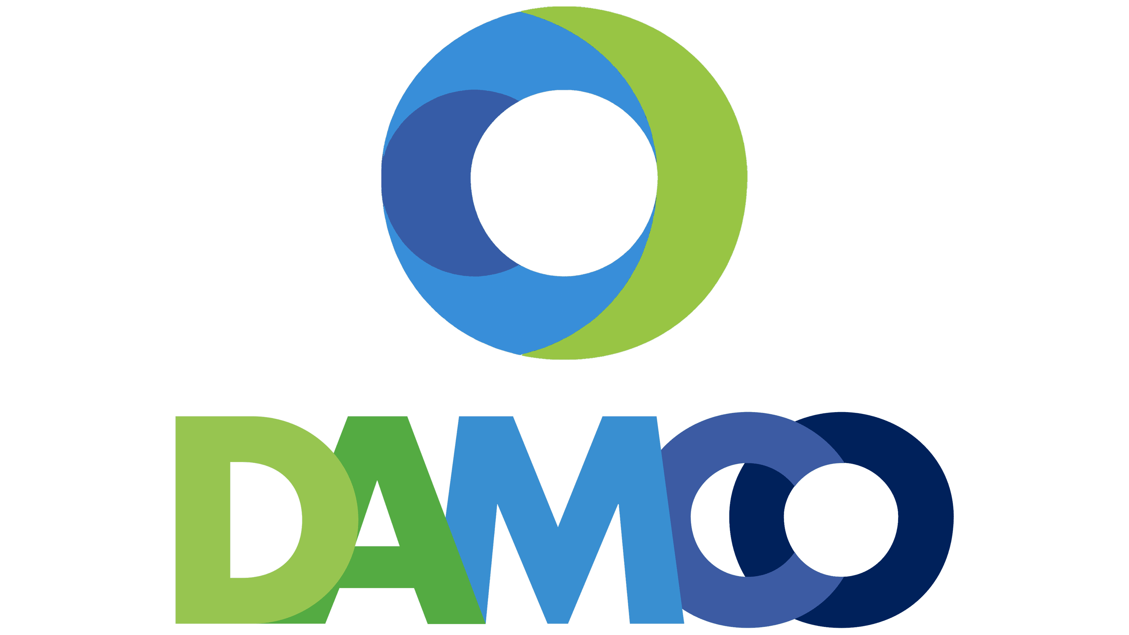
It consists of a word inscription and a round emblem located on the left. A white circle with a thick outline consisting of green and two shades of blue looks modern and convincing. Moreover, the color contrast creates a three-dimensional effect on the emblem, making it more mysterious and unusual.
What is Damco?
This is one of the largest logistics companies in Denmark, which provides customers with transportation services throughout the country and beyond.
In turn, the verbal inscription consists directly of the brand name. Each letter has its own color. The three letters are painted in the same shades as the emblem, but dark green and dark blue have also appeared. Visually, the letter “O” is very similar to the emblem, and therefore, there is unity between the two elements of the logo. Interestingly, there are no spaces between the letters; they are superimposed, which draws additional attention. Speaking of style, this is a classic, bold sans-serif typeface with thick character lines. As a result, the logo looks modern and organic on any surface. The uniqueness of the Damco logo lies in its ability to stand out from the competition despite the traditional lettering style. Bright colors are not entirely associated with logistics company activities; therefore, it is not surprising that there are no real analogs for the logo. Perhaps it was precisely this visual identity that the leadership of the Danish brand sought.
Font and Colors
The wordmark font for the Damco logo was a classic sans-serif style. All letters are presented in the traditional version, and each, by itself, does not have unique elements. In turn, the effect of superimposed letters is genuinely interesting, making the logo more distinctive and progressive than competitors’ logos.
The color palette consists of many shades of green and blue. Regarding the logo, the color contrast creates a three-dimensional effect. At the same time, each letter in the word inscription uses its own shade of green or blue. As a result, the logistics company logo looks bright and positive, which is a bit unusual for such organizations that prefer strict colors and a formal style.