 Dan Henderson Logo PNG
The Dan Henderson logo is as masculine as the mixed-martial-arts fighter it represents. Perseverance, strength, unwavering determination, and goal-oriented focus reflect the qualities needed to confront an opponent in personal combat. The logo is complemented by an equally powerful color scheme that underscores the athlete’s superiority.
Dan Henderson was born on August 24, 1970, in Murfreesboro, Tennessee. He grew up in California, where he began wrestling at a young age. Before MMA, he built a strong Greco-Roman wrestling career. He represented the United States at the 1992 Olympic Games in Barcelona and the 1996 Games in Atlanta. His wrestling background later shaped his fighting style, which was combined with a powerful right hand known as the “H-Bomb.”
Henderson entered mixed martial arts in 1997. One of his first major results came at UFC 17, where he won a tournament in the middleweight class of that era. In 1999, he also reached the final of Rings: King of Kings in Japan. That same year, he co-founded Team Quest in Gresham, Oregon, with Randy Couture and Matt Lindland, creating one of the notable MMA gyms on the U.S. West Coast.
His career peak came during his time at Pride Fighting Championships. In 2000, Henderson won the Pride Welterweight Grand Prix by defeating Murilo Bustamante. In 2005, he won the Pride Middleweight Grand Prix by knocking out Wanderlei Silva, becoming the only Pride fighter to hold two titles simultaneously in different weight classes.
After Pride was acquired by Zuffa in 2007, Henderson moved to UFC. His knockout of Michael Bisping at UFC 100 in 2009 became one of the promotion’s best-known finishes. In 2011, he won the Strikeforce light heavyweight title against Rafael Cavalcante, then returned to UFC and fought Mauricio “Shogun” Rua at UFC 139. Henderson retired in 2016 after facing Hector Lombard and later focused on coaching through Team Quest.
Meaning and History
The future champion fighter was born in 1970 in Downey, California, and grew up in Apple Valley. During his school years, Dan became interested in sports, choosing wrestling. He repeatedly won awards among juniors in Greco-Roman and freestyle wrestling. During his college years, Henderson did not abandon his pursuit, continuing to train and compete.
As the athlete became better known, he adopted the nickname Hendo and incorporated it into his personal logo, which he used throughout his active career. After retiring, Henderson changed the emblem when he opened his fitness center, where he began training young wrestlers. The logo became part of the sports institution’s identity but continued to represent its owner.
What is Dan Henderson?
Dan Henderson is an American wrestler who has won numerous victories in prestigious tournaments, including the Ultimate Fighting Championship, Pride Fighting Championships, Strikeforce, UFC 17, Rings: King of Kings, Brazil Open, and others. He is also an Olympic champion in Greco-Roman wrestling and an NCAA Division I Wrestler. Currently, the athlete is working as a coach at his namesake fitness center.
Old

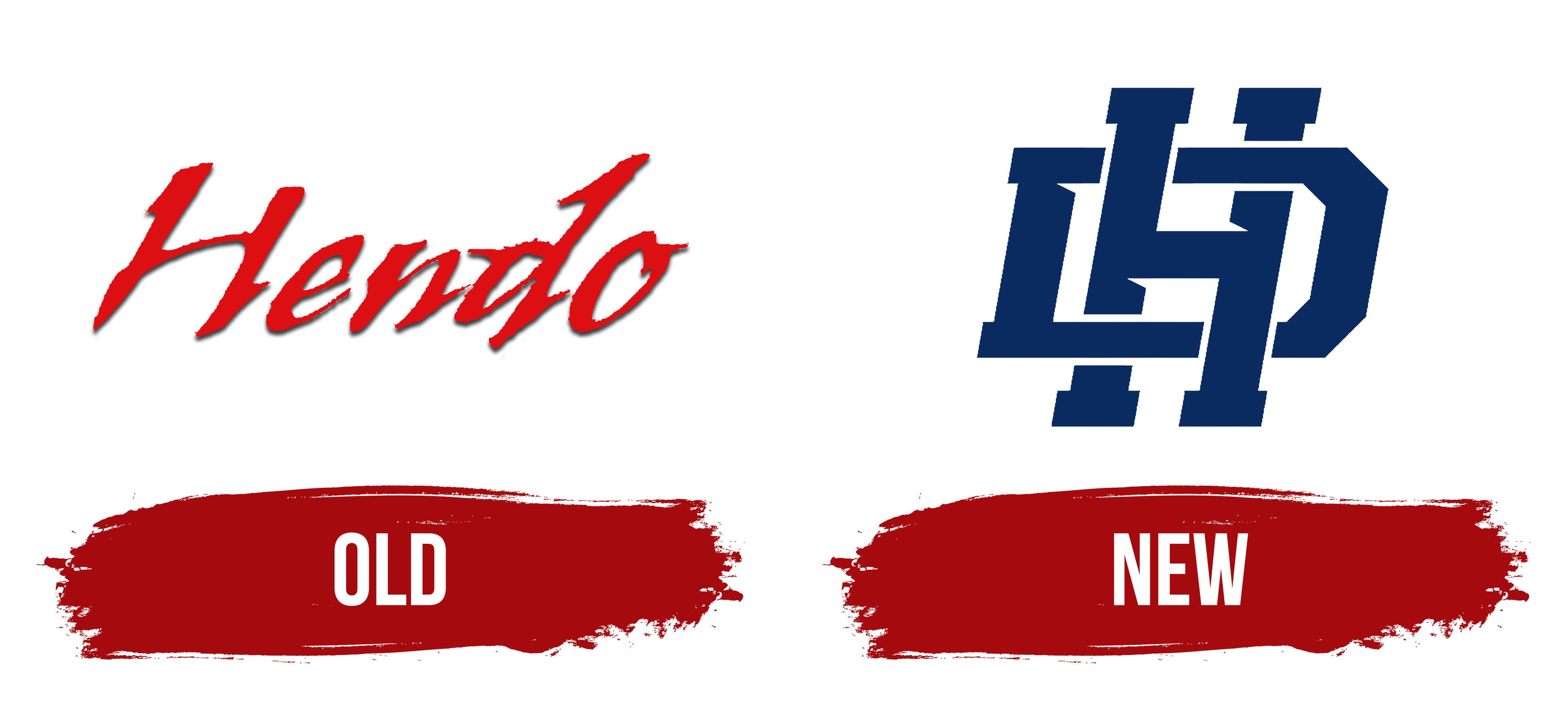
The Dan Henderson logo is textual. It uses a unique font, specifically developed for this project, with no analogs. The nickname of the famous wrestler Hendo is written in italics with a semi-connected typeface that imitates a handwritten style. The uneven glyph edges resemble serifs, with short strokes protruding from the ends of the legs of “H,” “d,” and “n.” The dark red letters are complemented by narrow black stripes, creating a shadow effect.
New

The Dan Henderson logo is massive and impressive, representing the athlete and his wrestling center. To materialize the idea of impregnability, power, and immense strength, designers used a block style. They took the first letters of the name and surname, combined them into a monogram, and added a bold touch. As a result, the initials are intertwined, symbolizing unwavering determination. The torn glyph edges are now replaced by large, rectangular serifs, even and smooth. However, the italics are preserved, adding dynamism to the emblem. Triangular notches play this same role on the wide sides.
Font and Colors

Individual typefaces were created for the Dan Henderson logos, emphasizing the essence of the wrestler: his striving for confrontation, his focus on high performance, and his ability to resist external pressure. That is why the text is slanted as if moving forward. The glyphs are bold, large, and uppercase. The horizontally placed “D” is pierced by the vertical “H.” They are intertwined, forming a solid monogram.
The color scheme consists of red and blue, which were used at different times. The background is always neutral light so that the inscription looks clear and bright. The red has a slight haze, making it appear as a shade from the pastel palette. Blue, by contrast, is classic, as it most often accompanies sports emblems.