


![]() Datsun Logo PNG
Datsun Logo PNG
The Datsun logo is very futuristic. The emblem exudes fluidity, innovative materials, and fantastic possibilities. Owners will be amazed by the machines’ technical equipment, speed of movement, and ease of control.
The Datsun brand has disappeared and reappeared twice. Its history dates back to the early 20th century, when two Japanese companies merged to form a single company that produced luxury cars. At the same time, the range was based on an inexpensive model that dominated the US market in the 1960s. However, the fame did not last long: the trademark was discontinued in 1986 and forgotten for 27 years. She returned in 2013 with new machines targeted at buyers from several countries.
Datsun is directly related to Nissan Motors because that company originally owned it. As far as I know, in 1934, Jitsuyo Automobile and DAT Automobile merged, the two automakers that gave birth to Nissan. At the same time, the products of the newly formed structure were sold abroad under the Datsun brand. First, the lineup featured luxury cars. During the fighting, it is time to deploy military technology. When World War II ended, the US Army ordered Datsun mini-trucks from Nissan, saving the automaker from bankruptcy.
So, gradually, the Japanese brand became popular and captured the American market through cheap transport. However, the parent company had completely different plans: it abandoned Datsun to unite all areas under Nissan’s common name. This required a huge financial investment that did not even pay off. The executives didn’t consider that people were used to the old brand. If Japan were known for Nissan, motorists in other countries would only be familiar with the Datsun logo. As a result, sales in the overseas market dropped sharply.
Meaning and History
![]()
The automaker started from scratch in 2012. He had to win customers’ trust and draw attention to his products. It is all the more surprising that in 2012, he decided to restore the Datsun brand, launching a campaign to “resurrect” it. The owners decided to forgo a full rebranding. They retained the original name, which was composed of two words: “DAT” (the initials of the investors) and “sun” (the symbol of Japan). By the way, the creatives would first give the brand a completely different name, Datson. This indicates that the brand is a subsidiary of DAT. However, this spelling caused negative associations in Japanese, so the penultimate letter was replaced.
After Datsun’s unexpected return, the logo was retained, albeit with a modern look. Over the centuries, it changed many times, but laconic inscriptions often prevailed. They were an integral part of the iconography of cars exported to markets. However, the most popular and memorable round sign with a rectangular plaque, on which the brand name was written.
What is Datsun?
The automotive brand Datsun has experienced two births. It appeared in 1931, when DAT Automobile Manufacturing introduced the first subcompact prototype. In 1986, the brand disappeared, giving way to Nissan. The restart took place in 2013: Datsun began producing inexpensive cars in several countries. In 2020, production in Russia and Indonesia was stopped, but the machines continued to be manufactured in India.
1931 – 1935
![]()
The original emblem featured a red circle divided into two equal parts by a blue rectangle with “DATSUN ” in white lettering. The word was written in bold type with long and sharp serifs. The letters were disproportionately squeezed at the edges.
1935 – 1976
![]()
The emblem used a simple, smooth, even, and chopped font. The letters grew wider, but the spacing between them didn’t increase because the designers removed the serifs.
1951 – 1963
![]()
Another early symbol looked like a red plaque with rounded corners. Inside was the brand name, highlighted by an elongated white line. The first “D,” the most unusual, is shaped like a rectangular trapezoid. Moreover, all the letters consisted of strokes of varying thicknesses and were slightly flattened, as seen on the badge-adorned Datsun 320 cars.
1963 – 1964
![]()
In 1963, a logo appeared with widely spaced letters connected by thin horizontal lines. The font became handwritten, with a noticeable rightward slant. The rectangle disappeared, and the red color was replaced by blue. This wordmark could be seen on the Datsun Bluebird 410 radiator grilles.
1964 – 1965
![]()
The Datsun automotive brand used a badge with stylized lettering during this time. If the previous emblem was thin and elegant, the new one is thick and geometric. The font was coherent, outlined, and italicized. Wide letters made up a single composition. Because the connecting line ran at the bottom, the glyphs were less visible than at the top. The background of the title was a horizontal blue stripe.
1965 -1986
![]()
The 1965 Datsun logo can be characterized as strict and businesslike. It was completely verbal and consisted only of the name. The inscription was made of uppercase type with classical-style block letters. They had no notches. “D,” “S,” and “U” had characteristic curves. This design improved the text’s readability and facilitated quick recognition of the car brand.
1970
![]()
In 1970, the automaker brought back the logo in cursive outline lettering. The glyphs in it were connected, as in the 1964-1965 version, but only looked more distinct and easier to understand. The line below could have been more perfectly even: it consisted of segments that formed letters. Another change: the “n” had a miniature indentation at the top.
1970 – 1972
![]()
In 1970, the inscription was placed inside a gray oval with a red-and-black ring. The gradient gave the elliptical shape a three-dimensional effect. The letters also seemed three-dimensional because they were outlined in thin, dark lines that contrasted with the white base. Moreover, large rectangular serifs made the brand name noticeable against the background of other elements. This logo was first used for the Datsun Cherry 100A E10.
1972
![]()
After a complex form, the logo was again simplified. The “Datsun” inscription has been modernized by increasing the inter-character space and, accordingly, reducing the glyphs. A narrow, long horizontal rectangle limited their height. The only thing the designers have kept is the gray outline on the white letters. On a black background, they looked distinct and expressive.
1972 – 1976
![]()
In 1972, another version of the word mark appeared: a simple black inscription on a white background. The most prominent detail was the long and sharp serifs on the edges of the letters. A similar symbol adorned the Datsun 240K C110 cars but lacked some elements.
1976 – 1986
![]()
The Datsun corporate logo was developed in 1976. It was based on the original design and contained the same elements as the first emblem: two red semicircles, a blue rectangle, and white lettering. The font changed because the developers preferred the sans-serif version, with bold lines of the same thickness. Due to the small spacing, the letters practically crawled over each other. Because of its distinctive shape, Americans have nicknamed this symbol “hamburger.” In the 1980s, it was used on cars and the Nissan emblem, but it was abandoned. The Datsun brand remained a marketing tool for selling products until the mid-1980s, when the parent company began unifying its names. In 1986, he was forgotten for a long time.
2012 – 2022
![]()
In 2010, the owners decided to restore the historic trademark. The preparatory phase took three years, and Datsun machines returned to the markets of some countries as early as 2012. They needed a little image change to show their commitment to progress. Therefore, the logo was changed, while retaining some classic elements.
In the center of the blue plaque is the word “DATSUN.” The inscription has a linear white-to-gray gradient; the letters are highlighted in black outlines on the right. The rounded rectangle is embedded in the same blue ellipse. In addition to color, they are united by a radial gradient, making it appear that an invisible light source is in the left corner. The outer part of the logo is a silver oval bezel with cut-out tops and bottoms.
Font and Colors
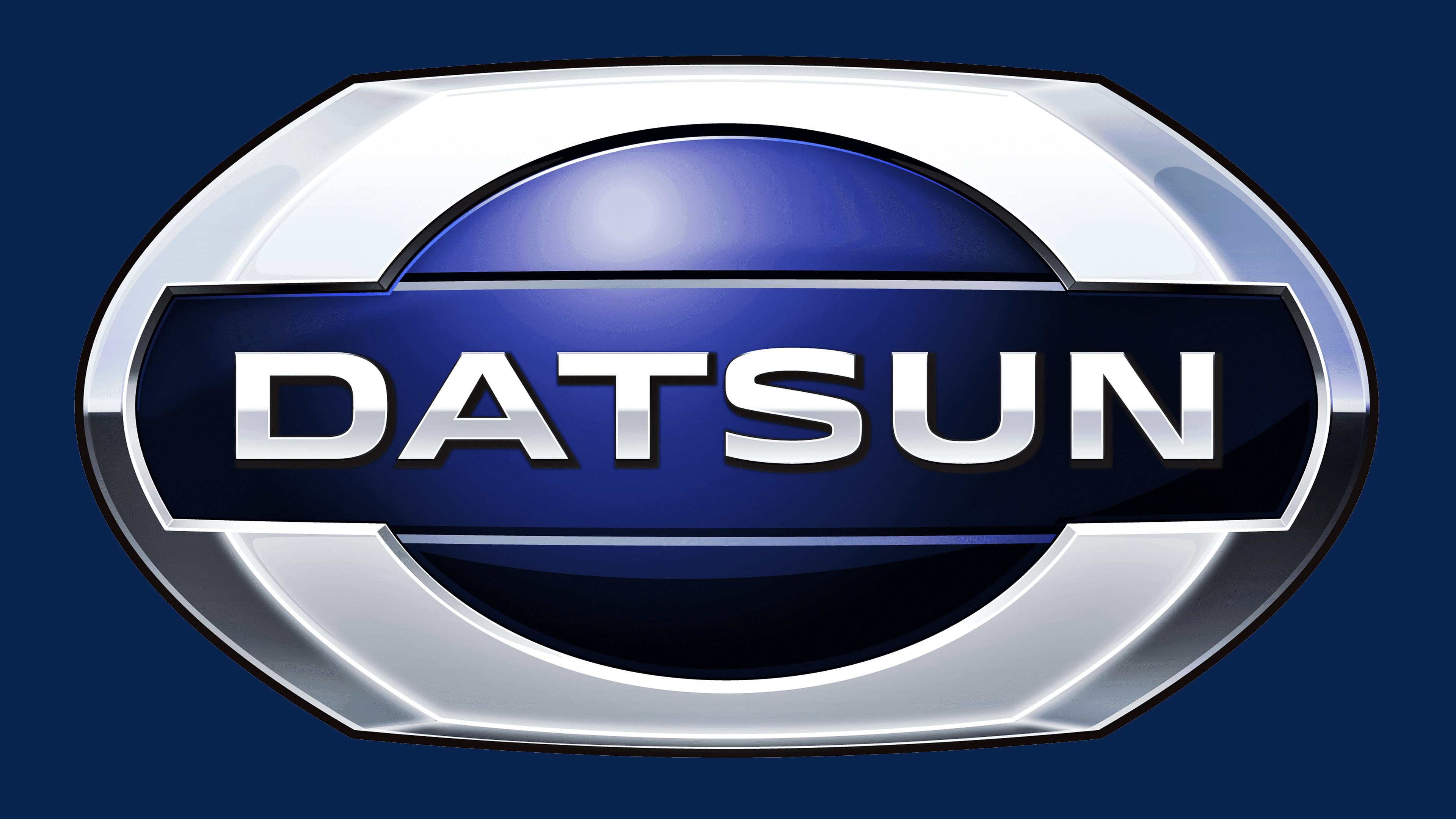
The circle in the middle represents the rising sun, Japan’s national symbol. It demonstrates that the company is committed to development and modernity and, to some extent, illustrates the name Datsun. The dividing rectangle represents the energy at play, which helps the brand move forward.

Following an established tradition, the designers used a sans-serif font for the logo. The official colors of the car brand used to be red, blue, and white – the same as on the US flag. After the revival, the emblem became silver-blue as America ceased to be Datsun’s main market.
FAQ
What is the rarest Datsun car?
The 2000GT is one of the brand’s rarest cars, with only 351 examples produced between 1967 and 1970. Collectors regard it as a significant achievement in automotive design and engineering.
The Z series of cars began in the late 1960s and included the Nissan S30, known in Japan as the Nissan Fairlady Z and internationally as the Datsun 240Z. This series combined a beautiful appearance, performance, and affordability, making it very popular.
What brand of car is Datsun?
Datsun was founded in Japan in 1931, five years before Toyota. It quickly became important in the automobile industry for its ability to offer affordable, reliable cars. Nissan Motor Company owned the brand, and in 1986, it stopped using the “Datsun” name to focus on promoting the Nissan brand worldwide. This step aimed to make the company’s brand more recognizable globally.
What does the Datsun logo mean?
The logo includes several significant elements of Japanese culture. It depicts a blue oval, symbolizing the sun. The blue oval pays homage to the brand’s Japanese roots. Inside the oval is a rectangle with rounded edges. This shape represents energy and forward movement in the automotive industry.
What is the Datsun symbol?
The main symbol is the sun, a vital element of Japanese culture, reflected in the Japanese flag and in the country’s nickname, “Land of the Rising Sun.” The sun logo features a modern, unique style that isn’t immediately recognizable. Using this national symbol, the company combines its history with modern uniqueness.
What is the font of the Datsun logo?
The logo’s letters are key to its design. The designers chose a unique, bold sans-serif font that doesn’t match any commonly available fonts. It is similar to FontSite Inc.’s MicroSquare Bold Extended, a paid font, and to Steve Gardner’s Plateia Bold, a free font. This font choice creates a modern look and feel, ensuring the typography complements the logo’s overall style.