The Delco Remy logo represents stability, balance, and a reliable foundation. The company’s parts make vehicles powerful and capable of high speeds. The emblem features innovative elements that the brand incorporates into its products.
Delco Remy: Brand overview
Founded in 1896 by the Remy brothers, Frank and Perry, in Anderson, Indiana, Delco Remy has a significant legacy as an innovative manufacturer of automotive components. The company has established itself as a key player in the automotive industry, specializing in creating starters, alternators, and ignition systems.
With several patents for starter motor innovations, Delco Remy has become an influential figure, licensing its technology to worldwide manufacturers. This leadership role caught General Motors’s attention, resulting in Delco Remy’s acquisition in 1918. As a result, Delco Remy became a major division of GM, responsible for supplying AC Delco auto components.
By the middle of the 20th century, the company’s reach had expanded, and products from the Delco Remy plant were used in millions of vehicles produced by GM, Chrysler, and other global brands. This broad influence did not prevent the company from innovating and diversifying. Delco Remy began producing heavy-duty systems, hybrid powertrains, and even traction motors for locomotives in the following decades.
A significant shift occurred in 1994 when Delco Remy was spun off from GM, leading to its merger with Lucas Varity in 1998. This merger gave rise to Remy International, which continued Delco Remy’s rich legacy. Today, the Remy brand is still heavily involved in manufacturing starters, alternators, and other automotive power electronics components.
The story of Delco Remy is more than just the story of a company that manufactures automotive components. It is a testament to the spirit of innovation and adaptability, reflecting the legacy of a pioneering and leading manufacturer in the 20th-century automotive industry. Delco Remy’s contribution to engine starting and power generation systems continues to be felt, symbolizing an era of technological advancement and industrial growth.
Meaning and History
What is Delco Remy?
It is an American manufacturer known for its automotive electrical components, including starters, alternators, and ignition systems. Originally part of General Motors, the company has a long history of supplying reliable components to the automotive industry. The brand’s products are used in various vehicles, from cars to heavy trucks. The company has become a trusted manufacturer of automotive electrical systems, providing advanced technology and support to original equipment manufacturers (OEMs) and the aftermarket.
1901 – 1927
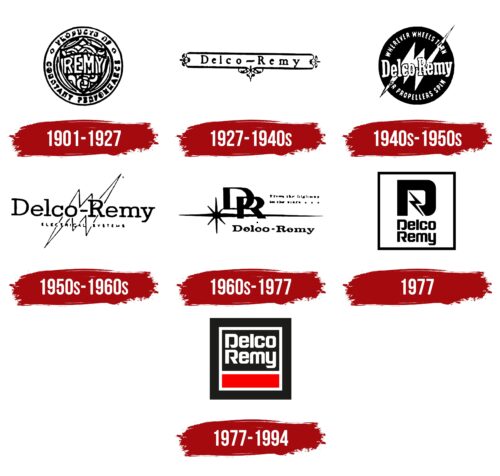
The first Delco Remy logo featured a round coin with a unique design. At the center was a crest adorned with numerous roses and the word “Remy,” likely indicating the family name of the company’s founders. The company was founded by brothers, emphasizing the importance of the crest.
The Spanish word “veoducto” surrounded the crest, indicating the brand’s involvement in wire production. The company primarily produced home electrical wiring at that time, as reflected in the logo.
The coin had a metallic appearance, conveying a sense of durability and reliability, which matched the qualities of Delco Remy’s products.
1927 – 1940s
Working with General Motors brought significant changes to the Delco Remy emblem. The new emblem featured an elegant elongated Delco Remy plaque, reflecting the owners’ collaboration. Delco stands for Dayton Engineering Laboratories Co., and Remy is the founders’ last name.
Heraldic peaks were placed at the edges and bottom of the emblem, highlighting the company’s historical roots. These elements symbolize the company’s long history and commitment to quality and tradition. The small details on the emblem indicated the production of individual auto parts, which became Delco Remy’s main focus after partnering with General Motors.
1940s – 1950s
Everything the company produces is related to electricity and movement, represented by a lightning bolt on the emblem. Sharp edges extending beyond the logo resemble propeller blades, symbolizing speed and dynamism. The black circle in the background signifies continuous movement in transportation. The company’s products enable the movement of vehicles, whether car wheels or airplane propellers, reflected in the text around the emblem.
During World War II, Delco Remy expanded production, manufacturing armored vehicles, trucks, and aircraft engines. This added strategic importance to the company in the military industry. The white text on the emblem represents the renewal of the product line and the introduction of new items that contributed to victory. This color emphasizes the company’s commitment to innovation and development, which was crucial during wartime.
1950s – 1960s
In the post-war period, the Delco Remy emblem changed. The black background was removed, creating a more concise and modern design. The primary elements of the logo became a lightning bolt and the phrase “electrical systems.” These changes emphasized the company’s focus on electrical components and systems.
The thin, serifed letters of the name associated with wiring highlighted the technical aspect of the company’s products. The white zigzag with a black outline on the logo resembled a reservoir filled with energy, symbolizing the power and reliability of Delco Remy’s electrical systems.
1960s – 1977
The new Delco Remy logo features a star’s light and the spear’s power aimed at its target. The letters “D” and “R,” merged into one, shine like stars in the sky, symbolizing the company’s high goals and ambitions. This logo reflects Delco Remy’s significant achievements, including producing 100 million batteries and opening several new factories.
The emblem looks elegant and noble, highlighting the success and premium quality of the products. The star’s rays resemble sparks, reinforcing the brand’s connection to electricity and energy. The full company name is placed at the bottom of the logo, emphasizing its recognition and prestige. The name “Delco Remy” is associated with quality and reliability, symbolizing success in producing electrical systems and components.
1977
The symbol introduced in 1977 resembles a battery, indicating the company’s main product. Black borders outline a spacious square, hinting at Delco Remy’s products and their ability to store and transfer energy.
The large “D” ends with a lightning flash, running through the symbol like a wire. This element highlights the brand’s focus on electrical systems and components. Below, in two levels, the full company name appears, making the logo recognizable and associated with quality and reliability.
Using black letters emphasizes the production of individual machine parts and symbolizes the company’s technical and essential work. This color conveys professionalism and precision, reflecting Delco Remy’s high standards in manufacturing automotive components.
1977 – 1994
The Remy International logo features a modern and clean design with a square within a square. The old company name is written in bold white, making it stand out. The letters are smooth, even, and crisp, with diagonal cuts adding a unique touch.
The text is centered and occupies two lines, creating a balanced look. Below the text is a red rectangle that adds a splash of vibrant color. This red element is framed with a bold white border, enhancing its visibility. The design is set against a black square background, providing a stark contrast and highlighting each element. This combination of colors and shapes reflects the brand’s commitment to quality.
The white letters in the logo have a clear and sharp appearance reminiscent of freshly written graffiti on a brick wall. The diagonal cuts in the letters give it an edgy, modern look. The bright red rectangle draws attention and adds visual interest. The white border around the red rectangle stands out against the black background, like a spotlight on the brand name.
The logo conveys precision and dependability. The bold white text ensures readability and impact, while the contrasting colors create a visually appealing design. Geometric shapes and clean lines highlight the company’s dedication to excellence and innovation. The overall design is modern and timeless, representing the brand’s values and legacy.
