


 Dettol Logo PNG
The Dettol logo symbolizes protection. The company’s sharp sword cuts through and destroys most pathogens. Disinfectants inhibit pathogen growth and development, helping keep you healthy.
Dettol originated in 1929 within Reckitt & Sons, founded in 1840 in Hull, Yorkshire. Bacteriologist William Colebrook Reynolds joined the company and focused on postpartum sepsis, a major cause of death in maternity wards. Existing antiseptics damaged tissue, forcing a trade-off between treatment and safety.
After four years of research, Reynolds developed a formula that uses 4.8% chloroxylenol combined with pine oil, isopropanol, castor oil, soap, and water. The mixture produced a visible emulsion when diluted, a phenomenon later known as the “Ouzo effect,” and became a recognizable product feature.
The product was nearly named PCMX, reflecting its chemical base, but Lloyd Rook proposed the name Dettol. In 1932, clinical trials at a London maternity hospital showed a 50% reduction in postpartum infections within 2 years. In 1933, Dettol entered the market through hospital channels.
That same year, Dettol was exported to India, where it was used in hospitals but faced competition from traditional remedies like turmeric. Reckitt relied on medical endorsements rather than mass advertising to build trust.
In 1958, Dettol entered UK retail stores, expanding into household use. In 1981, the brand launched antibacterial soap, competing with Lifebuoy from Hindustan Unilever. By the 1990s and 2000s, the range included liquid soaps, plasters, wipes, and cleaning products.
In 1999, Reckitt & Colman merged with Benckiser N.V. to form Reckitt Benckiser, later shortened to RB in 2014 and renamed Reckitt in 2021. In 2010, Dettol received a Royal Warrant from Queen Elizabeth II.
Meaning and History
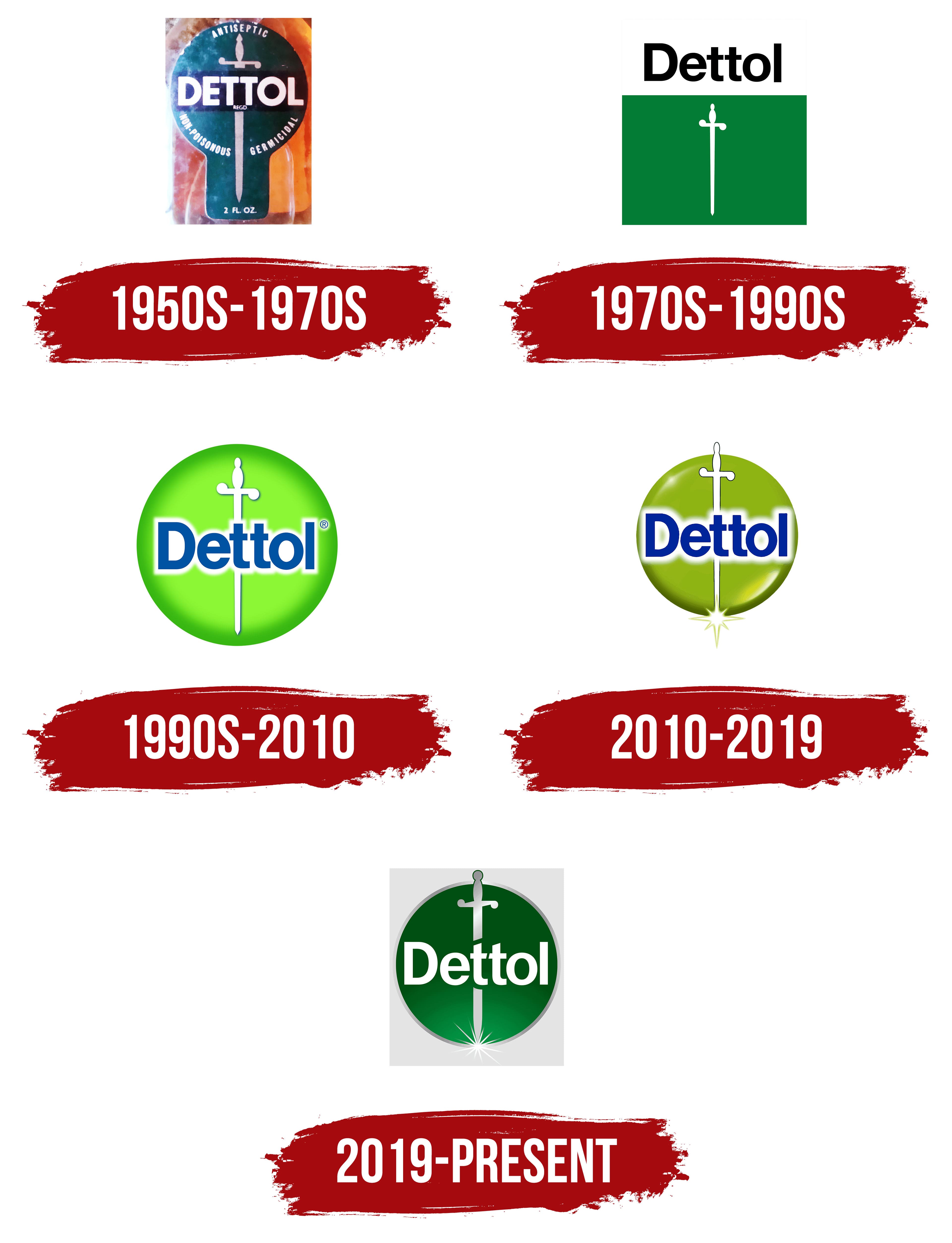
The logo clearly confirms the manufacturer’s claim that its antiseptic preparations kill 99.99% of bacteria, leaving them no chance. That’s why the designers chose a sharpened sword as the main element.
What is Dettol?
This brand from Reckitt Benckiser has become a symbol of cleanliness and germ protection in households worldwide. It provides reliable family protection with its unique antiseptic liquid, signature scent, and a wide range of cleaning products, hand soaps, and disinfectants. The lineup includes surface cleaners, laundry disinfectants, and specialized solutions for the kitchen and bathroom, extending beyond personal hygiene and rooted in expertise in germ prevention.
1933 – 1950s
At this point in the company’s development, the brand’s logo and emblem are unknown.
1950s – 1970s
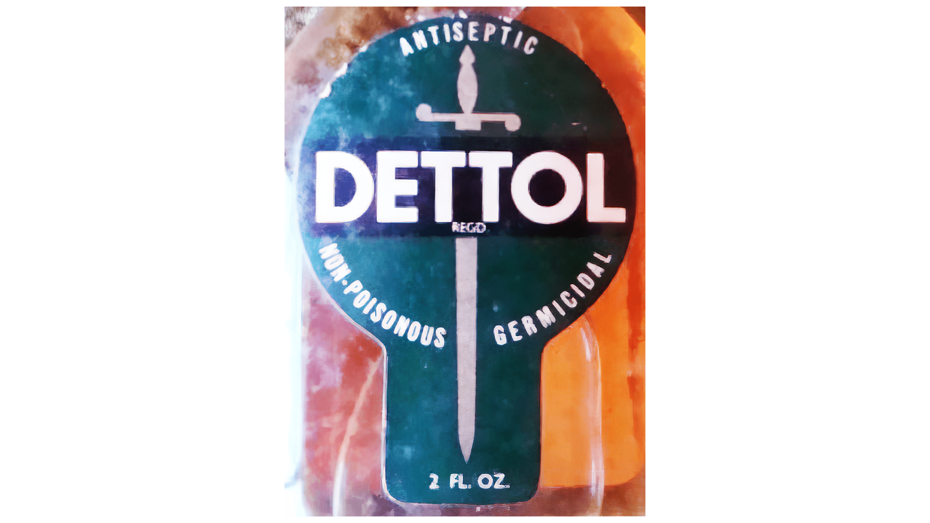
In the 1950s, a single white sword appeared on the emblem, indicating the destruction of bacteria and the exceptional sterility of treated surfaces. Across it was the inscription “Dettol,” in large sans-serif capital letters. A black shadow was visible against it. Two-thirds of the sword was surrounded by a ring with clarifying information about the antiseptic drug. The logo was shaped like a table tennis racket.
1970s – 1990s
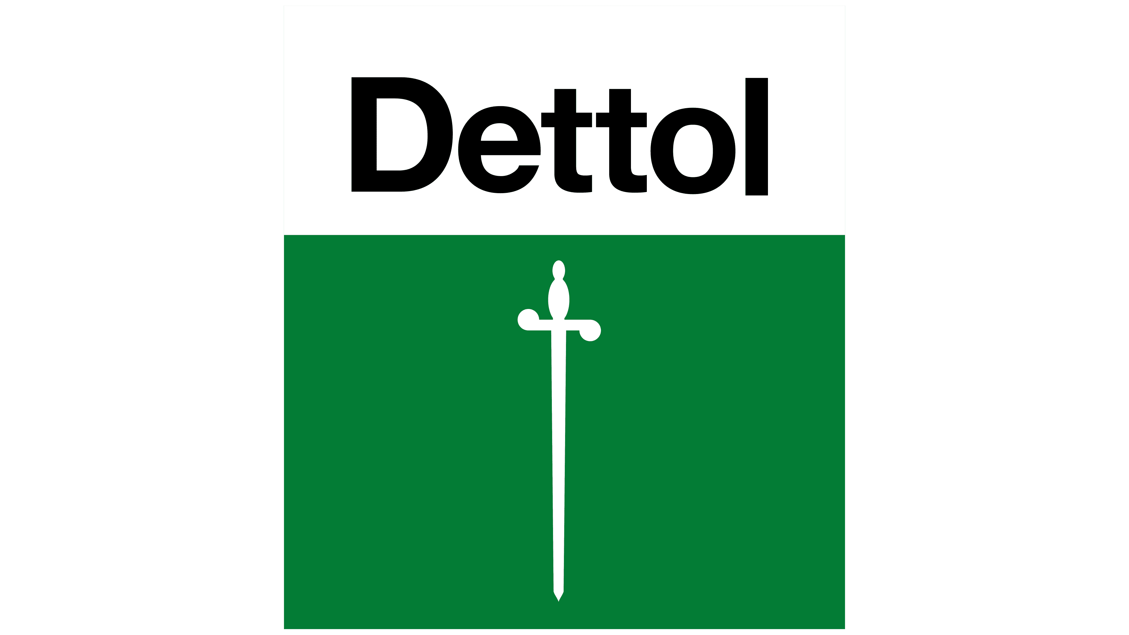
After the redesign, a minimalist version of the logo appeared with a white rapier on a green rectangle. This reflected the hygiene product’s growing popularity and public recognition. The geometric figure was placed vertically, with the product name in black, lowercase letters above it.
1990s – 2010
Another modification led to a radically different logo. First, it became round, and second, lighter. The green gradient background became darker towards the edges, highlighting a white sword with a shaped hilt; its handle was turned in different directions. The developers shifted the brand name to the center and added a blurred white background, creating a glow-like effect. The font was colored blue. Neither the lettering nor the cold stabbing weapon went outside the circle.
2010 – 2019
During this period, the rapier was very thin and white with a gracefully curved hilt. Underneath it was a dazzling glow with rays diverging in different directions. The main element’s background was a light green circle that darkened at the bottom. At the top was the word “Dettol,” with a blurred white outline indicating its purity.
2019 – today
The modern version consists of a large sword, replacing the lightsaber. This emphasizes the preparation’s increased ability to destroy bacteria. The delicate green color was darkened, brightening the lower part of the circle, where a radiant glow emanated from the blade tip. A gray ring surrounds the background.
Font and Colors
The individual insignia first depicted a sword, then a sword. The blade tip sparkles with sharpness and clarity. This means that the cold-stabbing weapon aptly and blatantly kills all dangerous types of microflora, protecting a person from harmful influences. Both logo variants are superficially similar, as they reflect the same concept.

The font used to write the brand name has never changed. The word “Dettol” is written in a grotesque sans-serif font. The first letter, “t,” combines with the sword blade and extends it. The main colors of both emblems are shades of green and white. Earlier, there was also blue; now, dark gray provides contrast.