The Diet Coke logo is closely related to the visual identity of its parent company – Coca-Cola. This marketing move allowed the brand to become one of the best-selling non-alcoholic beverages. The emblem effectively attracts attention to the product, instilling trust in consumers.
Diet Coke: Brand Overview
Diet Coke is a line of non-alcoholic beverages with zero sugar content that was launched by the Coca-Cola Corporation in 1982. Although its competitor, Diet Pepsi, appeared on the market much earlier (in 1964), it quickly caught up, matching in popularity among consumers and consequently in sales volumes. The parent company’s head office is located in Atlanta, Georgia.
This brand’s adventure began in 1982 when it introduced a new era for Coca-Cola with a brand-new product that took the American market by storm.
In 1982, the brand made its grand entrance in the United States, a bold move since it was Coca-Cola’s first new brand since the original formula launched in 1886.
By 1983, the brand had already become a phenomenon, quickly rising to the top as the leading low-calorie beverage in the United States within two years.
The year 1986 marked the brand’s international expansion. It appeared under the name Coca-Cola Light in various countries, appealing to a global audience.
1994, the brand experimented with new flavors, introducing a lemon-flavored variation.
By 2005, the brand had achieved an impressive feat, surpassing Pepsi to become the second most popular carbonated drink in the United States, following the original Coca-Cola.
Celebrating its 30th anniversary in 2012, the brand unveiled a new can design, showcasing its enduring appeal and evolving brand identity.
In 2018, the brand underwent a significant transformation. It launched a fresh design for its cans and introduced four new flavors to captivate a broader audience.
Despite declining soda sales by 2020, the brand remained a beloved product within Coca-Cola’s lineup, demonstrating its resilience and lasting popularity.
In 2021, Coca-Cola announced a global refresh for the brand, updating the packaging design to keep the brand relevant in a swiftly changing market.
Throughout its history, the brand has remained a crucial part of Coca-Cola’s portfolio, continually adapting to shifting consumer preferences and trends while maintaining its leadership in the low-calorie beverage segment.
Meaning and History
The flagship diet cola’s early name didn’t catch on, nor did the product, which had been manufactured since 1963. The non-alcoholic beverage tab was not as in demand as its full analog, Diet Coke, first released in 1982. Although the new variant started selling almost 20 years later, it significantly outpaced its popularity, catching up with Pepsi’s competitor.
A well-chosen identity aided this surge in popularity, as most consumers are familiar with and trust the Coca-Cola brand. The later introduction of Diet Coke is linked to the marketing policy of the globally recognized manufacturer, which used the phrase “Coca-Cola” exclusively for its main product. However, marketers decided that selling a beverage that resonated with the name Coca-Cola would be much more successful than under the Tab label. And indeed, it was: bottles with the Diet Coke logo in the brand’s signature style massively attracted customers’ attention. Additionally, the narrow line depicted signifies a slim waist and a refined silhouette, with nothing superfluous.
What is Diet Coke?
It is the name of a line of non-alcoholic carbonated drinks without sugar, also known as Coca-Cola Light Taste, Coca-Cola Diet, and Coca-Cola Light. It appeared in 1982, catching up in popularity with its direct competitor – Diet Pepsi. The brand was created by the Coca-Cola Corporation, launching it to replace another of its products – Tab, which had been released in 1963. In 2020, the new product completely replaced it, pushing it out of the assortment.
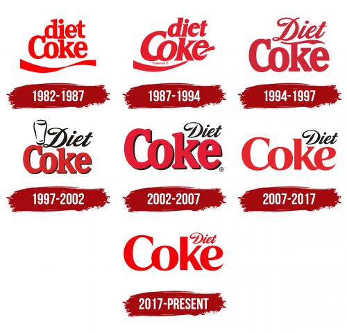
1982 – 1987
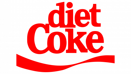
The two-level name is set in bold, lowercase font, except for the capital “C.” Massive serifs of different shapes complement the glyphs: in the word “diet,” located in the first line, they are slanted, and in “Coke,” they are straight. Despite having an equal number of characters, the upper inscription is one-third shorter than the lower one. Below them is a winding stripe, resembling a twisted ribbon due to its narrowing. All elements of the emblem are painted in bright red.
1987 – 1994
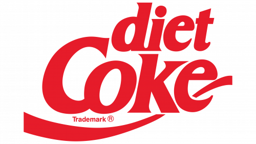
The Diet Coke logo from this period is also red but in a rich, dark shade. The letters are bold and italic, with miniature and sharp serifs. The most transformed is “e”: it becomes italic and rounded with a high inner letter space. A ribbon edge peeks out of it, pointing upward. The lower part of the stripe seems to underline the first two glyphs in the word “Coke.”
1994 – 1997
The authors of the new logo (Neil Powell and Alan Leusink from Duffy Design Art Studio) completely changed the font. The result is an inscription with smoothly rounded letters. The top line contains the word “Diet,” set in an italic font reminiscent of handwritten text. It’s calligraphic and semi-connected, as “D” is separated from the main part. The lower row is set in a geometric typeface with tall and large glyphs. Above “k” is a wavy line in the form of a flame-like blade with a decorative indentation. The entire emblem is red.
1997 – 2002
Designers slightly refined the Diet Coke logo, adding narrow shadows and glass and coloring the upper word in black. The developers of this version are SBG Partners Studio employees. The wavy line above “k” in the word “Coke” disappeared.
2002 – 2007
The ratio of the lines changed: the upper became twice as short as the lower. Designers removed the glass and moved the word “Diet” above the top of “k.”
2007 – 2017
After modernization, the Diet Coke logo underwent a significant transformation. The letters lost their black shadows and became light red. The massive serifs on the glyphs were replaced with miniature sharp ones resembling spikes. The upper inscription remains black, italic, smooth, and very short.
2017 – today
This version adopted the emblem’s color from the earliest period, making all elements bright—scarlet. “C,” “o,” and “e” have curves, unlike the letter “k,” which is angular. The black color completely disappeared to avoid a mood contrast.
Font and Colors
At first glance, the inscriptions in logos from different years may seem to be set in the same font. However, this is not the case: each emblem contains text slightly different, even in minor details, like a shadow. The top line is set in the italic font Loki Cola, and the bottom in Coke4U. Both are proprietary and custom-developed.
The palette is predominantly red, sometimes with the addition of black. The red has several shades – from bright scarlet to pastel raspberry. The Coca-Cola Corporation established its signature color in 1950; it has been present on all its signs since then. This choice is obvious: red instantly attracts the eye, causing an explosion of emotions.
