


 Digicel Logo PNG
The Digicel logo symbolizes the brand’s commitment to connecting people and fostering communication across a broad and diverse range of communities.
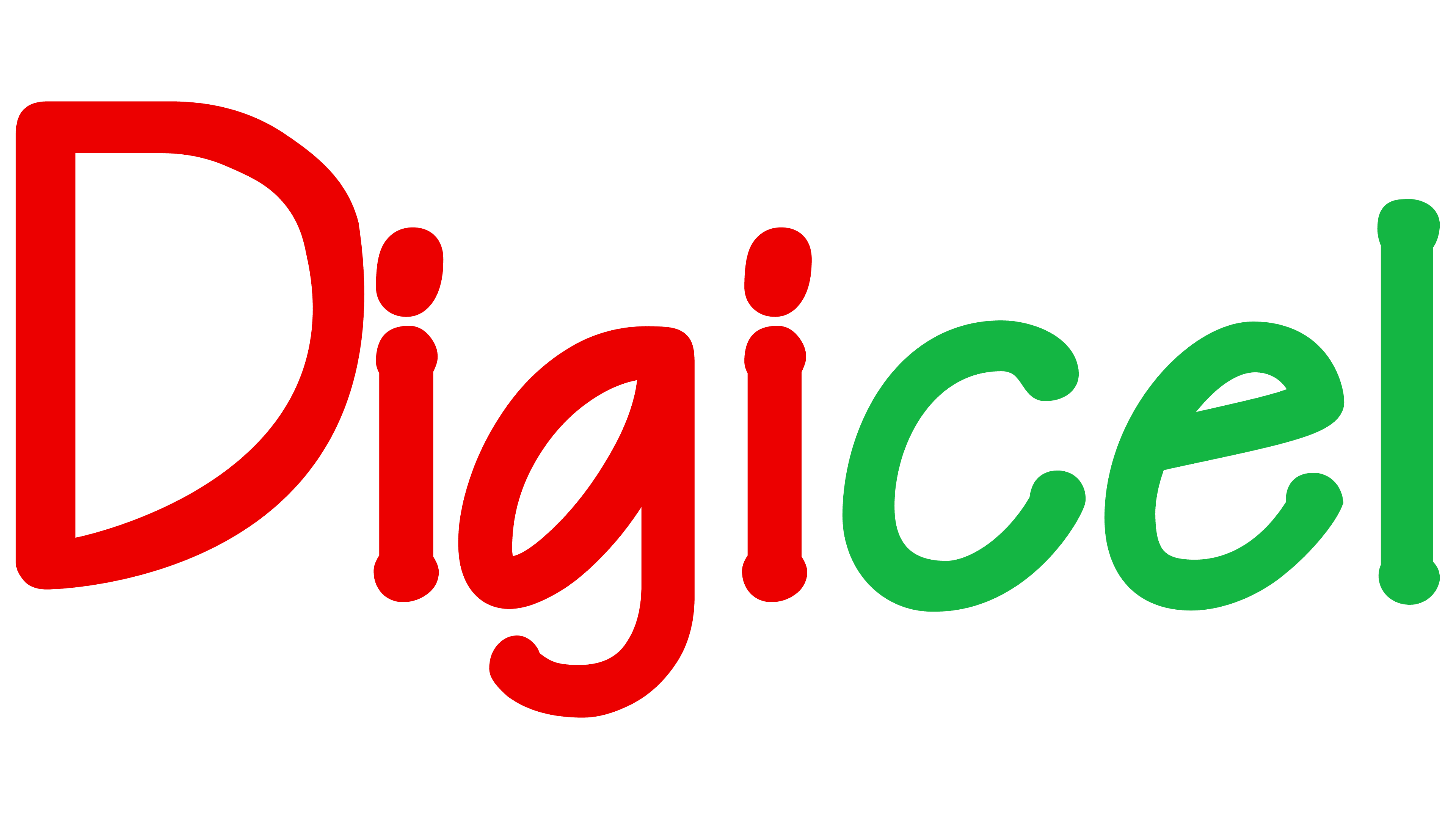
At the heart of the logo is the Digicel name, rendered in a vibrant shade of red. This color often signals energy, passion, and action, aligning with Digicel’s mission as a telecommunications provider. The red also stands out against various backgrounds, ensuring high brand visibility.
The typeface used is a friendly, slightly modified sans-serif font. It gives the logo a modern, clean appearance that reflects the brand’s focus on innovation and advancement in telecommunications.
The dots above the ‘i’s are slightly larger than usual, making them more prominent. This could be interpreted as a subtle nod to connectivity, a key facet of the telecommunications industry.
The ‘l’ in Digicel is slightly curved, adding uniqueness to the design and possibly symbolizing adaptability and flexibility, key traits for a telecom company operating in a rapidly changing industry.
In summary, the Digicel emblem represents the brand’s vibrant, innovative, and customer-centric approach to telecommunications, using design elements that convey energy, connectivity, and adaptability.
On April 19, 2001, Irish entrepreneur Denis O’Brien founded Digicel, a notable development in the telecommunications industry. Headquartered in Kingston, Jamaica, the brand set out to revolutionize telecommunications services in the Caribbean and Central America.
From the start, the brand had a clear vision to bridge communication gaps and make technology accessible. It quickly became a key player by providing mobile communication services to previously underserved regions. Its commitment to meeting these markets’ needs was critical to its early and ongoing success.
The brand’s portfolio quickly expanded beyond mobile telephony to include a wide range of services. It expanded its product line to include broadband internet, cable television, and business solutions, broadening its consumer base and reinforcing its position as a leading regional telecommunications provider.
A significant achievement was the brand’s pioneering of mobile money services in several markets. This initiative provided an invaluable financial tool for those with limited access to traditional banking, showcasing the brand’s commitment to innovation and social development.
Meaning and History

The Digicel logo represents its brand identity. It typically features the company name in bold, vibrant typography, often accompanied by an icon or symbol that signifies connectivity and technological advancement. The logo’s design conveys energy, modernity, and reliability, reflecting Digicel’s position as a leading telecommunications and entertainment provider.
Digicel’s brand identity is defined by a deep commitment to innovation, quality service, and social responsibility. It champions bridging the digital divide in the markets it operates in by providing accessible technologies and services that empower individuals and support socio-economic development. More than a telecom provider, Digicel embodies connectivity, progress, and community cohesion.
What is Digicel?
Digicel is a renowned Jamaican and Caribbean mobile phone network and home entertainment provider that operates in 25 markets worldwide. With a strong presence in the telecommunications industry, Digicel has become a trusted brand synonymous with connectivity, innovation, and entertainment. Beyond telecommunications, Digicel offers home entertainment services, bringing a wide array of digital content, including television programming, sports, and on-demand content, directly to households.
2001 – 2006
2006 – 2017

2017 – today
