 Disney DVD Logo PNG
The Disney DVD logo helps consumers identify the connection between DVD content and the Disney company. It contains memorable elements that strengthen this recognition and instill trust, as buyers know they have chosen a product that meets their expectations and high standards.
Disney DVD grew out of the company’s cautious approach to home video. During the VHS era, classic films were released through the Disney Vault model, with limited sales windows followed by years out of circulation. That policy helped create demand around each return of a title.
When DVD expanded in the late 1990s, The Walt Disney Company adapted its catalog for a format with better image quality, stronger sound, menus, subtitles, and bonus material. The first Disney-branded DVD was Mary Poppins, released in 1998 by Buena Vista Home Entertainment. The 1964 film was a fitting debut because it combined live action, animation, music, and major Oscar recognition.
In the late 1990s and early 2000s, Buena Vista Home Entertainment moved many Disney classics to DVD. The Little Mermaid, Beauty and the Beast, Aladdin, and The Lion King appeared in Gold and Platinum editions with restored transfers, commentaries, deleted scenes, storyboards, and archival extras. Warner Home Video and Universal Pictures Home Entertainment were active in the same market. Still, Disney had a deep animation library and a large audience raised on VHS.
The Vault policy continued in the DVD era, with films returning for short periods before being withdrawn again. In the mid-2000s, Disney supported Blu-ray over HD DVD, a choice that helped the format before Toshiba ended HD DVD players in 2008. After Disney Plus launched in November 2019, DVDs and Blu-rays remained relevant for collectors who wanted packaging, extras, and physical copies.
Meaning and History
Since Disney DVD is a marketing project aimed at the widespread distribution of The Walt Disney Company’s products, it is visually aligned with the parent corporation. This is reflected in the logo, which shares similar symbolic elements. Of course, designers didn’t use all the details but chose only the most recognizable ones, helping to identify the product as official at first glance. This approach allows users to enjoy their favorite movies at home, not in the theater, being confident that they have purchased a high-quality original.
Overall, the branding on compact discs performs several important functions. The emblem signifies magic and wonder, as the line looks like the trail of a magic wand or a portal to the wonderful world typical of Disney Company film intros. It also strengthens product recognition and branding, instills confidence in impeccable quality, confirms the products’ high standard, and emphasizes the connection with the main content producer.
What is a Disney DVD?
Disney DVD is a brand of The Walt Disney Company that offers its cinematic works on digital video discs. Typically, they contain feature films, cartoons, and other media content available for viewing on home DVD players. Through this trademark, consumers can easily identify products that meet their expectations. Although the trademark was conceived earlier, it was not used until 1998, when the film “Mary Poppins” was released on disc.
1997 – today
The Disney DVD logo combines graphic and text elements. It contains two equally important elements for visual identity. The center features the trademark name, divided into two parts: the upper level holds the general brand name, and the lower line indicates the product type. They have different designs: the first word is handwritten, faithfully copying the studio’s creator’s real signature, while the second is printed text with uppercase glyphs in a geometric style. An arc encircles them, shifted to the right, as it is interrupted by the letter “D” on the left.
Font and Colors
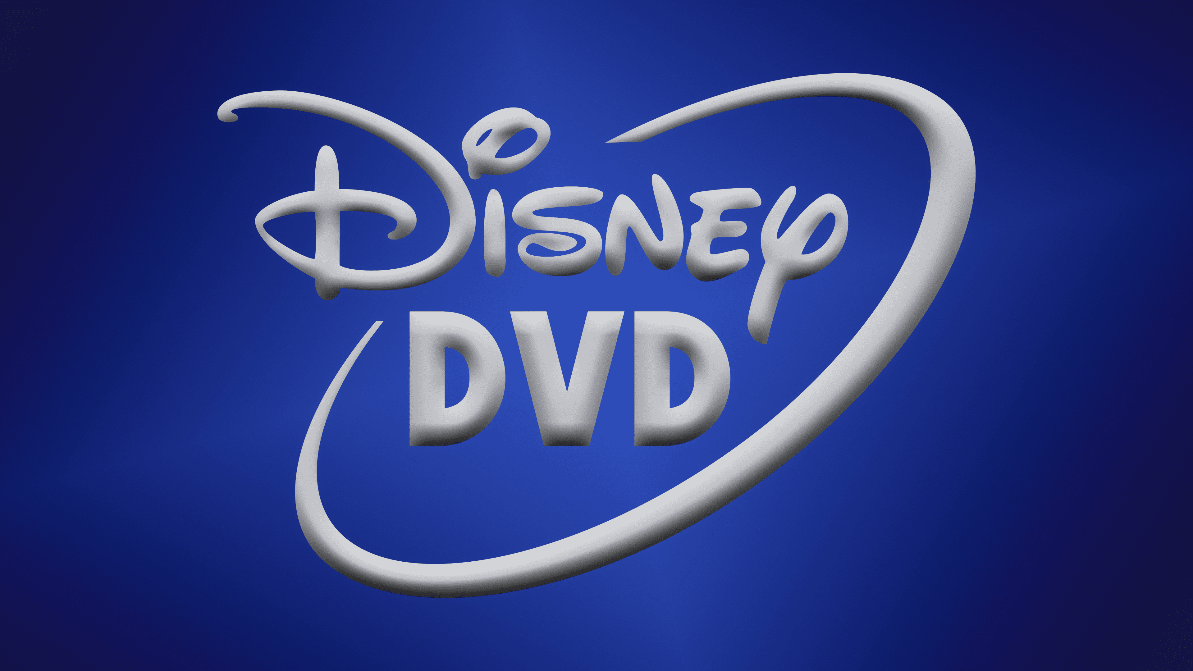
The inscription in the logo is based on Walt Disney’s real autograph, thus mimicking his handwriting. Later, an identical typeface was developed based on it. The creator was Justin Callaghan, who first introduced it in 2004. Initially, it was called Walt Disney Script, and in 2004, it was renamed Waltograph. The second line is set in a geometric font in uppercase. All letters are extra bold and grotesque. The emblem’s palette depends on the cover’s background, but in the classic version, it always includes black.