


![]() Dyson Logo PNG
Dyson Logo PNG
The Dyson logo is visually soft and smooth because the shape of its elements subconsciously evokes trust in consumers. The emblem symbolizes the safety of all company appliances, from vacuum cleaners to hair dryers.
Dyson began in the late 1970s, when James Dyson worked in a shed behind his home after leaving his own company. Trained at the Royal College of Art, he had earlier launched a ballbarrow business in 1974, where he first saw an industrial cyclone separating dust from air.
At home, his Hoover Junior kept losing suction as the bag filled. This led to the idea of a bagless vacuum using centrifugal force. The concept was rejected by his board, which believed that companies such as Hoover and Electrolux had already developed it.
Between 1979 and 1984, Dyson built 5,127 prototypes. The first working machine appeared in 1983, but no British or American manufacturer agreed to license it because of the profitable dust-bag market.
In 1986, Japan became the entry point. Apex launched the G-Force vacuum, a premium product that gained attention and won a design award in 1991. Using royalties, Dyson founded Dyson Appliances Limited in July 1991.
Production began in Wales with Phillips Plastics, but after a dispute in 1993, Dyson opened his own factory in Chippenham. On July 1, 1993, the first vacuum left the line.
The DC01 entered the UK market with direct advertising that challenged competitors such as Miele, Bosch, Siemens, Electrolux, and Philips. Within two years, it became the best-selling vacuum in the country.
In 1999, Dyson sued Hoover for patent infringement, leading to a £4.2 million payment in 2002. Manufacturing moved to Malaysia the same year. By 2005, Dyson led the US vacuum market in revenue, and later expanded into products such as the Air Multiplier (2009), the Supersonic (2016), and the Airwrap (2018). In 2019, the company moved its headquarters to Singapore.
![]()
What is Dyson?
Dyson is a technology company founded in the early 1990s in the UK and moved to Singapore in 2019. It is named after its founder, James Dyson, who invented the bagless vacuum cleaner. The company’s product range includes innovative heaters, fans, air conditioners, hand dryers, and other modern appliances. All of the company’s household appliances are known for their high efficiency, functionality, and performance.
1993 – 1994
![]()
The original Dyson logo consisted of the brand name and signified originality. It was an innovative product of its time, consisting of three-line inscriptions. The first was the company’s name. It was made with capital letters formed from three thin stripes. Each glyph contained several components of different shapes. The most interesting were “S” and “O.” The former had the shape of waves, and the latter of vertical arches. The middle row was occupied by the phrase “Dual Cyclone,” typed in lowercase, bold, and black. The third row contained the word “Technology,” typed in thin capital letters.
1994 – today
![]()
The brand is created thanks to innovations and exists only for them. Thanks to this approach and impeccable aesthetics, the brand has become one of the most recognizable worldwide. This distinguishes its logo, which has successfully combined relevance, simplicity, and classic style. This principle holds that the manufacturer should not speak for itself; its product should.
As a result, the brand emblem is recognized as a standard of modern design. According to the developers’ concept, bright and high-tech products effectively complement the strict black-and-white sign. The main element used by artists was the brand name. The unified inscription “Dyson” is monochrome, elegant, and minimalist.
Font and Colors
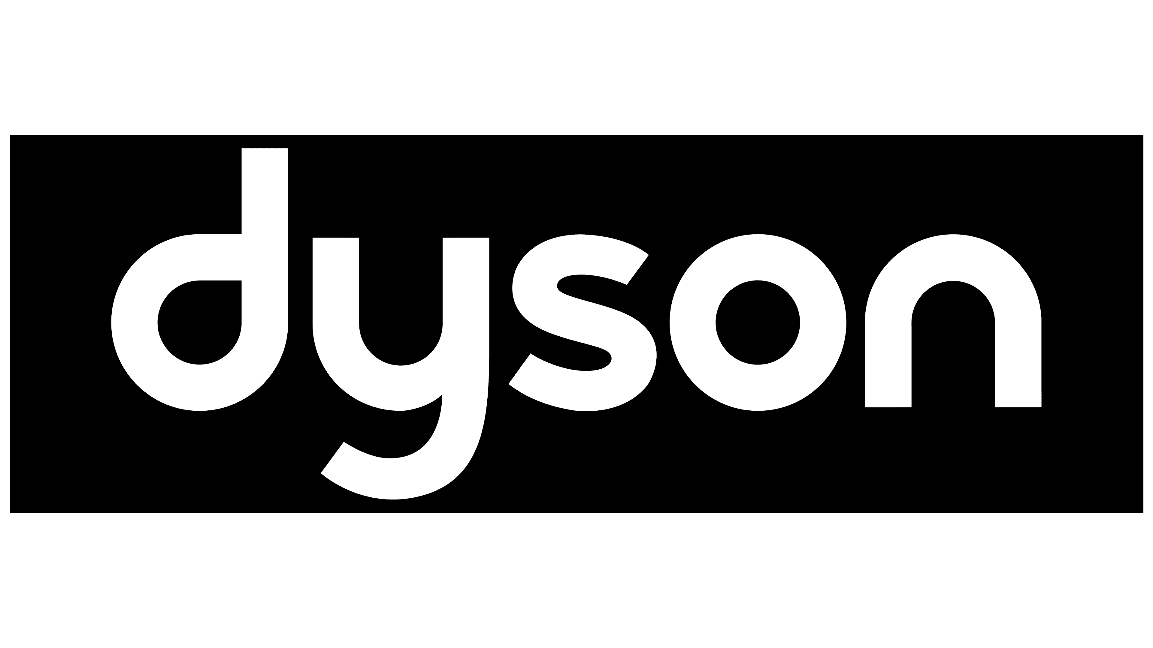
The company chose the individual Dyson Sans font for the word symbol, which fully conveys its values: innovation, originality, reliability, luxury, practicality, and creativity. Thanks to its concise form, the logo embodies perfection, with nothing more important than a well-executed idea.
The inscription is set in wide, lowercase sans-serif letters. The symbols are evenly distributed in the word and made slanted and rounded. The “D” lacks the lower part of the stem, and the “n” looks like an inverted “u” without a stick.
The brand palette is monochromatic. Both white and black backgrounds are used. Gray is used for product labels. A dark blue version is used in the internal administrative network. The official version consists of light letters on a dark substrate.