Innovative and original logo Easy easily makes its way to customers’ hearts because the retail chain has chosen a bright and multifaceted emblem for itself. With smooth curves and lines, it reflects the concept of a convenient network where you can easily find everything you need. Colorful colors and a concentration on detail: this is the basic style of its brand identity.
Easy: Brand overview
| Founded: | 1993 |
| Founder: | Cencosud |
| Headquarters: | Santiago, Chile |
| Website: | easy.cl |
Easy is the name of a large chain that includes dozens of stores throughout South America. They specialize in the sale of building materials and various household goods. The brand has its headquarters in Chile (Santiago), as well as a large number of branches in Argentina, Chile, and South America. Currently under the control of the parent company Cencosud.
The visual identity of Easy has changed several times over the entire period of its existence. But, in all versions of the logos, common features made up a certain core of the concept. They can also be seen in the modern emblem. This is a bright palette consisting of 3 colors, a soft font, and a graphic element in the form of a strip under the name. Each of these characteristics makes the brand icon recognizable and stylish.
Meaning and History
Easy was established over 20 years ago as a small company with limited geography. But, the management did not stop there and decided to expand the scope of activities. As a result, the company has created over 100 branches in different countries. Today, Easy is considered one of Chile’s largest and most successful brands. Its emblem is incredibly recognizable. It attracts attention due to the bright, expressive coloring, which is successfully combined with a stylish font.
There are two inscriptions at the base – the name of the brand itself, as well as the name of the parent company. The first inscription is more massive and has a large size. The second, on the contrary, is made in smaller letters. It is more elegant and sophisticated, which creates the perfect balance in the overall concept of the visual identity. The colors are also in perfect harmony with each other, which emphasizes the company’s prosperity.
What is Easy?
Easy is a subsidiary of the large conglomerate Cencosud and has more than a hundred points of sale in different countries (South America, Chile, and Argentina). They offer a wide range of products for home improvement, as well as different types of building materials. The head office is located in Chile, and the company’s annual turnover is more than 1 million dollars.
1993 – 2005
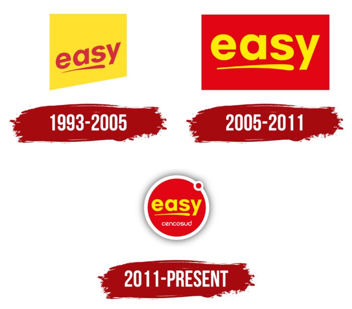
The earliest version of the logo was formed in 1993 when Easy was founded. The original badge consisted of only two elements – the brand name and a characteristic stroke. The latter was a strip that resembled the movement of an artist’s brush. It was a bright symbol of a creative approach to home improvement. An additional semantic load of the stroke also consisted of absolute freedom of choice and flight of fancy. In Easy, one could find everything to implement the most daring ideas for decorating rooms.
The name itself was designed in a minimalistic style. The letters had soft, smooth lines and had no serifs. All this was associated with comfort, accessibility, and coziness, which is especially important for a retailer of such goods. The elements were located inside a figure resembling a price tag. The feature perfectly reflected the essence of the brand. The bright yellow color was chosen as the background, symbolizing optimism and cheerfulness, and the main elements were red.
2005 – 2011
As a result of the rebranding, which took place in 2005, the company received an updated emblem. It was a balanced icon that retained the content but changed in terms of the position of the characters and the prevalence of colors. In the new version, the Easy name was not slanted, as in the previous version, but straight and level.
This symbolized the strengthening of the brand’s position and stability in development. The font and stroke were still present on the emblem. They demonstrated the company’s unchanging focus on helping design clients’ homes creatively. But, in the new version, they changed color from bright red to rich yellow.
At the same time, the background color changed to red—the predominance of the latter symbolized passion, energy, and progressiveness. The proportions of the shape containing the components have also changed. The disproportionate figure has been replaced with a rectangle located on the wide side.
2011 – today
The next update of the visual identity happened already in 2011. The old emblem was replaced by a more modern design, which combines elements of previous versions and new components. A three-dimensional circle replaced the rectangle with a white outline, which had a small shadow, as well as a red dot. Inside the new figure, there were two inscriptions – Easy and Cencosud.
The latter was the parent company’s name and emphasized its role in the development of the chain of stores. It was made in a futuristic font that did not have serifs. The main inscription remained the same, including the shape and colors. Beneath it was also invariably located the symbol of creativity – a neat stroke. The small dot, located on the contour, had a special meaning.
In the understanding of the company, it meant that the chain’s stores had such a wide range of products that customers did not need to go anywhere else. This design showed respect for the traditions and past of the brand, as well as the successful achievement of new goals. An additional advantage was a more modern design, which remains relevant today.
Font and Colors
The Easy logo is a prime example of how you can smartly upgrade an older version while keeping the core and adding stylish modern elements. The logo follows the traditional visual concept, represented by an expressive palette and the use of characters in a fixed font. From previous versions, the stroke symbol also remains.
All this demonstrates holding a single course from the moment the company was founded, aimed at stable development. Among the innovations is the name Cencosud, which is made in an original font with unusual angles and cuts and uses a circle. The last element has a thick white outline and a tiny red circle directly on top of it.
In addition, red, white, and yellow colors were used in the logo. The first demonstrates openness, honesty, and conscientiousness. Yellow is a symbol of positivity. Easy provides a friendly and welcoming attitude to each visitor and tries to create the most favorable atmosphere for shopping.
Easy color codes
| Peridot | Hex color: | #ebe320 |
|---|---|---|
| RGB: | 235 227 32 | |
| CMYK: | 0 3 86 8 | |
| Pantone: | PMS 3945 C |
| Fire Engine Red | Hex color: | #cd1b29 |
|---|---|---|
| RGB: | 205 27 41 | |
| CMYK: | 0 87 80 20 | |
| Pantone: | PMS 185 C |
