


![]() EE Logo PNG
EE Logo PNG
The emblem is filled with the idea of connection and contact. The EE logo is like a wire carrying packets of information. They instantly connect subscribers and help them feel a sense of unity and closeness.
The British international holding BT Group plc owns the wireless and EE providers. Until 2012, the mobile operator was called Everything Everywhere, but then it launched an ultra-fast fiber-optic network under the EE brand and took on a similar name. It is the first UK company to provide 4G access to residents.
EE was formed in 2010 when Orange UK and T-Mobile UK, two major players in the British mobile market, decided to join forces. The European Commission approved this move, and on July 1, 2010, EE became the UK’s biggest mobile network operator, serving around 28 million customers right from the start.
Initially, EE kept the Orange and T-Mobile brands while merging their networks and operations to improve customer experience. A significant change happened in 2012 when EE introduced itself as a new brand, becoming the first in the UK to offer 4G services. This step sets EE apart, offering faster internet speeds and better connectivity.
In 2015, BT Group bought EE for £12.5 billion, and the deal was completed in 2016. With BT Group’s support, EE expanded its 4G network and began rolling out 5G services in 2019, initially in six UK cities. This move kept EE at the forefront of the next wave of mobile internet.
Now, EE serves around 30 million customers and is known for its wide 4G coverage and growing 5G network. It’s not just about offering fast internet; EE also has innovative plans and services tailored to customers’ needs.
EE doesn’t stop at providing mobile services. It’s also involved in social and environmental efforts, like recycling mobile phones and supporting charities. EE’s story is more than just a brand change; it’s about continuous innovation and helping connect people across the UK.
Meaning and History
![]()
EE had two predecessors: Orange UK and T-Mobile UK. They teamed up in 2010 to share the 2G cellular network. These trademarks disappeared a few years after the 2012 rebranding. Moreover, during the restructuring, the operator changed the name and the logo: the ascetic inscription “everything everywhere” was replaced by two stylized letters.
In 2015, telecommunications corporations Deutsche Telekom and Orange SA sold their joint venture to the BT Group. However, the transition did not affect EE’s identification: the company retained its visual style.
What is EE?
EE is a brand of the telecommunications holding company BT Group, which also owns two other trademarks: Plusnet and BT. It was formerly known as Everything Everywhere, but in 2015 it started using the shortened name EE. It is a major provider of cellular and internet services. Its 3G network covers 98% of the UK population. The brand was established in 2010 as a result of the merger between Orange UK and T-Mobile UK.
2010
![]()
The first logo of Everything Everywhere, born from the merger of Orange UK and T-Mobile UK, marked a new era in UK telecommunications. Its soft, modern sans-serif font made the logo friendly and approachable. The words “everything everywhere” were written with sharp ends in a sleek style, enhancing their modern feel.
The logo’s color scheme was simple black on a white background, highlighting the company’s clear vision of providing connectivity “everywhere and everything” to its customers. An “@”-like symbol at the end added a playful touch and symbolized the company’s presence in the digital, always-connected world.
Created when EE promised to revolutionize mobile communication in the country with the UK’s first 4G network, the logo represented more than just the union of two major networks. It stood for seamless communication and innovation. The logo’s simplicity and distinctiveness mirrored EE’s ambition to lead the market by offering not just service but a new way of interacting with technology.
2010 – 2012
![]()
In 2010, a new logo for Everything Everywhere was introduced, reflecting the brand’s fresh and minimalist vision. The design featured lowercase, cursive letters arranged in a staggered format, the first line positioned at the top, the second slightly lower, and to the right. The symbol that once appeared alongside the text had vanished, streamlining the logo to its core elements.
Set against a clean white background, the designers opted for a stripped-back approach, forgoing any bright color highlights or extra details that might distract from the brand’s name. The font was chosen for its legibility and simplicity, ensuring the name was easy to read and recognize. This design shift signified the brand’s commitment to providing straightforward, accessible communication services, with a focus on clarity and efficiency. The refined logo stood as a symbol of a company looking forward, poised to deliver connectivity across the UK without unnecessary frills, just pure, unadulterated service.
2012 – 2023
![]()
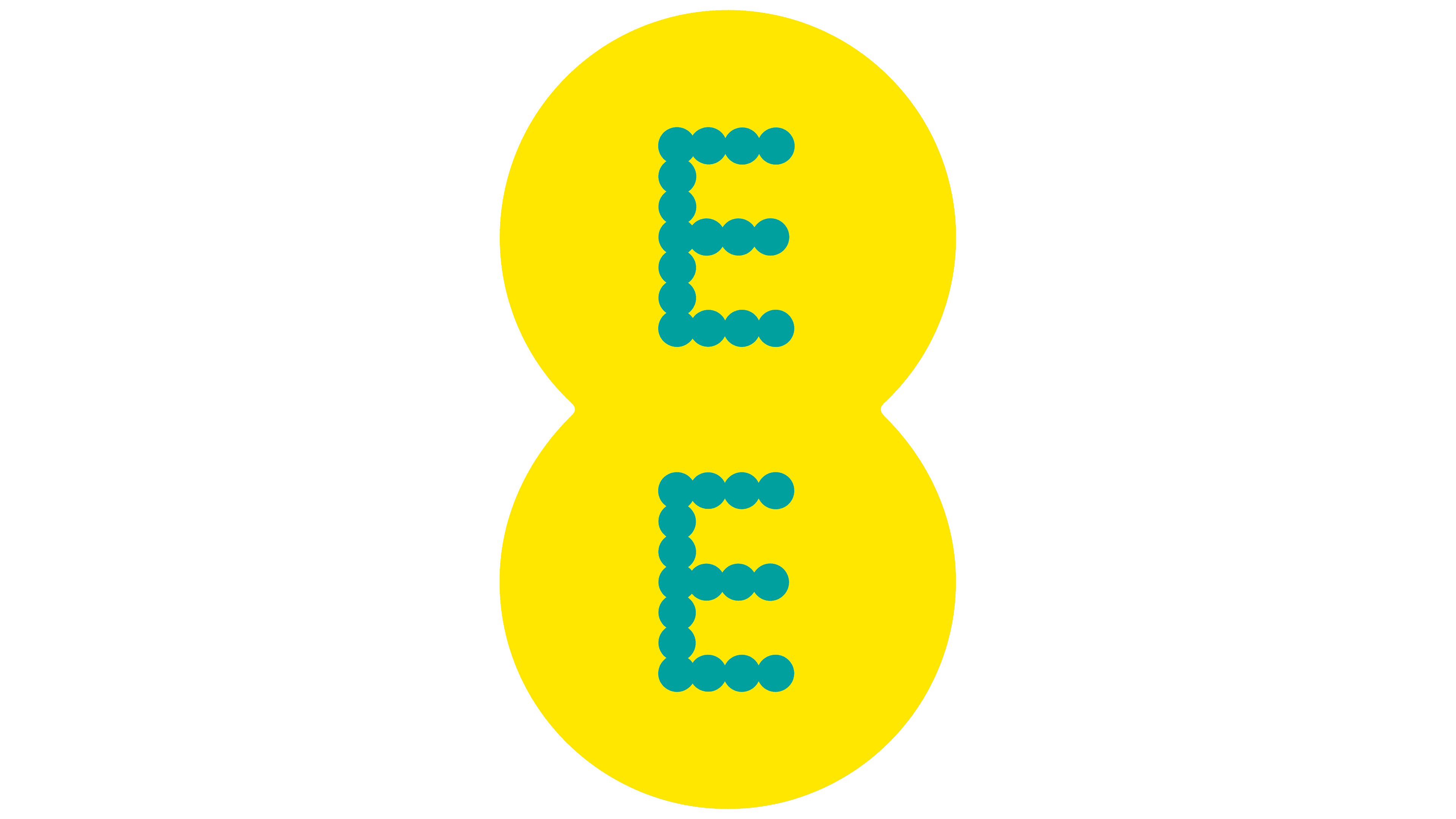
The 2012 EE logo marked a fresh phase for the brand, signifying the merger of Orange and T-Mobile into a more streamlined, updated look. The double ‘E’ stands side by side, symbolizing unity and cooperation. Consulting agency Wolff Olins was responsible for the corporate identity change. The designers depicted “EE” with dots, placing the letters in two turquoise circles.
The letters’ design, composed of dots, nods to the digital essence of communication and technology that EE embodies. These dots can also represent network cells, fitting for a telecom operator.
The logo’s aquamarine color injects energy and a fresh feel to the brand, setting EE apart from competitors and emphasizing its role as an innovator. The color choice reflects EE’s ambition to lead the market, especially as the first to bring 4G services to the UK, as it moves towards a digital future.
This logo is known for its clean and memorable design. Its simplicity and clarity focus on what EE stands for, providing quality communication services and meeting the needs of its users. Moving from the original complex Everything Everywhere logo to this simpler, direct version mirrors the company’s dynamic evolution and its adaptability to the changing demands of the times.
2023 – today
![]()
The 2023 EE logo showcases the brand’s maturity and stability. The shift to a darker shade of turquoise conveys the company’s solid, deeper strategy. This color is often associated with trust and reliability, which are crucial in the telecom industry.
The new design’s simplicity speaks to EE’s clear market position. It aims to maintain straightforward customer interactions and focuses on user needs. The EE logo symbolizes the company’s progress, adaptability to changing times, and commitment to innovation and growth.
Font and Colors
The mobile operator EE’s emblem consists of many small and large circles. Both letters consist of 16 connected white dots. The first symbol is in a large circle at the top, and the second is in the same figure, below. This graphic composition should convey dedication and open prospects, as the authors intended. The simple shapes of the elements are designed for the digital space. The developers animated the dots in the commercials to showcase the company’s new identity.
When the designers at Wolff Olins created the logo, they were guided only by their imagination, artistic taste, and EE leadership requirements. At that time, no font could be compared with an inscription made of small circles. Later, on this basis, a proprietary family of typefaces called EE Nobblee appeared.

The two large background circles are tinted dark teal (#17a09f), similar to Java (#259797). This is a great foundation for the white “EE”: the letters stand out with contrast and are immediately striking. This graphic technique helped to focus attention on the company name, which, combined with dots, makes the corporate identity bright and recognizable.
FAQ
What does the EE logo stand for?
The EE logo represents the company’s goal to offer widespread mobile network coverage throughout the UK. It highlights EE’s commitment to advancing its technology, positioning the company at the forefront of the telecommunications industry. The logo’s design is sleek and contemporary, reflecting EE’s dedication to innovation, to providing top-notch mobile services, and to ensuring customer satisfaction.
What Colour is the EE logo?
The EE logo features a distinctive bright aqua or turquoise color. This vibrant shade is used for the two letters’ E’ that make up the logo, set against various backgrounds depending on the context, but often seen with white or black.
Does BT own EE?
Yes, BT (British Telecommunications plc) owns EE. BT acquired EE in 2016.