![]() Electric Sunglasses Logo PNG
Electric Sunglasses Logo PNG
The Electric sunglasses Logo reflects the freedom and meticulousness that have become the brand’s foundation, whose products combine style and functionality. Glasses are designed to protect against the sun and provide a clear image, suitable for outdoor activities and city life.
Electric sunglasses began in San Clemente, California, in 2000, when Bruce Beach drew on his experience at Arnette Optics to create eyewear specifically for extreme sports enthusiasts. The brand quickly gained attention by making durable, high-quality sunglasses favored by surfers and snowboarders. Known for innovative lenses and strong materials, Electric ensured reliability during intense activities. Over time, the collection expanded beyond sports, adding everyday styles and collaborating with popular athletes and musicians, further boosting its appeal. International offices opened, spreading its reputation worldwide. A major turning point came when Volcom and Electric were acquired by PPR (now Kering), bringing new resources for technological improvements, particularly enhanced UV protection. Eventually, Electric separated from Volcom, focusing on developing advanced eyewear designs and materials independently. Significant investments led to cutting-edge lens technology, better visual performance, and specialized models tailored for specific activities. By 2024, Electric will remain dedicated to its original vision, creating premium-quality sunglasses that blend innovation with active lifestyles.
Meaning and History
![]()
What is Electric sunglasses?
It is a company that manufactures stylish and durable sunglasses. The collections are inspired by snowboarding and surfing, so the accessories suit outdoor activities and everyday life. The design features bold patterns and classic shapes, while the lenses provide UV protection. A distinctive detail is a lightning bolt symbol, emphasizing the dynamics and connection to extreme sports.
Before 2013
![]()
The first Electric Sunglasses logo was kept simple from the start. A lightning bolt was placed vertically, with curved lines on both sides. This created the impression that the bolt was enclosed in a shell like a shield or protective field. It resembled a burst of energy or an electric discharge, fitting the brand’s name.
The brand name was written in an unusual font; the letters appeared slightly compressed, giving them a futuristic, technological look.
The company quickly gained momentum, releasing sunglasses and optics that suited the lifestyle of local surfers and skaters. Its simple yet dynamic design, the emblem blended well into the California aesthetic, where sports, sun, and comfort come together.
2013 – 2015
![]()
The Electric Sunglasses logo from 2013 to 2015 looked unusual for a company that produces sunglasses and accessories. The strict and somewhat technical style seemed more suited to a battery or power plant manufacturer than to a California-based brand.
The name “ELECTRIC” was written in a simple, elongated font. The letters were tall, thin, and evenly spaced. A horizontal line ran below the text, visually separating the name from the symbol.
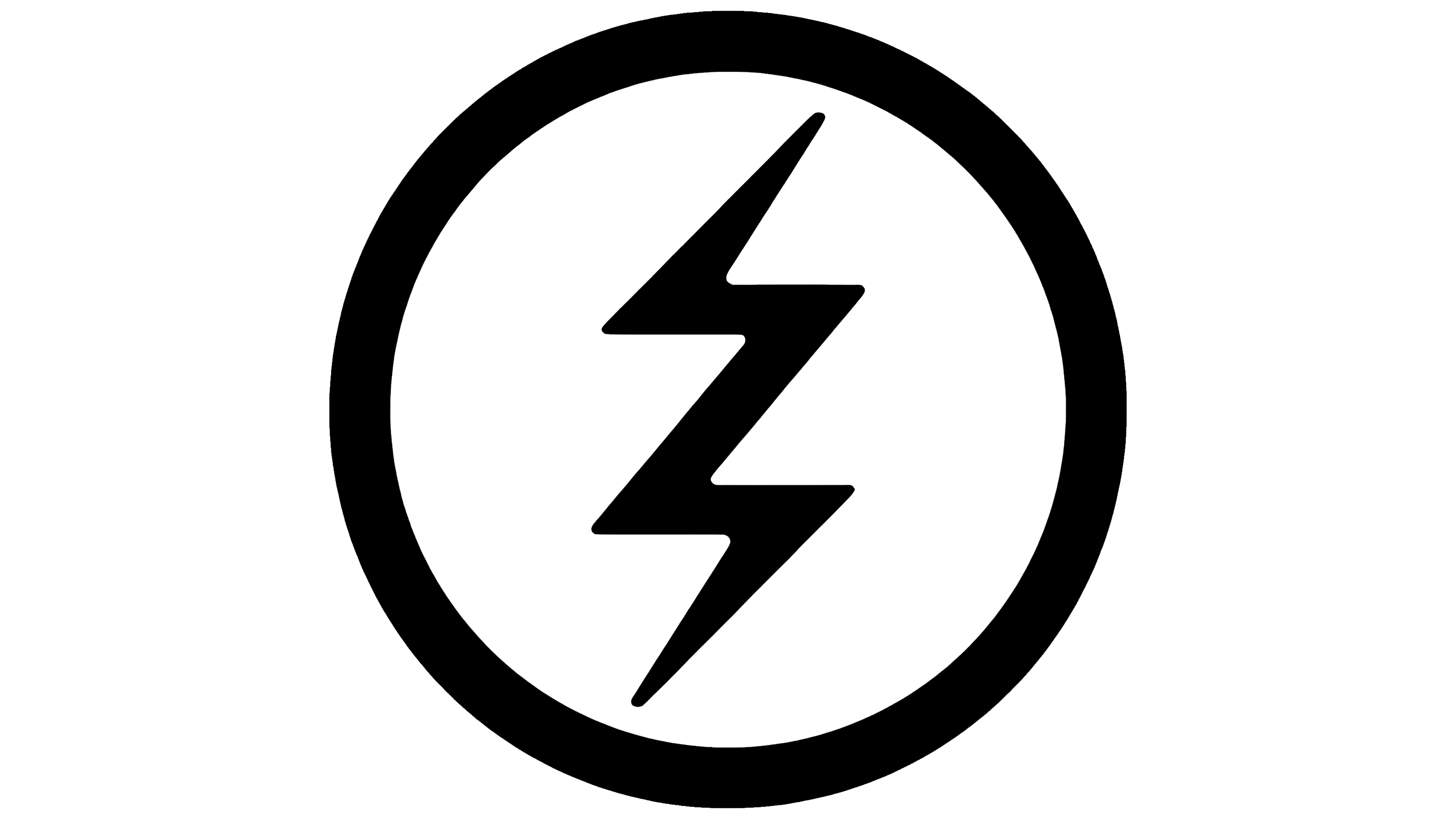
The symbol below was a lightning bolt inside a circle. The bolt was depicted with a zigzag line featuring sharp angles and pointed edges. The minimalism and strictness of the design conveyed a sense of technology and energy, even though it didn’t directly reference sunglasses. This contrast helped the company stand out among competitors, highlighting the connection between an active lifestyle and the high functionality of its products.
2015 – 2021
![]()
The emblem took on a slightly different look from the previous version, though the overall concept remained the same. The brand name stayed unchanged, with black, elongated letters, written strictly and precisely. They were spaced apart, with a line beneath them dividing the composition into two sections.
The main feature was the new symbol. Inside a circular contour, the lightning bolt was different, no longer smooth but sharp and angular, resembling an energy discharge. This suited the brand and became popular among those with an active lifestyle, including surfers, skaters, and street-style enthusiasts.
A lightning bolt is associated with energy and movement, waves or motion, something fast and powerful. The symbol complemented the brand’s direction, producing accessories and sunglasses for those who are always on the move, driven by adrenaline, and who value high-quality products with bold style.
2021 – today
![]()
In the current emblem, “Electric” is written in black, vertically elongated letters. There is ample space between the characters, making the text open and unobtrusive. Below the name is a thin, slightly elongated lightning bolt designed as a broken line with sharp, angular protrusions. In this form, it looks energetic and visually dynamic. The minimalist design emphasizes the versatility and functionality of Electric’s products.