


 Jimmy Choo Logo PNG
The Jimmy Choo logo vividly and accurately reflects the brand’s popularity, embodying its commitment to tradition and constant drive for growth. This symbol also conveys the professionalism of its employees and the high quality of all its products. Every element of the logo, like every product from the brand, is distinguished by beauty and elegance.
The minimalist, neatly aligned letters draw attention and are easy to read. They evoke images of Jimmy Choo’s best offerings in the audience, reinforcing associations with sophistication and luxury. The logo does not aim to be creative or unusual, giving it a sense of seriousness and a classic look that highlights the brand’s prestige. It aligns perfectly with modern trends while remaining committed to timeless values.
A classic palette dominates the brand identity, creating a subtle play of contrasts: on a clean white background, sleek, slightly elongated letters in a dark shade stand out clearly. This harmonious balance of simplicity and refinement enhances the brand’s renowned elegance and sophistication.
Jimmy Choo began in London in 1986, when Malaysian shoemaker Jimmy Choo opened a studio in Hackney after studying at the London College of Fashion. He first made custom shoes for private clients, including members of the British royal family, and later supplied footwear for designers’ runway shows.
In 1996, Choo partnered with Tamara Mellon, accessories editor at British Vogue, to create a ready-to-wear luxury label with backing from her father, a Vidal Sassoon co-founder. The first boutique opened on Motcomb Street in Belgravia, followed by other London locations. Hollywood exposure grew in the late 1990s, helped by Sarah Jessica Parker and Sex and the City. Handbags arrived in 2001, while Safilo Group produced eyewear in 2004.
Choo sold his stake in 2007, retaining limited rights to use his name, while Mellon remained president and creative director. Men’s shoes and a fragrance with Inter Parfums SA followed in 2009. Labelux acquired the company in 2011, and Made-to-Order launched in 2013. In 2014, the brand listed on the London Stock Exchange, followed by a twentieth-anniversary collection in 2016.
Michael Kors Holdings Limited bought Jimmy Choo for £896 million in 2017 and later became Capri Holdings. Bridal shoes and jewelry appeared in 2018, sneakers in 2019, and digital sales expanded during 2020 and 2021. By 2023, the company continued opening stores and selling footwear, bags, accessories, eyewear, fragrance, and jewelry.
Meaning and History
What is Jimmy Choo?
This luxury fashion house revolutionized the world of accessories and footwear. The brand is known for its brilliant and sometimes bold designs, becoming essential to red-carpet looks and fashionistas’ wardrobes worldwide. Its shoes feature elegant designs, high heels, and impeccable craftsmanship, often adorned with vibrant patterns or eye-catching decorative elements. The brand has also expanded its product range to include wallets, sunglasses, and perfumes, all marked by a signature elegance and sophistication. Continuing to push the boundaries of design, the company creates footwear that serves a functional purpose and is a work of art while maintaining a commitment to traditional manufacturing methods.
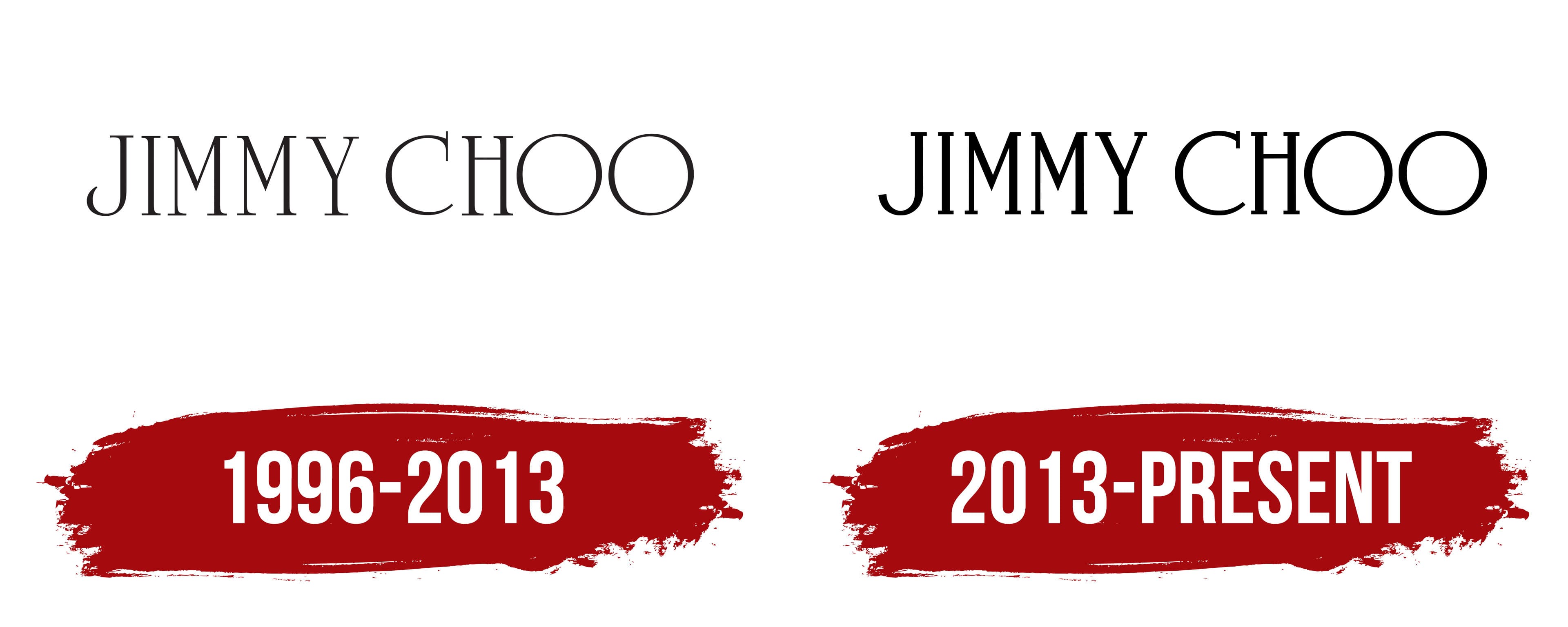
1996 – 2013

Initially, the Jimmy Choo brand positioned itself as a manufacturer of high-quality footwear whose products stood out from competitors for their superior quality and unique style. The company was founded in the early 1980s and opened its first store in 1987. The first logo, however, was presented almost a decade later, in 1996, coinciding with the brand’s official registration.
A mystical beauty characterized the brand identity of that time. Using an original font, an elegant and memorable logo was created. Although it consisted of only two words, they spoke louder than many others. The first and last names of the brand’s founder formed a unique name, which, over time, became a symbol of high style. Jimmy Choo shoes, frequently worn in public by Princess Diana, brought the brand worldwide fame. Therefore, the logo could not be overly playful or fanciful; it reflected status and quality, serving as a purely informative element.
On a white background, the black letters appeared airy yet radiated dynamism. The rounded elements of the letters, along with graceful serifs, represented a successful combination of styles from different eras. The two “O” letters at the end of the second word subtly hinted at infinity. The precise edges and strokes of the logo drew attention and sparked interest. This logo, placed on all types of the brand’s products, lasted for almost two decades, leaving an indelible mark on the history of Jimmy Choo.
2013 – today
A new logo was introduced in 2013, along with updates to the brand’s strategic directions. This logo marked a striking transformation from the previous version, retaining its key features while adding more expressive graphics and symbolism. The brand name remained central, but the letters gained sharp outlines through bold black font. The characters were aligned in a single horizontal line with minimal spacing, giving the logo a strict and presentable appearance. It could be said that these two well-known words truly “shone.” Thanks to this update, the rebranding was considered a great success, and the new logo received many positive reviews, marking a significant step toward strengthening the brand’s reputation.
Like many years ago, “Jimmy Choo ” again drew attention. The exclusive premium products began to see even higher demand. The logo, consisting of nine capital letters, conveyed reliability and high competitiveness. It contained no additional elements, drawings, symbols, or graphics, yet maintained its uniqueness and maximum presentability. The serifs on vowels and consonants added sophistication and emphasized the brand’s refined style.