


 Maison Margiela Logo PNG
The Maison Margiela logo represents simplicity and minimalism. The emblem emphasizes sophistication and intellect, serving as a symbol of fashion art that transcends traditional notions of style and design.
Maison Margiela began in Paris in 1988, when Belgian designer Martin Margiela, a graduate of the Royal Academy of Fine Arts in Antwerp, founded his label. His first collection introduced an unconventional approach to presentation and clothing construction. In 1989, he showed the spring/summer 1990 collection on a playground outside Paris, where a white-painted runway left marks on the models’ clothes.
In 1994, the company introduced MM6, a more accessible line created for everyday wear. In 1997, Margiela became the creative director of Hermès’s women’s line while continuing to run his own brand. The house released its first unnamed fragrance in 2004, with packaging that matched its restrained visual style. Margiela left the creative director role in 2008, and from 2009 an anonymous design team continued the collections.
In 2012, the brand marked its 20th anniversary with archive-based reinterpretations. John Galliano became creative director in 2014, and the label later changed its name to Maison Margiela. His first Paris Fashion Week collection appeared in 2015. In 2017, the Artisanal collection used recycled materials, while a 2018 Paris retrospective marked the brand’s 30th anniversary.
From 2019 to 2024, Maison Margiela expanded its couture, accessories, footwear, digital shows, and retail operations. The 2019 Artisanal line drew attention for material experiments, and the Tabi sneaker became part of the footwear range. In 2020, the “SWALK” video presented spring/summer 2021 digitally. In 2021, Reebok joined the house for Tabi-based sneakers, and Replica fragrances expanded. Later collections used cleaner materials, while 2023 saw a 35th-anniversary line and new flagships in Tokyo and New York.
Meaning and History
What is Maison Margiela?
It is an avant-garde French fashion house founded by Belgian designer Martin Margiela in Paris. Known for its unconventional approach to design and presentation, the brand has significantly influenced the world of haute couture. It is known for its deconstructivist philosophy, often presenting clothing that challenges traditional notions of dressing. The brand’s collections include ready-to-wear accessories, shoes, and fragrances for men and women. The brand is particularly known for its iconic Tabi split-toe boots and for using unconventional materials and recycled elements in its creations. With its distinctive aesthetic approach to fashion, the company continues to fascinate fashion fans and push the boundaries of contemporary design.
1988 – 2015
The company’s logo consists of three words, each starting with a capital letter. “Maison” translates from French to “house,” while the other two are the designer’s first and last names.
The brand’s logo appears plain despite its distinct extravagance, unusual materials, and unfinished forms. The collections have become a means of self-expression for the unique individual whose talent the fashion house is built on.
The word “Paris” at the bottom emphasizes the boutiques’ location and the love of French fashion.
2015 – today
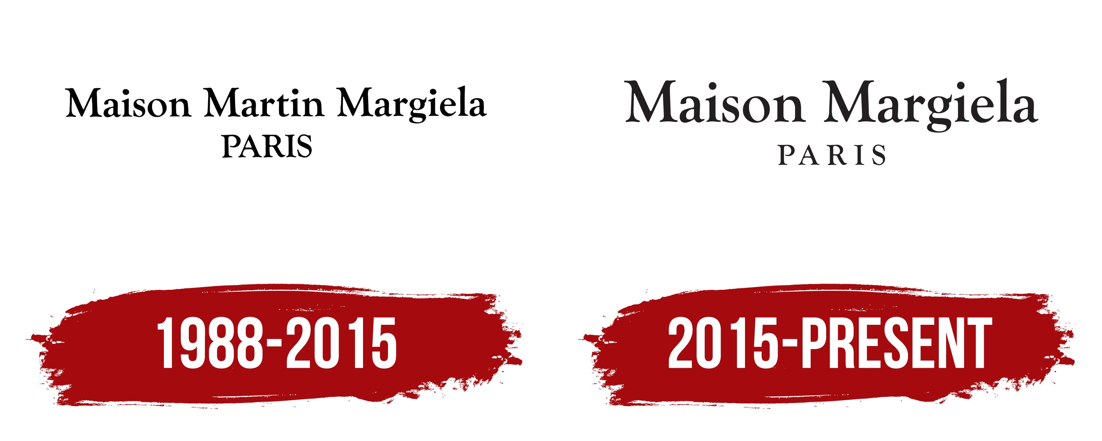
Since its founding, the fashion house has earned a reputation as an innovator and trendsetter. When John Galliano became the creative director in 2014, he remained faithful to the brand’s core principles but changed the emblem to reflect his vision and style.
The Maison Margiela logo features the brand name in a strict and elegant font. The letters’ thin lines and refined shapes create a sense of sophistication and high quality. The simplicity and precision of the lines emphasize the high style inherent in the products. The emblem also symbolizes continuity and respect for tradition by retaining key elements of the previous trademark design.
When designer Martin Margiela left the house, John Galliano took over. The new head preserved the brand’s fundamental aspects but made some changes, such as removing Martin’s name from the title and thinning the word “Paris” to emphasize the brand name.
The emblem’s font is designed in a strict and refined style. The letters have clear and elegant forms, highlighting the brand’s high level of sophistication. Thinning the word “Paris” emphasizes the brand name, making it stand out against the other elements.
The logo is rendered in black, symbolizing luxury and versatility. The black color also underscores the brand’s classic and timeless style.