The Eli Lilly logo would suit a cosmetics or fashion brand more than a pharmaceutical manufacturer. This is precisely what helped the old American company stand out in the pharmaceutical market, making its emblem a symbol of high quality.
Eli Lilly: Brand overview
A tiny pharmaceutical company was created in Indianapolis, Indiana, in 1876 by Colonel Eli Lilly, a Civil War veteran and pharmacist, marking the beginning of Eli Lilly and Company’s history. Lilly set out to create high-grade pharmaceutical items because he was dissatisfied with the poor quality of medications available at the time.
During its initial years, the company concentrated on manufacturing gelatin capsules, a breakthrough that enabled accurate dosage and covered up the unpleasant flavor of medications. As a result of this innovation, doctors and patients began to favor these medications.
The business started growing in the 1880s, adding more laboratories and industrial spaces. The manufacturer invested significantly in scientific research and pioneered pharmaceutical research and development.
The company was among the first to mass-produce diphtheria antitoxin, a critical step in the fight against this deadly disease and a notable accomplishment of the 1890s.
Josiah K. Lilly Sr., Eli Lilly’s son, assumed leadership following his father’s death in 1898. The company grew under his direction, adding new products to its lineup and solidifying its market position.
In the early 20th century, the company became a leader in medication standardization, greatly enhancing the caliber and potency of its goods. Additionally, the business started working with educational institutions to advance scientific research.
The 1920s were a time of great innovation for the producer. 1923, the firm revolutionized diabetes therapy by starting to produce insulin in partnership with the University of Toronto.
The company contributed significantly to World War II in the 1940s by manufacturing penicillin and other critical medications for the US Army and its allies.
There were some significant advances in the 1950s and 1960s. In 1955, the firm released the broad-spectrum antibiotic erythromycin. Since their introduction in 1960, cephalosporin antibiotics have been vital weapons in the fight against infectious illnesses.
The advent of third-generation cephalosporin and the beginning of recombinant DNA research defined the 1970s.
The corporation experienced substantial expansion during the 1980s. The producer invented several significant medications, such as Humulin, the first human insulin made by recombinant DNA technology.
The business kept up its innovative streak in the 1990s, introducing several important pharmaceuticals, such as the antidepressant Prozac, which became one of the most well-known in the world.
The company’s global reach and product variety grew in the 2000s. It kept funding research and development, concentrating on neurology, endocrinology, and oncology.
When the business released Cialis (tadalafil) in 2003 to treat erectile dysfunction, it emerged as a significant rival to Viagra.
Another significant event occurred in 2007 with the introduction of Cymbalta (duloxetine), an antidepressant that is also useful for treating fibromyalgia and chronic pain.
With the introduction of Tradjenta (linagliptin) in 2011, the company increased its market share in endocrinology.
In 2014, the FDA approved Sirturo (bedaquiline) for treating multidrug-resistant tuberculosis, a significant advancement in the fight against the illness.
One of the company’s most important medications, Trulicity (dulaglutide), was introduced in 2015 and immediately became a revolutionary treatment for type 2 diabetes.
The launch of Taltz (ixekizumab) in 2016 reinforced the company’s standing in immunology. Taltz treats psoriasis and psoriatic arthritis.
2017 saw the oncology portfolio take a big stride forward with the approval of Verzenio (abemaciclib) for several forms of breast cancer.
Expanding the company’s foothold in neurology, Emgality (galcanezumab) was introduced in 2018 to prevent migraines.
Innovation persisted in 2020 despite worldwide challenges, and their drug Retevmo (selpercatinib) was approved for treating specific forms of thyroid and lung cancer.
Tivdak (tivozanib) was approved in 2021 to treat kidney cancer, which further solidified the company’s oncology focus.
The FDA approved the company’s Mounjaro (tirzepatide) medication for type 2 diabetes in 2022. This medication, which belongs to a novel class, showed notable efficacy in lowering weight and controlling blood sugar.
The first systemic medication authorized for severe alopecia was Olumiant (baricitinib), which was introduced in 2022.
In the same year, the company greatly increased the number of prospective patients by expanding the indications for Verzenio (abemaciclib) in treating early-stage breast cancer.
2023 was a year dedicated to Alzheimer’s disease research. Donanemab studies’ preliminary results were presented, indicating encouraging outcomes in halting the progression of the disease.
The company also improved its standing in immuno-oncology by creating novel therapies and extending the uses of already-approved ones.
The business continued investing in artificial intelligence and digital technology to enhance clinical research and expedite medication development.
In 2023, plans were declared to build new plants both domestically and internationally as part of a major expansion of production capabilities.
The business continued its acquisition and partnership strategy to improve its position in important therapeutic areas and gain access to cutting-edge technologies.
The company also focused heavily on creating biosimilars to give patients access to essential medications worldwide.
Throughout its existence, the company has adhered to its principles, upholding its founder’s high standards and dedication to innovation. From a modest laboratory in Indianapolis, it has grown to become one of the biggest pharmaceutical corporations in the world by continuously adapting to the demands of the healthcare industry and creating innovative technologies to enhance the quality of life for patients.
Meaning and History
What is Eli Lilly?
This company is known for creating revolutionary drugs that address some of the most serious health issues, such as autoimmune diseases, diabetes, and cancer. Its product line includes innovative biologic drugs and precision medicines, featuring well-known brands like Cialis and Prozac. The company is involved in clinical research and developing new treatments and therapies. Significant emphasis is placed on collaboration with academic institutions, biotech companies, and healthcare providers, fostering innovation and improving patient care.
1876 – 1906
Eli Lilly was established in the late 19th century when visual identity wasn’t as important today. Many manufacturers labeled their products with simple inscriptions of their name, address, and product information. Consumers relied solely on the brand’s reputation to make a final purchasing decision.
Eli Lilly medicine bottles were recognizable by the elegant handwriting of the man who founded the company in 1876. Colonel Lilly, who named the pharmaceutical company after himself, signed each label as if confirming the product’s authenticity. Over time, his name became a globally recognized symbol of quality and reliability.
1906 – 1915
The founder’s signature became an official logo in 1906 when the Pure Food and Drug Act was enacted in the United States. This law set new safety and marketing standards, requiring pharmaceutical manufacturers to list all active ingredients on their labels. These labeling changes prompted Eli Lilly to adopt a permanent emblem to make its products more recognizable.
The visual symbol the company began to use for product promotion looks exactly like the personal signature of the business owner, pharmacist Lilly. He used to autograph each bottle, confirming the high quality of the medicines. The new logo significantly simplified the labeling process, as the founder’s signature started being automatically printed on the labels.
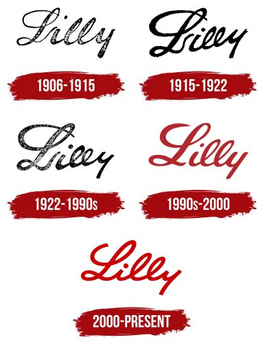
Designers standardized the inscription, preserving the original features of Lilly’s handwriting. However, the font used in the logo appears overly neat, as if it’s an idealized version of the autograph. The even slant of the letters, graceful flourishes, and smooth curves make it a model of calligraphy art. The only imperfection is the missing loop on the “y,” turning the letter into something resembling the number “4.”
Despite its elegant form, the logo is colored in a somber black. This choice is explained by the limited printing capabilities of that era, as producing color images in the early 20th century was technologically challenging and costly.
1915 – 1922
In 1915, the era of Eli Lilly’s black-and-white emblems continued. Designers only slightly modified the shape of the inscription, making it less perfect and more like the autograph of a real person. The line, which had been perfectly straight, now curves gently upward, hinting at the company’s prospects for growth. This dynamism became a symbol of the continuous movement and development of the pharmaceutical brand, focused on creating new medications.
The word “Lilly” lost some of its charm due to the rough shape of the letters. The lines are no longer as sharp as before. They became much thicker and appeared messy because of the blurred edges. Even the decorative loop of the “L” no longer impresses with its elegance, as the altered design made it visually heavier. Yet, the “L” remains disconnected from the “i,” as a separate logo element.
The two flattened “l” s closely resemble “e” s, which reduces the inscription’s readability, especially when combined with the unclear “y.” However, the emblem remains recognizable even in this form, as the founder’s signature has been used on product packaging for several decades.
1922 – 1990s
This is another black-and-white version of the chemist-pharmacist Eli Lilly’s signature. Here, designers outlined the edges of the letters to give them a defined shape and achieve a hypnotic smoothness in the lines. The elegant beauty of the capital “L” became apparent, with each curve forming decorative loops at the top and bottom, perfectly balanced.
The letter “i” is now more compact and tidy, making the inscription elegant. However, the two lowercase “l “s remain very small and look almost like “e” s, which detracts from the overall impression of the logo. Yet, the designers are in no hurry to correct the disrupted proportions, as this imperfection highlights the brand’s uniqueness and enhances its recognition in the pharmaceutical market.
In the new version of the emblem, the end of the word “Lilly” is slightly raised. This heightens the inscription’s dynamism and simultaneously creates a counterbalance to the pronounced slant of the letters, characteristic of the founder’s sweeping handwriting. The visual movement fills the logo with emotions linked to the triumph of medical achievements, yet the somber black color tempers this expression.
1990s – 2000
The company decided not to change the old concept but to infuse it with new meaning. To do this, designers adjusted the shape of the inscription, adding more elegant elements and correcting the proportions of some letters.
- The ends of the capital “L” were shortened so that the top line no longer passes through the loop, ending just before it. The lower part no longer hangs over the “i,” eliminating the overwhelming sense of dominance from the logo.
- The lowercase “i” became elegant due to the absence of angles. The dot was reduced and flattened diagonally, giving the impression that it bounced like a tiny ball. The visual dynamism matches the brand’s character, focusing on pharmaceutical innovation and constant drug research.
- Both “l” s no longer resemble “e” s, making the word “Lilly” clear and readable. The logo developers corrected the shape of the double letters, stretching them vertically so they were finally taller than the “i.”
- However, the “y” still lacks the traditional loop and looks more like an “h” rotated 180 degrees. This is a recognizable feature of the founder’s handwriting, and designers preserved it as a symbol of authenticity.
Overall, the emblem features an improved version of Eli Lilly’s autograph. The shape of the glyphs was corrected, the number of smooth curves increased, and the line contrast was enhanced. The only angular elements remaining are the sharp ends of the initial “L.” The burgundy color adds emotion to the emblem, which pairs well with the dynamism of the italicized font.
2000 – today
The logo with the word “Lilly” is at the origin of the pharmaceutical brand, as this short five-letter word has adorned the medicine bottles of the American manufacturer for over a century. Initially, it was the signature of the company’s founder: he marked each label with his surname to prove the product’s authenticity. Over time, his autograph turned into an authentic emblem, which would have been more suited to a cosmetics or fashion accessories brand.
Using an elegant logo, the Eli Lilly brand stood out among competitors. It has always remained true to its chosen style, so the 2000 redesign didn’t bring revolutionary changes: the wordmark remained just as elegant and refined. The inscription became more aesthetic because the developers balanced each stroke.
All the letters have the same thickness, giving the impression that the word is formed from a single continuous line that begins at the top loop of the “L” and ends at the lower part of the “y.” To enhance this artistic effect, the designers connected the “L” to the “i” for the first time in many years, so the inscription no longer appears disconnected.
Another change affected the size of the letters: the second-to-last “l” became shorter, just as it was in Eli Lilly’s original signature. Yet, it remains tall enough not to resemble an “e.” The logo’s creators found a golden mean, achieving historical accuracy in the font while maintaining the word’s readability.
The slant of the glyphs was increased to compensate for the absence of refined lines. The ends of the letters are no longer rounded—the designers restored the missing angularity. In this version, the inscription looks more natural, as the rough, angular shape helped balance the excessive softness of the elegant curves and loops. This contrast makes the logo visually intriguing and emphasizes the brand’s dynamism.
The wordmark cannot be called conservative, even though it is based on a real person’s signature. The designers made it unique by coloring “Lilly” in a rich red shade. This vibrant hue is associated with vitality and a desire for change, making it well-suited for producing innovative medicines. It expresses the company’s passion for its mission and reflects its almost aggressive drive to remain a leader in the pharmaceutical market.
