The ELVO logo symbolizes reliability, quality, and innovation. The company finds the optimal path and hits the mark with its developments. The emblem’s elements reflect a connection to Greece and its heritage.
ELVO: Brand overview
ELVO traces its origins to 1972 in Thessaloniki, Greece, where it was founded under the name Steyr Hellas S.A. This company was formed in conjunction with Steyr-Daimler-Puch of Austria, and the initial goal was to produce trucks, tractors, and motorcycles. Throughout the 70s and 80s, Steyr and Puch vehicles were assembled in the Greek market, mostly under license agreements.
Much of the company’s growth in these early years is attributed to significant military contracts awarded by the Greek government, mainly for supplying trucks and buses. By 1986, a change in identity and focus resulted in the company being renamed Hellenic Vehicle Industry or ELVO. The brand change marked a shift to developing and designing domestic military vehicles, particularly the Leonidas armored personnel carrier.
Even before the renaming, ELVO demonstrated its capabilities by developing a 3-ton truck in 1980 and a chassis for a military bus the following year. In the 1980s, the company moved from assembling licensed vehicles to innovating and producing original models and variants.
Today, ELVO is a key player in the Greek defense and automotive sector, offering products ranging from buses and trucks to armored vehicles for the military and civilian sectors. The company, which started as a licensee of the Austrian company Steyr, has evolved into an independent Greek vehicle manufacturer focused primarily on the needs of the defense sector.
Meaning and History
What is ELVO?
It is a Greek manufacturer specializing in military and commercial vehicles. The company produces many products, including trucks, armored vehicles, buses, and fire trucks. Known for its rugged and reliable designs, it serves both domestic and international markets by providing vehicles that meet the needs of military and government services. The company emphasizes quality, durability, and technological advancement.
1972 – 1987
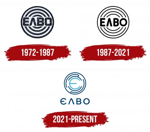
The first company emblem is designed like a dartboard. The center features the abbreviation ELVO, which stands for Ellinikí Laïkí Viomichanía Ochimáton, which means Hellenic Vehicle Industry. This choice symbolizes the company’s importance in developing Greece’s national economy.
The dartboard image conveys the precision and reliability of ELVO’s products, emphasizing that the factory’s output is a bullseye. The association with a dartboard refers to military equipment, the company’s primary production focus in its early years. This symbolism reflects ELVO’s contribution to Greece’s defense industry.
1987 – 2021
The lines of the emblem became thinner, making the sign lighter and more expressive. The concentric circles resemble wheels inside tank tracks, highlighting the company’s historical link to military equipment production. This design shows ELVO’s ability to produce vehicles of various sizes and purposes, from small transport vehicles to large military machines.
The main elements of the emblem remain unchanged, preserving its recognizability and connection to the original symbol. This approach reflects the company’s respect for its roots and traditions and its commitment to adapting and modernizing to meet contemporary requirements and standards.
2021 – today
The Greek brand ELVO’s logo uses the alternative English spelling “ELBO” in a unique font. The first letter, “E,” has a rounded shape, adding softness, while the “L” looks like an inverted “V” with a soft angle, creating a modern look. Above the brand name is a geometric pattern of lines forming a circular maze. A light blue “E” stands out at the center of this maze. The remaining logo elements are dark blue, making it look professional and reliable.
The circular maze symbolizes the brand’s intricate approach to problem-solving and engineering. The light blue “E” at the center draws focus, highlighting its importance. The dark blue elements convey stability and trust, reinforcing the brand’s image as reliable and professional.
The logo combines a distinctive font and geometric pattern to create a memorable design. The rounded “E” and unique “L” make the typography recognizable. The maze enhances visual appeal and symbolizes the brand’s innovative solutions. The light blue “E” emphasizes excellence and leadership. The dark blue color scheme adds professionalism and authority, making the logo both striking and engaging.
